Yes, it’s the most obvious thing in the world to review: what’s the best place to store and sync my files. And honestly, everyone’s going to have their own opinion on that. But with Dropbox’ recent plan updates (giving you 1TB and extra sharing features for $9/month), reviewing the big 3 storage apps—Dropbox, OneDrive, and Google Drive—seemed like a great way to test out our new reviews pages at Zapier.
And so, here’s a review of what’s great about each of them, with a short summary:
Dropbox: it’s all about files, and it’s still the simplest
Google Drive: it’s focused on web apps, and can OCR your images and PDFs
OneDrive: it’s integrated with Windows 8 and Office, and is essentially free if you need Office 365 anyhow.
As it turns out, I use all 3 for different purposes. But that’s a post for another day.
The Chromecast is great for streaming Netflix and YouTube to your TV, but it’s also the best alternative to taking an HDMI cable with you on your next business trip. Here’s some tips on how to use the Chromecast to present anything, anywhere.
Your Mac has dictation and screen-reading built-in, with the same voices (and many more) that you’re used to from Siri. Google, Wikipedia, and the calculator are only a keystroke away in Spotlight. Yet there’s still no Siri for Mac.
There is, however, a bit of artificial intelligence in your Mac. Open a new text document, in TextEdit or your favorite plain text writing app. Or possibly make a new email. Now, press the esc key on your keyboard. Tap enter, then press space. Now tap esc again. Rinse, repeat. Add punctuation as needed.
And, voila, your Mac has just written for you. Automagically.
My Mac has a penchant for saying it wants to “have a good day” or “be a good day”. Which is nice.
And so we should let my MacBook Air have the closing words. It said:
I love you so much fun and I was just a little bit of a new one is the best thing ever is when you have to be a good day.
***
Yes, this is just the default OS X spellcheck’s word suggest, which you can use to help you complete a word you’re unsure how to spell. And it apparently learns from what you type—and since I close most emails with “Have a good day!”, I guess it learned that phrase from me. Anyhow. Still a fun trick.
2 weeks ago, I started my latest adventure: doing marketing at Zapier. Here’s the story that started it all—and my last post, “It Takes a Story”, was the presentation I gave at Zapier when I got hired. And that—crafting the stories that’ll help people get more done with Zapier—is exactly what I’ll be doing.
In the beginning, it was dark. Very dark. It’d get light for half a day, long enough to find food and explore a bit, but then, it’d be dark again. But then, it’d be light again—until it was stormy, and there was no light for days on end. Those were the days you’d wish for a way to capture the sun.
And then, somehow, a piece of the sun fell out of the sky, and turned a tree into a mini-sun—or so it seemed to you. Here was your chance. Everyone else was terrified, but you walked to the tree, picked up a branch that had caught some of the sun, and figured out that it was fire.
Take it back to the camp, and everyone would think you were insane. You were literally playing with fire. So you’d have to convince them why this fire was good, how it could keep you warm and break the darkness. You’d tell a story.
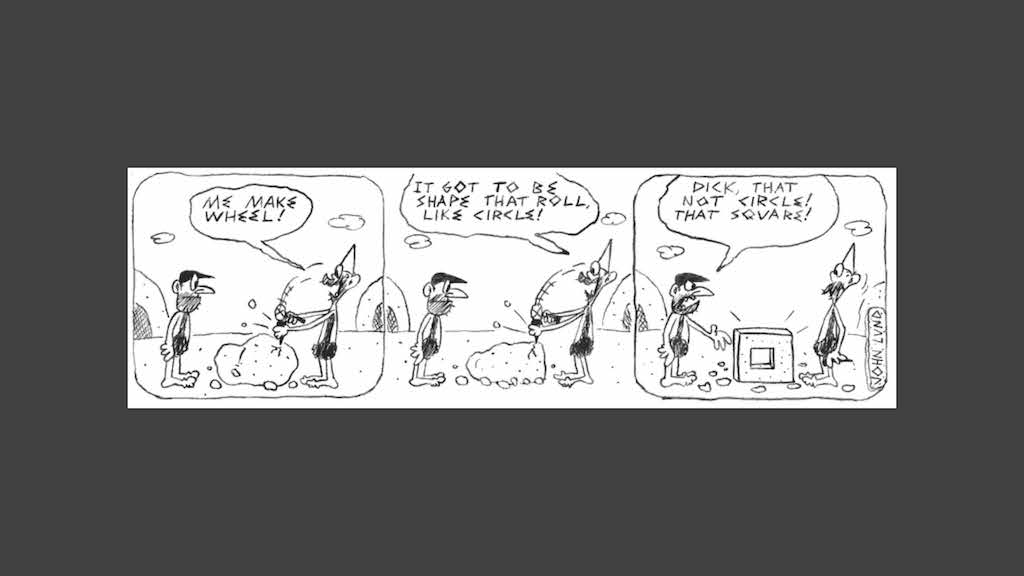
Fast forward a bit, and you’re tired of walking. You’re doing a lot more walking now with light, and it’s getting tiresome. And so, you notice a rock rolling down a mountain one day, tumbleweed rolling across a field in the breeze, and pebbles rolling under your feet. And suddenly, you’ve invented the wheel in your head.
You chisel and carve and craft the perfect wheel, but then what. Time for a story again. You’ll have to find a way to convince people this wheel is something important, perhaps by describing the tumbleweed and rolling stones.
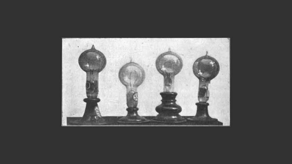
Centuries pass, and fire on sticks (or in glass lanterns, or on wax candles) has gotten a bit old. There’s this new-fangled thing called electricity, which turns out was what caught that tree on fire way back when anyhow, and if electricity can light up the night sky, surely it can light up your home. You’d just need to capture that new version of the sun in a bottle, again — and this time a stick wouldn’t cut it.
So you’d experiment and try and finally find a way to make a light bulb that works. It’d take forever, but finally, you’d have something. Ding.
But then, you’ve got to convince people to switch—to spend money for seemingly unproven technology. And that wouldn’t do. And so, you’d wire up a whole section of the city to show that electricity won’t burn everything down, and you’d shower the World’s Fairs with lightbulbs so people would see the whole world, brighter.
If you’re Tesla, you’d run a lightbulb off current passing through your body just to prove it was safe. Real-life stories, perhaps, but stories all the same.
Time passes on, the whole world runs on electricity, and it’s time for a new revolution. There was this not-so-little thing called computers, machines that’d take up whole rooms and solve math. Not exciting.
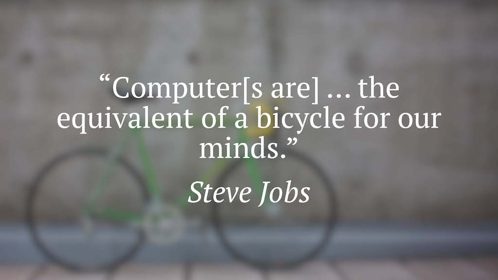
That is, not until the microchip came along, and made PCs possible. Even still, what normal person in their right mind would spend nearly $3k in today’s money for a computer when you didn’t know what it’d do for you? Math isn’t that exciting.
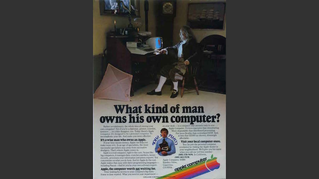
But someone saw more to them than that, and told us stories. He said the computer was a bicycle for the mind—it could let your mind do much more than it could do on its own. It could enable anything.
It was the time when full-page magazine ads were all the rage, and no one saw the need to skimp on words. And so, Apple—and really, so many others—would tell stories in their ads, tell us how we’d put their products to use, and why we weren’t crazy for wanting one. They’d explain what electronic mail was, and how it could save us postage and speed up our communications. They explained what BASIC meant, and how we could make stuff with it.
They told stories.
Sometimes, it just takes a story.
The App Store is filled with apps that have a vague name, an even more vague description, and a few random screenshots. There’s little space for much else. And if that’s all you rely on, you’ll be lucky to get any customers. If the app solves a basic problem—email, notes, or any of the dozens of things people already understand—people won’t know why to try it over the app they’re already using. And if it solves a unique problem, they won’t even begin to grasp what it’s for.
Ed Catmull said in Creativity, Inc. that “We humans like to know where we are headed, but creativity demands that we travel paths that lead to who-knows-where.” And those paths need stories. People won’t understand what we’re doing—if we’re doing something new and meaningful—unless we explain it. They need be able to see what we meant that thing to do. They later may find other, better uses for it, but it takes that first story to capture their mind and start seeing the possibilities.
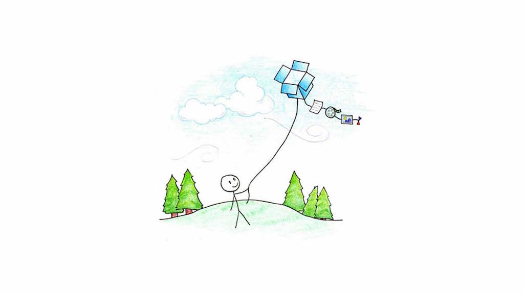
That’s why the best apps tell stories. Dropbox’ intro video told us that it was the place to put all of your stuff, and then described how exactly that made sense with examples of people traveling and more. Their homepage had little else—and it needed little else. The story was what mattered.
Basecamp the company, in its previous incarnation as 37signals, found that using a story from a customer increased their signups over 200%. Their initial long-form story, with a signup button far below the fold, increased signups over 100%, and further tweaks of adding a picture (so people could put a face behind the story) and tighter copywriting double that stat again.
And it’s not just fancy apps. More boring services like Draft Revise, a design optimization service, have found that a wall of text that in-depth explains what their service is all about helps prompt signups. Nick Disabato, the guy behind it, says that he’s told people the site address in a coffee shop and seen them stop talking just to read the page. All of that, for a $650/month service that’s inherently boring.
And yet, a story is what helps it work.
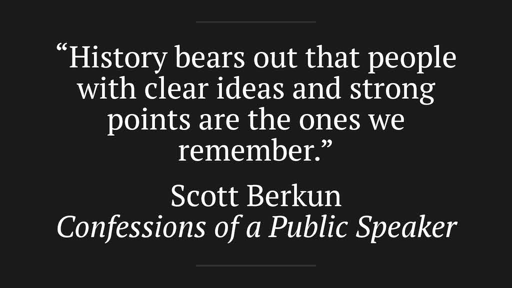
“History bears out that people with clear ideas and strong points are the ones we remember,” writes Scott Berkun in his book Confessions of a Public Speaker, after mentioning mistakes in famous speeches and the various speaking problems thought leaders had. That didn’t matter. They told a story, and that’s what we remembered.
That’s how the simplest tools can win: a solid story. No amount of design and features—or lack thereof—can make or break a product like a story. A solid story will win hearts and minds, and help people see how they can achieve greatness with what you made. No story will only let them see your sun captured on a stick, and they’ll wisely run away.
There’s something that loves a multipurpose gadget. The fabled Swiss Army Knife, the microwave oven, the rice cookers that can also make soup and steam break, the spork, the universal chargers and screw drivers and anything else that claims to be universal anything, the crazy tools shown on late night TV. The computer, even, or the iPhone with its promise that “there’s an app for that.” There’s something deep within us that automatically feels we’re getting a better deal when the thing we buy can be used for more than one thing. The more, the merrier.
And yet, seriously, how many of the multi-purpose gadgets do you really use daily (putting aside for the moment your computer and smartphone, since they’re a somewhat different category of everything devices). The best Swiss Army Knife’s screwdriver will never be as good as any standalone screwdriver, and its knives would never stand up to a top-quality real knife. The microwave is only half-way good at anything it does, and you likely only use your rice cooker to cook rice anyhow. And the poor spork is terrible at everything, no matter how much you want to love it.
No matter how much engineering and design and love and care you put into a multipurpose device—and it will take a lot more effort to make anything that does a ton of stuff—it’s always at this weird interception between everything it’s trying to do. It may be ok at a lot of things, but it’s not great at any.
Yet there’s also something that loves the simpler tools. The knife, forged with skills passed down through generations. The clock, ticking steadily for decades. The wood-fired oven, the hammer, the paintbrush, the pencil and paper. We ascribe mastery to those who use them, genius to those who invented them. Those tools may just do one job, but they’ll do them great. No ifs, ands, or buts.
Their simpleness has made them great.
That’s the genius—and surprise—behind the tech gadgets that do just one thing, like the Kindle Paperwhite, a DSLR, an original iPod, or even the Fitbit. They do just one thing, and they do that thing great.
That’s why the iPod Classic was great—that clickwheel and the whole UI were designed just around your music. In the same way, the Kindle (and this is referring to the eInk reader Kindles, not the newer Kindle tablets) manages to have a much better reading experience—and also is far easier to select text in—than any reading app on another gadget, simply because it’s designed just for reading text. When it lets you select text to highlight it, it can do that great since it’s just designed for books. There’s less features, but the features it has can be the best possible for that one scenario. Plus, since its only focused on one thing, its battery life is astounding.
Same goes for a DSLR. I’m so accustomed to random tech interfaces (say, the ones on a microwave or a car’s stereo) being terrible that I just assumed my Canon DSLR’s touchscreen interface would be atrocious. No big deal: I bought it for optics, and the screen just needs to show pictures. But then, surprise of surprises, it’s actually nice. There’s quick access to the photo settings you need, silky smooth swiping between pictures, and little else. And that’s all there needs to be.
Focus breeds something far closer to perfection, almost without trying. Perhaps you can improve on the Kindle or DSLR or iPod interface, but absolutely not by adding features. If anything, you’d only make them better by simplifying them even further, removing all extraneous parts until they’re as razor focused as a time-honed sword.
It’s not just traditional tools that can be single-purpose and focused. Software, too, can be a honed tool that’s perfect for just one thing. There’s Instapaper, with its simple idea to save article to read later and nothing else. There’s iA Writer, the most minimal writing app possible with nary a setting in sight—the closest to a digital typewriter yet. There’s web browsers like Safari, that with each release get closer and closer to having no UI and only the web pages you’re looking at. There’s even something more valuable in extremely focused apps—you can find all types of unique use cases for a read later app or a plain text writing app or anything else that’s focused, just because it’s great at one thing.
Tie a lot of small tools that are great at one thing together, and you’ve got a set of tools that’ll do the stuff you need far better than one piece of software that’s supposed to do everything.
And here’s where I wonder at the current state of the supposedly “smart” watch market. There’s the watches that are essentially trying to cram everything from a phone into a smaller screen on your wrist, while still requiring you to also carry a phone. They’re marketed as things that can do everything: show directions on the go, take pictures, show notifications, and more.
But they don’t do anything great. They by design won’t replace your phone, and are instead essentially just an external display. They make for great demos—or at least they should—but in practical life there’s zero pressing need to use one.
The Fitbit is interesting, since it’s just designed to be a sensor that sends data to your phone about your exercise and movements. It’s simple, single-purpose, and has an obvious use case. Maybe it’s not as exciting since it can’t do so much, but at least it’s easy to explain why one would want to use it.
I don’t know what Apple’s going to do with the wearables market, or if they’ll release an iWatch. All I know is that if I’m going to buy yet another gadget, I’d rather it have a specific thing it does great, and little else. The iPhone’s the hub, the multipurpose device. It’s great at that. Let that remain. Then give us something else that’ll make the iPhone better, not just duplicate features it already has.
Instead of spending time on something that might be sold or shut down tomorrow I much rather put on some safety goggles and build my own thing.
A brilliant call for a return to DIY from the guy behind Kirby, this time in building your own tech. Just the thing most of us should do more of.
Don’t find an app for it. Make your own app from it, even if you’re doing so just by mashing up open tools you can already get. You’d be surprised what you can build with just a CMS as your base.
When your business is selling hardware and software to customers—that is, when the people who use your devices and software are your customers—you can actually care about your users’ privacy, and make that a selling point. With almost every other tech company giving away everything for free and making it back in ads, their users aren’t their customers—their advertisers are—there’s no way they can advocate for privacy as a feature.
This article from Macworld sums up Apple’s privacy focus today. It’s another great reason to love Apple stuff.
The more professional the tool, the uglier it must be—or so it seems if you look at most business software. The new, simple apps get the stylish new designs—typically simple todo list, reading, and photo filter apps—while tools like Office keep the same traditional style forever. Even newer business web apps typically stick to a more utilitarian style, focusing on features more than UI.
When it comes to team task management apps, though, there’s one that’s always been a showcase of design, even as it’s filled with pro features: Flow. Several years back, I worked with their team doing copywriting and support, and even then it was beautiful for a task app. The design then leaned more heavily towards shiny, almost plastic graphics—a notch above, say, Things for Mac’s style. But over the years, it’s gotten lighter and flatter design while still maintaining its great usability, and today it could be a showcase of what OS X Yosemite designs should look like.
Plus, it’s got more features now than ever. There’s an Android app (the most requested feature when I did support for Flow) along with an iOS app and even a Mac app now (though the latter is just a web view, but still is nice). You can add sub-tasks to your tasks, format notes with Markdown, and more. It’s a seriously powerful team todo list app, one we used at AppStorm, and I happen to find it exciting to see how its continued to improve over the past few years.
If you’re looking for a nicer team task app, you can’t get much nicer than Flow. It’s gotten so much nicer over the past 3 years, it’ll be exciting to see what the next years bring.
It’s way too easy to fill up your computer’s storage, especially if you have an SSD. My MacBook Air does good to have more than 15Gb of free space at any given time. Thus, I’m careful with what I store locally, offload most of my pictures and movies to external drives, and selectively sync Dropbox folders to let me store files online, but not have them take up space on my Mac (that’s Dropbox’ best secret, by the way: open your Dropbox app preferences, select Account, then click the Change Settings… button beside Selective Sync. Unselect the folders you don’t want on your Mac, and voila: they’ll stay in the cloud a click away, but won’t take up local storage).
Selective sync is a small patch to one of the broader things that cloud storage doesn’t do right—devices come with terribly small amounts of local storage today, but then say they also have cloud storage. And yet, that does you precious little good if said cloud storage takes up as much local space as it does in the cloud. We need something better—but for now, at least there’s that option.
Except the only problem is, adding files to those selectively synced folders is a pain. You’ve got to upload them through your browser, or add them to another folder then go online and move them.
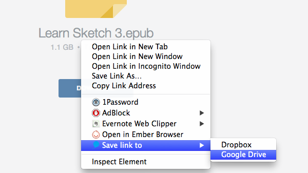
Now, there’s a simple Chrome add-on that lets you download files directly to a Google Drive or Dropbox folder of your choice: Ballloon. Find a file online you want to download—that image for a project, or an eBook you just bought and need to sync with Dropbox to get it on your phone, or whatever—right-click on it, and select the Ballloon option, and it’ll download it directly to your online storage.
That’s handy for the use-case I mentioned previously, but could be a serious usability improvement on a Chromebook, which lacks traditional file management anyhow, and could be the perfect extra for your work computer so you can “download” files and have them automatically show up in your personal Dropbox on your computer back home. And it’s fast—no more waiting for downloads to finish, as Ballloon takes care of it in the background and saves your files online.
So hey. If you’ve ever wanted to download files directly to the cloud—that is, save them to your online storage without downloading them to your computer—Ballloon is the Chrome add-on for you. Enjoy.