There’s something about that new MacBook smell, that clean feeling of having an original OS X install with no clutter or cruft. But you've got to get your old files back on your new (or newly wiped and reinstalled) Mac, and automatically restoring from Time Machine is the easiest and most obvious way to do so.
It's not, however, the only way. You can also easily selectively restore files from just the folders you want.
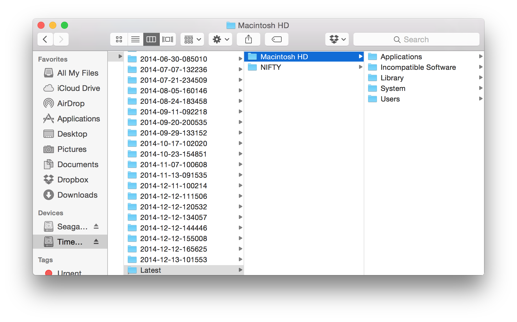
Just open your Time Machine drive in Finder, browse to your Mac's folder, and select the “Latest” link to open the last backup folder. Or, grab an older version if you're really sure that's what you want.
Now browse through the folders and find what you want to restore. If you want to just get your files and not your settings, you can drag over just your individual user folders, or copy over the applications you want. Personally I restored just main folders (Documents, Dropbox and such), then brought just the apps I knew I wanted to use and left everything else on the Time Machine drive. That way, I’ve got a fresh start, and can still get back any of the old stuff anytime if I want. It’s a bit more trouble, but does get you the cleanest new install possible.
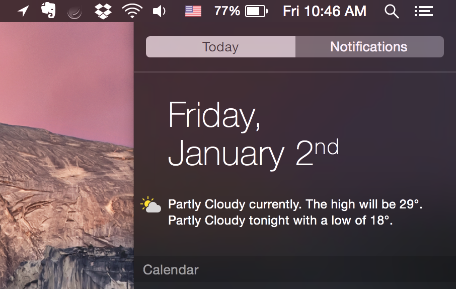
Consistency is important. So when you have your Mac set to the American locale but live overseas (or simply prefer Celsius), you’ll likely find the Today Summary widget showing the weather in Fahrenheit annoying. You can change the Weather widget to Celsius by clicking the small C° icon at the bottom of the widget, but the written description of the weather will still be in Fahrenheit with wind speeds in mph.
Here’s how to change it without having to change the rest of your American settings. Open your Mac preferences, select Language & Region, then click the Advanced… button at the bottom. There, you can switch measurements to Metric, and can tweak further if you’d like—including switching your date formats.
Or you could just switch to the UK region settings, like a jolly good chap. Your choice.
One of my longest running goals has been to write a book and this year, by accident, it happened. It all started with the idea to write a roundup of the best CRM apps on the Zapier blog, which then led to another post breaking down the types of CRM apps and yet another about how to automate your CRM, and then I ended up reviewing each of the apps included in the post.
Before long, I'd written nearly 28k words across 6 blog posts about CRM apps, along with another nearly 17k words in the accompanying review articles. Everything came together and it was time to turn it all into an eBook.
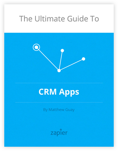
And that's exactly what we've done. Thanks to the rest of the amazing team at Zapier, we've published the CRM articles as their own eBook, "The Ultimate Guide to CRM Apps". It's free to read online, and even includes ePub, MOBI, and PDF editions so you can read the book on any device you want.
You'll learn everything you need to get started with CRM apps, including the different types of CRM apps and the best apps in each category (including a separate roundup of just the best free CRM apps), along with tips from other teams about how they use their CRM and a ton of ways you can automate a CRM with Zapier. It's perhaps more of a booklet than a book, but hey: it's a great place to start if you want to learn more about CRM apps.
And if you'd rather learn more about other types of apps, stay tuned. We'll have more great app learning guides coming from Zapier in 2015 :)
Drip emails are one of the best ways to market your products, educate your customers, and so much more. That's why you need to read our new series on drip emails at Zapier. Written by the Zapier marketing team, you'll learn everything you need about why you should send drip emails, the best apps for sending drip emails, and some of the best ways to automate everything about your drip process.
Here's your 15k word long weekend reading adventure on drip emails:
There's over 350 apps that work with Zapier today, with more being added all the time, but there's still likely a couple of your favorite apps that don't work with it yet—or at least don't work perfectly. In our home, that's Ebay, Etsy, and OmniFocus.
Here's a half-dozen hacky ways to get almost any app to work with Zapier, from simple tricks anyone can use to Zapier's incredible Email Parser to the geekiest tricks of integrating with databases and webhooks.
Ever wondered why John Gruber started his site Daring Fireball, and how he managed to make it profitable enough to be a great job on its own? At the 2014 XOXO festival in Portland, Oregon, Gruber told his full story from site inception to going full-time to the different things that, together, steered him to the business model he has today.
It’s a fascinating talk that’s a must-watch for anyone who publishes on the web, or who’d just like a peek behind the scenes at how a successful business model can be formed and grow over time.
Upgrading to a new OS isn't for the faint of heart. Years ago, it meant waiting up until midnight to buy a boxed copy of the latest OS for $100 or so of your hard-earned money. You'd likely opt to reinstall all of your software and restore your files manually just to make everything work better.
Now, a couple clicks and and hour or three to download and install is all it takes to get the latest OS X. Apple's simplified it so much, everyone can upgrade mostly without fear these days. With recent versions like Mavericks, one could almost upgrade and notice nothing different.
OS X Yosemite continues the trend of simple upgrades—my upgrade from a beta went without flaw, and that seems to be how it's going for most people. Make sure you have a backup, and you should be fine to upgrade.
But you can't upgrade without noticing it this time. Yosemite features the largest visual overhaul of OS X in a decade, borrowing designs from iOS 7 not entirely unlike what many of us had imagined. It works the same for the most part, but there's tweaks and changes everywhere. And, there's new features, including new Extensions and Continuity which lets your iOS and OS X apps swap info and handoff what you're doing almost seamlessly. There's also iCloud Drive, Notification Center widgets, and more. It can be a lot to take in.
You could just dive in; I'm sure you'd learn your way around quickly enough. But if you want to know what's really changed in any new release of OS X, John Siracusa's in-depth OS X reviews for Ars Technica are second to none. This year's review of Yosemite is no exception. It's a must-read if you want to get the most out of Yosemite. You'll learn about hidden features and new tricks—I did while reading it, and I've reviewed software for a job for years.
This weekend, if you'd like some geeky reading, it's Siracusa season again. Enjoy.
I jumped into blogging—dare I say tech reporting?—without any preparation. I was an IT major, "that guy" everyone asked for help with tech, and seemed to have a knack for fixing little problems (really, it was just persistence until I got something to work, and a willingness to move fast and break stuff). And so, I'd figure out how to get stuff to work that really should have just worked in the first place, then blog about how to work such magic.
Somehow it worked. A guide about how to get a specific HP printer to work over a network with Windows 7 x64 (yes, it was that specific) was among my most popular pieces. Specific, boring, and yet it helped people and Google rewarded that. One thing led to another, and I've been employed writing words, in one way or another, ever since.
I wasn't a journalist, and wouldn't have ever thought of myself as such at first. Even when I switched to primarily reviewing apps instead of writing tutorials about them, I approached them like iFixit, tearing them apart to see what features and fonts and frameworks made them tick. That's what's always driven my tech writing.
When I wanted to improve, I devoured books on copywriting (Erin Kissane's "Elements of Content Strategy" from A Book Apart is a great place to start there, by the way), trying to learn from the best on how to best phrase my writing and organize content to help people learn from it. That, and not "covering the tech beat", was my passion.
And yet, soon enough, PR pitches were filling up my inbox, informing me of this "great new app" with "groundbreaking new features" that's "already been downloaded millions of times" or that's "launching with a 1 week discount on Tuesday". Boy were they exciting at first. I'd arrived. Someone had "noticed" my writing, liked it, and wanted me to cover them.
Until I got nearly the same pitch tomorrow. And the day after. And a dozen over the weekend. Very soon I had a nice set of email filters, automatically marking PR emails as read and stuffing them in a folder for the days I had nothing else to write about. I'd rather hand-discover an exciting new app—and yes, for those of you who've followed me a while, I'm particularly excitable about apps that simplify something far more than it's ever been simplified before—or teach something about an old favorite than rehash a press release.
And yet, some pitches worked. Sometimes a founder—or a really nice guy at the company that does almost anything—would write a friendly email just saying they'd launched something and thought I might find it interesting. No PR fluff—or at least not much of it—and just a personal, non-demanding tone. Even to my jaded eyes, that'd at least get me to open their site and see if it kept my interest for half a minute. And that's the way your app would end up getting covered.
Of course, I'm on the other side now, and am the guy that'll be trying to get you to cover Zapier because it really is awesome. But I digress.
The reason I wrote this down is because I just finished reading former Techcrunch writer Jason Kincaid's book "The Burned-Out Blogger’s Guide to PR". In a book that'll take you just an hour or so to read if you read fast, he explains the basics of what PR is all about, and what you should do if you want people to cover your business. And it's great. No, really.
See, I know the pitches that have gotten me to pay attention and make them into a story, and the ones that instantly get deleted even if they're from Famous Corp Inc. Every writer does. Perhaps that's our trade secret, perhaps it's just hard to express, and perhaps we all just think it's so obvious anyone could see why a bog standard press release is worse than just a waste of time.
But Jason Kincaid went ahead and wrote it down, spelling out what you need to do to get covered, and how to make the most of it. And then, at the end, he veers off course, lamenting over becoming jaded and even mean, and helps you see just why yet another press release or broken embargo can be so soul crushing to a writer.
If you're building a product or business, go take an hour and read this book. Really. It may not be "the best" book on how to get press coverage and market your product, but it's real. So real it'd make tech writers have flashbacks. This is really how the modern business news process works, and you should understand it.
And if you're a budding writer, go read this to see what you'd otherwise learn by hard knocks over the coming weeks and months. You'll read it now, and then in a few months think "oh right, that's what Jason said." I wish I'd had something like that when I started.
Spreadsheets are the original killer app for computers, and they’re still a rather powerful tool for everything from crunching numbers to making outlines today. But they can still be rather confusing. Even if you know the basics, there’s likely tons more about spreadsheets that you could benefit from knowing.
As one of my last projects at Tuts+, I had the privilege of working with instructor Bob Flisser on publishing an introductory course about spreadsheets, and it’s finally been published. If you’ve ever wanted to learn more about spreadsheets, be sure to check this course out—it’s $15 to buy, or free with a Tuts+ subscription.
Also, of course, don’t forget about the Spreadsheet for Finance series of free tutorials that we’d ran on Tuts+ earlier this year as well.
Ever wished you could have a phone number in any country, and then have it ring on your local phone? Now you can.
Here’s how to put together a phone number in any Twilio-supported country that’ll forward calls and txts to your local number, and then how you can do even more awesome stuff with that phone number thanks to Zapier automations.
It’s how I’ve now got a US number that rings on my Thailand phone, and how you can build the phone you’ve always wanted.