The New Flow is Really Nice
The more professional the tool, the uglier it must be—or so it seems if you look at most business software. The new, simple apps get the stylish new designs—typically simple todo list, reading, and photo filter apps—while tools like Office keep the same traditional style forever. Even newer business web apps typically stick to a more utilitarian style, focusing on features more than UI.
When it comes to team task management apps, though, there’s one that’s always been a showcase of design, even as it’s filled with pro features: Flow. Several years back, I worked with their team doing copywriting and support, and even then it was beautiful for a task app. The design then leaned more heavily towards shiny, almost plastic graphics—a notch above, say, Things for Mac’s style. But over the years, it’s gotten lighter and flatter design while still maintaining its great usability, and today it could be a showcase of what OS X Yosemite designs should look like.
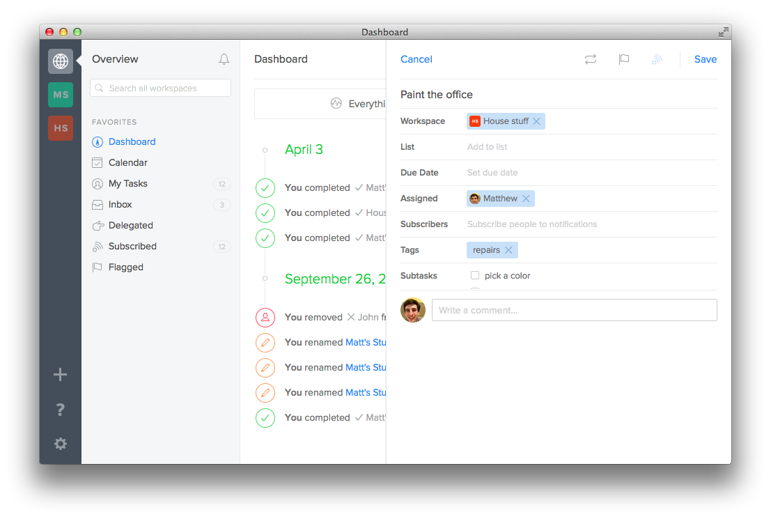
Plus, it’s got more features now than ever. There’s an Android app (the most requested feature when I did support for Flow) along with an iOS app and even a Mac app now (though the latter is just a web view, but still is nice). You can add sub-tasks to your tasks, format notes with Markdown, and more. It’s a seriously powerful team todo list app, one we used at AppStorm, and I happen to find it exciting to see how its continued to improve over the past few years.
If you’re looking for a nicer team task app, you can’t get much nicer than Flow. It’s gotten so much nicer over the past 3 years, it’ll be exciting to see what the next years bring.
Thoughts? @reply me on Twitter.