Ulysses III 1.2—The Word Processor Reinvented for Modern Writers
Just under 13 months ago, I tapped Purchase on an app in the Mac App Store that changed the way I write: Ulysses III. Then a brand-new reworking of a writing app with a decade’s legacy, Ulysses III was at once the 3rd version of the closest competitor to Scrivener, and a new writing app unlike anything seen before. It had the writing simplicity of iA Writer or Byword combined with in-line formatting and text info panes and more that’d remind you more of a traditional word processor, combined with file management that could rival a notes app like Evernote and exporting tools that’d rival Marked. It was feature packed, but then hid everything away to let you focus on your text.
Ulysses III was everything a web or print writer needed in one Markdown-powered app. You could write, easily keep up with all of your texts, and export in any format, all in one app. It's a one-stop-shop for all your writing needs, and a beautiful one at that.
That perhaps doesn’t sound so revolutionary, but it was enough to win me over. I love trying out new writing apps, wanted to switch to the Mac just so I could get Notational Velocity and WriteRoom years ago, and then bought iA Writer for Mac the second it was available. Its beautiful simplicity still makes it my favorite plain text editor. I’d tried the original Ulysses, as well as Scrivener, both of which offered to make managing documents and writing and publishing easier, and yet I only found they complicated my work. Most Markdown writing apps let you export as basic HTML, which is plenty for a web writer, and then there’s Marked for any other export needs you may have. I’d left Word—the original all-in-one writing app—behind in lieu of lighter apps and Markdown, and I didn’t see a need to go back.
But with Ulysses III, putting everything together clicked for me, enough that I switched to it as my main writing app. Here’s what made it so great, and what’s extra nice about it with the just-released v1.2 update:
Simple & Beautiful Markdown Writing
At its core, Ulysses is still a plain-text writing app, just one that happens to include a lot more features than most. You’ve got the plain text writing simplicity you’d expect, with extras. There’s Markdown formatting added as you write, with standard keyboard shortcuts to make it easy to write in Markdown even if you’re not used to it. Links, images, and footnotes get an extra popover to make it easy to add them to your text without cluttering everything, and pressing and holding CMD+V will let you paste rich text or code. It makes Markdown look so nice, it’s the writing app that'd make anyone want to start using Markdown.

Rather than just showing one blank document when you open the app, as the average text editor does, Ulysses shows everything you’ve written on individual sheets. You can select multiple sheets and “glue” them together to keep them as a set (perhaps to keep your table of contents and chapters stuck together while still individual), merge sheets, or now in the latest update split sheets at your current curser position. Scroll to the end of a document, and keep scrolling to open the next sheet automatically. It’s a simple way to jot down separate notes, flesh them out, and pull them together into a cohesive work.
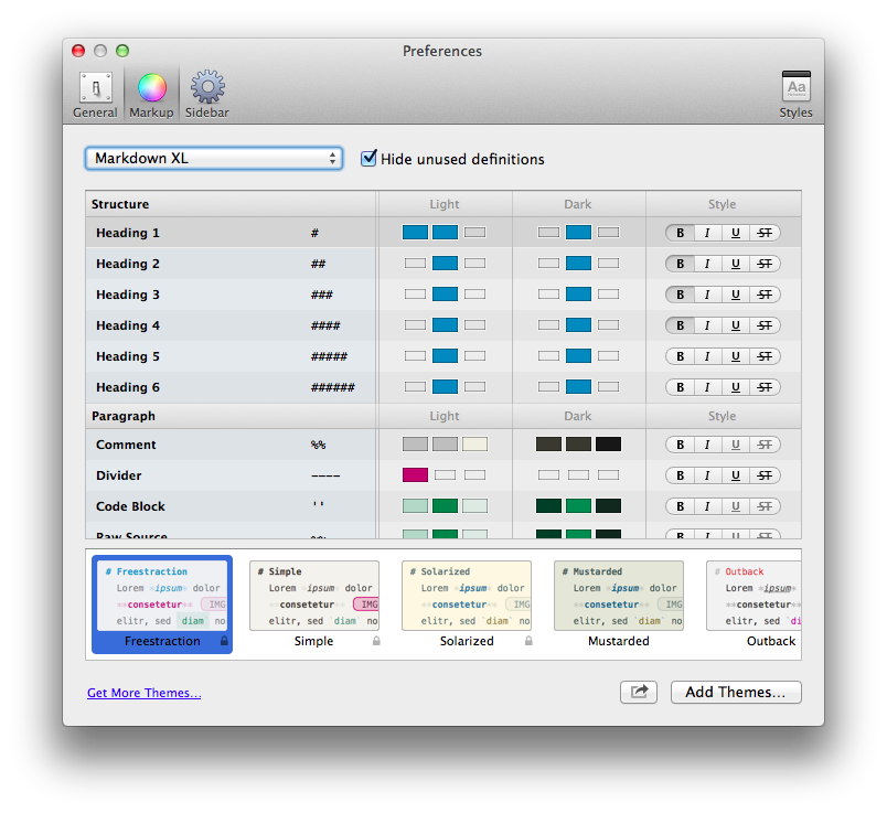
And no matter how lenghty your writing is or how many sheets you have glued together, your text will always look beautifully clean in Ulysses. There’s always been a couple of styles built into Ulysses, including the nice default scheme and a Solarized theme that each had an accompanying dark mode, along with the options to simply tweak the style of every part of the Markdown syntax. Now, that’s accompanied by themes, so you can download styles and share your own in the beautiful new Ulysses Style Exchange. There’s already some nice themes there, and it’ll be exciting to see more themes show up.
But then, my favorite Ulysses writing feature is that it remembers how you like your window to look in windowed and full-screen mode. If you want to have the 3 column view with a light theme in windowed mode so you can see all of your notes, but would rather use a dark theme without the folder sidebars when you’re full-screen, just use those options in the respective locations and Ulysses will remember what you like. And, as another nice v1.2 addition, you can now use a dark writing theme while keeping the folder columns in the more readable light mode.
There’s also still the options for typewriter scrolling, having the current line highlighted, show or hiding line numbers, and more. It looks great out of the box, and yet makes it easy enough to tweak that if you’re particular about your writing experience, you’ll be able to get it looking just the way you want.
All Your Writing in One Place
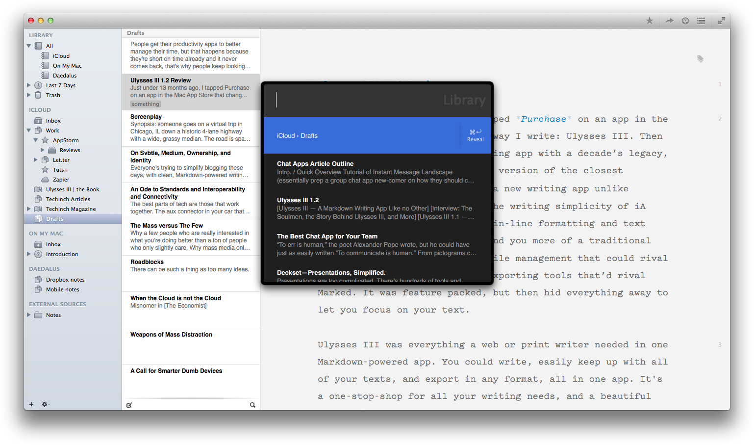
A slick writing environment would be enough to stand out in the writing app market, but Ulysses III goes far beyond that by letting you organized all of your writing in one place. You can keep your notes in iCloud, synced to Daedalus Touch (the current mobile counterpart to Ulysses until Ulysses Mobile is finished), or add your local folders from your Mac with text files. You can open files to add them to your library, and now even drag-and-drop in Word documents to convert them to Markdown (and yes, that preserves the basic formatting quite nicely). And, there’s Keywords (or OS X tags with the latest update, if you’re using external files) to add extra info to your notes, and smart filters to automatically put related documents together based on their contents, keywords, and more.
Ulysses has the standard folders and sub-folders you’d expect, but if you write a lot, you’ll end up with quite a mess of files. Ulysses has a ton of ways to help you cut through the mess and jump to the text you need quickly. The best feature is the Alfred-like search tool that the v1.1 update brought. Just tap CMD+Shift+O, and you can search through your entire library and jump to a different document without ever leaving your keyboard. The list even remembers your most recently edited files, so you can jump to them even if you forgot what you were last writing about. And, as mentioned before, you can show or hide the file browser sidebars, so if you only rely on the search box, you could get all the benefits of Ulysses’ library without having a more cluttered interface than in any other writing app.
A Built-in Personal Trainer
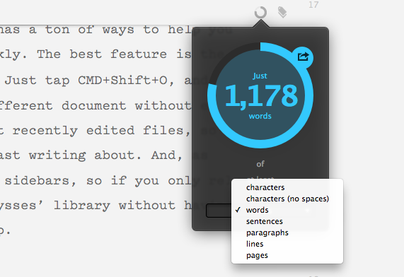
You can have the nicest writing app in the world, but sometimes it takes a bit more motivation to get a blank page filled with words. There’s nothing like a writing goal to keep you going, and nothing like an automated word count watching over your shoulder to let you know when you’ve hit your goals. That’s what the new Ulysses Goal feature offers.
Just attach a goal from the top of your sheet, and then set the number of characters, words, sentences, or pages you want, and choose if you want at least, around, or at most that many. Now, just keep writing, and there will be a small circle indicator at the top of your sheet that’ll fill up as you write and change colors to let you know when you’ve hit your goal. You can even share the goal image on your social networks if you’d like. It’s the Runkeeper of writing.
There’s also still the great Statistics pane as well, that shows you how many characters words, sentences, paragraphs, and pages your document contains, along with an estimated reading time for slow, average, and fast readers—and you can even tweak that view to only show the stats you need. Sure, you shouldn’t be looking at that all the time, but it’s nice to have the detailed stats when you want them. It’s also fun to select everything in your library and check the statistics of everything (my library contains just over 155k words right now).
Turning Text Into Documents
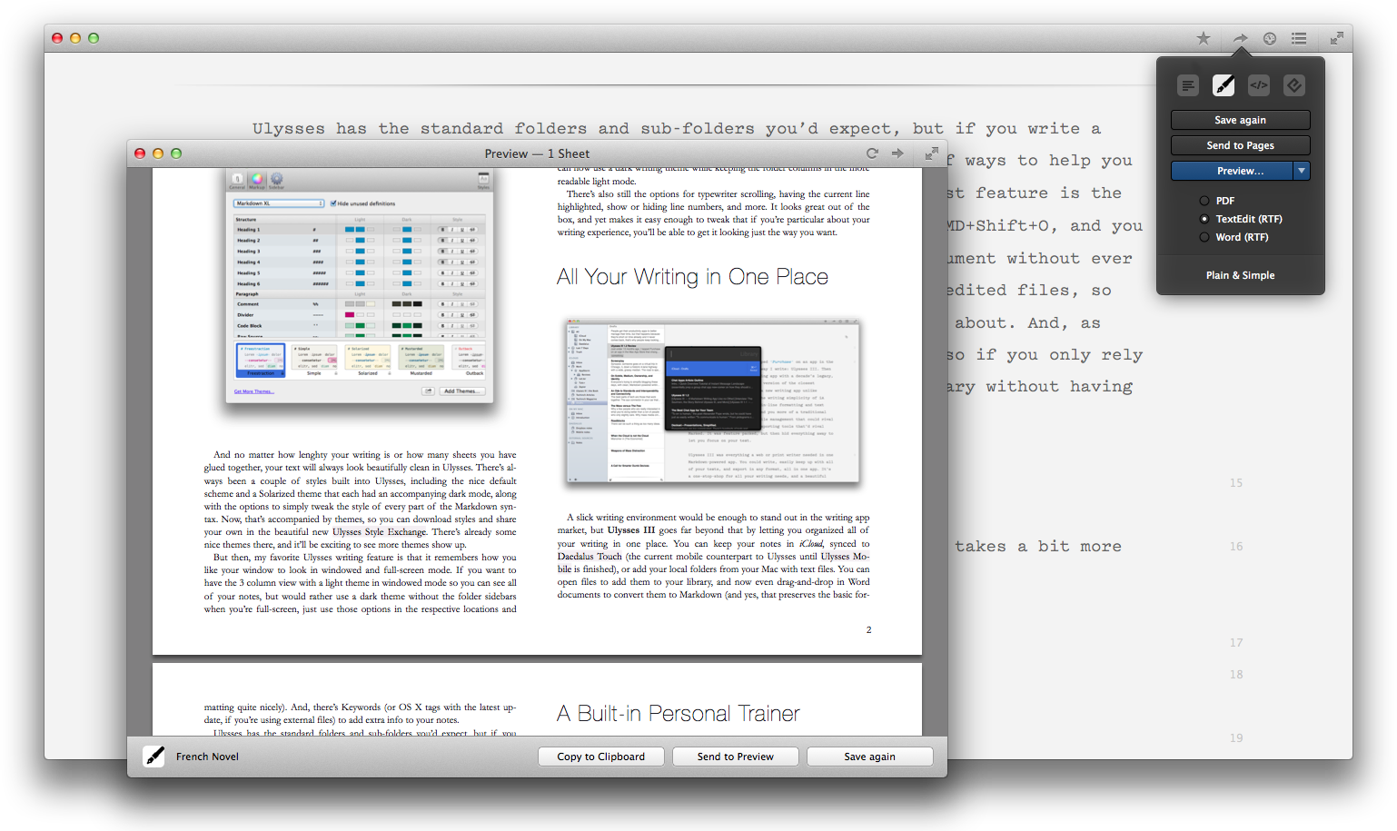
You’ve finished your writing goals, with your text organized and easy to find in Ulysses. Now, it’s time to put your words to work. You can select the text you want to export and tap Alt+CMD+C to copy it as HTML, or click the Quick Export button to export as Text, Markdown, HTML, Rich Text, PDF, or ePub. Or, just drag-and-drop the file or folder icon in the Quick Export box to your desktop or the folder you want in Finder, and you’ll have the document and any included images and files saved together.
If it’s formatted HTML (with a style sheet, not just as plain raw HTML), Rich Text (say, for Word or Pages), PDF, or ePub exports you’re wanting, you’ll find a number of beautiful export styles built-in. You can duplicate and tweak them in your favorite code editor, using CSS or a custom CSS-like syntax that’s easy to tweak. Or, you can now download new document styles from the new Ulysses Style Exchange, where you’ll already find a Word 2010-style template so you can write documents and export them in rich text that looks just like a document made in Word’s default text styles.
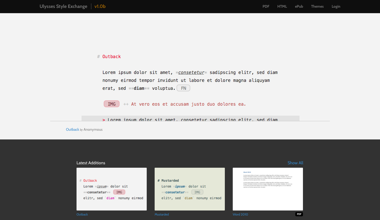
The Ulysses Style exchange is perhaps the nicest extra with the latest version of Ulysses III, with a number of nice text editing themes and export styles ready to use. It’ll be very exciting to see how it continues to grow, and it could end up being for writing (in some ways) what Package Control is for Sublime Text. And then, it’ll be equally exciting to see how Ulysses III itself continues to get better for writers. It redefined what a full-featured modern writing app should be, then in its v1.1 update made it insanely simple to export formatted documents and find what you want with the built-in library search. This update, v1.2, brings the new styles and the Style Exchange, along with goals and other tweaks that make it even nicer. In the future, we’ve got WordPress publishing and an iPad version of Ulysses, and more, to look forward to.
Putting it All Together
You can have the nicest writing app in the world, though, and still find it an unproductive place. Word isn’t a bad writing app, but it has far more features than you need and is designed around print, making exporting for the web a nightmare. Same goes for any other traditional word processor. Then, the average writing apps (iA Writer, Byword, and more) are great, but they’re also simple. You’ll need to organize your files in Finder, and if you want to export your documents beyond simple HTML export, you’ll need another app like Marked. You’ll also have to stick with their default writing theme, unless you use a highly configurable text editor like Sublime Text but then you’ll have to fight the urge to tweak for hours.
Ulysses III brings everything together in a way that reinvents what a word processor should be in 2014. You can write in an interface that looks the way you like (which is half the reason people change fonts and colors in Word—to make writing more fun, even if they have to switch everything back to Times New Roman when it’s time to print), keep everything in one place for reference, and export beautiful web or print ready content in a button click. It simplifies your writing experience, and gives you the power to do more—and even encourages you to write more with its new goals. It’s minimal and distraction free when you want it to be—and even remembers how you like said distraction-free interface to look—but then includes the extra features you need to not feel limited by writing in plain text.
As I said in my original AppStorm review of Ulysses III: “It’s the one app modern writers need.” That it is, indeed.
I honestly couldn’t recommend it enough. If you write much at all, as a student, professionally, or just for a hobby, do yourself a favor and download the trial or just buy it already. You’ll love it.
Ulysses III
A Markdown-powered writing app that lets you simply tweak you writing interface, keep all of your documents in one place and find them easily, and export everything in the formats you need. It’s the one app modern writers need.
for Mac | $44.99
What do you think about Ulysses III? Let me know on Twitter.
