OmniFocus 2 for Mac is finally here, and it’s great. I’ve written an in-depth tutorial on getting started with OmniFocus on Tuts+, so whether you’re 100% new to OmniFocus and would like help getting started with it, or have used it for years but want to learn your way around the new version, here’s the tutorial for you.
It’s a big day for Mac app releases; OmniFocus 2’s been announced for release today, and then Pixelmator 3.2. Pixelmator wasn’t nearly as overdue for a new version as OmniFocus; after all, v3 was just released 7 months ago, and a point release in January brought support for the Mac Pro and other improvements. v3 brought Layer Styles and and liquify tools, while v3.1 added support for 16-bit per channel color—but that latter most-coveted feature for pro photographers was only available on the Mac Pro. Now, that gap with Photoshop (and other competitors like GIMP and Acorn) is closed, as today’s release of v3.2 brings 16-bit per channel support to all Macs.
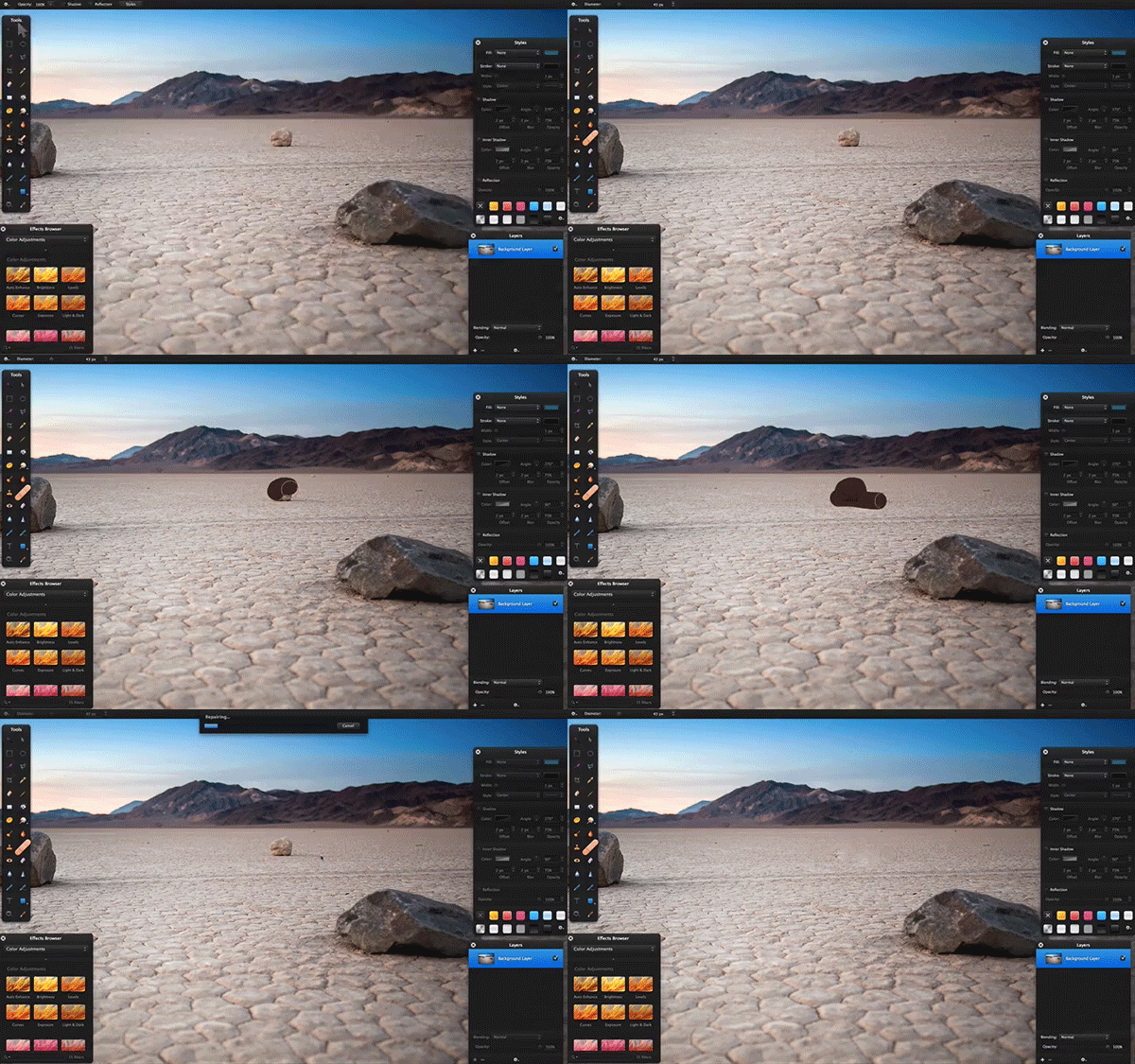
Along with that, you’ll find a much improved Repair tool in this update that is a much stronger rival to Photoshop’s Content Aware Fill. Select the Repair tool, draw over the objects you want to remove, and it’ll automagically try to replace them with the picture’s background. You can now change the size of the brush, along with its speed-vs-quality, and can get quite good results with it if you’re willing to tweak your brush and settings depending on the picture. I tried removing the parents in a screenshot of the picture used in Pixelmator’s Repair tool demo video to see if I could reproduce their results—removing the father was as simple as they showed, but removing the mother took about 4 tries before I got decent results. Either way, that’s still rather impressive.
In Photoshop, the thing I use Content Aware tools for most is for extending a pattern or section of a picture (for example, making a continuous rectangle pattern from a smaller square, or extending the sky upwards after expanding an image’s canvas). For that, I’ll select the area I want to add that pattern to, and delete it with Content Aware delete. 9 times out of 10, that works perfectly. In Pixelmator, you can use the Repair tool in much the same way, this time just drawing over the area you want to fill—but it won’t work if the area you’ve selected is transparent (the default if you’ve just extended your canvas). You’ll first need to fill that area with a color, and then select it with the Repair tool and let Pixelmator work its magic.
And then, there’s a final extra goodie: a Lock Layers option. This tiny little feature will make sure you don’t accidentally edit the layers that should already be finished, and is a handy tool that was again widely requested.
If you don’t already have a copy of Pixelmator, and aren’t already reliant on Photoshop, it’s the best $29.99 you could spend. It’s simply incredible how much of Photoshop’s functionality is packed into this tiny app these days.
Oh, and if you’re just getting started with Pixelmator, be sure to check out the new Tuts+ tutorials on Pixelmator. Pixelmator has enough of Photoshop’s features that you can follow many Photoshop tutorials in Pixelmator, but going through some Pixelmator-specific tutorials is a great way to get acquainted with its features.
Instagram got us all using filters on our photos, but its filters are often too heavy-handed, and if you just want to slightly tweak your color and brightness for a more natural photo, you’ll need to look elsewhere. The incredible VSCO Cam has been my photo editing app of choice for months now, with its vast range of filters and individual tweaks you can add to photos to make them far nicer than your original shots.
Then, the past couple of weeks, another app has stolen my heart: Litely. It’s filters are even more subtle, bringing out the original colors and details without making your photos look ‘shopped. They’re beautiful, and far lighter than Instagram’s filters—surprisingly enough, since it was made by the designer behind a number of Instagram’s original filters. Plus, Litely’s interface has a number of neat tweaks (pinch out over a photo to see the original compared to the new tweaked image, and move your phone around to see the rest of the image via parallax) that make it quicker and more fun to use than most other filter apps.
But filters alone aren’t enough. Dan Rubin just released a brilliant video on The Guardian that showcases a half-dozen apps—AntiCrop, TouchRetouch, Average Camera Pro, Cortex Camera, the aforementioned VSCO Cam, and the still-in-beta SKRWT—and shows how he uses them together to get beautiful shots in a number of scenarios. You can’t turn your iPhone into a dSLR, but put a few apps together like this and you can get quite a nice photography workflow to get the best photos possible from the camera you always have with you.
Check out the full video on The Guardian to see Dan Rubin puts these apps to use together to get surprisingly good photos from his iPhone, then go download some of the apps and try them out on your own. I’ve got my App Store wish list filled with them right now, and can’t wait to try out SKRWT.
There’s millions of beautiful photos and subtle textures out there, enough to keep your desktop wallpaper fresh for years to come. I’ve always been partial to fiftyfootshadows’ wallpapers, and that along with Simple Desktops’ pattern and color based wallpapers and Kuvva’s more artistic shots could keep me happy.
But then, the Metropolitan Museum of Art released several hundred thousand high-quality scans of the art in their collections, for free download. OS X used to ship with several art wallpapers, but nothing can compare to this library. There’s paintings, textiles, photographs, and more, all ready to download in high resolution—and perfect for desktop wallpapers.
They’re for academic purposes, first and foremost, so while Apple couldn’t bundle these images with OS X without licensing them, you’re perfectly free to download them to use as your desktop wallpaper or perhaps as a slideshow on your TV. You can even subscribe to an RSS feed of the art of the day, perhaps for creative inspiration or to get something new for your desktop. All you’ll have to do is download the images, and then perhaps crop them to your desktop aspect ratio so they’ll be centered and show the section of the art you want—and then be inspired by the works of the masters as you do your own creative work.
Google already has put together quite a collection of extremely high resolution scans of art and 3D walkthroughs of museums in their Cultural Institute, but you can merely browse those images online. The Met’s collection is great to browse online, but that one added bonus of downloadable images makes it especially nice.
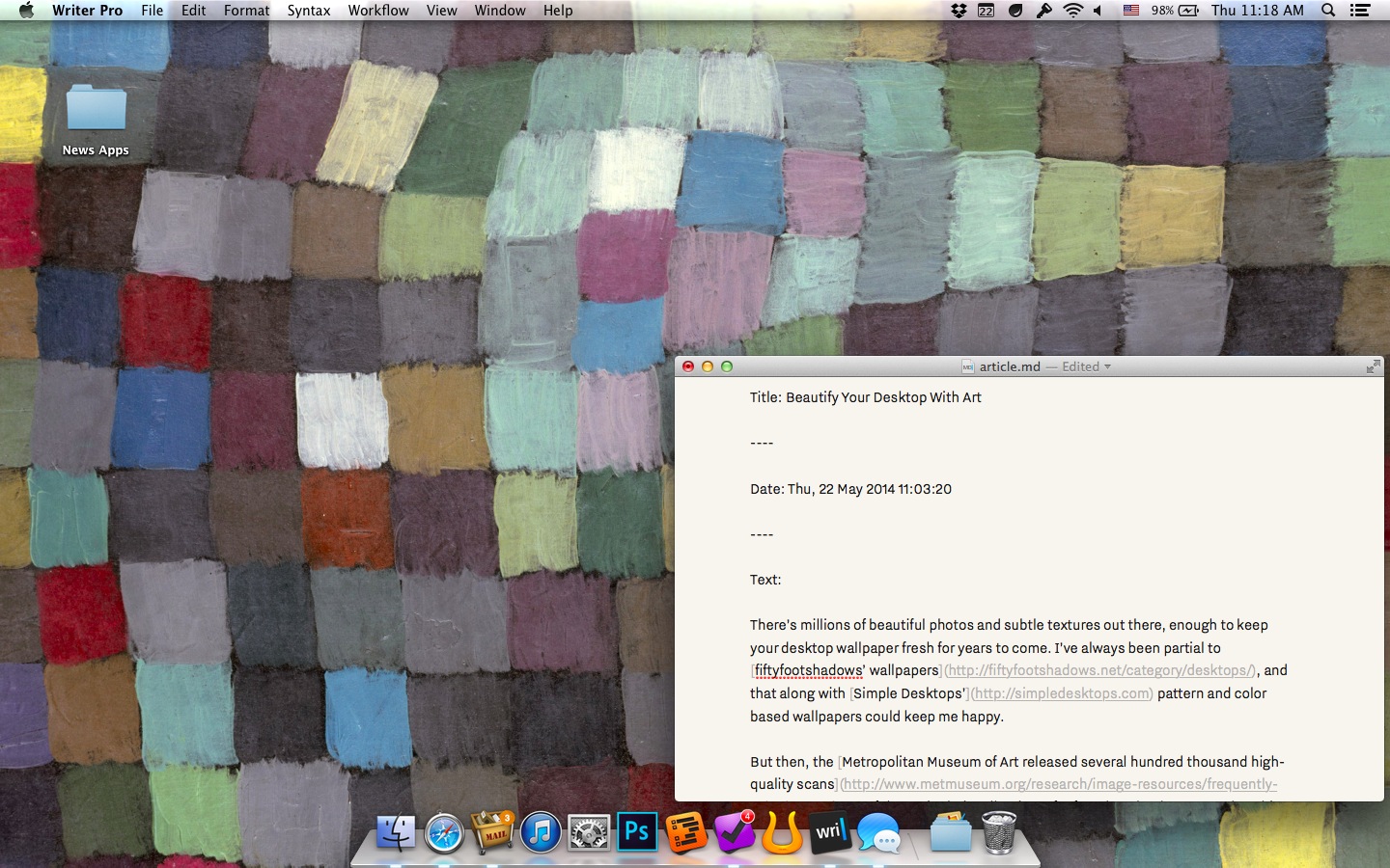
So go find some new-to-you artwork to spice up your desktop from the Metropolitan Museum’s collection, and enjoy. I’ve got a cropped version of Paul Klee’s May Picture as my wallpaper right now; it was rare (and low quality) enough online before now that Google Images can’t even locate it from a snippet of the picture, and now it’s gracing my Mac. Modern art suddenly makes perfect sense as desktop wallpaper.
There’s something nice about tools you own. Apps that you can keep using even if they were pulled from the internet, services you keep running on your own servers, tools in your garage. They’re yours, and they’re not going away.
Your copy of Pages will still work as long as your Mac works, even if Apple decides to quit making iWork. The bookmarks you’ve saved to Firefox years ago are still there, and would still be there forever even if Mozilla went out of business.
But if Google decided to shut down Google Docs, or if Delicious disappeared (as has nearly happened far too many times now), you’d suddenly have no app with your documents or bookmarks respectively. Unfortunately, the same would be true even for desktop software today if it’s subscription based, as the latest versions of Office and Photoshop are. If the companies behind them decide to shut them down, they’d be gone forever. That’s what was so angering about Google shutting down Google Reader; it took away the tool so many of us used to read the news. It was here today, and we’d nurtured our own reading lists for years, but then the next day it was gone.
You can carefully keep an old Nintendo 64 restored and running to keep playing your old games, but no amount of tender love and care can keep services and subscription apps running if the team behind them decides to pull the plug.
That’s why it’s so nice to own the tools you rely on. Post Google Reader’s demise, I switched to Fever, a self-hosted RSS reader app that runs on my own server and would continue to run even if it’s never developed further. It’s mine.
The other side to my news reading setup—a reading later app to save longform articles and pour over them at length later—however isn’t mine. For that, I use Instapaper, a service I love and am in the process of writing about right now. But even it was sold last year, despite having a profitable business model, and its main competitor Pocket has taken on venture funding without any apparent source of revenue since it’s 100% free. It seems ripe to join the ranks of web apps that get bought out and shut down, as sad as that would be. Instapaper has a far brighter future, it seems, but still: wouldn’t it be nice to have a reading service that’s 100% your own?
And then, think of bookmarking. Even if you’re using traditional bookmarks, and all your links are on your computer, how often do you try to visit a site only to find it’s no longer online? There’s the Wayback Machine, but even it’s not a guarantee you’ll bring back the content you’d wanted. If only you’d saved a copy of the site instead of just a link.
Perhaps that’s too long of an intro for an app review, but it’s those two use cases—self-hosted reading later and permanent bookmarking—that make Keep Everything such a neat app, one that feels a huge need but might not seem so exciting at first glance. I rarely review apps quickly after having them recommended to me—I haven’t even reviewed all the apps that I use in my daily workflow—but Keep Everything is an such an obvious solution in hindsight that I had to write about it.
Here’s how it works. You add a link to Keep Everything either by dragging-and-dropping a link from almost any other application (literally: click and hold on a link in Tweetbot, drag it over to the Keep Everything window, and then let go), or by pasting in a link you’ve copied elsewhere. On iOS, you can actually just copy a link inside any app, and by some magic I’ve never seen before on iOS, Keep Everything will grab said link in the background and add it to your archive.
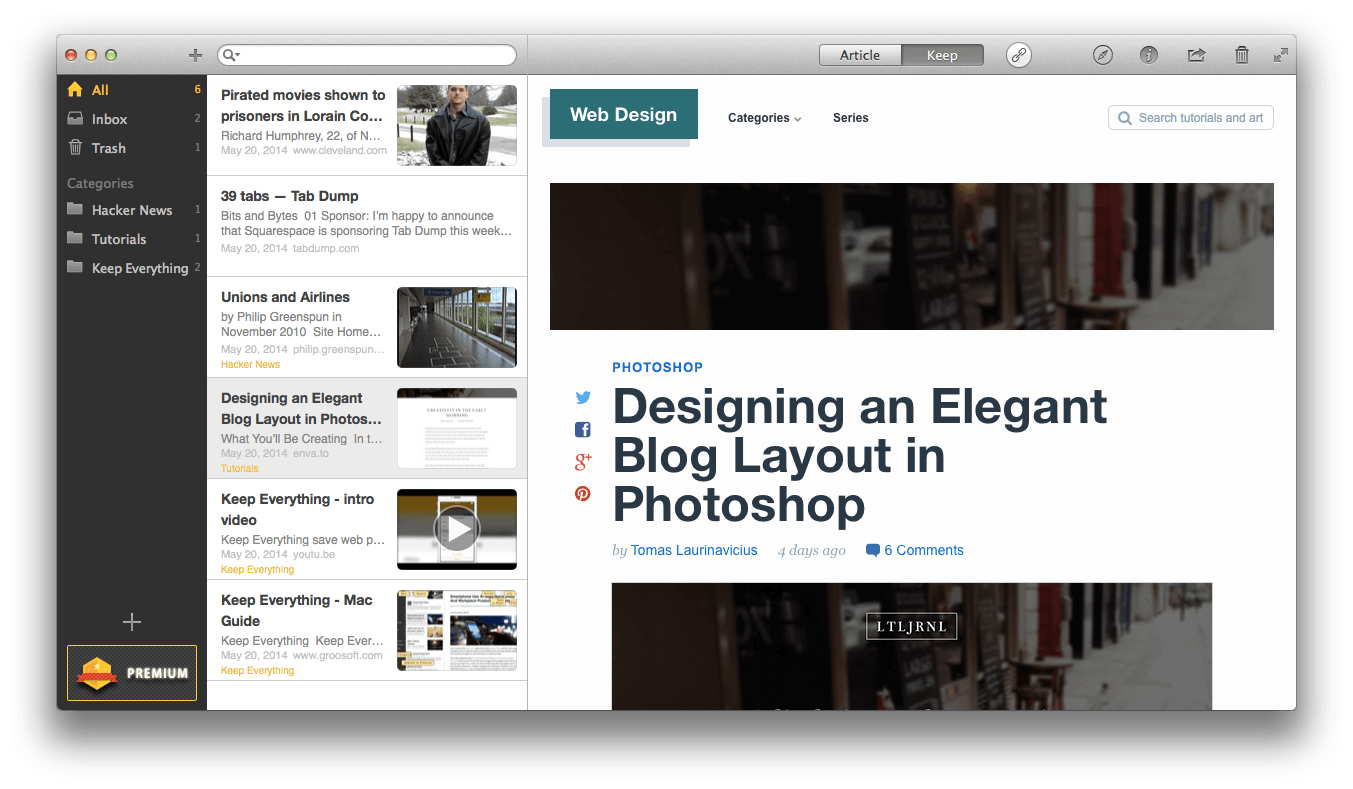
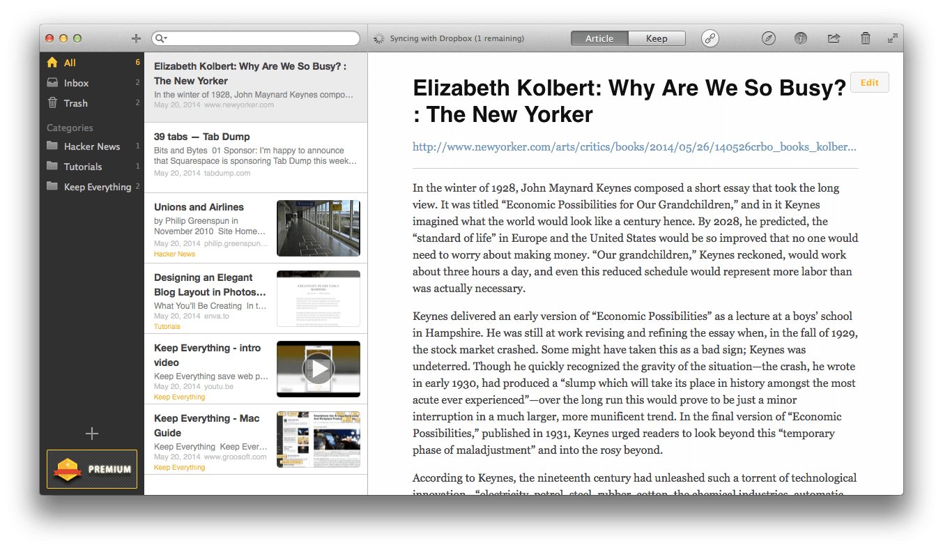
Once your link’s added, Keep Everything will download a copy of the page in question, storing it locally as a complete web archive and as a Markdown file. You can then read any site you’ve added in the article view (as in the image below), much like you’d read Instapaper or Pocket articles in apps like ReadKit. Or, you can click the Keep button and view a full original copy of the page just as it would have looked in your browser, even when you’re offline (as in the image above).
Internally, your sites are stored in a zip format with a .keep extension. Change that to .zip, and you can open the file archive and see its contents, which will include a Markdown text copy of the site, any include images along with a thumbnail, and a Safari-Compatible .webarchive file with the full code of the original page. Even if you no longer used the Keep Everything app in the future, you could still browse through the sites you’ve archived with the app.
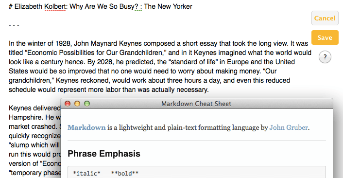
You’ll likely just want to keep using the app, though, since it makes it so easy to view your archived sites, in their entirety or in a simplified view on your Mac or iOS devices, with everything synced via Dropbox. You can organize sites into categories, search through the full text of all your sites, and can even view and edit the Markdown text view if you want to use the text of the site elsewhere or perhaps want to add your own notes. After all, a full site archive tool like this is an excellent tool for research, and if you’re using it for that, you’ll be glad to find that it includes complete metadata for sites, including the original URL and the date and time you archived it, necessary info for citations. You can also export sites in PDF, as well as in the aforementioned web archives, to share them with colleagues.
Keep Everything’s not perfect. Its UI has a number of small oddities, including inconsistent font sizes in its Add Link button and odd copywriting in a number of places, and both the icon and name are nothing to write home about. It also, like every other reading later app, supports saving sites with videos but doesn’t actually download those videos to your computer, making it more of a bookmark and less of an archive for those sites.
But nevermind. What it does right—saving full copies of your important websites in a way that makes them easy to find, read, copy, and share later—is good enough to overlook that. It even looks nice, and its iOS app is especially simple to use. And by being designed for dragging-and-dropping links (or just simply copying them on iOS), it’s immediately integrated with every app you already use.
If you’ve wanted an offline bookmarking tool that’d save your full sites, or a read later service that doesn’t rely on an online service, Keep Everything is the app for you. The Mac app will set you back $10, while its companion iOS app is half that price, but you can try both out for free (links: Mac, iOS) and store up to 100 sites to make sure it’s the app for you.
Have fun archiving original copies of the most important stuff you find online!
If there’s one reason I’m not as productive on an iPad as I am on the Mac, it’s keyboard shortcuts. I’m lost without keyboard shortcuts. If I’m launching or quitting an app, finding a specific file, editing text, entering passwords, emptying the trash, starting a new blog post, or almost anything else I do on the Mac, I’m using the keyboard, not my touchpad. iOS has the same great selection of Mac text editing shortcuts (which are awesome, and the lack of them on Windows makes me have an even harder time using a PC), but OS X and the extra tools like Alfred and native Mac apps like Ulysses’ tendency to have a ton of power-user keyboard shortcuts makes me so much more productive. And, the fact you can customize keyboard shortcuts make me feel even more lost on anyone else’s machine.
So there’s an ode to keyboard shortcuts. They’re awesome, and if you’re not a Mac keyboard shortcut power user yet, Matt Gemmell just put together the nicest guide to OS X keyboard shortcuts yet. It’s got tons of great keyboard shortcuts, including ones I’d never noticed before, all illustrated to make them easier to use. It even digs into great Alfred shortcuts to speed you up even more with it. Go check it out, and bookmark it, and watch your productivity soar.
Want the inside scoop on how we ran giveaways at AppStorm, and how I still run giveaways on Techinch.com? Here’s the secret: a spreadsheet and the =randbetween() function are all you need. Check my new Tuts+ tutorial for all the info you could need to run a full giveaway using social network entries and more, and then simply pick a random winner in a half-second.
No, the Omni Group hasn’t decided to go cross platform and release their apps for Android, but yes, there’s now a way to get your OmniFocus database on Android: Quantus Tasks. A brand new app that was originally named AndroidFocus that was quickly renamed to avoid confusion, Quantas Tasks lets you view all of your OmniFocus projects and tasks on your Android device, add new tasks, and more. It doesn’t support attachments or recurring tasks yet, but the developer’s promised to add that soon.
It’s not an official OmniFocus app, but works with OmniFocus for iOS and Mac since its file format is open. And that’s pretty neat.
I’m a Mac and iOS user, and will continue to be for the foreseeable future, and yet there’s something nice about having cross-platform alternatives to the apps I rely on. It makes it less likely my workflow would break down if I had to switch platforms for some reason, and that’s nice.
So, if you use OmniFocus on Mac or iOS, but use an Android phone, Quantus Tasks is the app for you. Enjoy!
Also, see Sven Flitcher's thoughts on it at SimplictyBliss.
We resign to not knowing how to change the oil in our car, replace a busted light switch, or develop that app idea into a real app. “You need to be an expert to do that”, we say. Thinking back to the times I’ve challenged mystery and learned to do something myself, I recall it giving me great satisfaction. And once demystified, those tasks that seemed impossible before now seem trivial.
Sometimes the best way to simplify tech—or anything, really—is just to take the time to learn how to do new stuff. Everything is possible, and you don’t need to be an expert—or you can learn to be one.
Learn something new. You’ll be glad you did, and the world will be a bit less mysterious.
You need a website for your business. There’s no question there. What’s tough to figure out is how you’ll create a website if you’re not already a web developer and have no experience coding. There’s pre-made themes and a number of services to build a site, but most still require CSS and HTML skills to make the site look exactly like you want—and they’re mostly centered around building a blog anyhow.
If all you want is to design a beautiful new site without having to touch code, Webydo is the app for you. It’s an online web design studio that lets you design a real site as easily as you could design a template graphic in Photoshop. In just a few minutes, you can have the site you’ve dreamed of, without needing to know anything about HTML or CSS.
Here’s how you can design your own site in Webydo in minutes.
Webydo’s online design studio lets you drag and drop the elements you want onto a grid, type in the content and add the media you want, and then turns that into a full-featured website ready to publish in a click. If you’re making your own site, you can tweak it until everything looks the way you’ve always imagined, and publish your site all from one place. If you’re a designer, you can use Webydo to build sites for your clients, then let them add their own content and handle the billing without messing up the design. Best of all, you can experiment with Webydo to your heart’s content for free, and only pay when you take your site live with a custom domain.
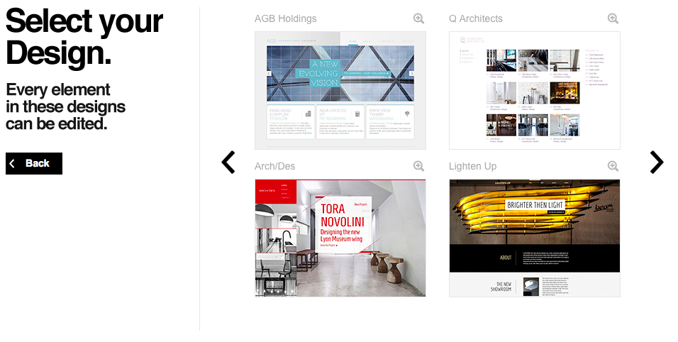
Here’s how it works. After signing up for a free Webydo account, you’ll be asked to pick if you want to make a new site from pre-made design, a layout that already has a standard structure for your site, or with a blank canvas where you can make anything you’ve imagined. The Design option is the best if you want to quickly make a beautiful site without having to do everything by hand. You can pick one of two dozen pre-made themes, then can tweak every part of the design once it’s open in Webydo. And if you happen to not like the design you selected, you can start over with a new site and pick another one of the designs.
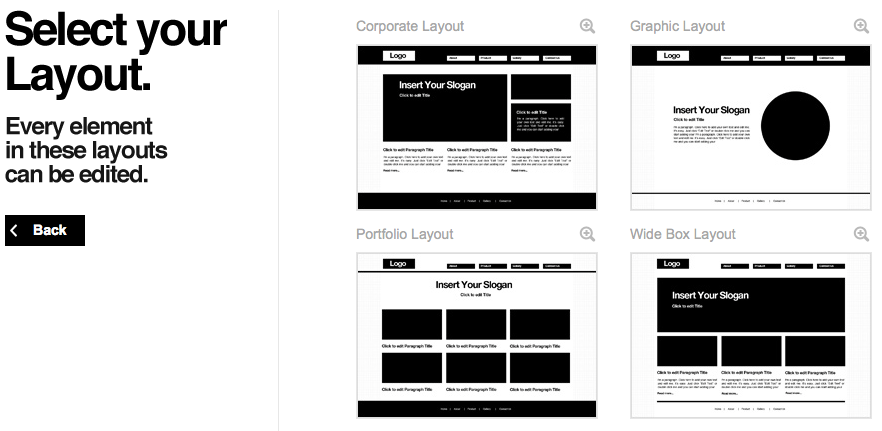
Otherwise, the next best option is to pick one of the pre-made Layouts. These will include a basic menu, image and text sections, headings and more that’ll help you start off your site quicker. You can then move around the sections and resize them you want, then quickly customize them to make the site you want. Or, if you’re really sure you want to design your own site from scratch, you can pick the Blank canvas option for a clean slate where you can add all of your site elements on your own.
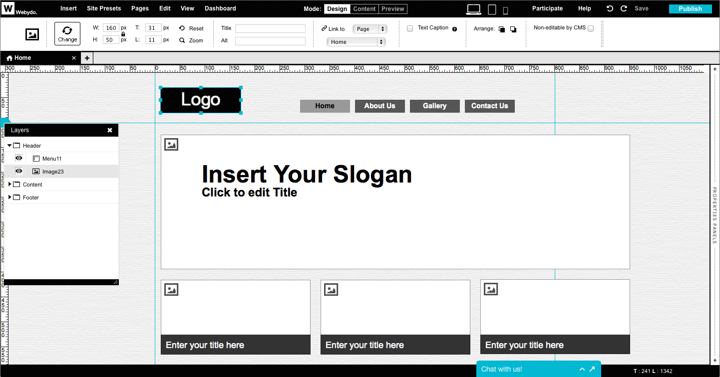
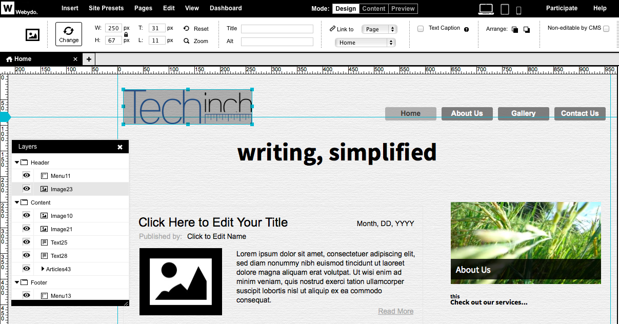
Now you’ve got a base to work with: either a theme to tweak, a framework to work around, or a clean slate ready for your ideas. Your site’s in the center of the screen, with layers and elements listed on the left and a Microsoft Office ribbon-like toolbar on the top. It’s time to get to work getting your site looking the way you want.
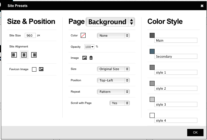
Before you jump in, the first place you should check is your basic site settings. Click the Site Presets link in the top menu, and then you can set your site width, the main theme colors you’ll use throughout your site, and pick a page background. For the background, you can easily upload a background pattern image, pick a color, tweak opacity and more. Then, with the colors, you can click each color to pick the color you want or enter its hex value. That’ll give you the base you need for a consistent design.
Now, it’s time to add the content you want and get it looking the way you want. You can select any element to replace it with the images and text you want, drag them around to the position you want, and resize them just like you would in Photoshop or any other graphics app. Move an element around, and you’ll see alignment guides appear to help you keep everything aligned along the grid for your site’s layout.
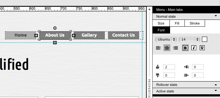
Then, it’s time to get everything looking just the way you imagined. You can select an element and tweak its font, color, alignment and more from the top menu. Or, depending on the type of element you’ve selected, you’ll see a properties panel on the right. You’ll be able to tweak the shape, color, and font in menu elements—set them once, and all menu elements will get the same design.
Or, you can drag in the gallery or blog sections instead of manually adding each element. Just like with the menu, you can tweak the design of one of the included elements once, and all of the other elements will gain the same design. Do note that everything in Webydo is based around pages, including the gallery and blog elements, so the elements in them will link to new pages with the content you’re sharing—unlike a traditional blog where blog posts are separate from your site pages.
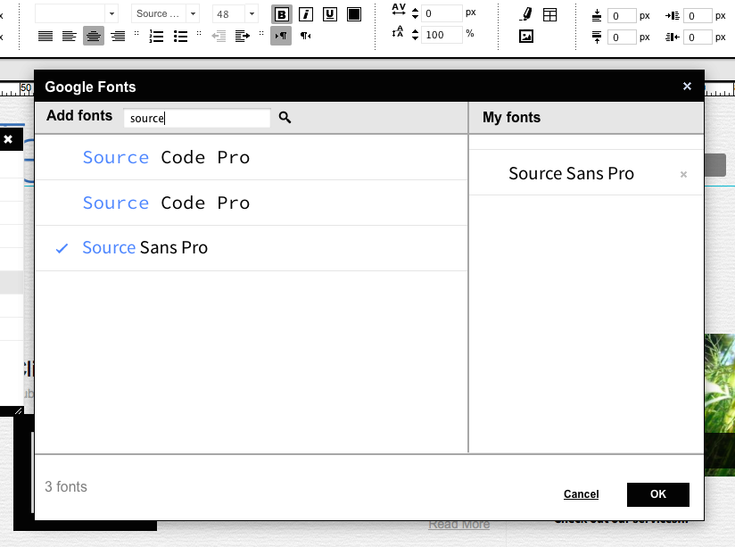
One of the nicest design elements is the built-in integration with Google Fonts. You can pick from hundreds of fonts by default, or you can search through the entire Google Font library, find the typefaces you like, and add them to your design. It’s simple, and makes it easy to get your site customized without any code.
It’ll take a bit to get your site looking just like you want, but within minutes you should start having the site you’ve always dreamed of just by dragging and dropping elements. If you really want to dig in deeper, or add more features from external services, you can use the code editor to add HTML, CSS, and more to your site, but there’s no reason to have to use code. That’s the idea behind Webydo: you can get a beautifully designed site without having to worry about code.
Doing More
There’s more than just pages, though. You can also add a store easily to your pages with ecwid, or bring along your videos and more. You can add a pre-made contact form so your site visitors can email you without leaving your site, or add a widget to embed another site or any HTML embed code from another app directly into your new site. Each of these elements can be resized and positioned as you’d like, and you’ll still find the same stroke and fill tools in Webydo to customize those elements as with everything else. And, coming soon, you’ll find even more features, including Parallax Scrolling, and you can suggest and vote for new features you’d like to see added.
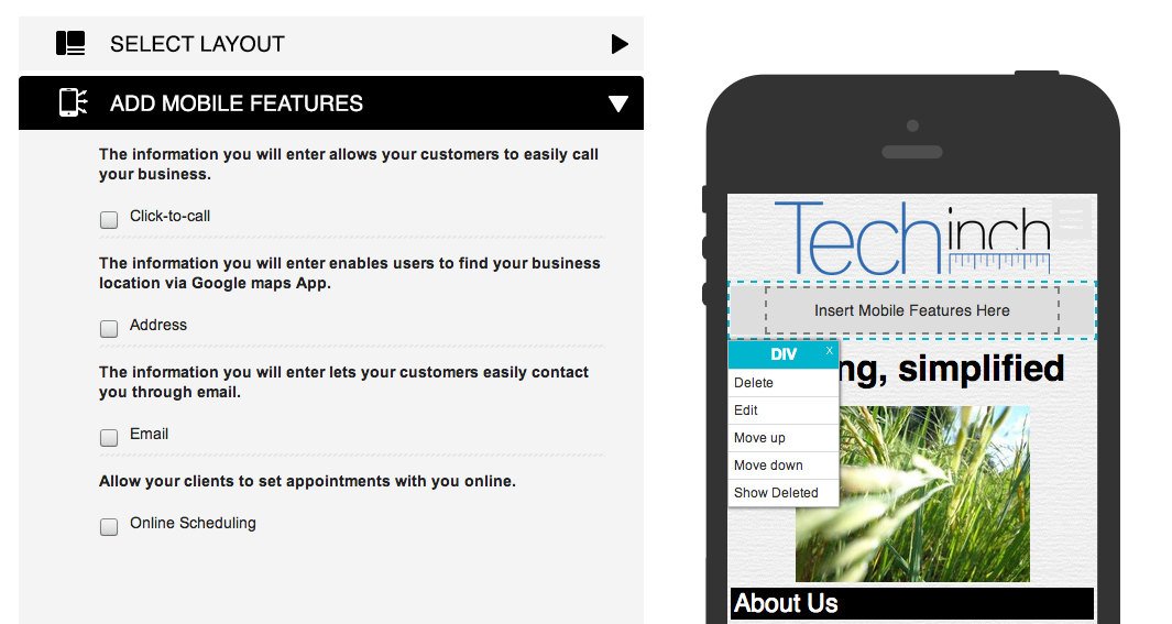
Once your site’s finished, there’s one more thing to focus on: your site’s mobile design. You can click the smartphone icon in the top right of the Webydo app, and then you’ll see your design shrunk down to a mobile size. You can then tweak the design to fit your style, with the most important elements at the top and extra touch-specific features to let your mobile visitors get the most from your site—from Google Maps integration to an option to tap-to-call your business directly.
And with that, your site’s finished. Tap the Publish button in the top right corner, and you’ll be ready to share your site with the world. You can then come back and update your site anytime, or if you want others to be able to help you edit your site, you can add them as a CMS user from your Webydo dashboard. That way, they’ll get a special login that lets them edit the text, images and more on the site, without being able to change the actual site layout and design. They’ll still be able to see the full layout in their browser as they’re editing the content, just as you do while tweaking the design.
Go Build Your Site!
With a bit of tweaking, you’ll have a beautiful new site online that looks just like you want in minutes without any coding. You can start with a nice theme, add your own stylistic touches and tweaks, and in no time you’ll have the site you want online.
This tutorial was sponsored by Webydo. If you’d like to feature your app on Techinch with a sponsored tutorial or weekly sponsorship, (book one today)[https://techinch.com/sponsor]!