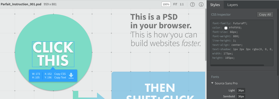
One of the many nice new features in Photoshop CC is a tool to copy text and layer styles as CSS, added in an attempt to keep web designers using Photoshop to design sites instead of Sketch and other newer tools. And now, with the new free beta Project Parfait from Adobe, you can get the same features in your browser with any PSD even from an older version of Photoshop.
Just upload your PSD, and you can select elements and then copy their CSS, text styles, colors, and more to use in your own designs. You can even view a list of the layer elements and toggle their visibility, download layers as web-optimized images, and measure the distance between elements precisely. You can’t actually edit the PSD, but you can very quickly extract the design as CSS to use in your web designs.
We might never see a full-featured Photoshop web app, but this is yet another neat, lightweight web design tool to add to Adobe’s growing arsenal of free and surprisingly nice web design tools. There’s the Adobe Edge tools, the open-source Brackets text/code editor, and of course Typekit and its new Typekit Practice site that’ll help you learn typography design for free.
The lumbering software giants Adobe and Microsoft are staying surprisingly interesting this year.
Presentations are too complicated. There’s hundreds of tools and options in PowerPoint and an entire industry of books and courses on using those tools, just to help you get a single sentence looking nice on a 100” screen.
And yet, presentations should be simple. Really simple. They’re just snippets of text and images, plus some formatting. That shouldn’t require a full-featured slide design app—one that actually makes it difficult to keep your presentation consistent.
With writing, we’ve solved the problem with Markdown. You can write in plain text in any app, from humble code editors to beautiful apps designed just for Markdown writing, using formatting that’s structured and translates equally well to the web or print. Then, with export tools like those built into Ulysses III or in stand-alone apps like Marked, you can turn your writing into beautiful print documents or HTML in a click. While writing in Markdown and using the tools that support it might take a bit to get used to, once you’ve switched you’ll never look at word processors the same.
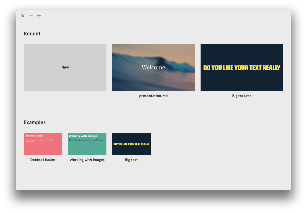
And now, with the brand new app Deckset, the Unsigned Integer team is disrupting presentations in the same way. Give it a Markdown document, and it’ll turn it into a beautiful, ready-to-show presentation in one click, the same way Marked turns your Markdown text into printable documents. It’s awesome.
Just write the text you want included in your presentation in Markdown, using headers, quotes, body text, and bullet points as you would otherwise. Separate each “slide” with three dashes on a new line, and add in images and video the same way you would in Markdown (e.g. . Now, open the file in Deckset, and you’ve got a presentation. It’s that simple.
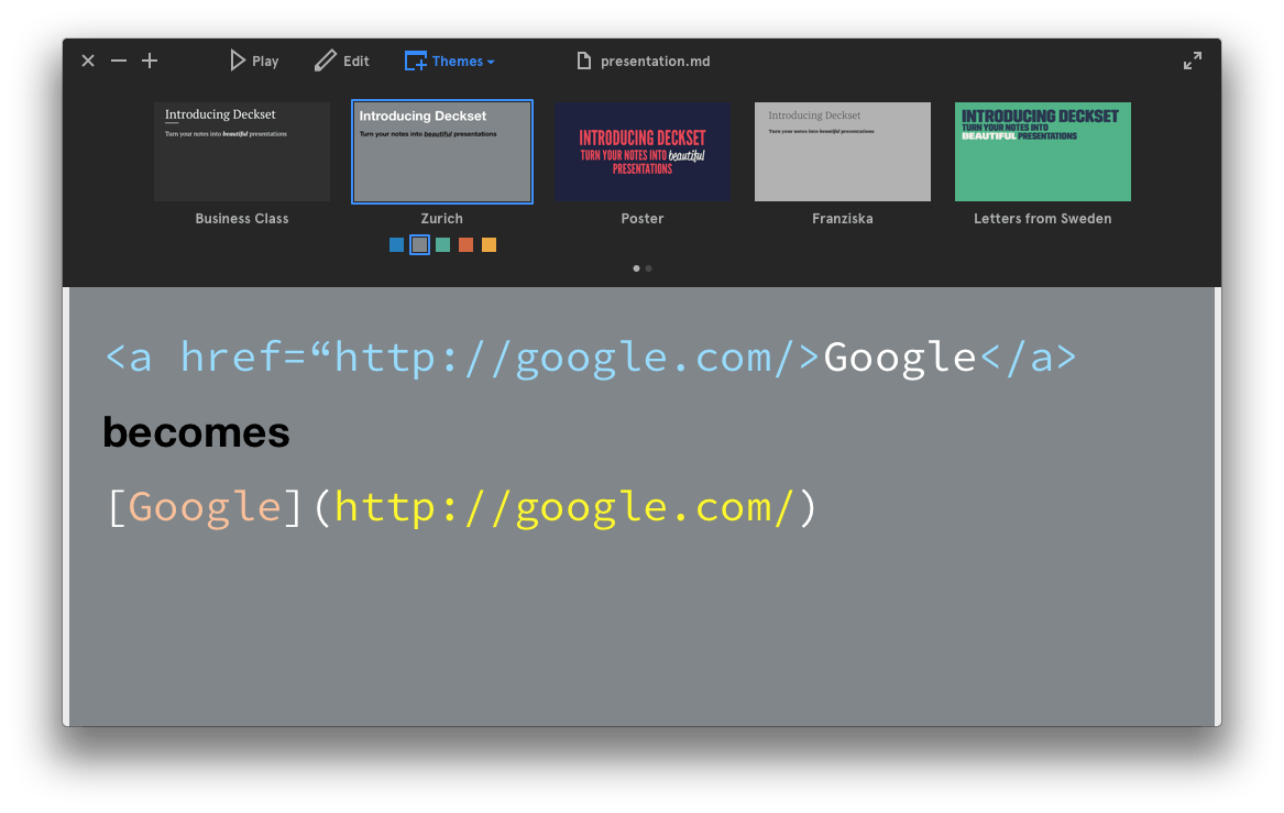
In iA Writer’s grand tradition of including no settings, Deckset is almost feature-free. You can pick from one of 7 built-in themes in 5 different colors (click the color square under the theme to select the one you want), each with their own professional typefaces that are bundled with the app, but for now, you can’t add your own templates (though the team has announced that feature may come in the future). The only setting you’ll find is one that lets you choose which text editor you want to use to edit your presentations, and an Aspect Ratio setting in the menubar. That’s it.
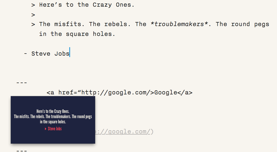
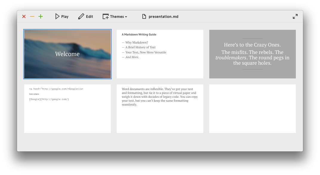
All you’re left to do is focus on the content in your presentation, and leave worrying about how the presentation looks to the app. You’ll get a preview of how each slide looks, then can click on each slide to see it fully in the window. If something looks wrong, or you just want to keep adding content to your presentation, click the Edit button to open the Markdown document with your presentation in your default text editor. You’ll get a tiny floating preview of your slides from Deckset as you write, and it’ll update with your changes live as you make them. It’s a handy little addition that should leave you confident in editing your text, and is a great way to try out the various styles you’ll get with quotes, code, and more content that Deckset’s themes will use for special slides.
Multimedia is the tricky part, though, and yet Deckset has it covered, too. There’s no graph support built-in, so you might need to reach for an app like the free OmniGraphSketcher (or even the iPad app Paper as Ben Thompson has used so nicely for charts and graphs at Stratechery) to create charts and graphs, and then add them as images to your slides. Then, adding images and video is as simple as adding them in Markdown (as such: ). Images will be shown full-screen by default, or as a background with a filter or blur with your text on top if in a slide that has text. Then, you can use simple text modifiers like [right] to align your images the way you want. Each theme will make images look slightly different, with various filters and such to look perfect with the theme, so you can experiment to see what looks best for your content.
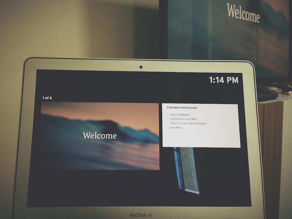
Then, when it’s time to show your presentation on the big screen, Deckset has a nice surprise for you: presenter mode. You’ll get a preview of your current slide and the next, along with the current time, while your presentation shows as normal in your projector or TV screen. You can even add presenter notes to your Markdown text, and they’ll display below your slide in the presenter view. It’s everything you could have wanted from a simple Markdown presentations app.
Now, as a Markdown-powered app, the only files you’ll have are your text file and any media you’ve included. Deckest will save your theme choice as metadata on your text file, so you should be able to send the file to someone else using Deckset without trouble, but to be safe you might want to tell them what theme to use as well. Otherwise, you can export as PDF, which would work even to present the presentation without Deckset if you preview the PDF full-screen since Deckset doesn’t use animations anyhow.
Conclusion
Text in Markdown formatting turned into a slide makes sense. It’s something the online writing app Draft added recently, and that Evernote (sans-Markdown) added to their Premium subscriptions, letting you turn your notes into a basic presentation. What’s difficult is making those presentations actually look better than a decently polished PowerPoint or Keynote presentation. And yet, Deckset’s themes and typography will be sure to make your presentations look nicer than they would with any default PowerPoint template, and with the advanced-yet-simple image options and the beautiful presenter mode, it’s got enough to not just to use as an occasional quick presentation tool but instead to actually replace PowerPoint for most presentation needs.
Deckset is priced the same as Keynote for Mac—$19.99—and is absolutely worth it if you use a presentations app at all. It’ll reduce the time you spend making your slides to nearly zero, while making you focus on the most important part of your presentation: your content.
*****
There’s nvAlt to replace OneNote, Ulysses and Writer Pro and Byword and Marked and dozens of other Markdown writing-centric apps to replace Word, Calca in some small ways to replace Excel, and now Deckset (along with Draft and a tiny handful of others) to replace PowerPoint. The Markdown-powered Office is all-but complete, and it’s great.
Take time to think more seriously about subscriptions than signup forms want you to.
Everything’s a subscription these days. You can get Photoshop and Lightroom, all of Microsoft’s Office apps, almost every song ever recorded, a library full of books, a vast catalogue of back TV shows and a handful of movies, a terabyte of online storage, unlimited backup, virtually unlimited website hosting, and so much more, all for the low price of $9.99 or less a month each. You can get a domain for that price per year, and a number of web apps like Evernote for half that price per month. You can support your favorite writers on the web or subscribe to magazines and newspapers for anything from a dollar to $20 a month.
They all sound cheap and harmless at first, but over time, they can add up just as badly as traditional boxed software and stacks of music CDs. Worse still, if you stopped subscribing to everything tomorrow, you’d have little-to-nothing to show for your investment. That’s perhaps not precisely bad, as you could say the same thing for your internet subscription or even the food you eat, but it does put subscriptions in a different light than buying a box set of your favorite artist’s music CDs. Worse still, if you buy a CD, you won’t automatically be charged for another CD next month, but subscriptions will keep charging you automatically even if you forget about them.
Subscriptions aren’t bad. If anything, they’re a natural extension of the internet. Information wants to be free, and having it behind an all-you-can-eat subscription paywall is the most obvious way to set media and apps “free.” You pay for an unlimited internet connection, and then pay for unlimited “libraries” of apps and content. That makes sense.
And yet, it can all get expensive. Add up a few site, app, and media service subscriptions, and you’ll be spending more than a premium cable bill each month—and more than your computer’s value each year. That’s fine if you want and use all of those services, but it’s far too easy to forget what all you’re paying for—which sometimes can be nothing, as I found when iTunes doesn’t automatically kill subscriptions even after a magazine app and its in-app purchases are pulled. A handful of services can go unnoticed on your bank statement for a few months, but they sure add up over time.
That’s why you need to do two things: only subscribe to the things you know you’re glad to spend that annual amount on, and remind yourself to reconsider each of your subscriptions every so often. The first should be obvious: subscriptions cost per month, so think of the cost over time instead of the cost today. Sure, it might just cost $9.99 this month, but it’ll actually cost nearly $120 this year. If it still sounds sensible to you, then go ahead and subscribe.
Then open your to-do app, and set a recurring reminder a few days before your subscription is due—a few days sooner than a year from the day you subscribed for annual subscriptions, or perhaps 3 months later for monthly subscriptions. Remind yourself to reconsider your subscription then, and forget about it. When that time rolls around, think through the first condition—am I getting my subscription’s value out of this?—and if you can still answer it affirmatively, then check it off and don’t worry about it again until the reminder comes back. This will give you a somewhat random list of your subscriptions in a way that’ll remind you to be smart about your subscriptions and give you a chance to reconsider them right before they’re due to charge you again.
~
I have quite a few subscriptions, some of which absolutely make sense. Netflix, for instance, makes sense whenever I’m watching a TV show series, as it’d cost far more to buy the series on iTunes when I’d never watch it again. Rdio mostly makes sense for me, but then, I like random radio which iTunes Radio does brilliantly for free, and I listen to the same albums enough times that buying them almost makes more sense. My reading material subscriptions (newspapers, magazines, and blogs) vary over time, so the reminders are the most helpful there. Office 365 makes sense for me right now, as I often write Office-centric tutorials, but it may or may not make sense next year, making it great to review then.
The first domain name I purchased felt like a huge decision since buying it was really committing to paying for it each year for the foreseeable future. Over time, in-app purchases and subscription upgrades get easier and easier to add on, since they just cost this much, and it’s easier to lose sight of the long-term picture.
You wouldn’t have bought a several thousand dollar Creative Suite box set without careful budgeting and consideration years ago. Don’t jump into subscriptions that are just as expensive over time with any less consideration.
One of the nicest Kindle features is that you can email your own eBooks and documents to a unique @kindle.com email address and they’ll automatically show up on your device. That same feature is what lets Instapaper and other services automatically send periodicals and books to your Kindle. It’s nice and simple.
There’s two major problems with it: one, it’s a pain to send a lot of documents to your Kindle wirelessly, and two, it’s very annoying to have a dozen old Instapaper archives in your Kindle Cloud account. For the former, it’s smarter to just connect it to your computer and copy the books over if you have a ton to move, but the only way to get around the latter problem is to delete each document individually from your Manage Your Kindle page.
Now there’s another option. Amazon has combined their Amazon Cloud Drive service with your Kindle Personal Documents, so you can see all the documents you or any 3rd party services have sent to your Kindle. Just login to Cloud Drive, open the My Send-to-Kindle Docs folder, and you can delete any files you want from there, and they’ll be deleted from your Kindle Cloud automatically. You’ll also notice now that you’ll have 10Gb of free storage space in Cloud Drive: 5Gb for free by default, and another 5Gb for your Personal Documents.
Unfortunately, you can’t add documents to your Kindle from Cloud Drive, at least not right now. You’ll instead still need to email documents and DRM-free books to your Kindle or use one of the Send to Kindle apps. The good thing is, those files are now much easier to manage in Cloud Drive, and they’re saved there in your original formats—no more having your documents converted to the kindle .az3 format by default.
Now, here’s to hoping that Amazon will eventually let you add documents to your Kindle just by saving them to that Cloud Drive folder. Until then, you can get something similar by getting IFTTT to email documents to your Kindle when you add them to a Dropbox folder.
Google Chrome started out as the most clutter-free browser. It was fast and had a clean interface, but it also lost most of the features and buttons that other browsers had. But that’s ok. It taught us to love the web on its own, and that the browser is best as a minimalistic chrome that’s there just to render websites and web apps.
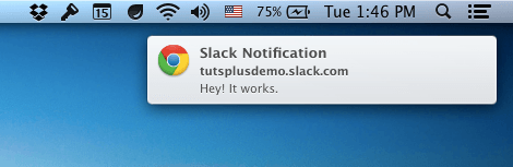
And then, out of nowhere, Google decided to add a menubar icon for notifications, without asking if we wanted it and with no obvious way to turn it off. If you like keeping your Mac menubar clean, as I do, that’s more than just annoying—it’s almost enough to make you not want to use Chrome at all.
The new notifications center is designed to show all the browser notifications you’ve missed, as well as Google Now notification cards that you’d otherwise get on your Android phone or in the Google app in iOS. That can be nice enough to want to keep enabled if you rely on Google Now, but I don’t use it anyhow. Thus, my annoyance with the new menubar icon.
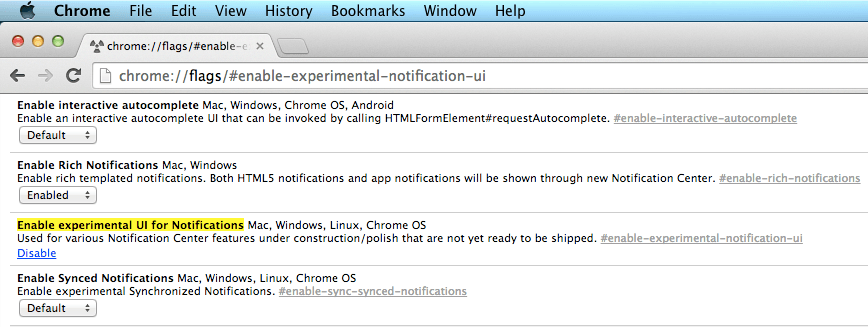
There is a way around it, though, thanks to the hidden preferences in Chrome’s chrome://flags page. Just open that page in Chrome and search in the page for “Notifications”, or click this link (chrome://flags/#enable-rich-notifications) inside Chrome to jump directly to the notifications settings section.
Here you’ll find two options: one to disable the "experimental UI for Notifications" (aka the new menubar bell icon) and another to disable “Rich Notifications” (aka Chrome’s flat-style notifications). Disable both of those, and you’ll lose the bell icon from your menubar and Chrome will start using standard OS X-style notifications for web app notifications, just like Safari. You’ll lose Google Now on your Mac, though, but at least your menubar won’t be cluttered with random stuff if you wouldn’t have used it anyhow.
Perhaps features randomly showing up and disappearing is just the price we pay for rapid development these days. It’s how web apps like Gmail work, and Google treats the Chrome browser the same way. It’s not all bad.
What is bad is the lack of choice when it comes to visual clutter. At least there’s an option—however hidden it may be—to take some of that clutter away.
The Office team's on a roll. After releasing the redesigned free Office.com web apps and finally shipping Office for iPad—as a much more full-featured suite than most of us would have expected—it looks like it's going to be a good year for the 2nd most important team in Redmond (presumably Windows is still considered more important for the company). And so, yesterday, the Office Team ran an IAmA Q&A session on Reddit yesterday as, perhaps, a bit of publicity for the new apps and a chance to answer a few questions from users.
There were a few interesting facts revealed by the Office for iPad team—which, incidentally, is the Office for Mac team as well. When asked why the apps shipped without print support, they said “Print is a high demand feature that we intend to introduce in due course,” and also indicated that since Office is a subscription service, they'll be shipping updates and new features far quicker than in the past. Promising, at least. Though, all features won't ever make their way over; macros, especially, aren't expected to be added to Office for iPad barring an App Store policy change.
Building Office for iPad was, as should be assumed, not something that just started recently. "The decision to ship Office for iPad was made before Satya became CEO. Steve Ballmer approved the plan to ship Office for iPad." It took such a long time because they wanted to get it right, delivering an Office experience that felt familiar to existing Office users but was also perfect on touch. “Since we were designing Office for iPad from a “blank slate” so to speak, we wanted to take the time to deliver the highest possible quality Office experience that is fully optimized for the iPad. A wise man once said, “Details matter, it’s worth waiting to get it right.” That rings true for how we thought about it” said Kaberi, Technical Product Manager of Office for iPad.
It's impossible to say if they could have shipped Office for iPad sooner—I'd like to think they absolutely could have if they'd wanted to—but what really matters is that it's here, it's polished, and is something plenty of people will want to use. They're so serious about getting it working good, they have an entirelab of iPads to test it in every possible scenario. It's even built using native Objective C code for its UI, with the core engine behind the apps being the same C++ core that powers ever edition of Office. It's the real deal.
The question still remains if enough people will want to pay for Office 365 to use it, but there seems to be enough who do to have Word and Excel rather high on the top grossing list of the App Store. There were plenty of people asking if the Office apps will be available for direct purchase without a subscription on the iPad, but that was never answered—presumably, of course, the only option Microsoft will ever offer is the subscription.
Then, there's the future. In addition to the promise of print support coming to Office for iPad, the team confirmed that “Yes, we are working on the next version of Office for the Mac.” They also said that the work on Office for iPad will help with shipping the next version of Office for Mac. “The code for Office for iPad and Office for Mac is shared, as the development platforms for both are very similar. :) The iPad work required us to create an all-new UI and to redesign the interface between UI and the internal logic. That work actually helps us with de-Carbonizing Office for the Mac, instead of delaying or hindering it. We're able to create new Cocoa UI on the Mac and tie it into the new logic interface now.” That work will now help with shipping the next Office for Mac, and the touch interface research will presumably help as they make Office for the Windows Store and even Android tablets, both of which were promised during the IAmA (though at the same time, the idea of Office for Linux was shot down).
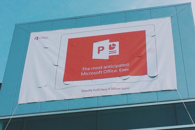
And yet, the most interesting part of the interview was the banner over Microsoft's Silicon Valley headquarters that the Office for iPad team shared (pictured above). "The most anticipated Office. Ever." That doesn't read like words from a team who begrudgingly released the minimum of Office compatibility for the iPad possible, just to keep competition at bay. It reads like a team that's truly proud of their work, of one who really does want the best of Office on the most popular platforms, whether or not they're Microsoft's.
“We want to bring great Office experience to our customers who want to be productive on their tablets," said Sangeeta Mudnal, Excel's Group Program Manager. That's the spirit needed if Microsoft wants to compete: making productivity tools we'll all want to use on any device. If they keep improving Office for iPad and adding more feature, there's a solid chance for that. There's still the fear that Microsoft will treat the iPad as a second-class citizen going forward, and give the best of Office to their own Windows 8.1 tablets—and yet, that banner above makes me think that's not what Microsoft's thinking.
They're proud to have Office on iPad. That's a very good thing.
eInk screens have intrigued me ever since the original Kindle was released. I’ve always loved reading, and switched to eBooks years back simply to save the shipping costs I’d otherwise incur reading English books in Thailand. And yet, that very same issue—cost—kept me from getting a Kindle. Kindles are cheap, but cheap is still relative seeing as a Kindle would only be for reading and only every other device I could buy would be multipurpose (and that pesky little shipping cost issue was still there—after all, Apple devices cost almost the same around the world, but a Kindle costs almost double as much when you throw in international shipping and customs).
I’ve referred to my iPod Touch, and later iPhone, as my “Kindle” since I’ve always used them so much for reading, everything from news and Instapaper articles to dozens of full-length books. An iPhone is small enough to comfortably hold for long stretches, and can hold an ok amount of text on one screen (especially compared to my laughably small HTC Excalibur’s screen that I read full books on years ago). And, most importantly, the iPhone’s always with you, so you’ve got a library of books in your pocket at all times. That, to me, was even nicer than the iPod’s old promise of a thousand songs in your pocket.
And yet, the iPhone’s screen’s small enough to make reading annoying. You sure don’t want to read books on your laptop after spending a day working on it (and yet, I have done so many times over), and the iPad gets heavy after a while (and still feels the same as reading on a laptop screen).
So, I bought a Kindle Paperwhite, a 2nd generation ad-free one from a local reseller that threw in a case and charger for less than it’d cost from Amazon with international shipping. Interestingly, it came with 4Gb of storage, so presumably came from Amazon Japan where it’s shipped with 4Gb by default. Not that it matters much when you’re reading books—you can have hundreds of books and gigs of storage to spare. It was cheaper than an iPad Mini, or even a Nexus 7, though of course there’s plenty of cheap cut-rate Android tablets even cheaper than a Kindle today. But that wasn’t the real consideration. The real reason I wanted a real Kindle was for reading on a screen that felt more like paper and less like a screen.
Reading
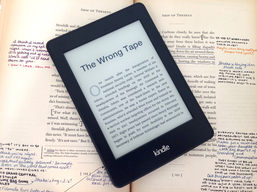
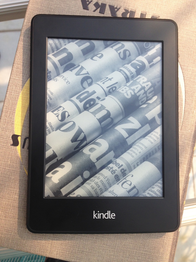
And oh. Wow. eInk really does feel like reading on paper. The screen itself looks almost like slightly yellowed paper without the backlight, but turn up the Paperwhite’s backlight a bit and it’s almost the same as bright white paper under a light. Turn it down to the next-to-lowest setting, and it’s dim enough to read comfortably in the dark. Take it outside, and it’s clear as non-glossy paper in the sunlight. It’s the only screen I’ve ever used that looks better in sunlight.
If you’ve ever used any Kindle app, or honestly read on any touchscreen device, you’ll know how to use a Kindle automatically. Once you’ve signed into your Amazon account, your book library will be ready for you. Tap a book once to download it, then tap any book in your downloaded library to read it. The Kindle store works great on the Kindle—almost too good, if anything, since you can buy a book in literally one tap, no login required (that can be turned off if you want). There’s the famous “experimental browser” that’s worse than you could imagine, but then, it’s nice to have in a pinch (and allows Instapaper some neat Kindle integrations—more on that later).
The screen almost even feels like wax paper to touch. It’s the slightest bit rough, just enough to remind you you’re not swiping on a pane of glass anymore. You swipe or tap anywhere on the right 2/3rds of the screen to go to the next page, and tap the left 1/3 or so of the screen to go back. That’s enough difference to keep you from accidentally going back, while still making it easy enough to turn pages while holding the Kindle in one hand. And unlike the iPad, the Kindle Paperwhite feels just fine to hold one-handed for long stretches of reading.
I’d worried before buying a Kindle that the screen refresh—where the entire screen goes black before showing your page text periodically—would be annoying. And for the first few minutes of using it, my worst fears seemed true as it hard refreshed with every page swipe. After a bit, though, it settled down to the normal hard-refresh of once ever 10 page turns or so; it’ll refresh more when there’s graphics on a page, but otherwise, it ends up being unnoticeable.
The Kindle is an iPod for books, of sorts: it’s really a single purpose device just for reading. That’s all that matters; you could go for a week reading a book and never have to think about the tech aspects of the device. You turn it on, read, turn it off, then come back and jump back into the book directly. There’s no notifications, no games and YouTube videos and social networks to distract you. There’s just your reading. You can even tap in the lower left corner of the reading view, in the most recent update, and turn off the page number, position, and time left indicators to leave you alone with your text (that said, each of those are nice to have just one touch away). There’s font options (the default honestly looks better with most books, and I hope Amazon adds more typefaces in the future, but it’s ok as-is), search, table of contents, and more in the header if you top the top of the screen, but otherwise, all that fades away and leaves just your book.
It’s a smart book, though: you can tap-and-hold on a word to define it, use Kindle’s X-ray feature to see how often that word shows up in the book, or check Wikipedia about the term (and the Kindle smartly chooses the best pick of the three depending on what you select). Drag your finger over text, and you can highlight it, add a note (and easily copy them to your computer if you want), or share it on social networks. Uncannily enough, the text selection on the Kindle works better than it does in iOS, perhaps a testament to the benefits of a single-purpose device. Your page location, bookmarks, and highlights sync automatically just as they would in the Kindle app, so you can pick up reading in one of the Kindle apps if you want.
But you’re not going to worry about all that. You’re just going to read, because the Kindle makes reading as nice as on a book. No distractions, just a full page of text and the tiniest bit of smarts to make it feel perfect together.
And More
Now, there’s the whole thing of getting your reading material on the Kindle, but that’s nearly as simple as you could hope. Your Kindle library is always just a tap away, so anything you’ve ever bought there is easy to add to your offline library. Then, any DRM-free eBooks you own can be simply added to the Kindle by emailing them to your @kindle.com email address, as long as they’re in a compatible format (and you can convert other eBooks via the Kindle Previewer app on your Mac or PC). Next time you grab your Kindle, they’ll be ready for you to read.
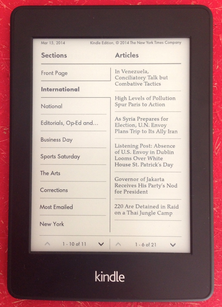
There’s also periodicals on the Kindle, with a wide selection of both newspapers and magazines available for subscription. I got a New York Times trial subscription, since it’s the main news source I read online anyhow and the Kindle subscription lets you get unlimited access to their website and new NYTimes Now iPhone app as well. Every day (oddly enough, early evening my time in Bangkok since I subscribed to the American version, but that works out for me since I like reading in the evening) a set of today’s full-length articles will automatically show up on my Kindle, organized into sections and easy to browse. You can’t share posts directly to your social networks, but then, it’s more like a “real” paper. And that’s perfect. You can browse through articles quickly in a list view, jump to the next article with a tap on the bottom from any article, and search through a full “issue” or keep one day’s issue saved if you want to keep it around (otherwise it’ll be replaced with tomorrow’s issue).
And then there’s Instapaper, the killer app for Kindle. I’ve used it for years to save articles to read later, but it turns out, it’s best use is to save them and then let it send them to the Kindle automatically. You’ll then have a curated “newspaper” that works just like the New York Times or any other Kindle periodical, only one that’s filled with the stuff you picked, or you can send one-off articles directly to the Kindle using another Instapaper bookmarklet. Your Instapaper articles on Kindle even integrate with the Kindle’s browser with links at the end of articles to let you archive, archive and like, or delete them from your queue. That’s the perfect amount of tech to mix into your reading later list, and since reading on the Kindle is so nice, you’ll for once want to finish out your reading queue.
There’s one annoyance I’d love to get rid of: the row of suggested books on the home screen, even on the ad-free model. You can get rid of it by switching your books to list view, but I happen to like the cover view, and just don’t want the suggested books there. Show that in the store, perhaps, but let me see more of my own books when I’m on the home screen.
Update: Thanks to @maique, I've discovered that you can turn off the suggested books on the home screen. It's just a bit hidden. To find the elusive setting, open Settings, select Device Options, then tap Personalize your Kindle, and finally slide off the Recommended Content button. Then return to your home screen, and bask in the presence of 6 of your most recent books and periodicals, with no recommended books in sight.
Other than that, I cannot think of one thing I’d change about the Kindle Paperwhite. It’s that nice.
If you love reading, you should get one already. It’s absolutely a nicer reading experience than you’ll ever get on another traditional tablet, cheap enough to justify just for reading, and simple enough that you won’t end up feeling the urge to upgrade it semiannually along with your smartphone. It’s just a smarter book, and that’s quite enough for quite some time to come.
There’s one tiny thing that’s always bugged me: not being able to install my own fonts in iOS. I wouldn’t want to change the main system fonts, but simply would like to bring, oh, Maven Pro or Courier Prime or Pitch to the iPad and use it as a writing font in text editors and word processors. The built in typefaces are great, far better than the terribly limited selection included on other mobile OSes, but there’s a world of beautiful typography that’s off limits to the iPad unless a developer adds them directly to that app.
Letting you install your own typefaces doesn’t seem like too crazy of a request; after all, if the iPad’s the computer of the future, the designers of the future will want to work with more than just Helvetica Neue and Zapfino. Plus, iOS doesn’t support every language out-of-the-box, and many languages only have one supported font in iOS, so for those languages installing extra fonts is actually even more important.
Several months ago, I discovered that you can install OS X dictionaries in iOS 7. That was pretty awesome to find, since I often consult a Thai-to-English dictionary and now that’s just a tap away from any word on my iPhone.
That discovery led me to find that you could also install your own fonts on iOS—though at the time it was required a rather convoluted process. Abelardo Gonzalez, the design of the OpenDyslexic typeface, first cued me in that you could do so, as him and others had pieced together how to get it to work thanks to iOS 7’s Configuration Profiles. Since then, support’s shown up in a number of places, and now it’s terribly easy to get your own fonts installed on your iPhone or iPad. Here’s the best ways:
AnyFont, a new $1.99 app from the App Store, makes it one-tap simple to install any font you want on your device. This is absolutely the easiest way.
If you’ve purchased a typeface from MyFonts, you can now install it on iOS directly from their site.
If you want to add extra languages to your iOS device, Keyman is a $2.99 app that already includes fonts for the most common languages that aren’t supported out-of-the-box in iOS and lets you install them in a tap, then use them in custom keyboards inside the app.
Now, all you’ll have to do is open an app that lets you choose your editing font (yup, Pages works fine) and select your newly installed font from the font list. It’ll work for normal editing, and even should print out perfectly in completed documents. And if you’ve installed a font that supports a non-supported language in iOS, you’ll suddenly be able to read text in that language in every app on your device.
iOS is slowly but surely growing into a full computing platform that’s increasingly close to letting you do anything you’d do on a Mac or PC. The past month has brought us both Microsoft Office and Adobe Lightroom for the iPad, filling out the ranks of professional apps that already were on the iPad, from Apple’s iWork and iLife apps to great productivity apps from Panic, the Omni Group, and so many more 3rd party developers. Throw in Mac-like features like being able to install your own dictionaries and fonts, and some hardware like an external keyboard and wireless printer, and there’s little that the iPad can’t do these days.
It’s indisputable today that the iPad’s as much a work device as anything. It’s a real computer—one that even lets you bring along your own typefaces. Now, if we just had Xcode for iPad and could code iPad apps on the iPad, it’d be a 100% complete standalone computing platform.
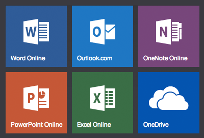
Microsoft Office's branding today is more centered on colors and typography than the icons themselves. If you find yourself wanting to use their icons in your own work, say perhaps in a preview image when writing about them (the reason I needed them), it's easiest to have a palette of the colors used for Office's branding. And thanks to the CSS on Office.com, here's the official colors for each of the major Office apps:
Word: #2b579a
Excel: #217346
PowerPoint: #d24726
OneNote: #80397b
Outlook: #0072c6
OneDrive: #094ab2
And, of course, each of the app names are set in Microsoft's Segoe UI Light typeface.
PDFs can be rather annoying to edit if you want to more than mockup and move pages around (something you can do rather easily in OS X' Preview app and a number of alternate PDF readers). If you have a copy of Adobe Acrobat, it's easy enough to edit them, but that requires Creative Cloud ($50/month) or a $400 investment.
So here, in my latest Tuts+ tutorial, is how to use Word 2013 to edit PDFs—and how to use Nitro Cloud to get PDFs ready for editing in any other version of Word. It's not something you'll need to use every day—if you do, just get a copy of Acrobat already—but might be a nice tip to bookmark for the times you do need to edit a PDF.