You need a website for your business. There’s no question there. What’s tough to figure out is how you’ll create a website if you’re not already a web developer and have no experience coding. There’s pre-made themes and a number of services to build a site, but most still require CSS and HTML skills to make the site look exactly like you want—and they’re mostly centered around building a blog anyhow.
If all you want is to design a beautiful new site without having to touch code, Webydo is the app for you. It’s an online web design studio that lets you design a real site as easily as you could design a template graphic in Photoshop. In just a few minutes, you can have the site you’ve dreamed of, without needing to know anything about HTML or CSS.
Here’s how you can design your own site in Webydo in minutes.
Webydo’s online design studio lets you drag and drop the elements you want onto a grid, type in the content and add the media you want, and then turns that into a full-featured website ready to publish in a click. If you’re making your own site, you can tweak it until everything looks the way you’ve always imagined, and publish your site all from one place. If you’re a designer, you can use Webydo to build sites for your clients, then let them add their own content and handle the billing without messing up the design. Best of all, you can experiment with Webydo to your heart’s content for free, and only pay when you take your site live with a custom domain.
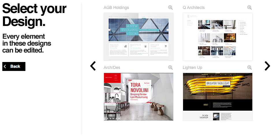
Here’s how it works. After signing up for a free Webydo account, you’ll be asked to pick if you want to make a new site from pre-made design, a layout that already has a standard structure for your site, or with a blank canvas where you can make anything you’ve imagined. The Design option is the best if you want to quickly make a beautiful site without having to do everything by hand. You can pick one of two dozen pre-made themes, then can tweak every part of the design once it’s open in Webydo. And if you happen to not like the design you selected, you can start over with a new site and pick another one of the designs.
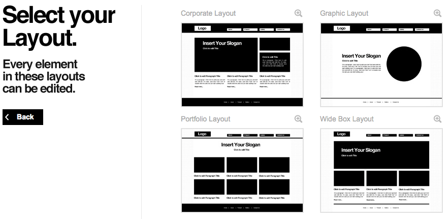
Otherwise, the next best option is to pick one of the pre-made Layouts. These will include a basic menu, image and text sections, headings and more that’ll help you start off your site quicker. You can then move around the sections and resize them you want, then quickly customize them to make the site you want. Or, if you’re really sure you want to design your own site from scratch, you can pick the Blank canvas option for a clean slate where you can add all of your site elements on your own.
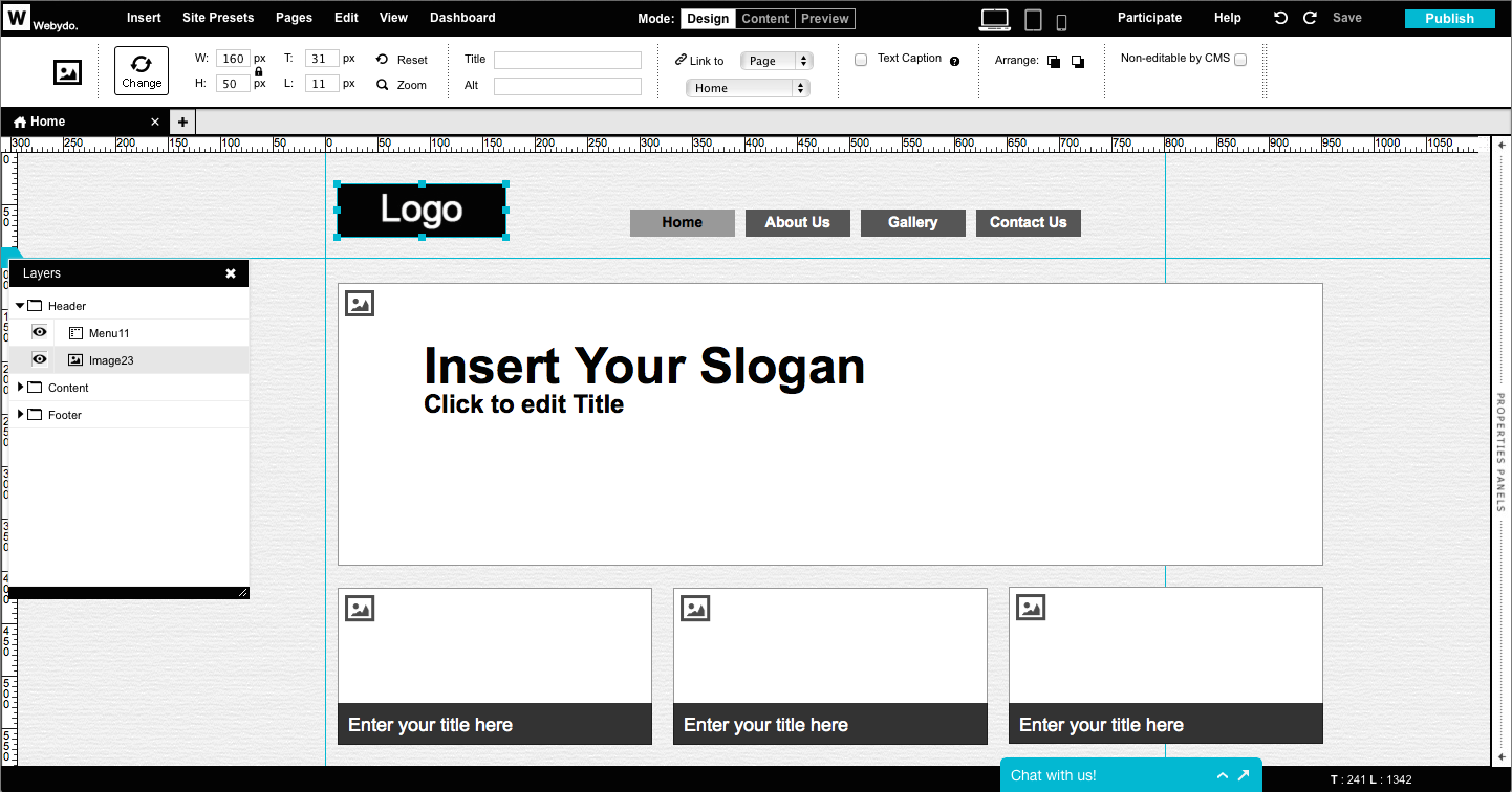
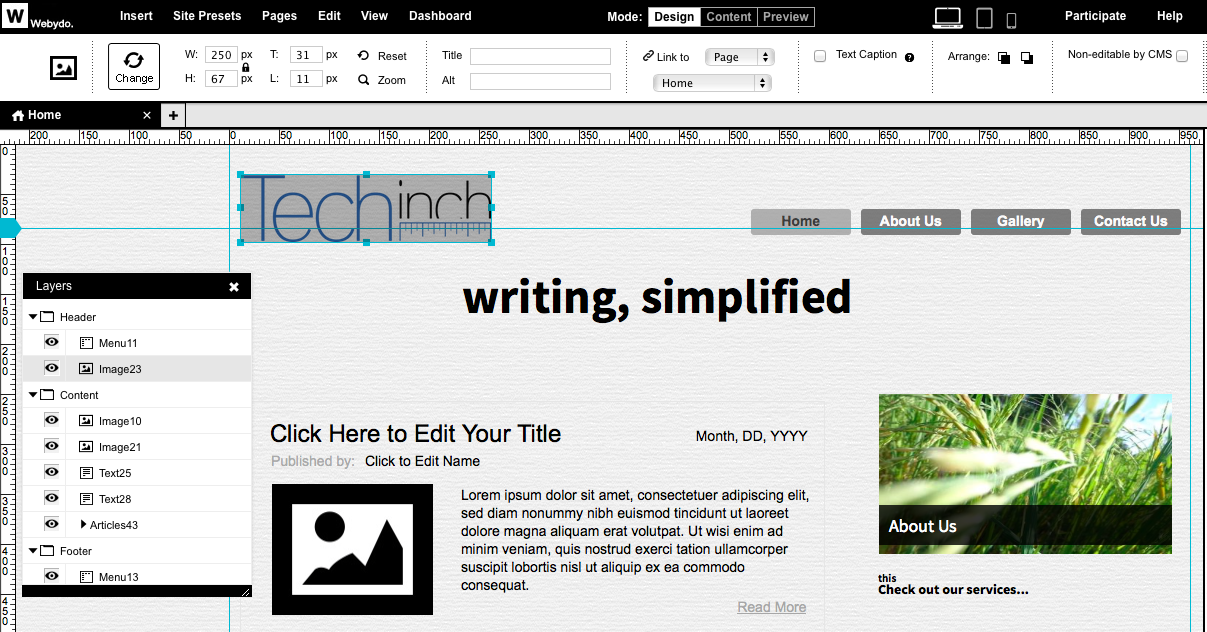
Now you’ve got a base to work with: either a theme to tweak, a framework to work around, or a clean slate ready for your ideas. Your site’s in the center of the screen, with layers and elements listed on the left and a Microsoft Office ribbon-like toolbar on the top. It’s time to get to work getting your site looking the way you want.
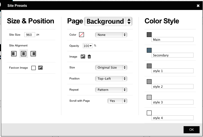
Before you jump in, the first place you should check is your basic site settings. Click the Site Presets link in the top menu, and then you can set your site width, the main theme colors you’ll use throughout your site, and pick a page background. For the background, you can easily upload a background pattern image, pick a color, tweak opacity and more. Then, with the colors, you can click each color to pick the color you want or enter its hex value. That’ll give you the base you need for a consistent design.
Now, it’s time to add the content you want and get it looking the way you want. You can select any element to replace it with the images and text you want, drag them around to the position you want, and resize them just like you would in Photoshop or any other graphics app. Move an element around, and you’ll see alignment guides appear to help you keep everything aligned along the grid for your site’s layout.
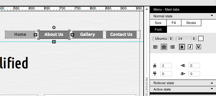
Then, it’s time to get everything looking just the way you imagined. You can select an element and tweak its font, color, alignment and more from the top menu. Or, depending on the type of element you’ve selected, you’ll see a properties panel on the right. You’ll be able to tweak the shape, color, and font in menu elements—set them once, and all menu elements will get the same design.
Or, you can drag in the gallery or blog sections instead of manually adding each element. Just like with the menu, you can tweak the design of one of the included elements once, and all of the other elements will gain the same design. Do note that everything in Webydo is based around pages, including the gallery and blog elements, so the elements in them will link to new pages with the content you’re sharing—unlike a traditional blog where blog posts are separate from your site pages.
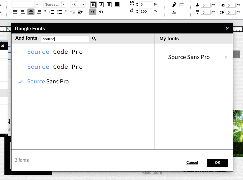
One of the nicest design elements is the built-in integration with Google Fonts. You can pick from hundreds of fonts by default, or you can search through the entire Google Font library, find the typefaces you like, and add them to your design. It’s simple, and makes it easy to get your site customized without any code.
It’ll take a bit to get your site looking just like you want, but within minutes you should start having the site you’ve always dreamed of just by dragging and dropping elements. If you really want to dig in deeper, or add more features from external services, you can use the code editor to add HTML, CSS, and more to your site, but there’s no reason to have to use code. That’s the idea behind Webydo: you can get a beautifully designed site without having to worry about code.
Doing More
There’s more than just pages, though. You can also add a store easily to your pages with ecwid, or bring along your videos and more. You can add a pre-made contact form so your site visitors can email you without leaving your site, or add a widget to embed another site or any HTML embed code from another app directly into your new site. Each of these elements can be resized and positioned as you’d like, and you’ll still find the same stroke and fill tools in Webydo to customize those elements as with everything else. And, coming soon, you’ll find even more features, including Parallax Scrolling, and you can suggest and vote for new features you’d like to see added.
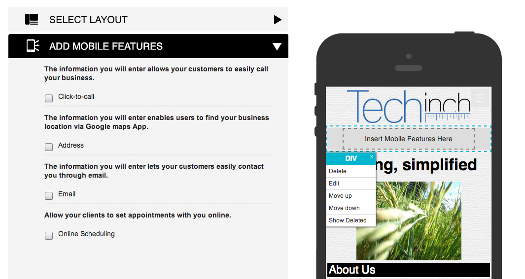
Once your site’s finished, there’s one more thing to focus on: your site’s mobile design. You can click the smartphone icon in the top right of the Webydo app, and then you’ll see your design shrunk down to a mobile size. You can then tweak the design to fit your style, with the most important elements at the top and extra touch-specific features to let your mobile visitors get the most from your site—from Google Maps integration to an option to tap-to-call your business directly.
And with that, your site’s finished. Tap the Publish button in the top right corner, and you’ll be ready to share your site with the world. You can then come back and update your site anytime, or if you want others to be able to help you edit your site, you can add them as a CMS user from your Webydo dashboard. That way, they’ll get a special login that lets them edit the text, images and more on the site, without being able to change the actual site layout and design. They’ll still be able to see the full layout in their browser as they’re editing the content, just as you do while tweaking the design.
Go Build Your Site!
With a bit of tweaking, you’ll have a beautiful new site online that looks just like you want in minutes without any coding. You can start with a nice theme, add your own stylistic touches and tweaks, and in no time you’ll have the site you want online.
This tutorial was sponsored by Webydo. If you’d like to feature your app on Techinch with a sponsored tutorial or weekly sponsorship, (book one today)[https://techinch.com/sponsor]!
When you first learned how to read, your mom or teacher likely had you hold your finger under each line as you were reading. It helped you focus on the word and sentence you were currently reading, without being distracted by all the other letters on the page. But then, as reading went digital, you can’t realistically keep a finger under your text when you’re reading on your Mac (and even on a tablet or smartphone, you’ll end up tapping something you didn’t mean to if your finger actually rests on the glass—and you’ll go insane holding your finger in the air forever).
Writing app developers solved this several years ago with single-sentence focus mode. Apps like iA Writer (now Writer Pro) and Byword let you focus on just one sentence in its focus mode, fading the other sentences to a lighter color and leaving only the sentence you’re currently writing in the full dark font. Ulysses III added an option to highlight the current line to help you focus. But when reading, in a dedicated reading app or your browser, the only way to keep your focus on the line you’re reading is by dragging your curser under the text, or obsessively selecting text while you’re reading (something I’m apt to do).
Overlays!, a new Mac app from Albelardo Gonzalez—the developer who made the OpenDyslexic typeface to help those Dyslexia have an easier time reading—is an app to solve the focus problem in any Mac app. It gives you a floating see-through bar that’s tied to your mouse cursor to highlight or hold under any text on your Mac. You can pick the color, size, and level of transparency, and turn it on or off from your menubar.
And then, whenever you’ve got any text you need to focus on, you can just turn on Overlays! and get a little bar that’ll help you keep your reading position. It’s the digital equilivent of the old finger-under-text trick, and it works great.
If you’re always randomly selecting text while you’re reading online, or worse are always losing your place and getting distracted, Overlays! is a little app that just might simplify on-screen reading for you. Plus, it’ll help support the development of the OpenDyslexic typeface, which is a nice little extra.
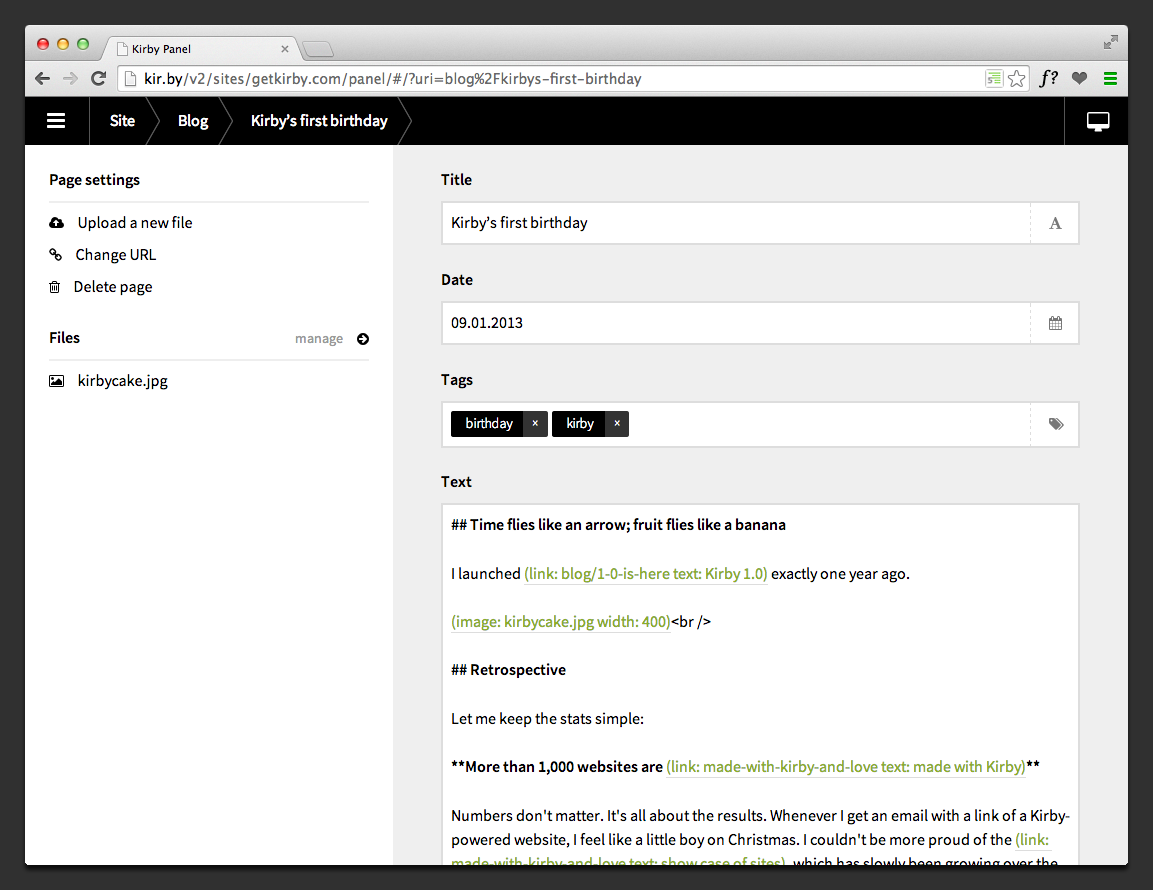
For fans of the Kirby CMS, the flat-file Markdown-powered CMS that I love and that’s powered Techinch.com for the past two years, there’s something exciting and new to play with: a beta of Kirby 2. It’s got a beautifully light new Panel, a nice new default theme, and tons of new core features including multi-language support, easier core access, and more.
You won’t want to switch your blog to it just yet, but it’s nice enough that you’ll want want to go play with it—and if your blog’s still on WordPress, it’s the perfect time to start plotting your escape to Kirby.
You've read Edward Tufte's books on visualizing data, seen the popularity of infographics and the horrors of misleading charts, and followed along as Nate Silver turned political predictions on its head with data at The New York Times and then spun his work out into its own news project, FiveThirtyEight. Big data's the name of the game for IT, but it's equally the future of journalism as every possible thing in the world is quantified and tabulated. There's stories in numbers.
Finding those stories, and effectively telling them, is the challenge of the day, and O'Reilly's new Data Journalism Handbook follows in Tufte's steps by telling you how, in today's world, to let raw data tell a story—and shows the best examples of organizations that have put data journalism to work. It's a great read for anyone in journalism, and since it's free online, it's a no-brainer read.
Here's your chance to inspire yourself to make better stories from the numbers that are all around us today.
There’s nothing like history to make the present clear. It’s true with governments and wars and religions (want to understand Ukraine or the Middle East? History is your friend, far more than the news of last week) and it’s true of everything else, including companies.
Most of us know Apple’s storied legacy, folklore, and everything about Steve Jobs from the way his dad focusing on how the back of a cabinet or a fence looked to his personal dietary choices. Google might not be the focus of as many books, but there’s still a pop-culture awareness of their culture and history, and Steven Levy’s “In the Plex” brings as much insider info to Google as most could hope to know about 1 Infinite Loop. But when it comes to Apple’s most direct competitor, Samsung, they’re little more than a name. We know of Samsung, but we know precious little about Samsung. Even if you’ve read everything there is to read about Samsung, you’ll know about their reboot when their chairman burned all their electronics and decided to make better devices, but that’s about it.
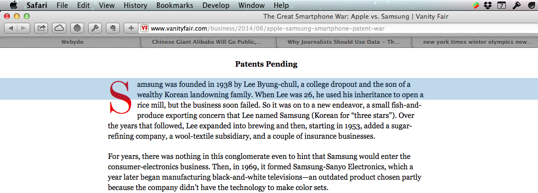
That’s where Kurt Eichenwald’s “The Great Smartphone War” piece for Vanity Fair comes in. It takes apart the Apple and Samsung litigation, looks at Samsung’s history of patent violations (in hardware, not just user interfaces and software) and lawsuit settlements, and how they use them to take over markets. If you want to make more sense of the smartphone/tech world of today, it’s a must-read.
Got a great app or service you know Techinch readers would love? Then here's the cheapest way to promote your app: sponsoring Techinch for $50/week.
Starting next week, Techinch.com will have a sponsorship post each week, featuring an app or service that'd be something I'd recommend otherwise. They'll include a couple paragraphs about the app and an image or video. And they're just $50/week, far cheaper than most online sponsorships. If you'd like to promote your app, head over to https://techinch.com/sponsor and book one of the open weeks today or get in touch for more info.
For everyone that reads and subscribes to Techinch, I'll do my very best to make sure the sponsorships are relevant enough that hopefully you'll actually find them interesting. If not, do let me know as well.
Now, back to our regularly scheduled programming...
Looking for new chat app for your team? There's a ton of great options, from the brilliant new Slack to the incredibly popular HipChat and everything in between. I've worked with the Zapier team this month to put together an in-depth comparison of the best team chat apps for their blog, along with tips on getting the most out of your chat app.
It's got everything you need to find the perfect chat app for your team, one that'll fit your budget and have the features you need, so be sure to check it out!
Just under 13 months ago, I tapped Purchase on an app in the Mac App Store that changed the way I write: Ulysses III. Then a brand-new reworking of a writing app with a decade’s legacy, Ulysses III was at once the 3rd version of the closest competitor to Scrivener, and a new writing app unlike anything seen before. It had the writing simplicity of iA Writer or Byword combined with in-line formatting and text info panes and more that’d remind you more of a traditional word processor, combined with file management that could rival a notes app like Evernote and exporting tools that’d rival Marked. It was feature packed, but then hid everything away to let you focus on your text.
Ulysses III was everything a web or print writer needed in one Markdown-powered app. You could write, easily keep up with all of your texts, and export in any format, all in one app. It's a one-stop-shop for all your writing needs, and a beautiful one at that.
That perhaps doesn’t sound so revolutionary, but it was enough to win me over. I love trying out new writing apps, wanted to switch to the Mac just so I could get Notational Velocity and WriteRoom years ago, and then bought iA Writer for Mac the second it was available. Its beautiful simplicity still makes it my favorite plain text editor. I’d tried the original Ulysses, as well as Scrivener, both of which offered to make managing documents and writing and publishing easier, and yet I only found they complicated my work. Most Markdown writing apps let you export as basic HTML, which is plenty for a web writer, and then there’s Marked for any other export needs you may have. I’d left Word—the original all-in-one writing app—behind in lieu of lighter apps and Markdown, and I didn’t see a need to go back.
But with Ulysses III, putting everything together clicked for me, enough that I switched to it as my main writing app. Here’s what made it so great, and what’s extra nice about it with the just-released v1.2 update:
Simple & Beautiful Markdown Writing
At its core, Ulysses is still a plain-text writing app, just one that happens to include a lot more features than most. You’ve got the plain text writing simplicity you’d expect, with extras. There’s Markdown formatting added as you write, with standard keyboard shortcuts to make it easy to write in Markdown even if you’re not used to it. Links, images, and footnotes get an extra popover to make it easy to add them to your text without cluttering everything, and pressing and holding CMD+V will let you paste rich text or code. It makes Markdown look so nice, it’s the writing app that'd make anyone want to start using Markdown.
Rather than just showing one blank document when you open the app, as the average text editor does, Ulysses shows everything you’ve written on individual sheets. You can select multiple sheets and “glue” them together to keep them as a set (perhaps to keep your table of contents and chapters stuck together while still individual), merge sheets, or now in the latest update split sheets at your current curser position. Scroll to the end of a document, and keep scrolling to open the next sheet automatically. It’s a simple way to jot down separate notes, flesh them out, and pull them together into a cohesive work.
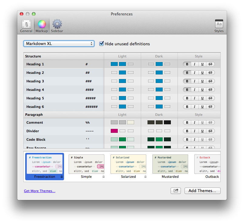
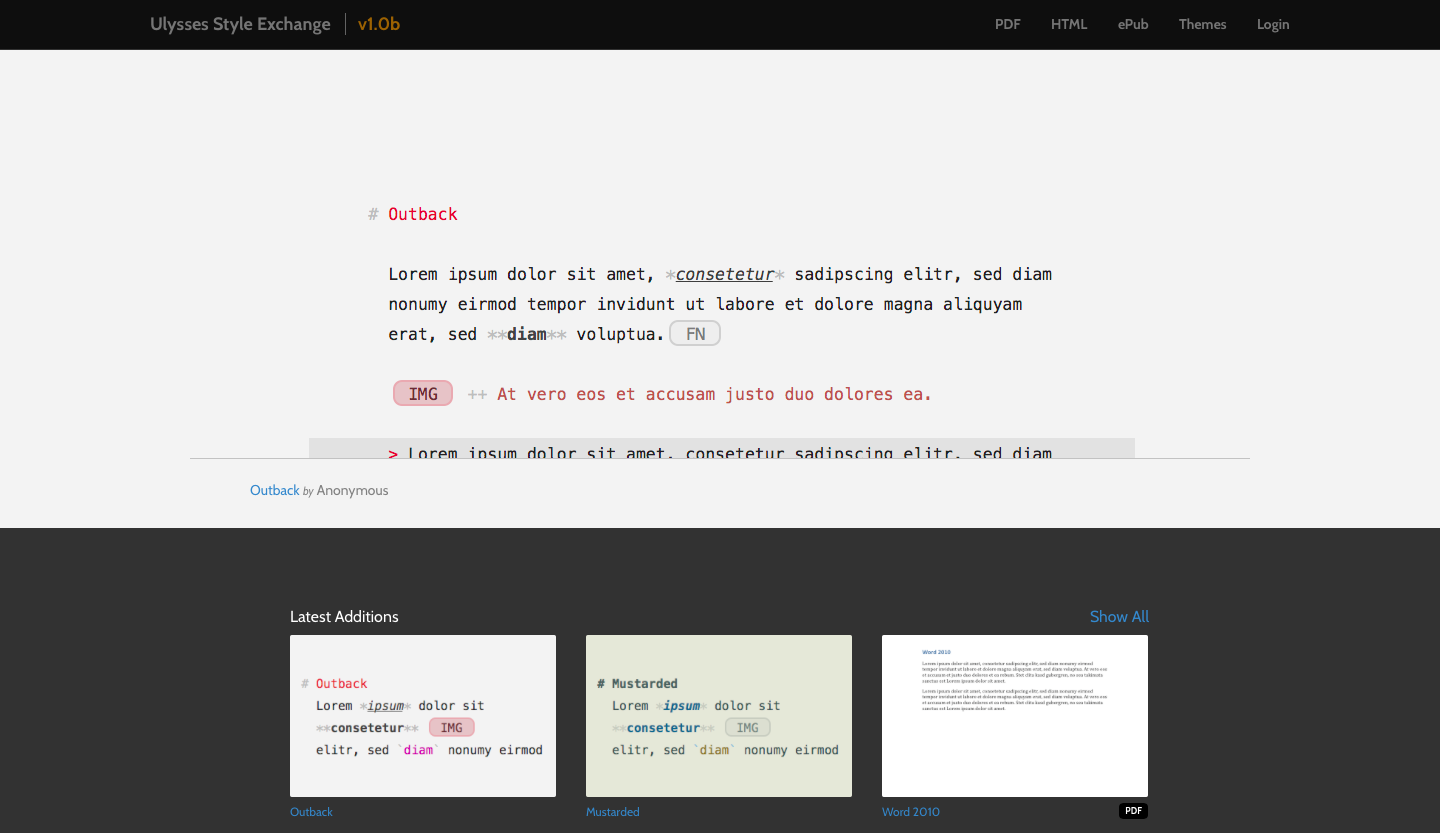
And no matter how lenghty your writing is or how many sheets you have glued together, your text will always look beautifully clean in Ulysses. There’s always been a couple of styles built into Ulysses, including the nice default scheme and a Solarized theme that each had an accompanying dark mode, along with the options to simply tweak the style of every part of the Markdown syntax. Now, that’s accompanied by themes, so you can download styles and share your own in the beautiful new Ulysses Style Exchange. There’s already some nice themes there, and it’ll be exciting to see more themes show up.
But then, my favorite Ulysses writing feature is that it remembers how you like your window to look in windowed and full-screen mode. If you want to have the 3 column view with a light theme in windowed mode so you can see all of your notes, but would rather use a dark theme without the folder sidebars when you’re full-screen, just use those options in the respective locations and Ulysses will remember what you like. And, as another nice v1.2 addition, you can now use a dark writing theme while keeping the folder columns in the more readable light mode.
There’s also still the options for typewriter scrolling, having the current line highlighted, show or hiding line numbers, and more. It looks great out of the box, and yet makes it easy enough to tweak that if you’re particular about your writing experience, you’ll be able to get it looking just the way you want.
All Your Writing in One Place
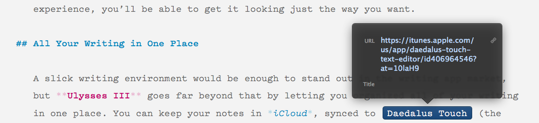
A slick writing environment would be enough to stand out in the writing app market, but Ulysses III goes far beyond that by letting you organized all of your writing in one place. You can keep your notes in iCloud, synced to Daedalus Touch (the current mobile counterpart to Ulysses until Ulysses Mobile is finished), or add your local folders from your Mac with text files. You can open files to add them to your library, and now even drag-and-drop in Word documents to convert them to Markdown (and yes, that preserves the basic formatting quite nicely). And, there’s Keywords (or OS X tags with the latest update, if you’re using external files) to add extra info to your notes, and smart filters to automatically put related documents together based on their contents, keywords, and more.
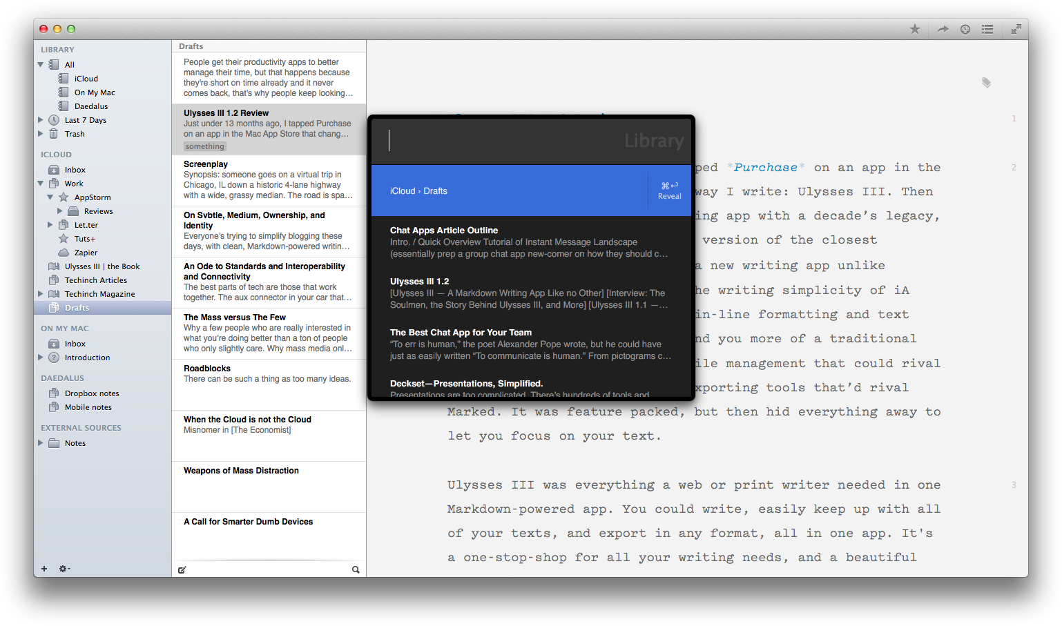
Ulysses has the standard folders and sub-folders you’d expect, but if you write a lot, you’ll end up with quite a mess of files. Ulysses has a ton of ways to help you cut through the mess and jump to the text you need quickly. The best feature is the Alfred-like search tool that the v1.1 update brought. Just tap CMD+Shift+O, and you can search through your entire library and jump to a different document without ever leaving your keyboard. The list even remembers your most recently edited files, so you can jump to them even if you forgot what you were last writing about. And, as mentioned before, you can show or hide the file browser sidebars, so if you only rely on the search box, you could get all the benefits of Ulysses’ library without having a more cluttered interface than in any other writing app.
A Built-in Personal Trainer
You can have the nicest writing app in the world, but sometimes it takes a bit more motivation to get a blank page filled with words. There’s nothing like a writing goal to keep you going, and nothing like an automated word count watching over your shoulder to let you know when you’ve hit your goals. That’s what the new Ulysses Goal feature offers.
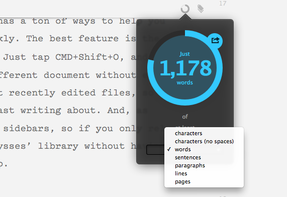
Just attach a goal from the top of your sheet, and then set the number of characters, words, sentences, or pages you want, and choose if you want at least, around, or at most that many. Now, just keep writing, and there will be a small circle indicator at the top of your sheet that’ll fill up as you write and change colors to let you know when you’ve hit your goal. You can even share the goal image on your social networks if you’d like. It’s the Runkeeper of writing.
There’s also still the great Statistics pane as well, that shows you how many characters words, sentences, paragraphs, and pages your document contains, along with an estimated reading time for slow, average, and fast readers—and you can even tweak that view to only show the stats you need. Sure, you shouldn’t be looking at that all the time, but it’s nice to have the detailed stats when you want them. It’s also fun to select everything in your library and check the statistics of everything (my library contains just over 155k words right now).
Turning Text Into Documents
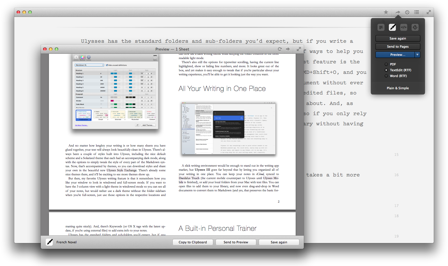
You’ve finished your writing goals, with your text organized and easy to find in Ulysses. Now, it’s time to put your words to work. You can select the text you want to export and tap Alt+CMD+C to copy it as HTML, or click the Quick Export button to export as Text, Markdown, HTML, Rich Text, PDF, or ePub. Or, just drag-and-drop the file or folder icon in the Quick Export box to your desktop or the folder you want in Finder, and you’ll have the document and any included images and files saved together.
If it’s formatted HTML (with a style sheet, not just as plain raw HTML), Rich Text (say, for Word or Pages), PDF, or ePub exports you’re wanting, you’ll find a number of beautiful export styles built-in. You can duplicate and tweak them in your favorite code editor, using CSS or a custom CSS-like syntax that’s easy to tweak. Or, you can now download new document styles from the new Ulysses Style Exchange, where you’ll already find a Word 2010-style template so you can write documents and export them in rich text that looks just like a document made in Word’s default text styles.
The Ulysses Style exchange is perhaps the nicest extra with the latest version of Ulysses III, with a number of nice text editing themes and export styles ready to use. It’ll be very exciting to see how it continues to grow, and it could end up being for writing (in some ways) what Package Control is for Sublime Text. And then, it’ll be equally exciting to see how Ulysses III itself continues to get better for writers. It redefined what a full-featured modern writing app should be, then in its v1.1 update made it insanely simple to export formatted documents and find what you want with the built-in library search. This update, v1.2, brings the new styles and the Style Exchange, along with goals and other tweaks that make it even nicer. In the future, we’ve got WordPress publishing and an iPad version of Ulysses, and more, to look forward to.
Putting it All Together
You can have the nicest writing app in the world, though, and still find it an unproductive place. Word isn’t a bad writing app, but it has far more features than you need and is designed around print, making exporting for the web a nightmare. Same goes for any other traditional word processor. Then, the average writing apps (iA Writer, Byword, and more) are great, but they’re also simple. You’ll need to organize your files in Finder, and if you want to export your documents beyond simple HTML export, you’ll need another app like Marked. You’ll also have to stick with their default writing theme, unless you use a highly configurable text editor like Sublime Text but then you’ll have to fight the urge to tweak for hours.
Ulysses III brings everything together in a way that reinvents what a word processor should be in 2014. You can write in an interface that looks the way you like (which is half the reason people change fonts and colors in Word—to make writing more fun, even if they have to switch everything back to Times New Roman when it’s time to print), keep everything in one place for reference, and export beautiful web or print ready content in a button click. It simplifies your writing experience, and gives you the power to do more—and even encourages you to write more with its new goals. It’s minimal and distraction free when you want it to be—and even remembers how you like said distraction-free interface to look—but then includes the extra features you need to not feel limited by writing in plain text.
I honestly couldn’t recommend it enough. If you write much at all, as a student, professionally, or just for a hobby, do yourself a favor and download the trial or just buy it already. You’ll love it.
It’s been 6 months since OS X Mavericks was released, which is a relatively short time but in the age of annual OS upgrades, it’s half a generation. Mavericks itself wasn’t a huge leap forward for OS X, design-wise, but it dropped some of the more skeuomorphic elements from the OS and rebuilt the core of the OS to be more energy efficient and speed up the entire system. If the Mac was Apple’s only computer, we could at best expect light UI changes and perhaps some new built-in apps in the next version of OS X.
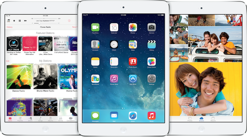
But today, it’s iOS that’s the OS everyone notices, in a world where iPhones and iPads vastly outsell Macs. iOS 7 was a complete redesign of the original modern mobile OS, with bright colors, thin fonts, and swipe-orientated navigation. It’s so sharply different from everything that came before, it’s hard to imagine that Apple won’t work some of the iOS design changes into the Mac this year. OS X Lion was the “Back to the Mac” version that brought new apps and design from iOS over to the Mac, and Mavericks continued that tradition by gaining iBooks and Maps from iOS. But this year’s 10th release of OS X is all but guaranteed to be a far sharper change from everything that’s come before—one Apple presumably wants the world to help them test, by opening OS X beta testing to everyone this week.
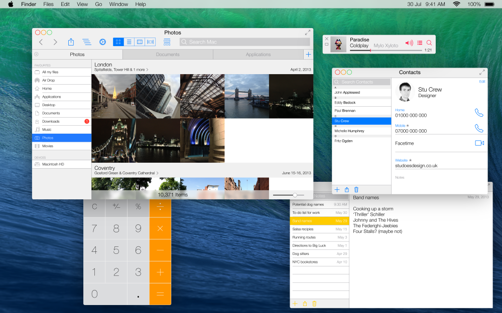
There’s next-to-no way Apple’s going to turn OS X into iOS directly, with its one-app-at-a-time model. It also seems rather unlikely OS X will be fully redesigned as deeply as iOS 7 (and as so many designers have mocked up, as in the above OS X Ivericks concept). For now, everything’s speculation.
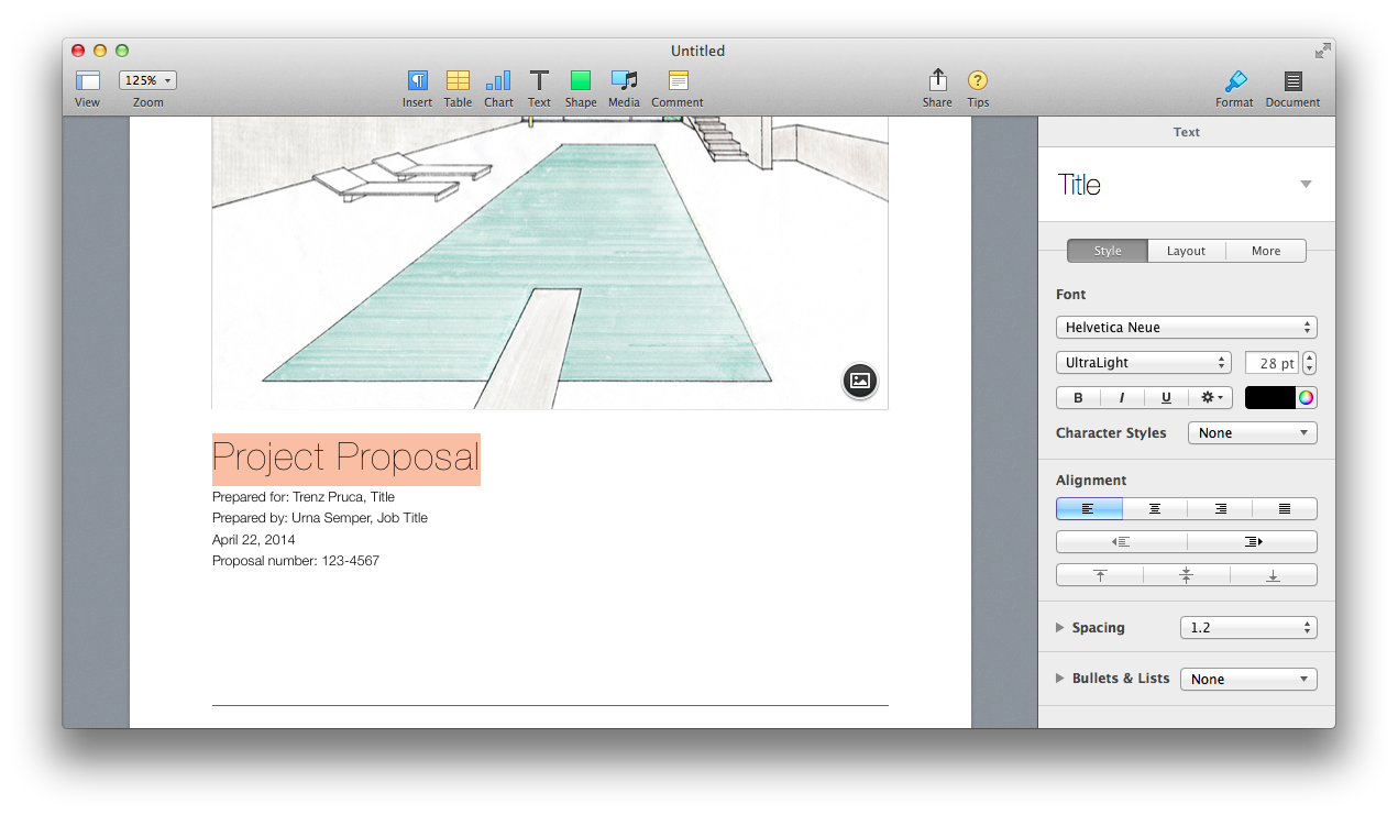
Steven Hackett rounded up the progress of Apple's user interface designs over the years, for a solid look at the past and a perspective on how Apple might change OS Xs design. But for a glance forward, the best place to look is at the apps that have already been designed with a lighter, thinner UI that’s reminiscent of iOS 7. And then, for a better idea of the future of pro apps on the Mac, there's everything from Apple’s own iWork apps to the new OmniFocus and Sketch that have this year redefined the way inspectors work on Macs, even while sticking with more dated designs. These apps give us the best concrete glimpse of the future of the Mac, as it already exists today.
The Simplification of OS X Design
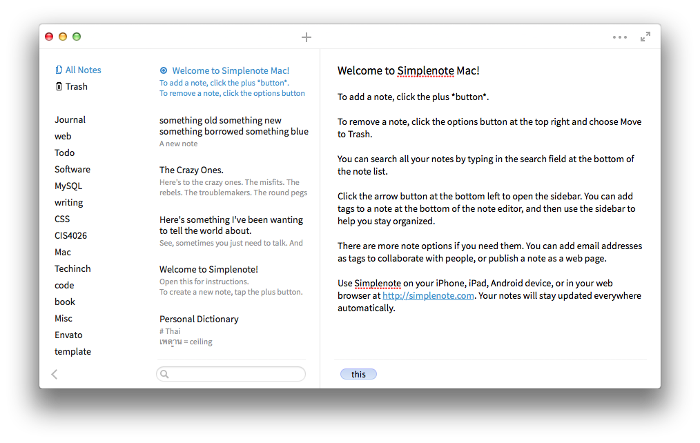
There's been a steady march to lighter, less distracting UIs for years now, with writing apps leading the way. WriteRoom was the original UI-free writing app that, while being a traditional windowed app, harked back to terminal-powered text editors like Vi. iA Writer took the next step, making a lighter, typography focused writing app with zero settings or options. It was the original iOS 7-styled app, launched nearly 30 months before iOS 7. And so, it's only appropriate that one of the first new Mac apps launched with an even closer iOS 7 style was Simplenote for Mac. Clean, bright white, and focused on thin lines and typography, it would feel at home immediately in a redesigned OS X aside from its traditional bubbly window buttons.
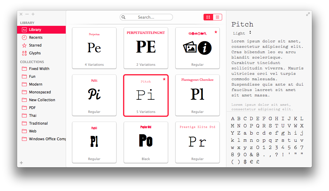
Fonts from Bohemian Coding, launched last November as an alternative to the Mac's default Font Book app and a successor to their own Fontcase, is at once a nice app and a beautiful showcase of what light, typography centric design could bring to the Mac. It has familiar Mac features like the move-mouse-to-scrub font previews that are reminiscent of iPhoto libraries, coupled with a unique design that stands on its own while being obviously influenced by iOS 7. Most interestingly, it has its own typography-based window buttons in the top left corner.
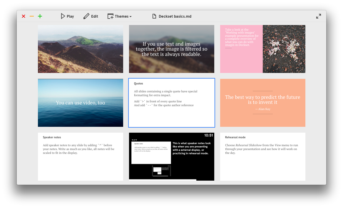
This month's release of the new Markdown-powered presentations app Deckset completes the circle from iA Writer's original off-white sparse writing interface merged with an iOS 7 style UI. The app is centered on your slides, not the UI, which makes it feel more like a mobile app than the traditional inspector-driven Mac apps, but it's the multicolored typographic window buttons and the beautiful theme browser that earned it inclusion in this list. A new OS X with this level of redesigned window boarders seems immediately possible.
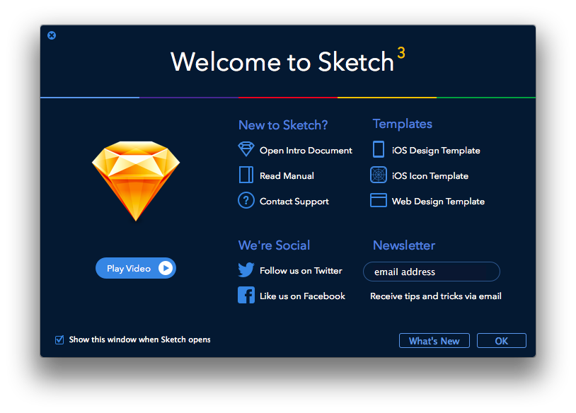
Modern doesn't have to mean bright white, though, as the launch screen in the new Sketch 3 proves. The app itself relies on a more traditional interface—though Sketch itself was one of the earliest adopters of the integrated inspectors that fill the ranks of Mac productivity apps today. What does show a sharp contract to traditional Mac design is the launch screen that's at once unique and yet iOS 7 inspired.
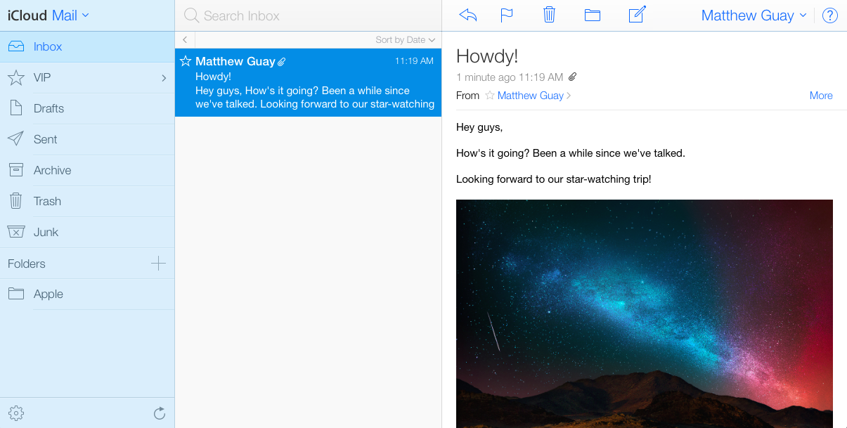
But if you want the strongest iOS 7 experience on the Mac, you'll need to look at Apple's own iCloud.com web apps. The Mail, Contacts, Calendar, and Notes apps feel almost just like their native iPad counterparts, with some desktop-orientated tweaks. I'd highly doubt the next OS X will look this much like iOS 7—after all, the last iCloud web apps looked precisely like iOS 6, and even at the height of OS X' skeuomorphic design it never looked that precisely like iOS. Still, these apps provide an interesting look at what an iOS 7ified OS X could look like if taken to its logical extreme.
Whither Inspector?
There's one more shift over the past few years in Mac app design that's as important to remember in how the next OS X will look as any other design change: the new integrated inspectors. They're embed in the right side of the app, use tabs that typically will switch smartly based on context (similar to Microsoft's Ribbon, albeit without taking up valuable vertical space). Perhaps it's not such a huge change from the former floating inspector windows, but it does make full-screen apps make much more sense—and that's one of the tiny iOS-style changes that have popped up in OS X over the past few releases.
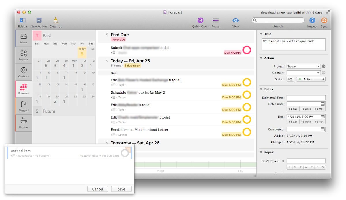
Third party developers have been using the new built-in inspector in various ways for quite some time now, with Sketch including one of the nicest built-in inspectors, but a recent adopter of the style has been the Omni group. OmniGraffle's UI looks perhaps the most dated of recently released Mac apps, but its inspector is similar to the iWork inspector while adding the extra tools needed for that app. OmniOutliner kept a floating inspector, but with the tabs and smarts that make it similar to iWork's inspector, while the still-in-beta OmniFocus 2 has a nice new twist on a built-in inspector that's flatter and whiter than most. Plus, its new Quick Add pane would look perfectly at home in an iOS 7-style interface.
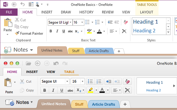
Speaking of flatter, whiter design, Microsoft Office 2013 took that to a different extreme, with all-caps typography, bright white accented with app-specific colors, and flat elements through the apps. The new OneNote for Mac sports a similar design, though with a bit more of Apple's Aqua bubbly plastic than could possibly look at home in an iOS 7-styled OS X. It'll be fascinating to see how the presumed upcoming Office 2014 for Mac looks—if Apple goes to an iOS 7 style extreme, and Office 2014 looks like Office 2013 for Windows, it'll actually look quite at home.
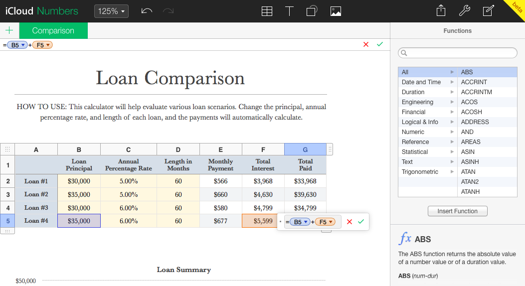
Then again, the best hint at what Apple may have planned for the next OS X' design is once again the iCloud.com web apps, this time the iWork apps. Their recent still-in-beta redesign uses a dark UI theme that includes iOS 7 style thin fonts and flat elements alongside an OS X style new-style inspector. These web apps design are unique in Apple's in-house lineup today, and I have to wonder if they don't point more towards a more "professional" twist to iOS 7's style that could be what Apple has planned for the next OS X.
New design, new inspectors, or perhaps something entirely unexpected that we can't predict? It's tough to say definitively what the next OS X will bring, but I happen to think you can put together the designs that have hit the Mac already and guess rather well at what a redesign that's halfway between iOS 7 and OS X Mavericks would look like—and my money's on that being the direction Apple goes.
What's in a Name
And then, there’s one more thing that’s fun to speculate about: what the next version of Mac OS will be called (which apparently is currently codenamed “Syrah”). OS X Mavericks was the first OS X version to not be named after a cat, but rather after a surfing location in California, and that change presumably means the next version of OS X will include a California location name as well. OS X Cupertino, anyone?
Even more interestingly, though, is the version number Apple will use. Mavericks is OS X 10.9, so will the next OS X be 10.10? Or, is it possible that this year OS X, will actually become OS XI (or OS Xi to show a closer alignment with iOS)?
OS Xi 11.0 Cupertino. Insanely great.
And then, there’s that fabled One more thing Wall Street is salivating about…
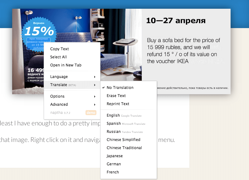
Speaking of interesting web app projects, here’s one that’ll blow your socks off: Project Naptha. It’s a Chrome extension that’ll OCR the text in any images in your browser, letting you select the text and copy it just as you would any other text on a page.
And it really works, even on skewed text in not-so-perfectly-clear photos. It’ll have similar mistakes to other OCR apps, and the results are perhaps similar to what you’d get with the OCR in OneNote for PCs, but still, that’s pretty good.
Want to really be surprised? Open a page with text in another language (Spanish, Russian, Chinese, Japanese, German, and French for now), select said text, right-click, and you can get Project Naptha to translate the text right on top of the image. It’ll replace the original text in the image with the translated text, like magic, similar to the Word Lens app that can similarly replace text on signs and more with translated text. Or, you can just use it to “erase” text from a picture, again like magic.