An online store? No thanks. I’ll just post a picture.
Ever tried to setup an online store? Rather daunting little task, isn’t it? Every major eCommerce CMS is complex and confusing at best, from the newer and simpler solutions like the WordPress powered WooCommerce all the way to full-fledged eCommerce engines like Magento. You can use them to make your own store, but you’ll sure find it frustrating at best to get everything to look and work the way you want. And don’t even talk about hand-coding your own eCommerce system from scratch without at least using a payment solution, unless you really know you can make a fully secure and PCI compliant.
Really, just scratch building your own online store by hand unless you’re really dedicated to the tech side of things. Just make a store on a hosted platform like Shopify or Big Cartel, places that make it easy for sell stuff online for a few dollars a month. You’ll get your own site to tweak as you like, within reason, and it should just work. That’s a ton simpler.
But even that’s likely too much trouble if you’re really not geeky. I mean, you just want to sell stuff: why have to go to this much trouble? So instead, just list your items on eBay and Etsy. There’s a built-in audience at those sites looking for things, so you’re more likely to get discovered anyhow. Seriously.
Wait. Is discovery the magic word? In that case, you might not even want a store at all. Just think for 3 seconds about where you discover stuff at random the most online, and you’re ready to sell.
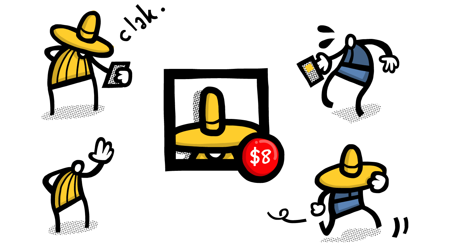
Apparently, that’s what entrepreneuring farmers in Kuwait did, when they decided to start selling their sheep on Instagram. No, really. It sounds insane, but as Quartz reported, farmers there are taking pictures of their livestock, adding the price and their phone number or WhatsApp messaging ID to the photos, and then posting them on Instagram. Voilà. Without doing anything more than simple photography and editing, they got a full eCommerce store that looks sharp and automatically broadcasts their new products to their customers. What more could you ask for?
Maybe we all think too hard
Backtrack several months, and my wife was trying to start an online business, selling handmade natural paper and more. She’d sold stuff on eBay years ago, but the fees and frustrations with eBay’s interface and policies made her want to try something new. So, I suggested we just make an eCommerce site and sell directly.
Easier said than done. WooCommerce proved rather frustrating, and the whole website project turned out harder than I would have thought at first. But once you have a site done, how are you going to attract buyers? You can try to get to the top of Google for the things you’re selling, but that’s tough at best — and still, how many people are going to buy stuff directly from a site they just stumbled across from a Google search? For her, eBay became the solution again. It’s filled with people looking for stuff to buy, and if you can put up with their insanely dated interface and listing tools and make enough to scrape together a profit after paying all of their fees, it’s rather simple to make your store a quick mini-success.
Discovery is the crucial element. If people don’t see what you’re selling, you’re out of luck. eBay fit the need by bringing potential customers and sellers together in one place that most people online think to look for stuff. But social networks are even better. Facebook and Twitter are where most people’s attention are these days. So why not sell stuff directly to where people already are?
As it turns out, Facebook eCommerce is already popular in Thailand in much the same way Instagram eCommerce is in Kuwait, but I never thought of it as such. There’s stores here that sell everything from furniture to iPhone cases without more than a Facebook Fan page. They’ll post pictures of their products, and leave more info about them and their prices and shipping policies in the description. If you want to buy anything, you can call them or send them a private message on Facebook, and complete the purchase with a bank transfer. There’s an element of trust since you can see the store’s fans talking in the comments on Facebook, and you know you could raise a ruckus if they didn’t deliver. But they do: eCommerce really works this way.
You’ll still have to build up a fan base, and you’ll still have to make great products. But processing payments and getting a web presence doesn’t have to be nearly as difficult as most of us think. You really just need to tell people the stuff’s for sell, and there’s likely really low-tech options for everything else.
No wonder Instagram sold for $1 billion.
Originally published on August 20th, 2013 in Techinch Magazine Issue 4
Flash back a decade ago, to early 2004. XP powered desktops are laptops were practically the only computers you’d see, running either IE6 or an early version of Firefox, and more likely than not connected to the internet via dial-up. Gmail wouldn’t be announced until April, the iPod was still black and white, and Fortune wondered aloud if anyone could ever topple Blackberry. YouTube was still a year away, and Netflix streaming wouldn’t be a thing for 3 years. The iPhone was still over 3 years away, and Android even further.
That’s the world Facebook was launched into. A world dominated by desktops and traditional browsers, ones where always-on internet was something new and sharing pictures meant syncing a digital camera and painstakingly uploading pictures hours or days later. It was a slower, simpler time.
And it was a time that Facebook was perfectly suited for, with a slower feed that’d show your friend’s longer, rambling posts they’d have time to type on a desktop, and the flash games and more that made it the one web app everyone used. It ended the reign of Myspace, AIM, MSN Messenger, and strongly displaced personal blogging in one fell swoop. It was unstoppable.
Then 2007 happened, and the iPhone changed everything. Another startup social network with 140 character messages styled after text messages had seemed like a rather unlikely challenger to Facebook’s dominance a year earlier, but now, the information density of short messages made perfect sense with smartphones. The next US election, only one year later, would see Twitter the talk of the town far more than Facebook had ever dreamed of. It was the perfect timing for the most unlikely social network.
Smartphones should have been an equal boon for Facebook, but the desktop-focused social network never felt as natural on smartphones as it had on the desktop. Its purchase of Instagram — the photo social network that, just like Twitter, seemed perfectly suited for a mobile audience – was a final Hail Mary to earn a place in a mobile world. And yet, Facebook itself has increasingly felt like an afterthought for most people: you private message on WhatsApp or Line or iMessage, you share pictures on Instagram, you discover what’s happening on Twitter, and if you’re writing anything of substance, you likely switched back to private blogging or writing on new platforms like Medium.
It's not that Facebook was so bad at sharing your status, or private messaging. It's that it strove to be everything, in an age where we're using one app for one purpose. And then, in trying to be too much at once, it made it impossible to focus on the one thing you where in the app to do: see what others posted.
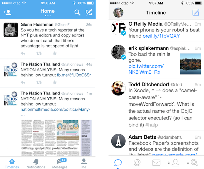
See, on mobile, information density is where you live or die. Facebook's app shows, at best one and a half posts at once, and often that half is an ad. You're scrolling a full screen each time you want to see another post. And those extra features — private messages, say — are at best 3 taps away. Information density wasn't a problem for Facebook on spacious laptop screens, but when they tried to shrink everything down for the phone, everything got cluttered and crowded, quick.
Compare that to Twitter, the social network that feels much more like a messaging app. In the official Twitter app you’ll usually see 3 posts (though one of those may be a sponsored post), and in 3rd party apps you’ll often get 4 posts at once. Twitter gives you over 3 times the information density in the same screen as Facebook, with far fewer options and confusions than the Facebook app presents at once. Those 140 characters have managed to cram in a ton of info — locations, links, and even pictures of late — that let one tweet tell you so much, while still taking up so little space. Twitter’s focused and information rich, while Facebook retains its desktop bloat.
Enter Paper
Thus, the new Paper app. The issues with its name notwithstanding, the Paper app represents the best new shot at making sense on mobile for Facebook since their purchase of Instagram. This time, though, it makes the core service make sense, not just one tiny aspect of it.
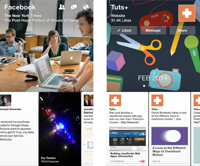
The app is slick and polished, enough to catch everyone's attention even in a crowded app market. And, for once, it wins the information density game, even without feeling like it’s cramming as much in one screen as possible. There’s a large banner at the top — itself actually one of the recent posts in your stream — with two and a third full posts visible below. That’s as good of information density as Twitter, if not better, considering how much text and graphics are in that one view. It, for once, has proven that retina displays can actually be more useful than their lower resolution counterparts, with its beautifully rendered full-length-yet-tiny Facebook posts.
Paper makes browsing your Facebook stream — the essential Facebook experience — fun again. Search and private messages and the other Facebook extras are still hidden away behind extra taps, but at the very least it nails the Facebook feed on mobile (and the separate Facebook Messenger app already gives you a one-tap look at your private messages if you'd like that).
And it makes exploring fun again. You likely don't rely on Facebook for your news, but Paper shows that you just might want to, with its curated topic views. They're far from perfect — it'd be much better if it turned your Facebook Likes into curated selections, and then perhaps threw in some of Facebook's recommended picks — but it's the first time I've discovered new sites on Facebook in a long time. Something's right, here.
Best of all, Paper's new card design and simple gestures to flip through content are so unique and yet so obvious once you've used them, it's hard to imagine that they won't be copied as much as Tweetie's then-new pull-to-refresh gesture has been. Facebook's leading mobile design here, and that's a surprising new start.
So, here's to the social network that I'm not particularly fond of. Facebook hasn't been my favorite social network in quite some time — that crown would go to Twitter. And yet, with Paper, I see promise again. At the very least, it's the one Facebook app that feels truly mobile-first and innovative. It's hard for that not to feel exciting.
Your computer, smartphone, and tablet are great, but on their own they can do very little. Your favorite OS might have a ton of features that help you be more productive and make your work environment the way you like it, but it, too, can’t do much on its own. Instead, your hardware and OS together give you the platform to run the software that help you get things done, keeps you entertained, and makes your machines worth buying.
For years now, Tuts+ has been a great place to learn how to use software to create stunning graphics and animations, craft websites and apps, record the clearest audio, and so much more. Its Sublime Text, Photoshop, and web design tutorials are among the very best available. That tradition’s been carried on in new vectors, with Tuts+ teaching everything from craft skills to OS X and Raspberry Pi tweaking. And now, we’re taking that same focus to the apps that make your devices great.
I’d started the new year by mentioning that AppStorm was being shut down, and that I’d be moving on to a new Tuts+ position. Since then, I’ve built a new Software Training team, and am the new Software Training editor at Tuts+. We’re taking the Envato mantra of “helping people earn and learn online” to the productivity apps that can be so confusing to use and yet so essential to business — and to the newer, simpler apps that business think couldn’t possibly counter their “professional” software.
Microsoft Office is still very important, and yet it’s both complex and packed with unknown features, ensuring most people only scratch the surface of what it can do. But reading a article that tells you specific features of an app is hardly anyone’s idea of a good time. And, even as feature-packed as Office is, there’s often ways to do the exact same tasks in other simpler apps, if you have the freedom to use them in your work. So, at Tuts+, our goal will be to guide you through how to accomplish a task with apps, in a way where you can get what you need to get done, done, using the apps you have available. We’ll show how Google Docs and iWork and even simple, Markdown powered tools can be used instead of Office, but we’ll also help you be the most productive with Office when you need to use it.
And that’s only scratching the surface of what we want to cover. You need to get your best work done, anywhere, from any device, and our ultimate goal is to help people learn how to do just that. At the same time, the former Mactuts+ team will continue writing about OS X and hardware, and the new Business Tuts+ will be teaching the business concepts and tips that’ll help you succeed in your work. Together, you’ll be able to learn how to use your devices and the apps on them to do your very best work.
It’s an exciting challenge, and we’re just getting started. So that’s my new day job at Tuts+, one I’m very excited about. Check out computers.tutsplus.com and see what we’re working on — and see the beautiful new Tuts+ hub that makes it easy to find training about anything our entire team has written about. And if you’re excited about the idea of a new style of app training, and would be interested in joining the team, get in touch. There’s a lot still to be done.
The global economy is great for everyone who jumps at it.
Somewhere in Europe, a developer decided to purchase an advertisement on an app-centric blog to feature his app, and paid his fee in Euros to the blog’s Australian-based headquarters. That, in part, paid for an article written on that blog, and was paid to writer on that blog in US Dollars — still the common denominator in international transactions. That writer transferred his funds from US-based PayPal account to his Thai bank, and days later pulled out Thai Baht from an ATM down the street from his house. He took that cash to the Scandinavian furniture giant IKEA, and bought drawers and dishes that’d been made in China.
And that’s just a day in my life.
I used to joke that I’m the American who came to Asia to find the outsourced jobs, but the truth is, we’re all working in a global economy. No matter where you work, where you shop, and where the stuff you buy is “from”, odds are a very large percentage of the money you make and use isn’t only made and used locally. In fact, odds are that if there weren’t people in Sweden or Singapore or some unknown village buying the products your company makes or producing some tiny part of the things you buy, your job and stuff simply wouldn’t exist.
It’s not a bad trend, and it’s not even a trend. It’s reality.
It takes a village. A global village, that is.
We all know how the economy works, on a basic level. We each make something that someone else needs, then we all give each other money for those things so we can each by the other things we need that we don’t make. Theoretically, it all works out.
Realistically, the economy is much more complex than that, but at the end of the day, that doesn’t matter. What does matter is that you need people to buy the things you make, so you can buy the things you need. Easy enough, right?
Long ago, that would have meant building a store and selling things in your hometown. If there weren’t enough people in your town to support your widget business, you’d have to find something in higher demand.
But today, the world’s your hometown. You can sell anything you want to anyone, anywhere. The App Store’s everywhere, as is the internet. You can make something today, in Canada, and tomorrow someone in China could buy it. That’s a huge change, one that’s definitely for the better. If there’s not enough people buying your widgets in Hometown USA, there’s surely enough people around the world that’d be interested in your widgets to make it into a business — or at least a small side-venture.
It’s the change that has left Foxconn be the assembly company of choice
Hello, neighbor from around the world
Of course, you’re not the only one out there that can do this. There’s 7 billion of us that can sell stuff online. We can all undercut you — a global economy in many ways will eventually mean that wages around the world will have to even out more — or make nicer widgets or ship faster or offer customizations. You’ve got 7 billion competitors, as well as 7 billion potential customers. And what would be a low income for you just might be a very good income for someone on the other side of the globe, so they’d be more than willing to undercut you. Others around the world might be better at the job then you, charging more but offering more exclusive products and services.
We’ve already seen this in action. Factory workers in China’s wages are going up fast enough that global corporations are looking to outsource production cheaper economies, while wages have been stagnant for years in the US and EU. It’ll be a long time until average wages around the world have evened out entirely, but I happen to think that’s exactly the eventual end result. It’s again not bad, per se — it’s great to see parts of the world come out of poverty, and a rising tide should eventually raise all ships — but it’s sure going to take adjustment, and it’s hard to say where the new average will up.
It’s a bigger market, with more supply and more demand than ever. It’s global, interconnected, and flat. But it’s far from dismal.
Creativity is the new Black
In fact, it’s so far from dismal that it’s crazy to think how worried people are about the future. Just imagine living in the middle ages as a peasant in the middle of nowhere in Europe. You work hard, sunrise to sunset, on your sustenance farm. Perhaps you can paint or carve, or perhaps you’re a brilliant chef. But even if you manage to find time to pursue your hobby, how in the world could you become world famous?
Now, think back to how many creative, original ideas you’ve come across online over the past year. Things from far-flung places around the world that you would have never possibly seen even a century ago, now can become a Twitter trending topic hours after they’re shared with the world. There simply weren’t trending topics and viral videos even a couple decades ago.
Today, though, anyone can at the very least get their five minutes of fame online. That five minutes of fame could be over a funny picture. Or a pithy statement on Twitter, perhaps. Perhaps it’s a redesign of iOS 7 you made and shared on Dribbble, that gets picked on top Mac blogs and then gets accidentally used by CNN when they’re telling the world about iOS 7.
And that’s what’s so exciting. Not getting on CNN, perhaps, but the fact that anyone, anywhere, can get noticed. That’s your opportunity. That’s all of our opportunity. You’ve just got to do something that can get noticed by enough people to support your work, which is where creativity comes in. Creativity is the absolutely critical part of this new equation.
We’ve seen it with Etsy, the App Store, and the web in general. We see it — perhaps without thinking about it — with the successful indie businesses all around us. Creativity is driving any meaningful change we see today. It’s the crucial element. It’s what makes those intricately beautiful apps worth downloading, what makes the Tesla Model S so genuinely exciting: creativity and uniqueness and ingenuity.
But you don’t have to go invent a new electric car. You can start smaller. You could start a WordPress theme company from Cape Town, or sell handmade chocolates from Hometown, USA. You can design cuter iPhone cases and sell them at your local mall, and on Etsy to the locals around the world that are your newfound neighbors. And when you’re looking for something new, you can expand your own horizons and find creative products from others around the world, things that are nicer than you could have ever found in the stores. You can find a nicer place to stay than the local hotels, thanks to the flatter-world options like Airbnb, or find writing about the things that interest you in indie blogs and books.
Sure, the world’s getting flatter. I happen to think that’s a good thing. And I happen to think that we can all make the very best of it.
It’s sure an exciting time to be alive.
Originally published on August 20th, 2013 in Techinch Magazine Issue 4
There's no reason to keep everything organized these days.
It defies common sense to be messy. And yet, there's no reason to keep your files insanely neat these days. There's search for that.
If you started your computing life on Windows as so many of us did, you’ve learned by experience in XP that search typically takes forever and hardly ever finds what you need. Even if you know that’s not the case these days, old habits are now hard to break (witness PC users’ backlash to Windows 8’s lack of a start menu, and the fact that most new Mac users’ first inclination is to look for a start button or pin everything to the dock). Plus, no matter where you started computing, any self-respecting tech user has learned to keep their files meticulously organized in folders. You know you can find the homework you finished a decade and a half ago because it’s a dozen folders deep in your Documents.
Awesome. But you can go ahead and throw that conventional wisdom away, quit being so clever, and start saving some time.
See, OS X has had Spotlight search since OS X Tiger was released 8 years ago, and Windows has had half-decent search built-in since Vista was released 2 years later. There’s a ton of search tools for Linux, with the most user-friendly (hello, Ubuntu!) having similar easily-accessible desktop search. In all 3, you can open a search pane with a simple keyboard shortcut (CMD+space on OS X, the Windows key on a PC, Super on Ubuntu) and start typing without moving your hands away from the keyboard. Chances are, you’ll directly find whatever you’re looking for, like magic. Even if you’re away from your computer, if you store your files in Dropbox or another online storage service, you can find your files with the same ease using the service’s search tool.
Once you start doing that by default for everything you ever open, you’ll realize how much quicker it is than clicking through folders to find what you want every time. There’s less for you to remember, less to click through, and more time for you to do what you set down to do instead of spending all your time getting ready to work.
Feeding the Engine
Now search isn’t perfect. It can only find the info you give it. So instead of spending your time organizing files into meticulous folders, think about how you’ll find them again in search.
It’s been a long time since you could only use 11 characters in your file names — for the most part, you can use up to 255 characters in most file names these days and be safe on any computer you use. That’s a lot of space to make your file names give a lot more info than “New Document 2.docx”. You can do better than that — you know it’ll be far easier to find “2013 Filed and Signed Income Tax Return.pdf” by search than it will be to find “scan.pdf” in your Documents/Finance/Government/Tax/2013/ folder. So add more data to your file names — it will only take a second extra, but will save you a ton of time in finding your files later.
Then, there’s the other data in your files: metadata. The date you made the file, the date you last edited it, the place you created it (especially in photos), and so much more. Most search tools will see that info, and by running an advanced search in Finder or Explorer, you’ll be able to quickly find files based on when you made them and more — something that’s especially great for photos and videos that often have cryptic names auto-generated by cameras.
Oh, and don’t forget about folders. I know I said you shouldn’t worry so much about folders, but they’re still useful — especially since you won't want to go rename everything. You likely don’t need a dozen levels of folders, but they’re still great tools for putting your 2013 vacation pictures together in something that’ll be easy to find with search. And even for everything else, there’s still no ready to be way too messy — you’ve still got to backup and move this stuff eventually — so some broad-category folders will go a long ways. You won’t need to go change what you have right now, per se, but you’ll likely end up over time with a lot less folders holding a lot more files — and, thanks to search, you’ll find everything quicker than you ever did with your intricate folders.
But it’s not just folders and files you’ll be looking for — it’s data stored in programs, too. So many programs, frustratingly enough, don’t lend their data to easy searching outside of their own app. Good luck finding what Kindle books are on your computer right from your system search. That’s not all programs, though. Evernote, your email app, your browser history and bookmarks, iTunes, and quite a few other programs (including almost anything that syncs with iCloud) make it easy to find your data right from your universal search — and for those that don’t automatically work, there’s often search plugins to expose their data to your system search. Evernote’s especially nice, since you can save everything there, from web clips to iPad drawings to shots of your Post-it notes, and easily find it from everywhere.
There’s More to Search than Finding
So you’ve stopped looking through Finder for every single file. Hopefully you’ve also started launching apps from search instead of looking through your Start Menu or Launchpad every time. Congrats. You’ve only started to scratch the surface of what you can do with search.
See, even with your built-in search you can also search the web, look up info in other apps on Windows 8, find definitions and do simple math on a Mac, jump directly to system settings, and more. But with a launcher app like the fabled Quicksilver or Alfred for Mac, or Launchy on a PC, you can do so much more. They’re power is their extendability — you can make them do anything you want. Check the weather, find WolframAlpha info without going to a website, do advanced math, start playing an album in iTunes, empty your trash, and so much more right from your search tool of choice — the same tool that’s opening your files and launching your apps will be simplifying everything else on your Mac. I’ve made Alfred scripts to open my default Scratchpad document where I jot quick notes throughout the day, and to make a new Kirby blog post template to simplify posting right from Alfred. There’s so much more you can do, both on your own and with pre-made templates.
So stop looking for stuff. Start searching, and you’ll realize your computer can actually simplify your life like it’s supposed to.
Originally published on October 20th, 2013 in Techinch Magazine Issue 7
You’re standing in line at the mall, ready to relax for the evening, when you get a text saying your website’s down. Big deal if the site is your personal blog with a couple hundred pageviews a day — it can wait — but if it’s your day job, and the problem’s yours to fix, it’s a big deal.
In my case, it was due to an odd issue where a page permalink starting with the word “feed” will cause that page to redirect to our RSS feed instead of showing said page. And this time, it’d managed to get the whole site to redirect — or at least that’s how it seemed to me from my rushed iPhone testing. The solution’s simple enough — go change the permalink, flush the cache, and everything’s good. Thanks to the marvels of carrying a computer in our pockets these days, it was something I could do in line and still be ready to eat dinner when our queue number was called.
Rushing worked. I panicked, then saved the day, and still had a relaxing evening. Sure felt good.
That’s one time. But for every time rushing works, there’s plenty more stories of times it doesn’t work. Like the time there’s similar server issues, and hurriedly figure out I can’t fix the issues myself — and so take to Twitter to complain about our CDN and its issues. Not such a good idea, especially when it results in a not-so-friendly call from your boss. Or the other time, when I noticed what must be a major issue in another part of our site, file a bug report with our IT team, then email everyone about it — only to notice 15 minutes later after I’d had time to think that the problem was simply my own confusion.
Rushing kills. You can watch the evening news or just pay attention during your commute to notice that in stark reality. But it also kills us in subtler, slower ways. It’s a disastrous way of life, but one we’re so used to, we don’t know how to live without rushing.
Everything rushes. It’s only normal — expected, even — to rush. Rush through the airport to catch your flight. Skip reading the instructions and license agreement and potential side effects because, well, ain’t nobody got time for that. Vote based on talking points since you definitely don’t have time to research every candidate. Drive the max over the speed limit you can get by with, regardless of safety or fuel efficiency.
We live in a culture that tells us we have to hurry in public, one where media makes us constantly feel behind our peer group. We’d better hustle, or we’ll never be as good as those guys. If you frequent entrepreneurial sites and forums like Hacker News, you’ll know the restless feeling that, if you didn’t invent something as important as Linux or raised a couple multimillion dollar funding rounds before you turn 30, surely you’re a failure.
And then, you’ve got the second-to-second rush of notifications and emails, telling you what you need to be doing right now. This is broken, that needs fixed, the other client is waiting on your email since yesterday and surely replying is more important than whatever you’re doing right now.
It’s insanely hard to calm the storm and simply get stuff done — meaningful stuff done purposefully, not just stuff that’s been pressed upon us by the latest notification. Sure, some things are truly urgent and you need to act on them immediately, but even the aforementioned site problem could have honestly waited until I’d had dinner. That would have likely saved me the heartburn from rushing.
So people tell us to turn off the internet, to block certain sites from our hosts file, to use a separate device or desk for creation and communication and consumption. I’ve even recommended trimming down the number of notifications you get in Issue 3, something I’d still recommend. And yet, none of those things are going to change us, to stop us from rushing. You have to change yourself.
I never sincerely believed driving slower would honestly save fuel — and hey, it’d waste time, so why try? But then, when you’ve had one too many accident affect those closest to you, you start to think it’s time to think more about safety. So I gave up my 120km/hr (75mph) ways, and started driving 90km/hr (56mph, or the normal highway speed limit in Thailand). And, wonder of all wonders, that little change nearly doubled the highway fuel efficiency of my 2012 Toyota Vios.
Not rushing worked. Interesting.
Rashly tweeting my thoughts about my day job’s site’s CDN got me thinking about how little I think before I act these days. We’re so used to answering questions on the fly and posting about whatever’s happening around us in real time that we seldom stop to think if that’s what we really should be saying right then. Think, then speak. That’s not just some fable for last generation, it’s something we need more than ever today.
Sure, you might not be the first person to tweet your brilliant thought about today’s news if you wait a minute to think before posting it. But you’ll likely save yourself a headache — or worse — if you realize that tweet wouldn’t look so good on your profile after all. You’ll save time when you take time to find the best solution for problems instead of rushing to fix them with the quickest solution. You might even save some money on gas. And you might be a tad more honest — at least with yourself — if a recent experiment is correct.
So stop, think, and wait. 99.9% of the things we rush to respond to today aren’t life-threatening emergencies — we’re so busy putting out the millions of tiny flames that we couldn’t possibly put out a big fire if we needed to.
The world will wait an extra minute. It really will. You can’t afford another rushed, non-thought-through tweet — at least I can’t.
Originally published on October 8th, 2013 in Techinch Magazine Issue 6
My first purchase on the Mac App Store was iA Writer, at its original $17.99 price. I’d fallen in love with its iPad counterpart, complete with its sparse white interface, lack of settings and features, and Nitti Light typeface. It was the one app I used for all of my writing, the place where all of my articles started and stayed until they were edited and published.
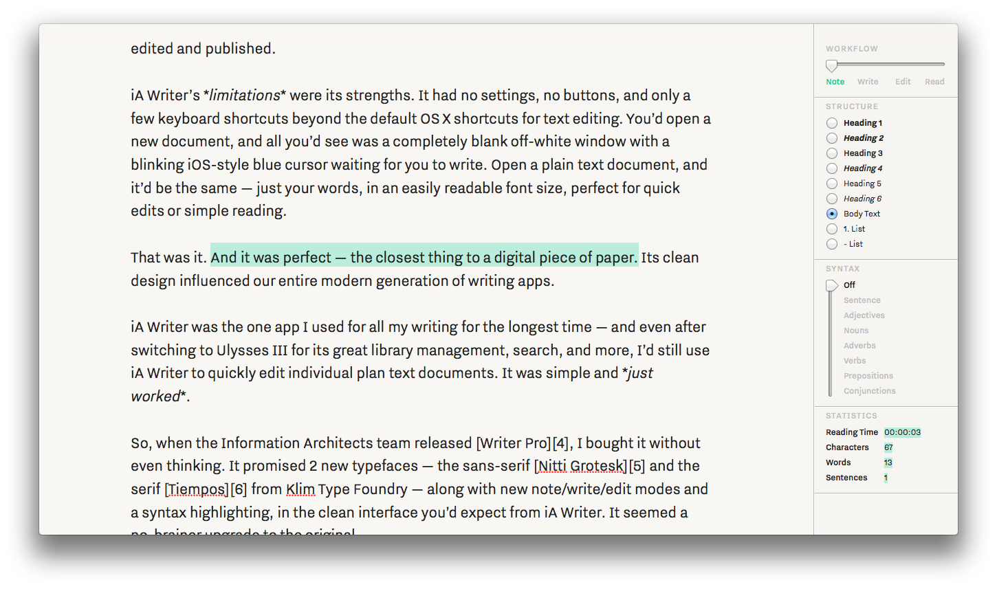
iA Writer’s limitations were its strengths. It had no settings, no buttons, and only a few keyboard shortcuts beyond the default OS X shortcuts for text editing. You’d open a new document, and all you’d see was a completely blank off-white window with a blinking iOS-style blue cursor waiting for you to write. Open a plain text document, and it’d be the same — just your words, in an easily readable font size, perfect for quick edits or simple reading. And if you really wanted to focus, there was a focus mode that’d dim out everything except the sentence you were currently editing.
That was it. And it was perfect — the closest thing to a digital piece of paper. Its clean design influenced our entire modern generation of writing apps.
iA Writer was the one app I used for all my writing for the longest time — and even after switching to Ulysses III for its great library management, search, and more, I’d still use iA Writer to quickly edit individual plan text documents. It was simple and just worked.
So, when the Information Architects team released Writer Pro, I bought it without even thinking. It promised 2 new typefaces — the sans-serif Nitti Grotesk and the serif Tiempos from Klim Type Foundry — along with new note/write/edit modes and a syntax highlighting, in the clean interface you’d expect from iA Writer. It seemed a no-brainer upgrade to the original.
Adding to simplicity
The core idea behind Writer Pro, as explained in their introductory blog post, is that you start writing with random notes, later combine and expand them into your first draft, and finally tweak and edit your prose before publishing it. To accommodate that workflow, Writer Pro includes four modes — note, write, edit, and read — each with its own typeface — Nitti Grotesk, Nitti, and Tiempos for the latter two, respectively — and text highlight and cursor color — green, blue, pink, and grey.
When you start a new document, or open an existing text file from your Mac, it’ll open in the Note mode and be saved in a Note folder in iCloud. As you’re writing, you can slide the slider in the top right to Write mode, and the interface will switch to the familiar typeface and highlight color from the original iA Writer — and, your document will be moved to a new Write folder in iCloud. Slide to Edit, and the typeface and highlight color will once again change, and your document will move to an Edit folder. The final Read mode is read-only, so everything will look the same as in Edit mode, only this time you can’t edit anything — and, yes, when you switch to Read mode, your document will be moved to the Read folder in iCloud.
The typeface change in the different modes is nifty — I happen to like reading in serif typefaces even though I write exclusively in monospaced typefaces, so that’s perfect for me. The different highlight colors are a whimsical addition that make it obvious which mode you’re in and add a little fun to the app. Neither are a bad addition at all. But moving the files between folders? That’s a surprising change that feels decidedly wrong on the Mac. You can add your own iCloud folders — where, interestingly, documents are opened in Write mode — but if you switch the document to a different mode, boom, it’ll move to that mode’s respective folder. And if you open files from another location, they’ll open in Note mode by default — you can switch them to a different mode, and that file itself will re-open later in the last mode you chose, but all other files will still open in Note mode by default.
So Writer Pro, rather than being a drop-in replacement for any other plain text editor, forces you to rethink your entire idea of document management. You could store your files outside of iCloud and organize them in folders as you want, but you’ll lose iOS integration as its iOS app only syncs via iCloud for now. And without a way to set a “default” mode, there’s no way to make your files open in Writer Pro in your favorite view by default.
But it doesn’t have to be that bad. On iOS, document management is basic at best, and organizing files by their current editing mode is a novel approach, at least, that shouldn’t be too annoying with search. And on the Mac, if you want to maintain some organization of your files while jumping in with Writer Pro’s iCloud document management, you could use tags to gives your files some permanence even as they move between folders seemingly on a whim. That’s a compromise, perhaps, but not such an obscene one as we wait for the perfect iOS+Mac document editing solution.
What’s truly disappointing, though, is that there’s no way to merge documents as alluded to in their launch blog post. Ideally, you write many notes, then combine them in your writing, before chopping out stuff in the edit mode. Ulysses III works perfectly for this by letting you “glue” sheets together — essentially, letting you treat multiple documents as one when writing, and still split them out again later if you want. It’s genius. Writer Pro, however, has no way to merge your notes into a final document aside from copy/paste. Its iCloud folders are a hint of a writing workflow, without the actual pro features to make them truly useful.
Worse still, the Read mode is not any different from the Edit mode aside from its read-onlyness. Your Markdown formatting is still there in plain view, instead of just showing your final formatted text. It, of all the modes, feels the most extraneous. And speaking of Markdown, on iOS, there’s not even live Markdown formatting, even though competing writing apps have had it for months, and no simple way to add Markdown characters to your documents. The workflow, perhaps, holds up the best on iOS, but the editing experience loses the most there.
There’s the promise of potential, and some neat features that — combined with a powerful document and workflow management — could be very cool. But, at least today, they’re not lived up to at all.
while carrying a big stick
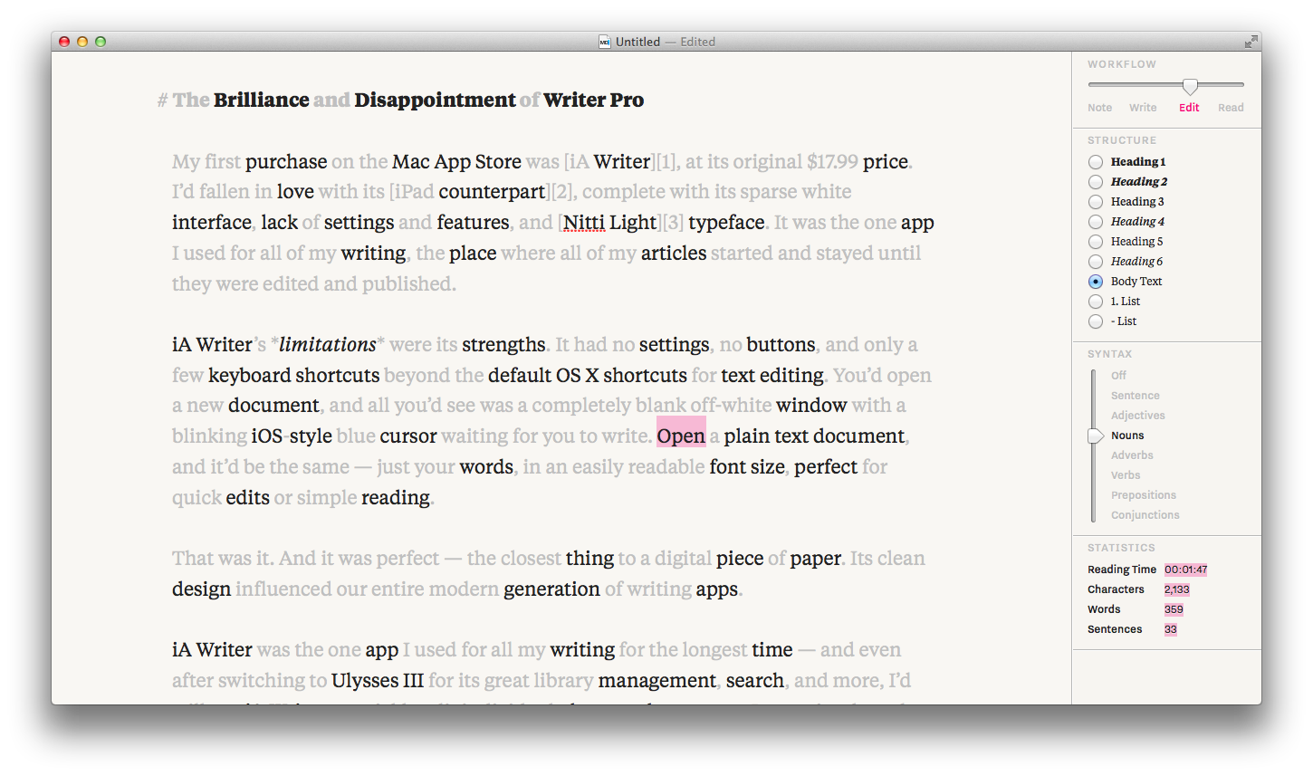
That wasn’t the only headline feature of Writer Pro — there’s also the new syntax highlighting. And it’s a neat addition, especially for editing your work. Essentially, it’s the same as the old focus mode — that’s still there if you select Sentence under the Syntax section — but can also highlight nouns, verbs, adjectives, adverbs, prepositions, and conjunctions. Theoretically, that should be a nifty tool to help you see the weak verbs and overused prepositions in your writing — a nice editing tool, but not something you’ll use actually while you’re writing.
And yet, that tool has given Writer Pro some of the worst PR in the history of writing apps. Information Architects called it a patent pending feature that’d taken 4 years or work to develop, and preemptively threatened other developers with lawsuits if they copied it. That’s a sure-fire way to alienate your fans, especially with software patents being so controversial (and, in general, evil) already. Worst of all, the feature isn’t something they invented themselves after all — turns out, other apps like Phraseology had added similar features earlier, and the feature itself was powered by NSLinguisticTagger, a built-in API in OS X and iOS that identifies parts of speech (you’ll see it in use in Mail.app, where it’s used to recognize appointment times and maps).
Information Architects has since withdrawn their pending patent, and promised to not pursue action against apps with similar features in the future, but the entire incident took the magic out of the app. Everything’s a remix — iA Writer borrowed UI cues from WriteRoom and iOS itself, just as other apps borrowed UI cues from iA Writer — and it’s simply bad taste to threaten others from copying your feature. If your app is better and truly original, people will see that. And then, when you’re building on the shoulders of Apple’s built-in APIs, it’s beyond insane to think you could patent what you’d built.
Worst of all, the feature is rather buggy. As you can see above, it highlights Open as a noun, even when it’s quite obviously a verb. That said, it’s still somewhat nice to have around, at least if you want to dig deeper into your text. Just don’t expect it’ll drastically change your writing, and don’t trust it to be fully accurate. And for goodness’ sake, if you’re a developer, don’t make a move like this. You’ll only give people yet another reason not to pay for your software.
Conclusion
Writer Pro is an interesting animal, one that’s rather unsure what it wants to be. iA Writer’s selling point was its simplicity, countered by Byword’s similar interface that also offered 2 background colors and your choice of fonts. Writer Pro’s selling point is its workflow and syntax highlighting, countered by professional writing apps like Ulysses III with their advanced document management, and tools like Marked 2 that’ll do a lot more to help you perfect your documents.
If you want a simple, writing-without-fuss app, the original iA Writer and its competitors like Byword will still do a better job at that. For more features beyond that, there’s a wealth of applications that are far more powerful, from Scrivener and Ulysses III to text editors like Sublime Text on the Mac or Editorial on iOS.
Writer Pro isn’t horrible. It still works great for writing and editing text, and the fonts are beautiful. In fact, if you’re a fan of the Nitti and Tiempos typefaces, this is the cheapest way to get them, albeit only in this one app. Beyond that, though, there’s precious little to justify the $19.99 price tag — especially if you double that for the Mac and iOS editions.
I hope the Information Architects team can surprise us with a reworked document workflow that’s truly transformative. Until then, though, Writer Pro’s only selling point is that it’s a clean writing app with the most bundled premium typefaces.
There’s apps, and then there’s tools like OmniOutliner that are so powerful, they last for generations and are the catalyst for new apps. The first version of OmniOutliner was released in 2000, when OS X was still in Public Beta. The last version — OmniOutliner 3 — was released in 2005, 6 months before Apple announced they’d switch to Intel processors, and 18 months before the iPhone was released. And it was that version that provided the platform for Kinkless GTD, a set of scripts that’d turn OmniOutliner into a full-featured task manager and provide the inspiration for OmniFocus.
An app that’s powerful and flexible enough to be turned into a whole extra app? That’s more than your common app.
And yet, in a world where tech writing is dominated solely by the newest apps in town, it’s little wonder that OmniOutliner nearly fell off the radar — aside from its iPad apps — over the last few years. OmniOutliner used to be the tool everyone was using in the latest scripts, until it got old enough to just get ignored. In the mean time, we got more interested in Markdown-powered writing apps, and rich-text powered outlines started to seem old-school. Plus, who’s really that interested in writing outlines, when they seem to only stand for the worst of schoolwork you left behind when you graduated?
Forget everything you think about outlines, and rich text, and Mac apps. Here’s what’s great about OmniOutliner, what’s even better in its fourth version, and why you should be using it already.
So Much More Than an Outline
At its very basics, OmniOutliner is a great app for writing detailed outlines. Type in your points, tap to start making sub-points or ⌘[ to de-indent a sub-point, and click the handles on the left of any point to drag-and-drop it to a different position. Throw in the option to add notes to any point via the note button on the left or the ⌘’ shortcut, and options to open or hide sections of outlines with click on a little triangle icon on the left, and you’ve got a powerful if standard outlining tool.
Dig a little deeper, and you’ll find more to love for raw outlining. There’s a convenient Focus option in the right-click menu on any item, so you can focus on just a subset of your list without being distracted by the full outline. Combine that with the auto-generated Table of Contents in the top left and its search tool, and you can keep a ton of data in one OmniOutliner document without getting lost. And noticed I said data? Your OmniOutliner documents can have far more than just text — there’s an audio recorder built-in so you can record a lecture and write notes at the same time, and you can drag any picture, audio, video, or any other file you want to keep track of right into an outline where you can view it right in OmniOutliner or open it in its appropriate app.
So now you’ve got outlines that are easy to navigate, can be easily used to manage tons of text and anything else you want to keep together. But it doesn’t stop there. The things that make OmniOutliner different are its theming tools — which make it incredibly easy to make a beautiful document you’ll want to write in — and its multiple columns.
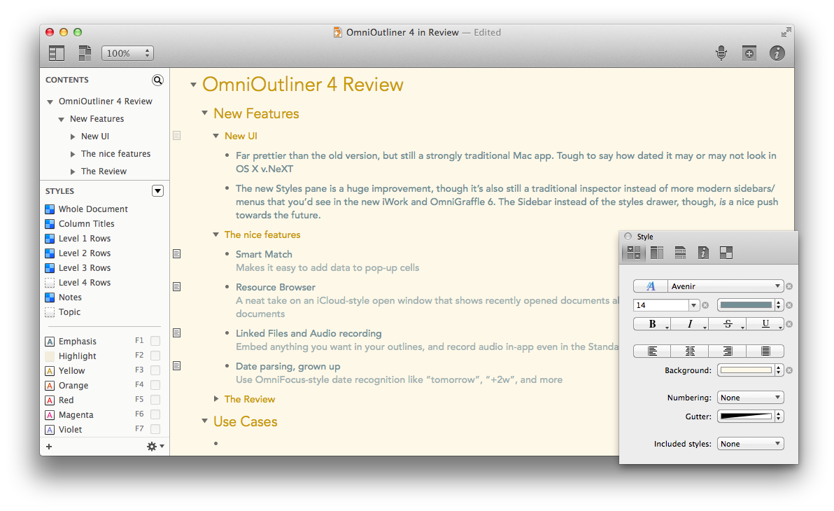
Themes, first off, got the most attention in v.4’s updates. There’s a redesigned dynamic inspector that makes it simple to tweak your fonts, colors, and more, and a new left sidebar that lets you tweak your document section styles and quickly change styles with your function keys. There’s a new set of built-in templates, including a very nice Solarized Light template, and you can in 2 clicks switch your document to a new template from your library. That template library, it should be mentioned, also is used as the new “Resources Browser” that shows your recent documents so you can quickly open them — something that almost feels like an iCloud-style document browser to keep your OmniOutliner files close at hand, even though they can be saved anywhere.
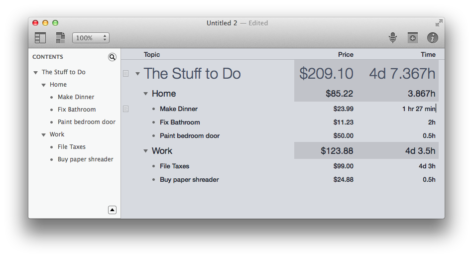
And then, there’s the columns. Columns add a slight hint of spreadsheet functionality to OmniOutliner — you can add as many columns as you want, which can contain just standard text, or they can contain numbers, dates, time durations, checkboxes, or a pop-up list of options. That’s the secret to how it so easily powered the original OmniFocus concept — there’s checkboxes to mark off tasks, extra fields for tags, and due dates in yet another column. And so, you can use them in much the same way. Just add new columns, then set the column type in the inspector, and hack away. Date and duration fields understand plain-text dates, so you could type in next tuesday or +2m, and it’ll add a real date for next Tuesday or two months from today, respectively. You’ll find format options as well, so those dates will show up the way you want, and your number columns can be formatted as percents or currency amounts or plain numbers with thousands separators and decimal points. All very much like a smarter, yet more limited spreadsheet.
But then, there’s the final part of columns that make them so great: summaries. Add a summary, and it’ll show up on the top levels of the outlines — individual points on the lowest level have their info (say, the price of the item listed), and their header points will show the summary (so, then, the total price of all items listed) and the top point will show a summary of the summary (the total price of all the totals, say). And there, you can tweak again, having numbers summarized as totals, averages, minimums, or maximums, and durations summarized by the total time (automatically converted into work days and weeks) or minimum/maximum timeframe in the list. Checkboxes will be summarized by showing if everything is complete, and pop-up lists can be summarized by showing what the most popular option is. There’s so much you can do with it, especially for quick lists math and project timeframes, but really the sky’s the limit. The columns are what makes OmniOutliner so versatile, and so apt to be used for a million different purposes by everyone. It’s at once the basics of a spreadsheet and databasing app, tied to a beautiful theme system and great rich text handling that make it a joy to use.
The App in Action
I’ve likely convinced you that OmniOutliner is interesting, at least, but that’s far from enough reason to buy an app. Instead, you need an app that works great and makes your life easier.
OmniOutliner 4, from my time beta testing it last year and using the final release for the past few weeks, is as reliable and fluid in use as you’d hope. Gone are the clunky, dated UI elements from previous versions, but still there are the great text editing experience you’d expect from a Mac app. It’s a great outlining app, and goes beyond just outlines in a way that you’ll want to work it into more of your life.
It works equally great with audio and video in an outline, though it does slow down for a bit if you drag in a document or other file, apparently as it’s trying to see what it can do with it. The multiple columns and their new features such as OmniFocus-style real-language date recognition work great as well. Exports work quite good for most uses — your PDF and HTML exports will look beautiful, and OMPL files will work fine in any other outline or mind-mapping app, though don’t expect to use the Keynote exports for now unless you have an old copy of Keynote ’09 around.
That’s the only quibbles I could find with the app. It’s solid otherwise, and has me writing more things in list and outline form than I would have otherwise. In fact, the only thing keeping me from using it more is the lack of a companion iPhone app for viewing my outlines on the go.
The Question of Editions
There’s only one thing left to mention: the editions. The base version of OmniOutliner for $50 gives you everything I’ve talked about here. Pay $50 more — to buy it directly, or to upgrade later on — and you’ll get AppleScript support, Word export, and a few other extra features including additional theming options like increasing spacing between columns. The AppleScript support is most interesting, since there’s only the very basics supported in the base version, compared to an extremely extensive AppleScript support in the Pro version that was used in the last version to build OmniFocus’ predecessor. If you want that, spring the extra $50 for the pro version, but otherwise, you’ll be just fine with the base version.
The best part is, you can test out the feature set of both editions from the 2 week free trial through an option in the app’s menu. That should help you see which one’s best for your needs. And since you can upgrade anytime for the same price, with an in-app purchase from the App Store edition or an Omni Store upgrade if you buy it directly, there’s no reason to worry about which version to pick. I went with the base version, and happen to bet that’d be fine for most uses.
In Summary
OmniOutliner describes itself as an app for “Indispensable idea organization”, and I can’t think of a better way to describe it myself. It’s almost an app that defies description. It’s great for traditional outlines, sure, but the notes, themes, and extra columns and data-types make it an insanely versatile app for keeping track of anything.
When a plain-text document is too little, and a spreadsheet too much, OmniOutliner’s the app you need. You’ll turn to it for simple budgets, project overviews, book drafts, basic databases, and lists of the mundane things in your life, and it’ll work great for all of those. There’s really nothing else like it.
It’s a bit hard to get started with, and could do with a larger selection of built-in themes and export options, perhaps. So much has been added to v.3 over time in free updates, v.4 might feel to long-time users as a tiny leap. But OmniOutliner’s so good at what it does right, and so unique, I couldn’t help but awarding it an Insanely Great rating. Its generous upgrade policy means you’ll get v.4 for free if you bought v.3 over the past 3 years, and otherwise, a $24 upgrade after 7 years of free updates isn’t a bad bargain.
So go give the 2 week free trial a spin, and use it for everything you can think of. Try the keyboard shortcuts, the extra columns, and the theming options. I happen to think you’ll like it.
Update: As Doug Murray pointed out on Twitter, the award for the original Macintosh outlining app would go to Dave Winner's Living Videotext ThinkTank, which was an original outlining and "idea processing" app. It retailed for $150 — nearly $350 in today's dollars — and cost $10 for a trial copy. 'Twas an entirely different world then.
So, I've updated the title. OmniOutliner is the original Mac OS X outlining app, carrying on a proud tradition started by innovative apps like ThinkTank. The only surprising thing is that there were such powerful apps for organizing ideas that far back, and yet they're not more popular today.
To-do list apps used to frustrate me terribly. They’d sound great on paper, but when I tried to put them to use to keep track of everything I needed to do, they'd fail me. Or I’d fail them. One way or other, it just wasn't working out. Me and to-do lists were apparently just not meant to be.
Of course, if you follow me online, you'll know that I'm pretty devoted to my to-do list apps these days. It's worse than that: I practically couldn't live without them. So what changed?
To-do list apps. That's what changed.
Turns out, all tasks aren’t equal, and neither are all to-do list apps. If one doesn't fit, perhaps you need two. Or three.
Learning to Love the Lists
Tools are only useful if you have something you need them for. We’ve all got stuff we need to do, but all of us don't have the same tasks, and we definitely don't all work and think the same way, so we each need different tools. That, more than anything, is why some people swear by OmniFocus, while others couldn't imagine life without Things, and others get by with just a simple plain-text list of stuff to do.
Spoiler: none of them are the wrong way to manage tasks.
There's tons of great to-do list apps out there, each of which have their strong points. That's not to say you won't hear me waxing poetic about the ways OmniFocus is better sometime in the future - but really, there's a lot of good ones. You don't really need to over-think it.
What you do need to think about is what you need from a to-do list app. Personally, there's three main types of things I need to keep track of: appointments on specific dates, things I need to do on specific times (complete with notes about them, ways to sort and categorize them, and make them repeating easily), and random small things I need to keep up with that aren't urgent or tied to a date or project.
An App Apiece
Let's break that down. Appointments are simple; they go in the calendar, and you've likely already got an app for that. When you need to make note of your nephew's graduation or your upcoming vacation, a calendar just makes the most sense. No need to stress that one.
The second one is where the advanced to-do list apps like OmniFocus and Things - or even the built-in Reminders app - come in. These are the tasks you must do, whether at work or home, and you need a way to get them out of your head and categorize them by project, location, due dates, and more. You want to add notes to them so everything's together in one place, and if they’re things you'll need to do over and over, you’ll want the app to automatically recreate them for you. This is what the majority of major to-do list apps aim for, and there's tons out there you can try. Pick one, and stick to it, and it'll simplify your life. Really.
But don't put absolutely everything into it, because some things shouldn't go in you main to-do list app. They're the random little things - movies you'd like to watch some day, the stuff you should pick up at the store next time you're out, apps you want to try - that don't really fit in your advanced to-do list app without cluttering your inbox, and they most certainly don't go in your calendar. They’re what lite list apps come in handy for, or even just your notes app. Jot them down there, and you’ll still have them saved, but they won't make you feel like you're losing your mind in your advanced to-do list app.
Find Your Three
For me, the three magical apps are Fantastical for calendar, OmniFocus for projects and scheduled/advanced tasks, and Clear for my simple lists of random stuff. They're each great, and I'd highly recommend them each. But you can accomplish much of the same with the built in Calendar, Reminders, and Notes apps if you’re just getting started.
Just keep things separated, and you'll find each app and system makes a lot more sense. OmniFocus never did make sense for my bucket lists and grocery lists, but it keeps my work at AppStorm and Techinch manageable. I couldn't live with just Clear, but I'd be a mess with just OmniFocus, too.
Use the right app for the right tasks, though, and everything works so much better.
Originally published on July 1st, 2013 in Techinch Magazine Issue 1
At 30, the device that defined Apple Computer, Inc. would be easy to dismiss in Apple, Inc’s device lineup. It accounts for only 15% of Apple’s revenue, stars in only 4 of the 30 ads and promo videos Apple’s published on their YouTube channel over the past year, and seems decidedly stuck in the past with a traditional keyboard and touchpad that fly in the face of the multitouch and sensor-orientated iOS devices. Surely it’s doomed.
And yet, the Mac itself is responsible for 50% of the profits of the PC industry, not to mention the Mac indie software market with its slew of exclusive — and profitable — professional apps from the likes of the Omni Group, Pixelmator, Panic, and more. The success of iOS devices are directly tied to Macs, since every iOS app is developed on a Mac — not to mention that once can only assume Apple’s own internal work is all done on Macs. For anyone worried that Apple will soon tire of making Macs when iOS devices are its profit center and chief source of marketshare, last year’s upgrades to Apple’s OS X apps and the new Mac Pro should at make it blindingly obvious that Apple’s still dead-set on keeping the Mac as the best PC in the market.
But what will the Mac look like, 30 years from today? Or what, for that matter, will it look like 30 weeks from today, after Apple’s likely unveiled its next annual upgrade to OS X? Will it work the same as it does today, albeit with a Helvetica Neue Thin and iOS 7 inspired refresh as so many designers have proposed over the past months?
Or will, perhaps, OS X and iOS somehow be merged, perhaps in a release I’ve enjoyed referring to as “OS Xi”? OS X Mavericks is v10.9 after all, so — baring a v10.10 release — the next version should technically be v11. To carry that moniker, one would assume that the version would be as groundbreakingly new as the first OS X release itself was — the initial version that killed Mac OS Classic in lieu of the new NeXT OS inspired UNIX-powered OS that just happened to look like a far shinier version of OS Classic. What could be more groundbreaking than a fusion of iOS and OS X? It’d kill the mouse and traditional OS X in one fell swoop, while perhaps super-powering iOS devices with more of the core OS X features professionals expect.
Except that’s not very likely to happen. Craig Federighi stated in Macworld’s Apple executive interview on the Mac’s 30th anniversary that the Mac “has been honed over 30 years to be optimal” for keyboards and mice, while further stating that it’d be a waste of time to simply add a touchscreen to a Mac, or try to fuse iOS and OS X for no reason. And the death of the Mac is out of the question, too, since Phill Schiller, in the same interview, said that “There is a super-important role [for the Mac] that will always be. We don’t see an end to that role. There’s a role for the Mac as far as our eye can see.”
Thus the Mac will live on, without merging iOS and OS X, and perhaps without a touchscreen. It’d seem obvious that it’ll get some iOS 7-style design touches, perhaps along the lines that 3rd party Mac apps like Simplenote and Fonts, or a continuation of the general less-extreme design trends — somewhat flatter, with redesigned inspectors and flatter, with larger, more graphical popover menus instead of text lists — that we’ve seen in iTunes 11, the new iWork, the Omni Group’s new apps, Capo 3, and more. Or perhaps it’ll stick with its current design, letting iOS veer off on its own design trajectory.
Step back from the bright colors and thin, Helvetica Neue Thin-esque lines of iOS 7, though, and there’s a lot of iOS specific parts of iOS 7’s design that make it what it is. Design isn’t simply the icons and colors — its the way the device experience looks and works together as a whole. Making hardware and software compliment each other has always been Apple’s specialty, far more than perfecting the absolutely most beautiful software interfaces. iOS 7, with its edge-swipe gestures to bring up the control panel or to go back in apps, uses its bright colors and thin fonts to highlight your content in a way that feels perfect on mobile.
That same look may come to the desktop, but the same feel cannot. There’s no way edge swiping from iOS could make its way to OS X in the very same way. Nor, for that matter, could iOS 7’s zoom-into-app animation that gives you a spatial feel for where you are in the OS, or the parallax animation on your wallpaper. They’re designed for the hardware and OS paradigm they work on.
OS X could, perhaps, use a similar rethinking in the way we interact with software on a traditional laptop or desktop, but those redesigns — even if they superficially look like iOS 7 — would have to be designed in a way that compliments the trackpad and keyboard if they’re to be truly influential changes. So many recent OS X changes to make the Mac more like iOS, from Notification Center and Game Center to the new Dictation before its Mavericks reinvention, are ignored by most users simply because they don’t feel perfectly at home in a keyboard+mouse environment.
And yet, that environment is still good. As Dr. Drang pointed out in his “MacBook Touch” article, the traditional computing environment affords a high level of information and control density that couldn’t be maintained if everything was increased in size to make it touch friendly. And no matter how many nifty multitasking gestures you bake into iOS, there’s nothing that’ll replace the speed of using launchers like Alfred and Quicksilver, or the text-editing keyboard shortcuts that thankfully are baked into iOS, or the simplicity of CMD+Tab to switch to another app without leaving your keyboard. The mouse and touchpad cannot go away from professional computing until someone reinvents a way to make computing without it just as powerful — and the keyboard won’t go away completely, ever.
One thing’s certain, though: Apple appreciates the role that the Mac and its unique components play in our work, and that’s refreshing to hear. I’m not against the idea of OS X becoming more like iOS, but those changes must come with an understanding of the power we get out of touchpads and keyboards. If touchscreens can productively argument or improve on that, in a way no one has done so far, then I’d be more than interested in switching, but until then, it’s nice to be reminded that the Mac is still appreciated just for being the Mac.
I’d still like to see the next version called OS Xi, though. Just because.