The Brilliance and Disappointment of Writer Pro
My first purchase on the Mac App Store was iA Writer, at its original $17.99 price. I’d fallen in love with its iPad counterpart, complete with its sparse white interface, lack of settings and features, and Nitti Light typeface. It was the one app I used for all of my writing, the place where all of my articles started and stayed until they were edited and published.
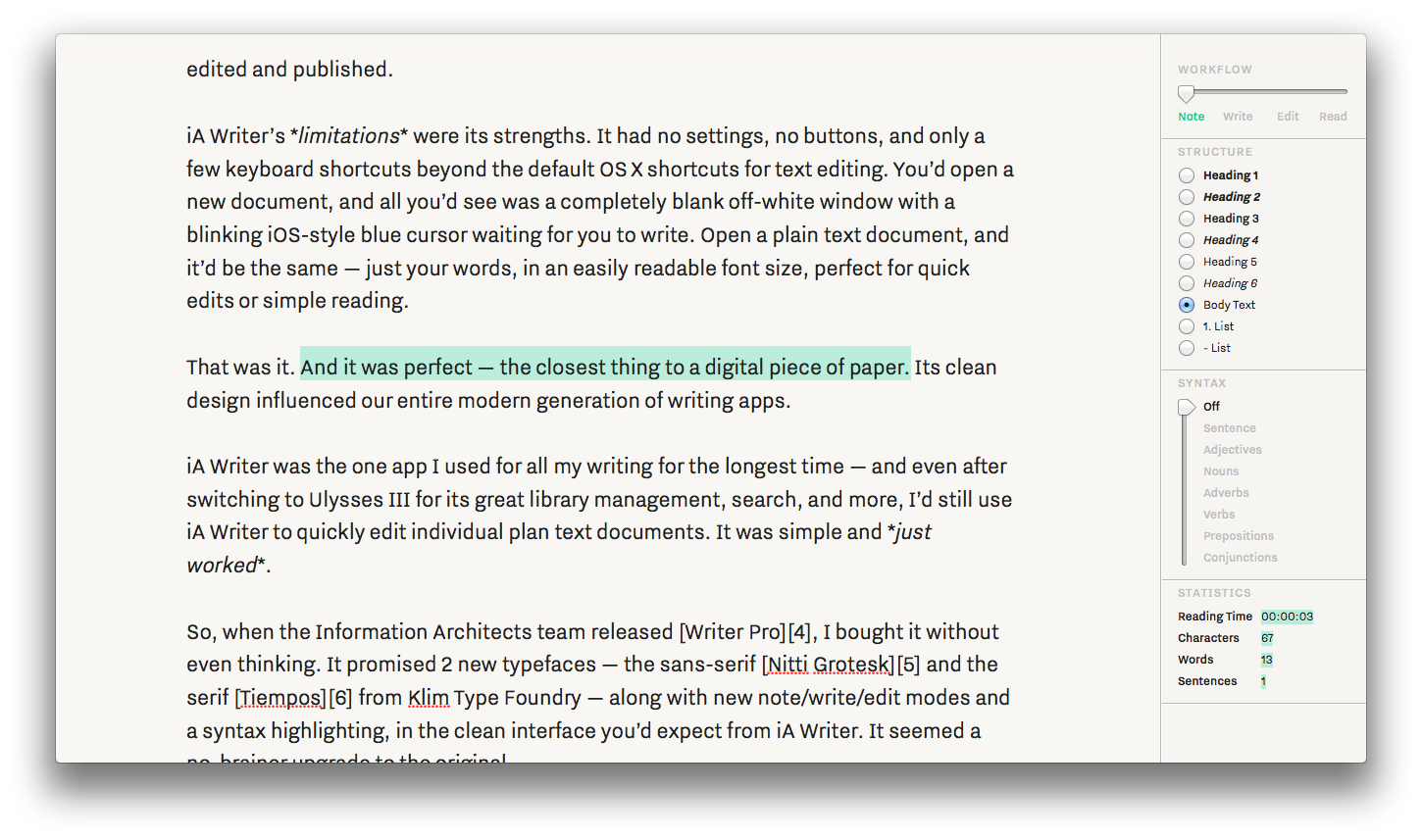
iA Writer’s limitations were its strengths. It had no settings, no buttons, and only a few keyboard shortcuts beyond the default OS X shortcuts for text editing. You’d open a new document, and all you’d see was a completely blank off-white window with a blinking iOS-style blue cursor waiting for you to write. Open a plain text document, and it’d be the same — just your words, in an easily readable font size, perfect for quick edits or simple reading. And if you really wanted to focus, there was a focus mode that’d dim out everything except the sentence you were currently editing.
That was it. And it was perfect — the closest thing to a digital piece of paper. Its clean design influenced our entire modern generation of writing apps.
iA Writer was the one app I used for all my writing for the longest time — and even after switching to Ulysses III for its great library management, search, and more, I’d still use iA Writer to quickly edit individual plan text documents. It was simple and just worked.
So, when the Information Architects team released Writer Pro, I bought it without even thinking. It promised 2 new typefaces — the sans-serif Nitti Grotesk and the serif Tiempos from Klim Type Foundry — along with new note/write/edit modes and a syntax highlighting, in the clean interface you’d expect from iA Writer. It seemed a no-brainer upgrade to the original.
Adding to simplicity

The core idea behind Writer Pro, as explained in their introductory blog post, is that you start writing with random notes, later combine and expand them into your first draft, and finally tweak and edit your prose before publishing it. To accommodate that workflow, Writer Pro includes four modes — note, write, edit, and read — each with its own typeface — Nitti Grotesk, Nitti, and Tiempos for the latter two, respectively — and text highlight and cursor color — green, blue, pink, and grey.
When you start a new document, or open an existing text file from your Mac, it’ll open in the Note mode and be saved in a Note folder in iCloud. As you’re writing, you can slide the slider in the top right to Write mode, and the interface will switch to the familiar typeface and highlight color from the original iA Writer — and, your document will be moved to a new Write folder in iCloud. Slide to Edit, and the typeface and highlight color will once again change, and your document will move to an Edit folder. The final Read mode is read-only, so everything will look the same as in Edit mode, only this time you can’t edit anything — and, yes, when you switch to Read mode, your document will be moved to the Read folder in iCloud.
The typeface change in the different modes is nifty — I happen to like reading in serif typefaces even though I write exclusively in monospaced typefaces, so that’s perfect for me. The different highlight colors are a whimsical addition that make it obvious which mode you’re in and add a little fun to the app. Neither are a bad addition at all. But moving the files between folders? That’s a surprising change that feels decidedly wrong on the Mac. You can add your own iCloud folders — where, interestingly, documents are opened in Write mode — but if you switch the document to a different mode, boom, it’ll move to that mode’s respective folder. And if you open files from another location, they’ll open in Note mode by default — you can switch them to a different mode, and that file itself will re-open later in the last mode you chose, but all other files will still open in Note mode by default.
So Writer Pro, rather than being a drop-in replacement for any other plain text editor, forces you to rethink your entire idea of document management. You could store your files outside of iCloud and organize them in folders as you want, but you’ll lose iOS integration as its iOS app only syncs via iCloud for now. And without a way to set a “default” mode, there’s no way to make your files open in Writer Pro in your favorite view by default.
But it doesn’t have to be that bad. On iOS, document management is basic at best, and organizing files by their current editing mode is a novel approach, at least, that shouldn’t be too annoying with search. And on the Mac, if you want to maintain some organization of your files while jumping in with Writer Pro’s iCloud document management, you could use tags to gives your files some permanence even as they move between folders seemingly on a whim. That’s a compromise, perhaps, but not such an obscene one as we wait for the perfect iOS+Mac document editing solution.
What’s truly disappointing, though, is that there’s no way to merge documents as alluded to in their launch blog post. Ideally, you write many notes, then combine them in your writing, before chopping out stuff in the edit mode. Ulysses III works perfectly for this by letting you “glue” sheets together — essentially, letting you treat multiple documents as one when writing, and still split them out again later if you want. It’s genius. Writer Pro, however, has no way to merge your notes into a final document aside from copy/paste. Its iCloud folders are a hint of a writing workflow, without the actual pro features to make them truly useful.
Worse still, the Read mode is not any different from the Edit mode aside from its read-onlyness. Your Markdown formatting is still there in plain view, instead of just showing your final formatted text. It, of all the modes, feels the most extraneous. And speaking of Markdown, on iOS, there’s not even live Markdown formatting, even though competing writing apps have had it for months, and no simple way to add Markdown characters to your documents. The workflow, perhaps, holds up the best on iOS, but the editing experience loses the most there.
There’s the promise of potential, and some neat features that — combined with a powerful document and workflow management — could be very cool. But, at least today, they’re not lived up to at all.
while carrying a big stick

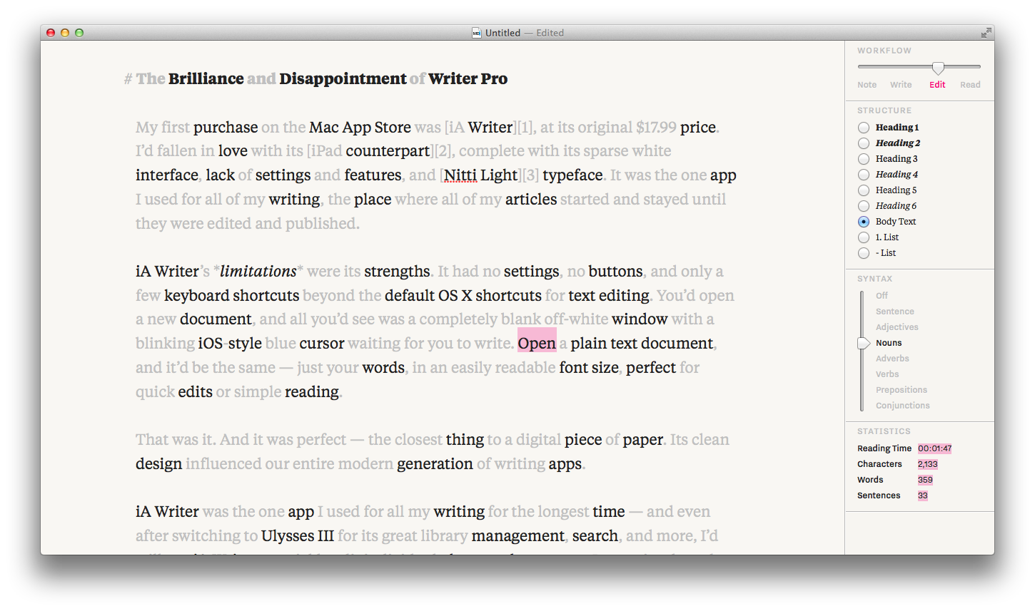
That wasn’t the only headline feature of Writer Pro — there’s also the new syntax highlighting. And it’s a neat addition, especially for editing your work. Essentially, it’s the same as the old focus mode — that’s still there if you select Sentence under the Syntax section — but can also highlight nouns, verbs, adjectives, adverbs, prepositions, and conjunctions. Theoretically, that should be a nifty tool to help you see the weak verbs and overused prepositions in your writing — a nice editing tool, but not something you’ll use actually while you’re writing.
And yet, that tool has given Writer Pro some of the worst PR in the history of writing apps. Information Architects called it a patent pending feature that’d taken 4 years or work to develop, and preemptively threatened other developers with lawsuits if they copied it. That’s a sure-fire way to alienate your fans, especially with software patents being so controversial (and, in general, evil) already. Worst of all, the feature isn’t something they invented themselves after all — turns out, other apps like Phraseology had added similar features earlier, and the feature itself was powered by NSLinguisticTagger, a built-in API in OS X and iOS that identifies parts of speech (you’ll see it in use in Mail.app, where it’s used to recognize appointment times and maps).
Information Architects has since withdrawn their pending patent, and promised to not pursue action against apps with similar features in the future, but the entire incident took the magic out of the app. Everything’s a remix — iA Writer borrowed UI cues from WriteRoom and iOS itself, just as other apps borrowed UI cues from iA Writer — and it’s simply bad taste to threaten others from copying your feature. If your app is better and truly original, people will see that. And then, when you’re building on the shoulders of Apple’s built-in APIs, it’s beyond insane to think you could patent what you’d built.
Worst of all, the feature is rather buggy. As you can see above, it highlights Open as a noun, even when it’s quite obviously a verb. That said, it’s still somewhat nice to have around, at least if you want to dig deeper into your text. Just don’t expect it’ll drastically change your writing, and don’t trust it to be fully accurate. And for goodness’ sake, if you’re a developer, don’t make a move like this. You’ll only give people yet another reason not to pay for your software.
Conclusion
Writer Pro is an interesting animal, one that’s rather unsure what it wants to be. iA Writer’s selling point was its simplicity, countered by Byword’s similar interface that also offered 2 background colors and your choice of fonts. Writer Pro’s selling point is its workflow and syntax highlighting, countered by professional writing apps like Ulysses III with their advanced document management, and tools like Marked 2 that’ll do a lot more to help you perfect your documents.
If you want a simple, writing-without-fuss app, the original iA Writer and its competitors like Byword will still do a better job at that. For more features beyond that, there’s a wealth of applications that are far more powerful, from Scrivener and Ulysses III to text editors like Sublime Text on the Mac or Editorial on iOS.
Writer Pro isn’t horrible. It still works great for writing and editing text, and the fonts are beautiful. In fact, if you’re a fan of the Nitti and Tiempos typefaces, this is the cheapest way to get them, albeit only in this one app. Beyond that, though, there’s precious little to justify the $19.99 price tag — especially if you double that for the Mac and iOS editions.
I hope the Information Architects team can surprise us with a reworked document workflow that’s truly transformative. Until then, though, Writer Pro’s only selling point is that it’s a clean writing app with the most bundled premium typefaces.
Writer Pro
A failed attempt to add a professional writing workflow and editing tools to the über-simple iA Writer. It's still beautiful, but will force you to change the way you manage documents at best, and break your workflow at worst.
for Mac and iOS | $19.99
What do you think about Writer Pro? Let me know on Twitter.
