There's dozens of alternates to Office, but one of the best actually comes from Microsoft itself: the newly rebranded Office Online at Office.com. I've championed Microsoft's Office web apps for many years, and now they're easier than ever to use and have the templates and features that most home users would need for the majority of their Office usage.
That's why on Tuts+, I've written a tutorial to help make Office Online less scary. Whether you've never used web apps or are simply curious about what Microsoft offers in Office Online, go take a look at the tutorial.
Quick question: how many nuclear weapons would you guess the Unites States has today?
I grew up in Knoxville, TN, right next-door to Oak Ridge—the original Atomic City that was the top-secret home to the Manhattan Project during World War II. Some of my earlier memories are visiting Y12, the American Museum of Science and Energy, and other historic nuclear-related sites. I’ve seen countless museum films on nuclear explosions, knew the differences between the two bombs dropped on Japan, and could have drawn a sketch of the guts of an atomic bomb far before I’d entered high school. I’ve read military history books for fun all my life, especially when they’re about espionage, nuclear weapons, and machinery.
And yet somehow, I would have guessed that maybe, at most, the US had a few hundred nuclear weapons, and would have absolutely trusted that they’re securely under the control of the president’s nuclear football.
Turns out, I was wrong. Dead wrong. According to Eric Schlosser’s book Command And Control, the US currently has 4,650 nuclear weapons, an absolutely staggering number when one considers the destructive power of just one atomic bomb. And yet, that number is far, far less than the US had during the Cold War, not to mention the countless thousands of nuclear weapons possessed by the USSR.
And my feelings of safety about the US’ nuclear devices? Those were equally incorrect. Nuclear bombs have been accidentally dropped in the Appalachians and Iceland, burned to a pile of slag on runways, and killed scores of soldiers—during peacetime, at that. There have been so many accidents with nuclear weapons, the document Schlosser obtained about them from the armed forces ran 245 pages long.
Command And Control is perhaps the most fascinating and hair-easing nonfiction book I’ve read, as it weaves the stories of accidents and issues with America’s nuclear stockpile with the detailed account of how a Titan II missile with a nuclear warhead actually exploded in Arkansas after a technician dropped a socket during routine service. To get a taste of the book, take a minute and read the excerpts from it that have already been reprinted in a number of magazines:
Scary stuff. As the book quoted General George Lee Butler, “we escaped the cold war without a nuclear holocaust by some combination of skill, luck and divine intervention, and I suspect the latter in greatest proportion.” And so we did.
And yet, here we stand on what some are calling the brink of a new Cold War, as Russia has annexed Crimea. There’s sanctions, accusations, and standoff between the West and Russia, and rightly so. Surely some will call for increased weapons spending, perhaps with new missiles in Europe to keep the Russians at bay. Perhaps that sounds sensible if you’re wanting to stave off WWIII.
So go re-read those links above, or dig into Command And Control itself. That’s the madness of arms races simply for the sake of one-upmanship.
Command And Control was published just before protests in Ukraine took over our newspaper front pages, and far before Russia seemed like it was trying to put the USSR back together. And yet, as I read it this past week, it felt like quite the timely reminder that weapons of mass destruction are just as likely to kill us as they are to protect us.
I don’t know the solutions to the world’s problems, or how to get countries to behave sensibly. But I do know this: nuclear weapons are far more scary than you’ve ever dared to imagine, enough so that simply hearing the plans the US had for using them against the USSR made both Carter and Reagan call for a reduction of nuclear arms and better ways to bring peace. And that was without knowing that the USSR had essentially a doomsday device in place that would automatically rain nuclear bombs on the US if it was attacked by a nuke.
There’s a place to right the wrongs in the world, but I do not believe we’ll ever right them by having enough weapons to destroy the world over and again. That just doesn’t seem sensible.
For all its faults, Microsoft still has a few products without rival, ones that people actually want to use. The most well-known would be Excel. There's dozens of other spreadsheet tools, but there's only Excel when it comes to the most advanced spreadsheet uses.
Then, there's OneNote. This freeform notebook app that was first introduced in 2003 seems to be the original embodiment of Bill Gates dream of a TabletPC years before the iPad was released. It lets you type notes and add images and other attachments anywhere on a piece of "digital paper," and included quite nice handwriting and OCR support. There's no forced structure, so it can work just the way you want. It can be a mess, but that's the point: it's the place for your unstructured notes.
And people loved it. Sure, Evernote and other notebook apps are still far more common, but the people that love OneNote really love it. There’s every other notebook app that treats each note like any other digital document that’s structured in lines of text, and then there’s the freewheeling anything-goes OneNote. It’s crazy, but in the best possible way.
That craziness was kept confined to the PC, though, for some unknown reason. Even though there’s been Office:Mac longer than there’s been Office for Windows, OneNote never made its way over to the Mac. Word for Mac has included a “Notebook Layout View” with support for audio and more, something its PC counterpart never had, but it still wasn’t OneNote. Then OneNote came out for iOS, and Android, and finally yesterday was released for the Mac—along with a new OneNote API that makes it easy for other apps to integrate with OneNote the way they already do with Evernote. OneNote’s now a platform for notes that essentially runs anywhere, albeit with a more limited set of features than the original OneNote for Windows.
So here’s everything you’ll find in OneNote for Mac—the good, the bad, and the things I hope will be added soon to make it at least have feature parity with OneNote for Windows. Because really: OneNote for Windows is actually pretty nice (and is now free, too, of all surprising things).
OneNote Goodness on Mac, at Last
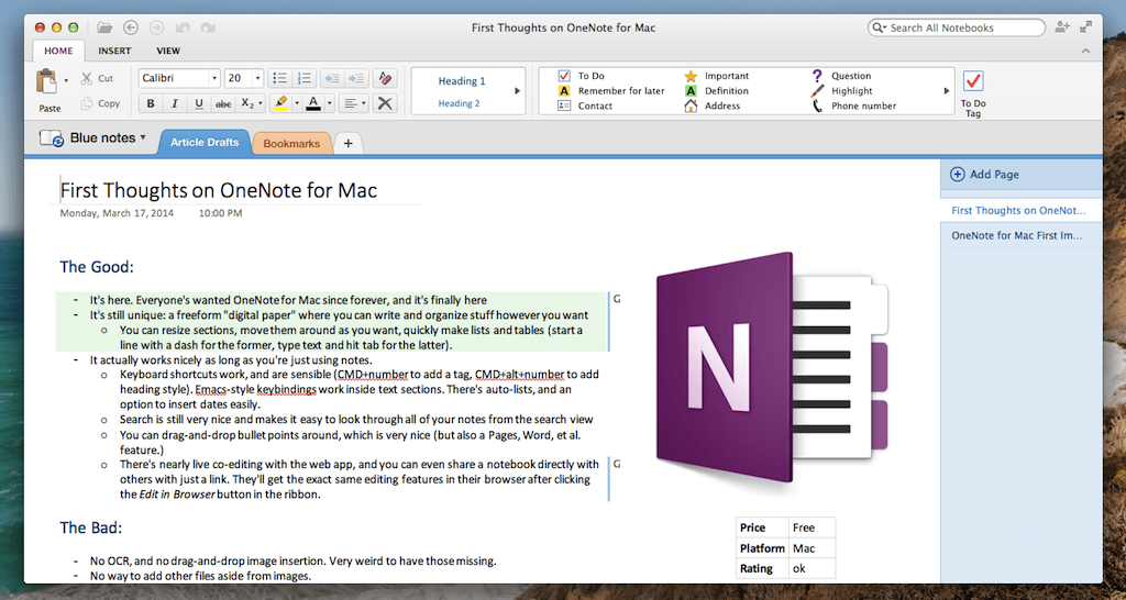
The best news is the most obvious: it’s OneNote, on the Mac. That means you’ll have unlimited notebooks with their own sections and pages—three layers of organization that should please the most visual neat freaks. It means you can click anywhere on the screen, and start typing right there, just like you can start writing anywhere on a piece of paper. You can resize sections, move them around at random, and generally make your notes entirely your own. That’s OneNote’s uniqueness, and it’s here in full on the Mac.
And honestly, the basics of using OneNote for Mac work quite well for the most part. Almost all OS X text editing keyboard shortcuts still work, including the text navigation shortcuts like CMD and ALT+arrows. OneNote will automatically turn dashed and numbered lines into lists, and you can drag-and-drop list entries around between levels to quickly rearrange your outlines. Type text and hit tab, and it’ll automatically turn that text into a table just like in OneNote for PC. There’s even sensible keyboard shortcuts for OneNote-specific features: CMD+number will add a tag to your text section, and CMD+Alt+Number will switch text to the appropriate heading style. Search works as great as you’ll remember from PC versions: you can select a search result and see that note without losing the list of other search results, as a quick way of filtering down to what you were looking for.
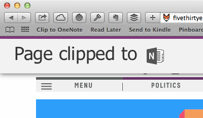
Then, there’s OneNote’s newfound online integration. OneNote for Mac is 100% based around OneDrive, Microsoft’s online storage service formerly called Skydrive. Your OneNote notebooks are saved there by default, so you can see anything you put in your OneNote notebooks and edit them online at OneNote.com/Notebooks or by browsing through your OneDrive storage. Microsoft’s opened the OneNote in OneDrive up with the new OneNote API that apps are already using to integrate with it. You can now email info to your OneNote notebook by emailing me@onenote.com, and can save stuff to OneNote with a bookmarklet or its new IFTTT, Doxie, and other apps integration. That’s a major new feature that’ll help OneNote actually be a drop-in replacement for Evernote and more.
Last but not least, there’s sharing. You can share any notebook with anyone by inviting them via email or just sharing a link with them, and they can then sync the notes with OneNote on their devices or just collaborate with you online. The OneNote web app is especially great for this: you can send a link to someone else, and seconds later they can be live co-editing your note document with you. OneNote marks the changes by the author, so it’s easy to see what’s what. Full read/write note sharing requires a Pro account in Evernote, so this is a tiny advantage for Microsoft (albeit not that huge since you could, alternately, just share a Google Doc and co-edit it in real-time already).
Wait, Really?
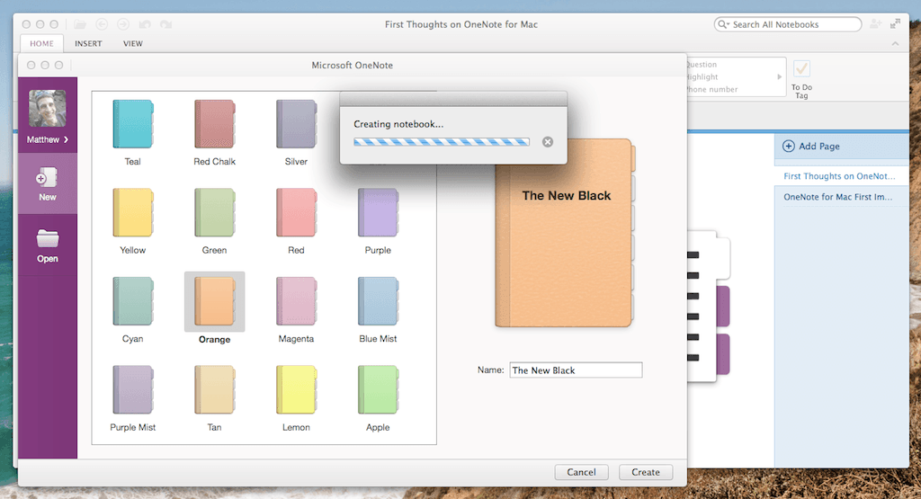
That’s the good parts. Then there’s the bad parts. As you may have just noticed, OneNote for Mac is cloud only, and there’s no way to open local notebooks or make new offline notebooks. You can use the app while you’re offline, of course—it’s not a web app by any means—but you’ll have to be online to make a new notebook, and OneNote will sync everything to OneDrive by default. That wouldn’t be so bad if the entire UI didn’t freeze whenever its contacting the server to create a new notebook or unlink an existing one, but that’s exactly what it does. It’ll sync notes just fine in the background, but add a new notebook and you’ll get a dreaded grey dialog while it’s contacting the server and doing its business. And, on the same note, you can’t delete a notebook in OneNote for Mac—you can only unlink it (you’ll have to go to OneDrive online to actually delete a notebook).
There’s also the bugs that’ll keep you frustrated if you’re picky at all. You can’t move a notebook page or section to another notebook. You can change the font of a section of text, but 9 out of 10 times when you type new text after that, the new text will be in the default Calibri font instead of the font you picked. Then, you can paste an image or plain text into OneNote for Mac, but paste formatted text and it’ll lose all of its formatting, and it will act like you did nothing if you try to paste anything else. You cannot, for instance, paste cells from an Excel spreadsheet or a chart into OneNote—something that makes its App Store marketing pictures look downright deceptive. And, to complete the pasting trouble, if you copy text out of OneNote and paste it into another app (Word, say) that text will also lose its formatting. It’s a rich text app that inexplicably acts like it can only input and output plain text.
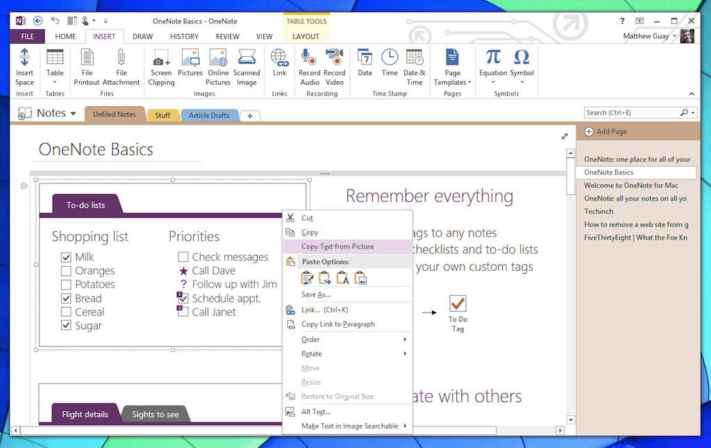
Most frustrating are the missing features. Shockingly enough, you cannot drag-and-drop an image or other file into a OneNote note. You can manually insert an image from the ribbon, but that’s about it. No audio or video recording, or any other multimedia integration. There’s no handwriting support—and definitely no option to turn handwriting into typed text—and no OCR support on images. In OneNote for PC, these are some of the best features. You can drag in images and it’ll automatically OCR them for search and even let you copy the OCRed text out of an image. It’ll do the same for on-screen handwriting. But on the Mac, these and so many other features (such as the option to have a small OneNote notepad hover over your desktop, or the note history viewer) are missing. Even the export features are missing, with the only option of sharing a PDF locked into emailing a PDF—and that doesn’t even work with most Mac email apps.
OneNote on Windows is packed with great features. The Mac version? Not so much.
The nearly Office 2010-style ribbon interface promises so many features—but go past the first tab, and you'll find that it might as well only have the first tab's options. There's hardly anything else. OneNote for Mac has feature parity with its web app counterpart—but its bugs if anything make it as frustrating to use as a web app, if not more so. And that's sad. There's so much promise, but for now, it's unfulfilled.
Conclusion
OneNote for Mac on its own feels like a beta—and compared to its PC counterpart, feels like a buggy demo app. And yet, it still has a lot of nice features and a nice enough port of the ribbon UI to the Mac that I’m hopeful Microsoft will rapidly improve it and at least bring it to feature parity with the PC. The PC version, combined with the new OneNote API-based integrations, is more interesting than ever, and we can only hope that the Mac (and tablet versions as well) reach feature parity soon.
And yet, even if it was a perfect copy of its PC counterpart, OneNote still isn’t for everyone. Its free-wheeling style has some neat uses, but it’s still something to get used to, something that can easily feel more confusing than the standard, orderly notebook apps that treat notes like every other structured document. I’d still likely end up using plain text files for notes, perhaps in Simplenote, and would supplement it with Evernote for clipping rich text and links.
If you’ve been dying for OneNote to hit the Mac, go download OneNote for Mac today. It’s free, and at least covers the basics. And if you’re curious about OneNote’s free-form notetaking format, it’s worth trying as well. But if you wanted offline notes, or OCR, or handwriting recognition, or easy ways to make rich notes with Office info and more, you’d be better off waiting to see if Microsoft improves the Mac version. And either way, be warned that everything’s not going to work quite right.
The good parts of OneNote for Mac—the fact it even exists, and looks decently nice—make me excited to see what Office:Mac 2014 will bring. The rough edges and dropped features, though, make me worry that Microsoft is treating the Mac like another tablet (read: light, feature-limited) OS that doesn’t need full-featured PC apps. That’d be a troubling future for Microsoft on the Mac if so.
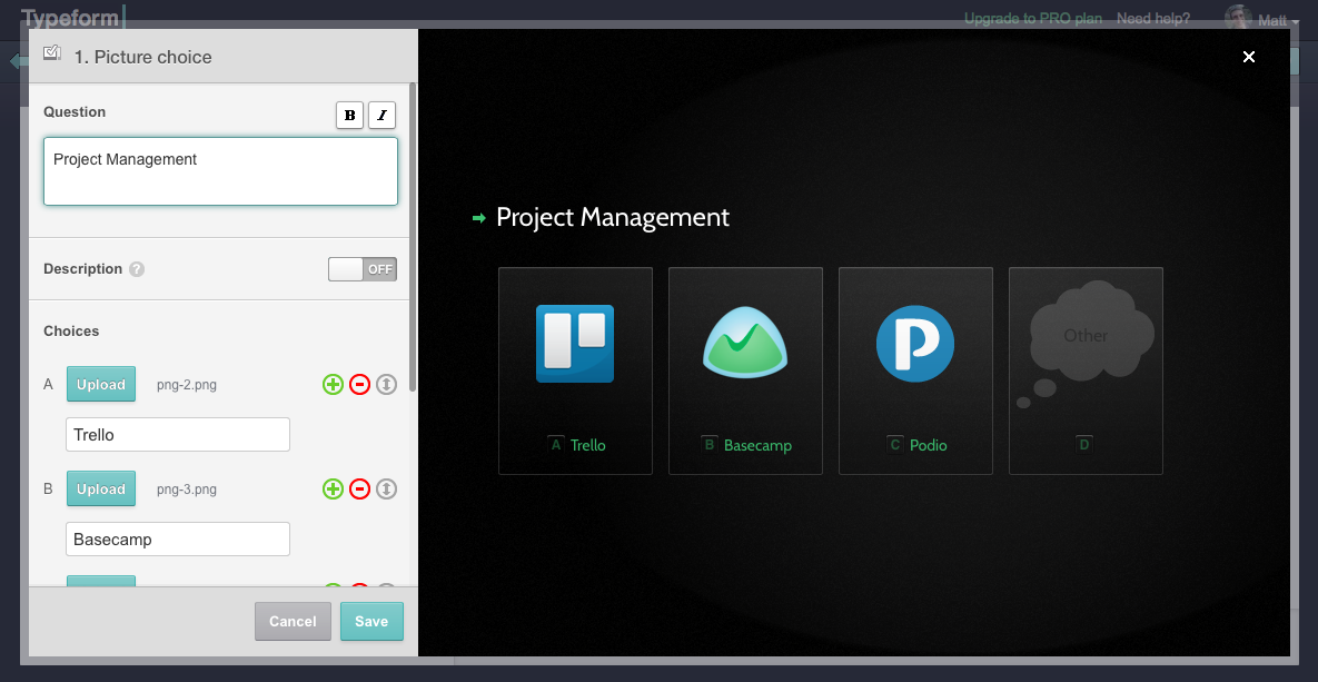
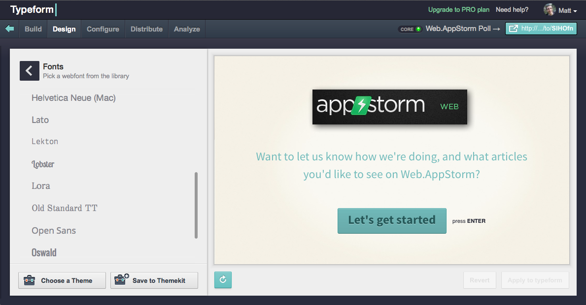
Typeform is a really, really great way to make online forms. So great, I just wrote a tutorial on Tuts+ that takes you through every feature in Typeform and shows you how to get the most out of your online forms. You'll learn how to make picture choice options, theme your form, add multimedia, and get beautiful reports and detailed analytics from your forms automatically.
So why wait? Go learn how to master Typeform—and get an exclusive coupon for 4 months of free Typeform Pro.
As usual, Stack Overflow has the answers you need when you need help with something geeky—this time, on removing old sites from your Google Analytics account. I've been annoyed with the old, now-dead sites that have filled up my Google Analytics front-page for far too long, and the option to remove them felt too hidden for me to find, even as a guy who teaches people how to use software for a living.
Thus, this tutorial. Stack Overflow user1997781 saved my sanity. And if you need to remove accounts from your Google Analytics, it'll save yours.
Considering switching to the Kirby, the flat-file CMS that powers Techinch? Then you'll need a new theme. And if you don't want to handcraft one—or want a clean theme to start out to make it easier to tweak it to your style without coding everything—then getkirby-themes.com is what you need. It's a directory of all the best Kirby themes—free and paid—and you're more than likely to find something there that'll strike your fancy.
Or, at least, you'll find inspiration for that perfect theme you're planning to build.
And if you're wondering, I'm still loving Kirby. Just can't wait for v2.0 and the new panel!
It’s one thing to know the differences between Arial and Helvetica, but crafting your own font? That takes it to another level entirely. It’d be a daunting undertaking simply to draw glyphs for every letter and character in an average font, much less to make italics and bold and other variants of each character needed to build a full typeface. And then, the tools you need to make a font are expensive—there’s the relatively cheap Glyphs Mini for $45, but then the full version of Glyphs will set you back $300, and the more well-known FontLab Studio costs $649.
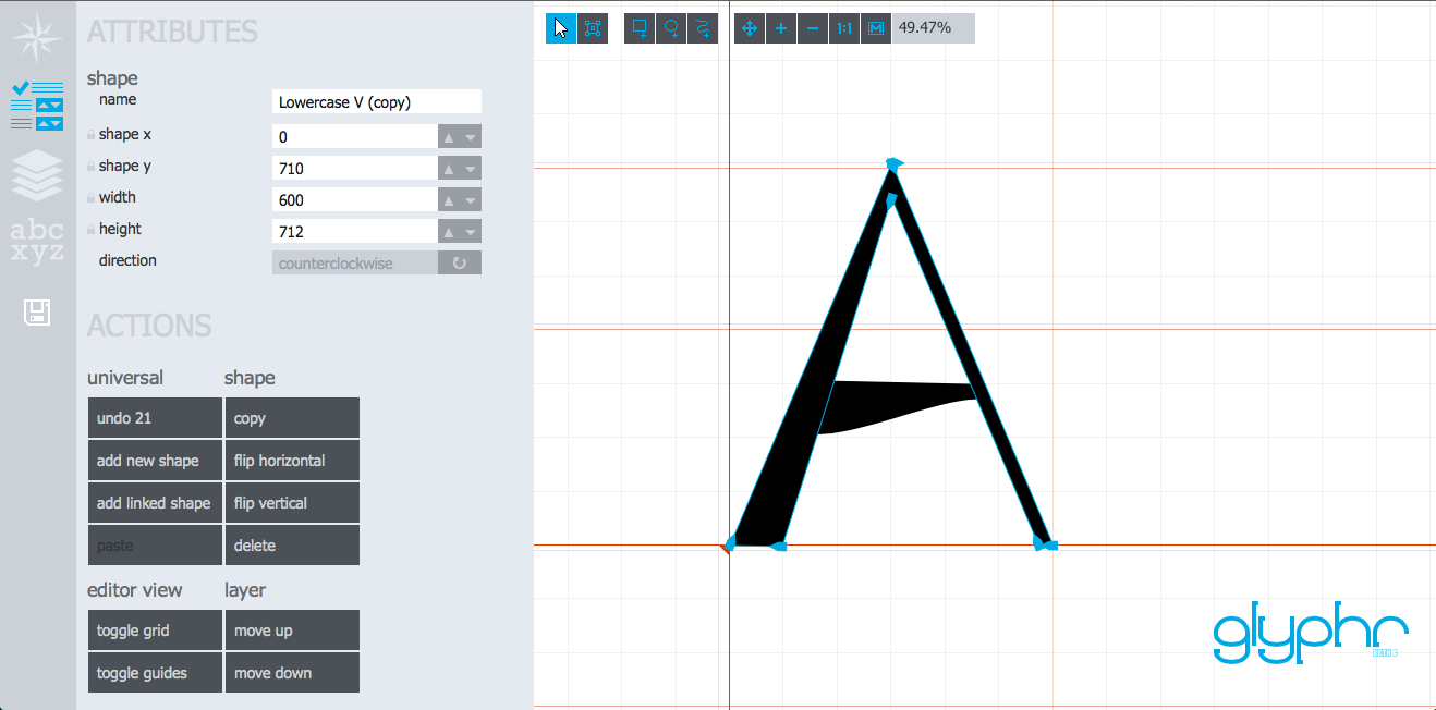
And then there’s Glyphr, a free HTML5-based vector editing tool for making your own fonts. There’s editing tools to create complex vector shapes with beautiful cubic Bezier curves. You can make the shapes you want, move, resize, and then reuse shapes across all of your characters. There’s even detailed settings for the size for the em width of each character’s spacing. You can open the default demo font and tweak away, or start your own from scratch. And despite the complexity of making a perfect new font on your own, Glyphr’s tools actually give you quite nice results with less effort than you’d think. It’s a really cool tool.
You won’t make the next Helvetica in Glyphr—it only lets you add each letter of the English alphabet and standard punctuation to your font, among other limitations—but to try out your font ideas and perhaps make a new logo font, it’s incredible. And you can even download the HTML and run it right from your own browser, offline, for free, or tweak the code to your liking. That’s pretty exciting.
Crafting each character in your font will still be a daunting challenge, but now, the tools to experiment with your font ideas are free and relatively easy to use. Have fun!
Online forms are predictable—predictably boring and annoying to use. There’s dozens of services out there, but they’re all so similar, the biggest difference is usually the pricing and plans available. No matter which you choose, your form’s going to look rather dated, force desktop users to switch back and forth from mouse to keyboard to fill out the form, and require finger gymnastics to fill out on mobile.
Ok. Perhaps they’re not that bad. But they’re almost that bad. And even the best seem to have changed precious little since the first web forms were introduced in the '90’s.
And then there’s Typeform. Launched in beta last year, Typeform takes a decidedly different approach to forms, making them both keyboard and mobile friendly at the same time, and—dare I say—beautiful. Typeforms are something you’ll have to experience to understand, so go check out Typeform’s demo form first, then come back and finish this review.
Impressed? I thought you would be.
Simple Doesn’t Have to Mean Basic
Making a Typeform isn’t that much different than making a form in any other online form app. You’ll drag-and-drop the sections you want into the form interface, adding in the descriptions and options, and linking parts of the form together with logic to direct your form users to different questions depending on their answers, if you want. The interface for making forms is nice—don’t get me wrong—but so is Wufoo’s interface.
But then dig deeper, and you’ll find more to be excited about. There’s options to add icons to your form options, making them more like buttons in an app. You can add a background picture to your form, include rich media including full-sized photos and YouTube videos, or customize the landing and exit pages with your company’s logo and links to your site. There’s detailed font and color options, with pre-made color palettes to pick from and options to save your own palettes to quickly make new forms in your company’s style. And the Typeform form interface is so light, your forms will blend into your site’s branding just by adding your logo and matching your brand’s typography and color choices.
Forms themselves are already very useful, but add in the extra image and customization options, and Typeforms can be used for so many different things—from interactive stories to customer surveys to promo landing pages to get people excited about your next app. The Typeform team even recreated the console from War Games using a Typeform.
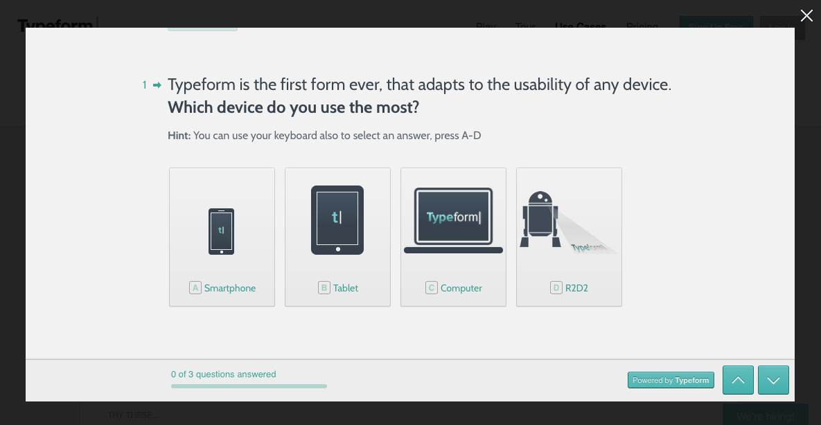
All of those different uses work so great with Typeform because of the unique way Typeforms work. As you’ve already seen in the demo, Typeforms only show one question at once, and already have your curser in the answer filed for you to type in your response without having to click anywhere. If there’s multi-choice options, Typeform shows letters beside each option so you can simply tap an option on your keyboard and immediately proceed to the next question. On mobile, the one-question-at-a-time view makes it equally easy to enter your answers without squinting at the options and trying your hardest to tap the tiny text boxes. Multi-choice questions are even more fun on mobile, since they’re easy-to-tap buttons that feel perfectly designed for mobile.
Filling out forms on your PC typically is an exercise in frustration as you try to click on tiny bullet points and tab through fields just hoping you don’t miss anything. And on mobile, filling out a form online feels like poking your way through a field of land mines—you’ll always end up taping the wrong thing. And in one fell swoop, Typeform fixes the biggest frustrations with forms on both.
Taking Your Forms Pro
There’s more, too. Typeform has an API so you can access your form data—or even create a form on the fly when the new Build API launches—with a few lines of code, and incorporate Typeform into your internal apps. There’s also the metrics and analytics you’d expect, including social network reports that show which network sent your form the most clicks. And as you’d also expect, you can embed Typeforms into your site or have them display in a separate window or a popover on your site, and you can have them email you anytime a form is filled out and export your form data to use in any spreadsheet app.
And then, Typeform’s pricing is equally impressive. There’s a free tier that lets you make unlimited forms with basic features, and then there’s Pro forms that let you add logic jumps and hidden fields to forms, remove Typeform’s branding, and soon will let you collect payments via Stripe, use icons from The Noun Project and premium fonts in your forms, and more. You can pay $10/form to create pro forms that’ll let you access your form data for a month, or you can pay $20/month for unlimited pro forms. Either option is very rarely priced, but the one-time payment option is especially great if you only occasionally need to make advanced forms.
Forms Worth Getting Excited About
I know it might sound a bit silly to get excited about a web form tool, but Typeform is really, really nice. You’ll never need to wait to fill out a Typeform form on your PC, since they’re so easy to use on your smartphone, and you’ll also be able to fill out Typeform forms quicker than ever on your computer with its keyboard shortcuts. That’s what’s really so surprising: it’s better on mobile and on traditional computers.
Typeform was refreshingly new when it was in beta and I had the opportunity to interview the Typeform team at AppStorm, and now that it’s open to the public, its polish and brilliant pricing plans make it the obvious choice if you want a new way to make online forms. It really is that nice.
And I’ve got something special for Techinch readers: for the next week, you can use the coupon code BLGtechinch when you signup for a Typeform account to get 3 months of Typeform Pro for free. Here’s your chance to make some awesome forms—or interactive stories, or something even more amazing—with the greatest new form tool. I’m sure you’ll enjoy it.
You can’t share more than 140 characters in a tweet, but that doesn’t mean you can’t include a lot more info than that. For quite some time now, links have been auto-shortened by Twitter, so they’ll each take up exactly 22 characters of your tweet, giving you more room to write. Images can also show in-line on Twitter.com and in most apps, so if you have another 22 characters to spare you can add a tiny preview picture to make your tweet stand out. And, of course, you can share your location, no extra characters needed.
Then there’s Twitter Cards. Since 2012, Twitter’s shown extra text, pictures, video, and more in-line when you expand a card that includes a link from a participating site. The New York Times, YouTube, and so many other sites support Twitter cards—but it’s still fairly rare for a link you tweet to show up with a full card. Most sites don’t just support it yet.
I’d assumed you had to be a Twitter partner or have some other special verification to get your site working with Twitter cards, but was surprised to find today that it’s very easy for any site to work with Twitter Cards. All you’ll have to do is add some extra info to your site’s header—including a special Twitter-specific page title, summary, and more—using the info you’ll find in the Twitter Cards documentation. Or, if you’re using WordPress, just install the JM Twitter Cards plugin and add your info through its UI. Then, you’ll need to go to the Twitter Card Validator, enter one of your site’s links, and make sure it looks fine as a Twitter Card. You’ll then see a button to request to get your site added to Twitter Cards, and after a short wait you’ll get an email saying it’s ready.
For me, it took less than an hour from the time I requested to get my site added to getting the email and seeing Techinch links with a full Twitter card. It may take a little while for new links to show up with their preview card, but soon enough, you’ll see the cards appear for your tweeted links even when they were shared months back.
Then, you can tweak and make your Twitter Cards even better. There's an option to add your own summary, a full sized image, live media (say, video or audio), and even a product card that can showcase a photo, price, description, and more about your products. If you're comfortable tweaking your site, there's plenty of ways to get your tweets showing as much info as you'd like—and you won't need any special treatment from Twitter to add them. Once your site's authenticated, it'll just take some tweaking to get the perfect cards you want.
It’s annoying how many network-specific integrations you need to add to your site these days—Google Authentication, Facebook page images, iOS touch icons, and now Twitter Cards—but they’re the extras that seem worth it. Twitter, at least, definitely seems worth taking the extra time to get integrated nicely, since it still sends so much traffic when tweets get popular. I'd wish Twitter would automagically parse the info from your site, no extra code required, but this is the price we all must pay to make links look nicer on Twitter.
And hey: when your tweets can get a boost of 200 extra characters, for only a bit of time tweaking your site’s code, that sure seems worthwhile.
It’s too easy to find info these days. Why remember the phone number for your favorite restaurant — or even take the two seconds to save it to your contacts — when you could just Google it again next time?
We’re so reliant on Google that it’s hard to imagine an internet without it. Non-techies are apt to sit down at a computer, type “Google” into the search bar on your browser, select the first link, and then search for what they’re looking for — even if said site is something that’d be easy to remember like the New York Times or the MLB.
And it’s not just about Google itself — google’s just an easy short-hand for search engine, one that’s an official English verb these days. So whether you Bing, DuckDuckGo, or Google, if you’re like me you likely do it far too much.
Search engine’s effect on our brains has been debated for quite some time, with Nicholas Carr asking in The Atlantic “Is Google Making Us Stupid?” half a decade ago, and the UCLA and CNN countering several months later that “Google does a brain good”. In reality, it’s hard to say it’s a good or a bad — we’re so reliant on search engines, we wouldn’t know how to function without them. Why would you remember basic facts when you could just look them up later? It’s the same rationale most of us made in school when we decided our teachers were crazy for having us memorize obscure names and dates, and it’s the same rationale we make each time we Google for something we’ve already looked up before.
We’ve outsourced our brains, without the slightest qualm.
I just argued in this issue’s first article that you should stop remembering where your files are saved on your computer, and search for them instead. Indeed, I think you should. Your computer’s smart, and you should let it do the heavy lifting for you and save your cognitive skills for more important tasks. But searching for the same fact on Google a dozen times isn’t smart.
So what should you do instead? Build your own Google.
Geeks reading this, don’t go fire up a server and start crawling the entire internet. Bad idea. Unless you’re Gabriel Weinberg, in which case, keep up the great work.
Instead, you should start saving everything that you’ll want to find again in the future to your own library. No, don’t just bookmark sites when you find them — instead, save the info you wanted to your computer so you can find it directly again without having to reopen a site that may or may not still be there. It’ll only take a second, and next time, you can search locally and find what you need with almost zero effort.
I’m going to recommend using Evernote — there’s a ton of other notebook apps that’d work great too, and even plain text files with the info snippet or PDFs if you want the whole site would work, though, if you really wanted to use something different. But Evernote has three major advantages that make it particularly perfect for building your own google: browser extensions that make it easy to save anything online to your library, apps on every platform, and — crazy as it may sound — integration with Google so you can find what you saved when you search online anyhow.
Here’s what you do. Whenever you need info about anything, Google it as normal. Find what you need, then hit the Evernote extension and clip just the part of the article you actually need and save it to your library. Keep doing that for a while, and at the same time put any other important info in your database as it’s convenient. Whenever you’d write something down, or file something away that’s not a typical file you’d put in your Documents folder, put it in your notebook. You can even get fancy and have IFTTT automatically archive stuff to your Evernote, if you want, or have Instapaper save your favorited articles to Evernote automatically. Basically, anything you think you’d ever want to find again, throw it in Evernote.
Now, after a while, you should be able to start trusting yourself to have info again. Search your computer when you’re looking for something, and Evernote’s results will start showing up more often than not. And hey — if they don’t show up in your search, it’ll take zero extra effort to search the web from your search tool once you’ve typed you’re query in.
Which brings us back to Google. The Evernote browser extension has a nifty extra that lets Evernote display search results from your own library right alongside your Google search results in your browser. If you’ve been saving everything to Evernote and still forget and Google for the answer, Evernote will still bring your saved result to the top and give you one-click access to the info you need without searching through search results.
Will this all make you smarter? I doubt it. Memorizing more data might make you smarter, but that’s a dubious proposition at best these days with so much data thrown at us in modern life. But it will make you a lot less panicked when the internet is out, and you’ll save a lot of time you’d otherwise have spent searching through search results or trying to rediscover data from links in your bookmarks that are long gone.
Originally published on October 29th, 2013 in Techinch Magazine Issue 7