“You should...commence the conversation by saying 'Hulloa!'” suggested the first phone book, New Haven, Connecticut’s The Telephone Directory. “When you are done talking, say 'That is all!', and the person spoken to should say 'O.K.'”
And so language changed, at least to start conversations.
As NPR summarized from Ammon Shea’s book The First Telephone Book, Thomas Edison favored starting phone calls with “Hello” while the more widely credited father of the telephone, Alexander Graham Bell, preferred “Ahoy.” The former won, perhaps thanks to early phone books, and Hello entered the global lexicon.
One century, Hello was almost exclusively an exclamation to draw attention to something and ask what was amiss. The next, Hello is the world’s most universal greeting. It’s hard now to imagine anything else taking that slot.
When names live on.
127 years after Edison and a phone book popularized hello, another generation’s innovator took the stage to introduce another communication medium. Podcasts, he called them, echoing a term coined at random a year earlier.
Everyone seemed to have a blog online and an iPod in their pocket in early 2004; put both together and an audio revolution seemed imminent. “All the ingredients are there for a new boom in amateur radio,” summarized Guardian writer Ben Hammersley. “But what to call it? Audioblogging? Podcasting? GuerillaMedia?" The second idea, improbably enough, stuck.
The world wide web promised everyone a virtual printing press. Blogs fulfilled that early dream of an editable internet where anyone could publish. RSS pulled those blogs together into an early, pre-social feeds of new things to check every morning. iPods and competitors popularized mp3 files, put audio in your pocket. A handful of random innovations coalesced into a new media.
While Podcast didn’t enter the lexicon with quite the force of Hello, language was changed, and a now-retired product name lives on in a portmanteau.
You can’t put the genie back in the bottle. It’s hard to imagine a world without a phone in some form, without the whole vocabulary of answering the phone and hanging up and saying hello. It’s equally hard to imagine the internet without some way to publish an audio series. The names weren’t preordained, but it’s easy to imagine the concept being invented regardless, of the inputs coming together into something resembling today’s phone and podcast.
Jobs didn’t invent the podcast, nor Edison hello or Graham Bell the phone. Innovation’s a tricky thing where at a certain level, everything’s a remix, a combination of inputs. But once things get pulled together into a new category, once they add new words to our lexicon, it’s hard to imagine a world before they were there.
And sometimes that future world gets imagined ahead of time.
The internet was always meant to be social.
Charles Babbage dreamed of computers, framed in the mechanical limitations of his day's technology. Ada Lovelace predicted programming languages ("A new, a vast, and a powerful language is developed for the future use of analysis...") decades before there were computers ready to speak them. Vannevar Bush visualized digital photos, hyperlinking, and modern notes apps, just as information overload started being a problem.
Social networks had one better. We acted like they were here before they were invented. "It will be where we social animals ... argue, meet new people, and hang out," predicted Bill Gates of the internet in his 1995 book The Road Ahead. "On the internet, nobody knows you're a dog," wrote Peter Steiner on his famous New Yorker cartoon two years earlier. Facebook and Twitter and even blogs were a decade or more away—and yet, here we were imagining what social networks would become.
"Many people are seeing the 'internet as a medium that can garner a great deal of feedback,'" mentioned Audible PR director Jonathan Korzen to the Guardian in that early post coining podcasting. That feels reasonable today, when you can @mention any brand on Twitter, share your thoughts with the world faster than you can fully think them through. And yet, at that time, getting feedback on your podcast wasn’t much easier than getting on feedback on a radio show. People could email your show, call a phone number if you listed one, perhaps leave a comment on the podcast's blog.
Perhaps social media didn’t have to look like Facebook, Twitter, WeChat, and TikTok. Maybe there was another way to connect humanity, a different direction we’ll discover someday. But social media is yet another invention that fills a need of connection that it's almost hard to remember the world without.
Twitter launched a year after Apple built podcasts into iTunes, while Facebook was still a closed community for university students. The concept of the internet making feedback easier was already there, one of the original promises of a connected world—we just needed a product to fill the need.
The inevitable categories.
The computer was destined to get invented—though perhaps it wasn't destined to look and work the way we know it today. Perhaps in an alternate universe, Babbage completed his difference engine and instead of folding screens we'd have windup phones. Maybe a different Steve Jobs would have come away inspired by Xerox Alto's portrait screen instead of its windowed interface and we would have always used smartphone-shaped screens.
It's easy to imagine ways computing could have evolved differently. It's hard to imagine computing never having been invented. Computers quickly became so crucial to modern life, that like the lightbulb and printing press and wheel, it's almost hard to imagine life without them. Their form may change, their function lives on eternal.
The implementations come and go, fads and fashions that fit a temporary need but were ultimately replaced by something different. Incandescent bulbs served for a time, LED lights fill their slot today, something else may take their place tomorrow. Indoor lighting—and the terminology of “turning on the light” lives on regardless. Photography is another crucial invention that will always be with us; film was merely a transitional means to an end, a way to take photos that was easily replaced with a more convenient technology.
These most crucial innovations change us, embedding themselves into the way we see ourselves, the way we talk about the world around us. As University of Southern California professor Vanessa Schwartz wrote in Aeon of how airports and jets changed society, "the greatest legacy is that the jet-age aesthetic transformed subjective experience itself, ushering in a culture that would soon conceive of the ‘networked society’ because human subjects could visualise being connected without being physically present."
Email, spreadsheets, databases, presentations, photo editors, and so many other core software categories have embedded themselves so deeply in work, it's hard to imagine them not existing, harder to imagine ways to change on the original idea and make something better. For all the ways computing has changed since the first personal computers, a spreadsheet on Google Sheets on your phone today would still look familiar to a VisiCalc user—and, indeed, to someone working as a manual computer on paper spreadsheets decades earlier.
"What is there in a name?" asked Charles Babbage, echoing Shakespeare. "It is merely an empty basket, until you put something into it." Once innovators fill that basket, put words in our mouths, it's hard to imagine that basket not having been there before. A browser was an animal who forages, looking among foliage for food, until software reinvented the word and made browser mean using the web.
Today's phone is far more than something to say hello. But the innovation of the telephone, that we could reach out and talk to anyone, anywhere, anytime, lives on, embedding itself deep enough in society that today we greet each other the way a phone book taught us to. Then came video calls, and just as quickly it's almost hard to imagine a world without them, whether as personal FaceTime and Messenger calls or team Zoom calls and Hangouts. Calls didn't have to be voice only; if anything, we expected them to gain video eventually. Technology just took time to catch up.
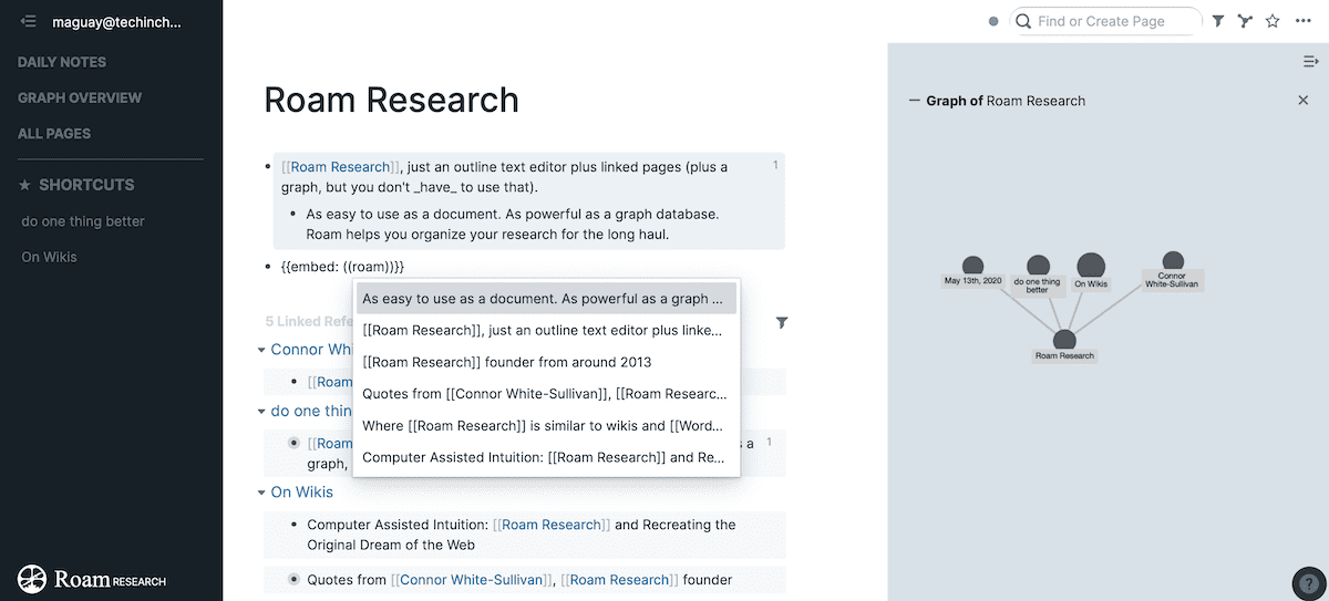
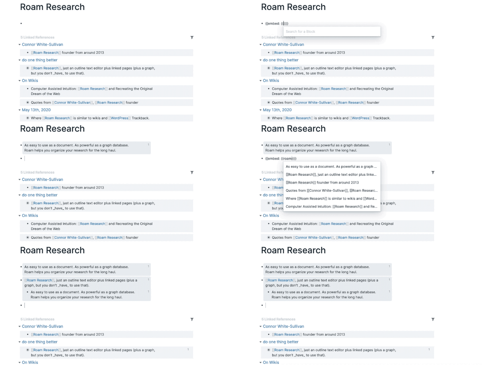
That's far from the last category to be invented, the last innovation to change language and human behavior. Bi-directional linked notes as the most recent innovation to pop up everywhere from Roam Research to Notion feel like the cumulation of the early dreams of the internet, much in the way social networking finally fulfilled how everyone imagined the internet would connect us. It's a new default feature, something that was missing before that is hard to imagine now not existing.
There are more inevitable categories out there to be filled. Once they're invented, we'll look back and wonder how we hadn't seem them as indispensable all along.
Originally published on the now-defunct Capiche blog on October 13, 2020.
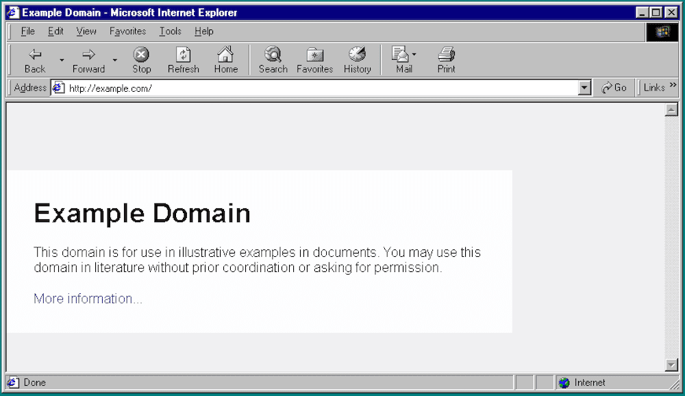
One day, Internet Explorer was nearly the only game in town, powering 96% of website visits at its peak in 2002. Then, quickly it turned into the app you only used to download Firefox or Chrome, or so the joke went. And then Internet Explorer died and turned into Chrome.
Empires rise then quickly fall in tech. One year, the web was merely a vision “about anything being potentially connected with anything,” as inventor Tim Berners-Lee put it before releasing the web in late 1990. 5 years later, Microsoft would bundle its Internet Explorer web browser with Windows—something the U.S. Department of Justice called anti-competitive in 1998.
From creating an industry to lawsuits over monopolizing said industry in under a decade may be a record. But that’s the web. Everything moves faster online, from the dot-com boom and bust to today’s smartphone-powered world.
“The Web is already so much a part of our lives that familiarity has clouded our perception of the Web itself,” wrote Berners-Lee in 1999, something far truer decades later. It’s almost hard to remember a world without browser and tabs and bookmarks.
The web and browsers didn't simply change computing. They changed us, forever.
Reinventing language.
First the web changed language.
Browsers were cows grazing in the field. Humans looking through shelves for the next book to read bore a passing similarity, so they in turn also were called browsers.
Then came the internet, and it’s hard to imagine browsers as anything other than apps to access the web.
We needed something to call the app we’d use to access the web, and the groundwork had been laid years before. InfoWorld in late 1983 mentions a reader as a “browser,” but earlier that year the rebranding had started in an article about the latest Smalltalk, a new programming environment from Xerox’ PARC laboratory.
“The programmer’s display lets you write a program in a window referred to as a ‘browser,’” explained InfoWorld writer John Markoff. “When the program is complete, you can select a menu item that compiles that text without making you save it to disk.” No files, no saving, just browsing.
That idea stuck around for naming other software for viewing things. Dr. Dobb’s Journal mentioned Browse command to view files without editing them as a File Browser in 1984. And by 1987 when Microsoft was rumored to build a HyperCard competitor, Robert Cringely said "It's called Browser, appropriately enough.” Browsers were mainstream years before the web needed one.
Browsing in its original sense was part of Tim Berners-Lee’s original inspiration for the web, with the Victorian-era book Enquire Within Upon Everything. The early single-volume encyclopedia was “a portal to a world of information,” reminisced Berners-Lee, covering “everything from how to remove clothing stains to tips on investing money.” It was a hardcover internet for an earlier age, where a young Tim browsed for information.
Browser alone was too restrictive a term for Berners-Lee, who envisioned the web as an interactive place where we’d read and write the web together. So he called WorldWideWeb a “browser/editor”—but the portmanteau was not for long. “As soon as developers got their client working as a browser and released it to the world, very few bothered to continue to develop it as an editor,” mourned Berners-Lee in his book Weaving the Web.
Browser stuck. And along with the name, the idea of the web as somewhere we scroll through content—browsing instead of creating—would stick until web apps reinvented software on the web.
That’d hardly be the last word the web would change. The Web itself was borrowed from what spiders weave. Sites were locations, until they became locations on the web. Links were parts of a chain, until they became underlined text. And now there’s an entire Urban Dictionary filled, in part, with words we’ve collectively invented and repurposed on the web.
Rapid iteration.
Then the web changed the way we work.
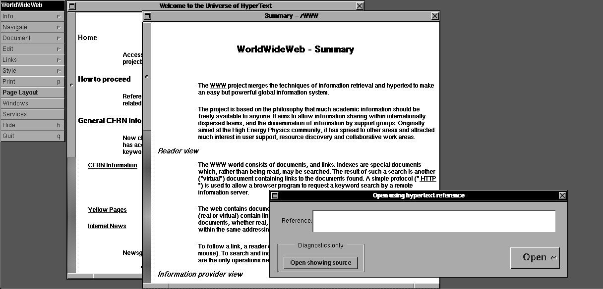
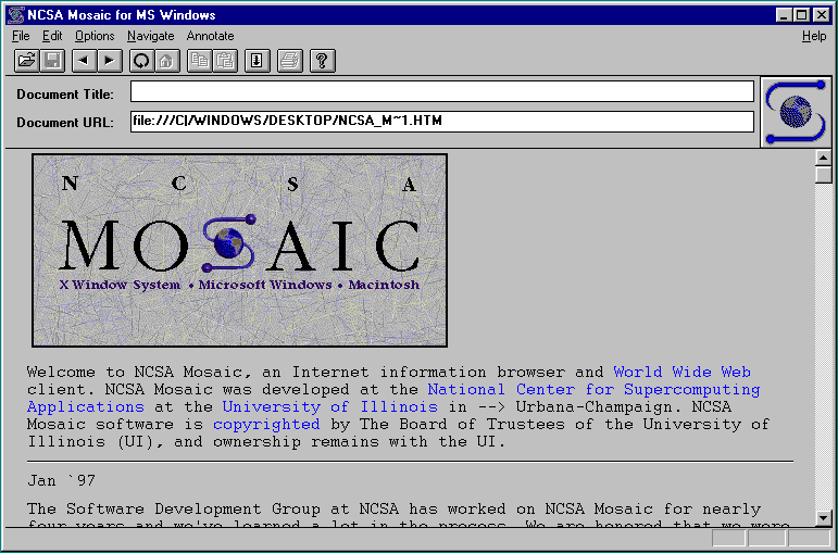
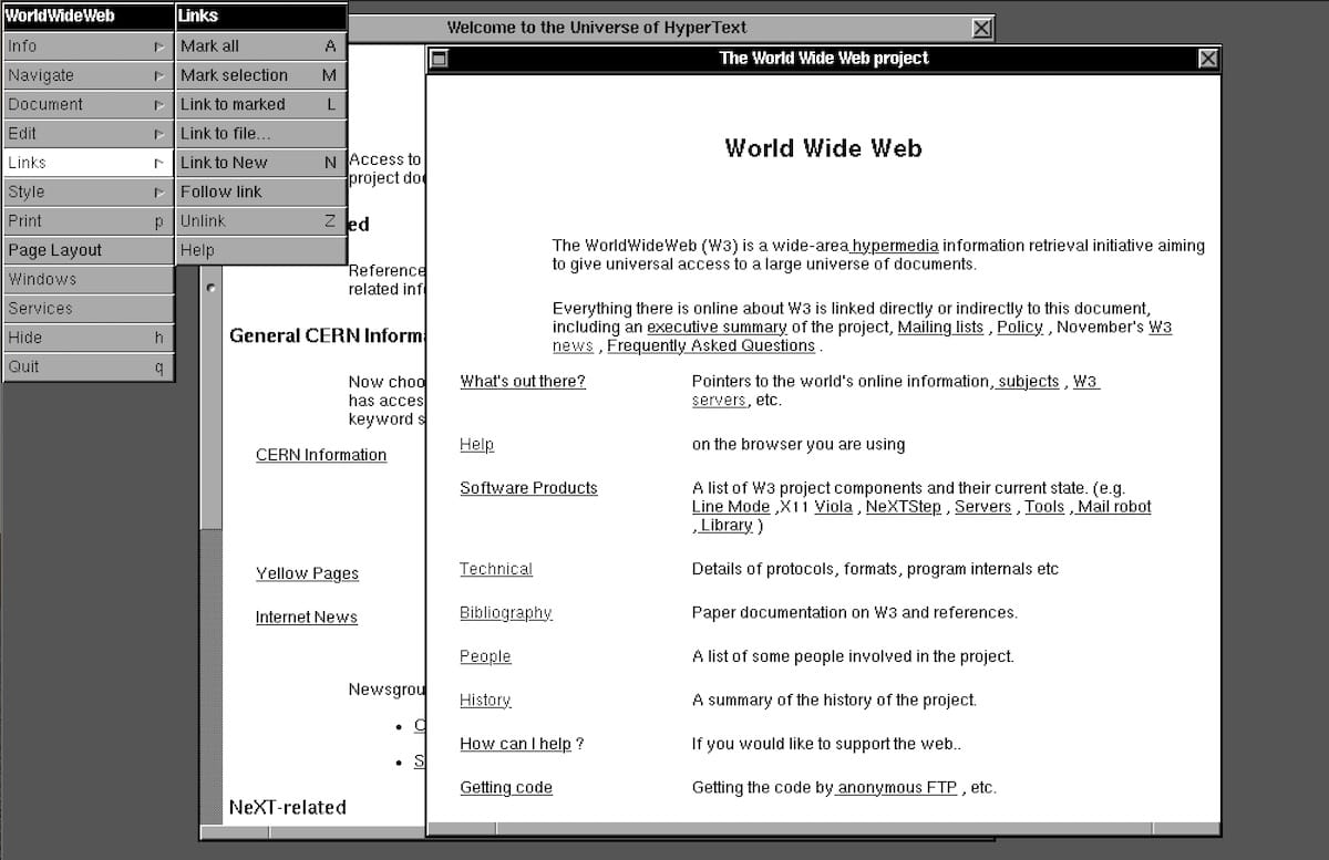
WorldWideWeb was a quite basic reader, a proof of concept for Berners-Lee’s hyperlinked text ideas. You could read and edit HTML pages, but you couldn’t embed photos or other media. The students at the University of Illinois demanded more. Thus came Mosaic as a project from students, where the National Center for Supercomputing funded the browser that made the web popular.
Mosaic turned the web into a magazine, with in-line photos and fancier layouts. You couldn’t have built Netflix or Spotify just yet, but the seeds were planted with embedded media. The web wouldn’t just be a collection of static documents.
Mosaic was also the original downloadable app. If you already had a browser, you could download Mosaic and install it on Unix, Windows, or Mac, for free, an early glimpse of the app stores of the future.
And that’s what changed the world. Mosaic wasn’t just software that stayed the same, as traditional boxed software had up until that time. It evolved quickly, in an early example of the rapid iteration and continuous release cycles web apps would later bring to software development, that would then spill over to the continuous news cycle in media.
“Marc maintained a near-constant presence on the newsgroups discussing the Web,” recalled Berners-Lee of Marc Andreessen, one of Mosaic’s developers. People would ask for something, he’d add it as a new feature and release it, then iterate on their next feedback. Each new feature increased Mosaic’s popularity. Why stick with the same old software when a better version was a click away?
That set the tone for decades of web development. When your competitors are only a tab or download away, you can’t afford to not listen to users. Give them what they want and they’ll give you a near-monopoly—until someone else meets their needs better, and your app will be an also-run.
“Marc, more than anyone, appeared interested in responding to users’ wants,” said Berners-Lee. Thus fancier web pages were in, editing was out, much to the web inventor’s frustration.
Then somehow, it came full circle. As Gary Wolf noted in Wired, after seeing people experience the richer web in Mosaic, “Almost every person who uses it feels the impulse to add some content of his or her own.” Editing would still be a core part of the web, from original homepages on Geocities to WordPress blogs, Facebook status updates, and every new work file in G Suite and Figma and more. It would just come from apps on the web, rather than from the browser itself.
Rethinking everything.
Then the web changed everything.
Mosaic died. The NCSA funds dried up, leaving the university to license Mosaic to other companies. Andreessen went to look for a job, linking his resume in Mosaic’s About page as an early personal growth hack.
AOL had a proprietary network, with publishers like National Geographic and the Smithsonian. Early Apple employees started General Magic and built an early smartphone-like device, with a custom AT&T-powered network.
The web was nice, so the thought went, but the future was custom networks run by media companies. The web got the idea started, but it was bound to be an information superhighway, a better TV.
So Andreessen, along with Jim Clark of Silicon Graphics, got the idea to make interactive TV—only it turned out to cost 10s of thousands of dollars per household. They considered connected gaming—but that was years away from working. “It was illegal to do commerce on the web until 1993,” as Andreessen recalled, but once that changed, maybe the web could work with a more powerful browser. Nothing else seemed to.
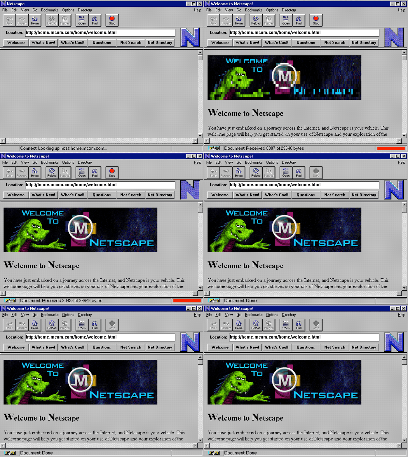
“It wasn't until deep into the planning process that they decided that by improving the browser to make it secure, more functional, and easier to use, they could make the internet the network of the future,” recalled early Netscape employee Ben Horowitz. “And that became the mission of Netscape.”
Netscape turned the web into a business, kickstarting the dot com bubble when the year-old company was suddenly worth $3 billion after its IPO. The web was here to stay, and with it the tech startups that would dominate the NASDAQ over the coming decades.
WorldWideWeb threw away the assumption that information couldn’t be connected, Mosaic that information had to be plain, Netscape that the web was only for academia. And along the way, it brought Javascript and interaction to the web, and SSL encryption for secure transactions, paving the way for web apps.
Rebuilding software around the web.
Rebuilding your core product around something that was invented merely 5 years earlier would be madness in the analogue age. But once the web sped everything up, there was little else to do. Adapt or die.
“The Internet is a tidal wave,” wrote Microsoft founder Bill Gates in 1995. “It changes the rules.”
Aol would go on to embrace the web, acquiring Netscape in the process and turning its network into a dial-up internet service. Microsoft would embrace the web so fully, it rebuilt the Windows desktop around the browser.
First they licensed Mosaic, used it to build early versions of Internet Explorer, and bundled them for free with Windows. Then they combined the two with Windows 98 and Internet Explorer 4. You could put parts of websites on your desktop, and use the same interface to browse your files or websites. The web wasn’t just another app, it was a core part of your computer—an early hint of what the web-only ChromeOS would offer decades later.
Web apps were still basic, with Hotmail’s online email and Amazon’s online checkout as state of the art. So IE also added browser extensions, to build mini-apps that lived in toolbars and could add extra features to websites, laying the groundwork for multi-million dollar businesses built as browser companions.
We’d grow to hate the stacks of toolbars, yearn for a simpler web. But the idea that software development would revolve around the web stuck, enough to uproot Microsoft’s dominance in desktop software.
“Our work moved developers from Win32 API, Microsoft's proprietary platform, to the Internet,” said Horowitz of the Netscape team. Ironically, Microsoft itself did the rest of the work, fueling the web’s growth while hastening Windows’ demise at the same time. Decades later, it’s increasingly rare to see business software developed for anything but the web.
Removing everything else.
Microsoft’s Internet Explorer won thanks to a combination of new features and bundling with most new computers, both Windows and Mac. Then it got complacent, shipping Internet Explorer 6 in 2001 then waiting five years before making another browser.
The rapid iteration that fueled Mosaic, then Netscape, then IE’s rise had come to a stop. Perhaps we’d be content with desktop software after all.
Then the Netscape team regrouped, built Firefox, and turned Internet Explorer into just a tool to download a better browser. It was fast, with features like tabs and popup blockers that tamed the web, and let developers build extensions that made it an increasingly better browser.
Then Steve Jobs decided Apple should build a browser. “The focus would be on one thing: Speed,” recalled engineer Ken Kocienda. “Steve wanted our browser to be fast, really fast ... much faster than Microsoft Internet Explorer, the product we aimed to replace.” So they forked KHTML, a Linux browser engine, turned it into Webkit, built Apple’s Safari browser, and put the internet in our pockets.
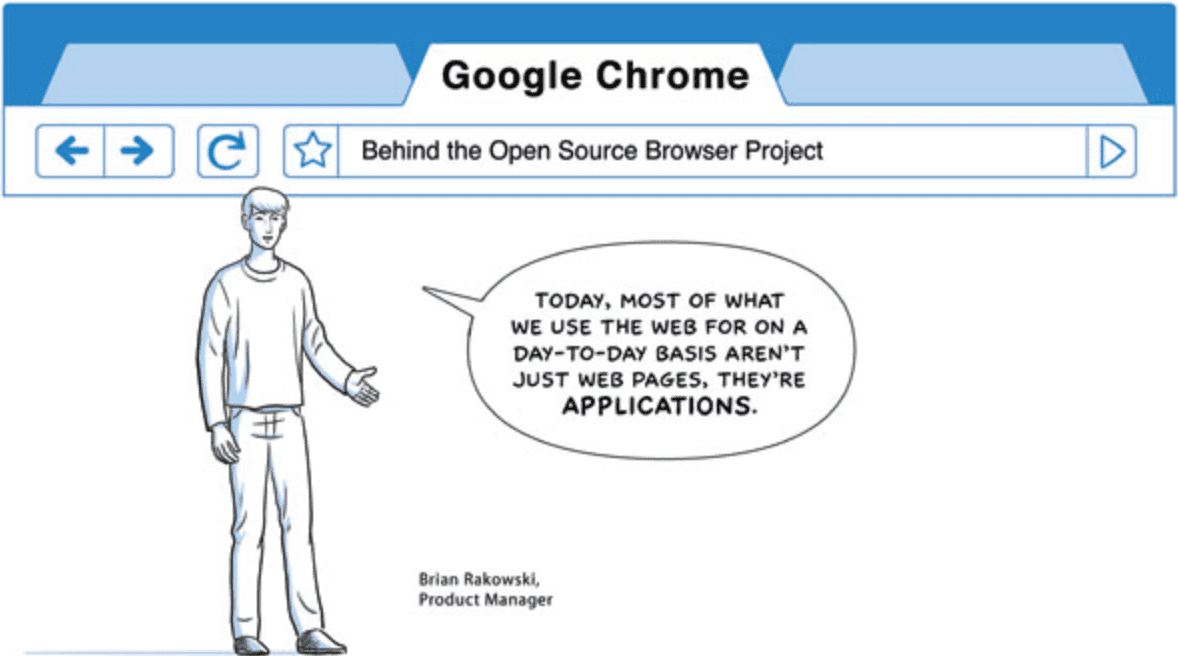
Webkit, in turn, provided the groundwork for Google to build Chrome. The search giant forked Webkit’s rendering engine, added a faster Javascript engine to make the browser better for apps, and removed everything else. Google named the browser after the UI chrome surrounding the web, then ironically removed most of it. Gone were the toolbars that cluttered IE, and the titlebar that announced the site’s name. Gone, too, was the Google search box that had become a secondary address bar ever since Firefox added it.
Chrome had less chrome than any other browser, left the focus on the web. You searched and browsed from the same box, with extensions relegated to tiny icons. Everything else was the web.
And that stuck. Today, every browser generally looks the same, with a unified address/search bar, extensions as small toolbar buttons, and site names in the tabs. Nearly every browser works the same too: Webkit still powers Safari, its forked Blink engine powers Chrome, Microsoft Edge, and Opera, while Firefox alone has a truly unique rendering engine. And every browser now supports similar web extensions, as Google’s simpler extensions became the default way to add features to the web.
Somehow, by removing everything other than the essentials, Chrome won the browser wars. It was the web all along that we wanted, as a platform for sites and positional software. Everything else was just extra.
Seasons change.
Market power on the internet is a fickle thing.
World Wide Web was the only browser. Then Mosaic quickly became the crowd favorite, before being eclipsed by Netscape, the competing browser built by one of its founders.
Microsoft’s Internet Explorer had 33% market share when the DOJ accused them of anti-competitive practices; it would go on to peak at around 96% market share in early 2002. Then came Firefox as Netscape’s revenge, gaining over 30% market share in 2009 before Apple’s Safari paired with the iPhone’s popularity gave it over 20% share in 2014.
Now, it’s Google’s world, with the search giant’s Chrome being used by over 70% of people on the web and the technology behind it powering Microsoft’s latest browser.
Today’s browsers are the ultimate remix. They’ve come and gone with surprising speed, each successor picking up the best things their predecessor introduced and adding new twists. And they’ve remade the world in their image. We now expect free software updates, tabs and bookmarks, and software companies being worth billions overnight. We’re used to tech-infused language changing how we communicate.
300,000 people are on Superhuman’s waitlist, while 95,000 requested a Hey invite before it launched—both in pursuit of a more productive email experience. Enough people paid Roam Research from $15/month to $500 for 5 years that they hit $1 million in ARR only 6 weeks after launching paid plans.
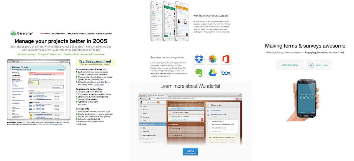
Give people a new productivity tool, and they’ll show up in droves. And woe betides if you take it away. There were more Hacker News comments about Microsoft shutting down Wunderlist than about any other thing the to-do list app had ever done.
Something entices us about productivity software. Not that most of us directly measure our productivity enough to know whether something actually makes us more productive. But with ever-growing to-do lists and inboxes nowhere close to zero, attaining peak productive tantalizes the imagination. Surely that new app will be the one to make us productive.
If only.
“Capital cannot be substituted for labor. Nor will new technology by itself generate higher productivity,” wrote management consultant Peter Drucker in 1991. Time hasn’t proven him wrong.
In pursuit of productivity.
When we say we want to be more productive, enough to switch tools and workflows, we’re wanting to get more done, feel more accomplished at the end of the day.
“Efficiency is about doing the same with less,” wrote Bain partner Michael Mankins. “Productivity is about doing more with the same.”
More on its own, though, isn’t enough.
A better notes app might help you write more notes. A better to-do list app might get you to list more stuff. A better email app might help you hit inbox zero, and email everyone you’ve met.
“To really improve productivity, you first have to … understand what work actually drives value,” wrote Ryan Fuller in HBR. Former Y Combinator president Sam Altman agrees: “Picking the right thing to work on is the most important element of productivity.”
Quality tempering quantity.
It’s not in answering every email, or checking off the most tasks. Its in answering the emails that need replies, focusing your to-do list on the tasks that really need done. And no software can do that for you.
“There's Productivity in its true, perfect form. It's an elusive ideal to strive for, one that involves both quantity and quality,” wrote @osbennn in a recent Capiche discussion about productivity. “And then there's #productivity, the over-obsession that people and organizational structures often have with measurable output.”
And #productivity is far easier to focus on than Productivity.
The real job to be done.
When Drucker analyzed productivity nearly 3 decades ago, “splintered attention is more and more the norm” he wrote even then. It was the tasks we assign today to #productivity software that he saw as the enemy of true productivity.
Nurses spent only half their time doing the tasks they were trained to do—and the remainder doing administrative tasks. Salespeople spent more time entering data in computers than talking to potential customers. Professors spend time in committees and meetings rather than lecturing and researching.
“It is job impoverishment,” lamented Durker. “It destroys productivity.”
A better to-do list for nurses’ administrative tasks, or a better notes app for professors’ meetings would be a best a minuscular boost to their productivity, at worst make them spend more time doing work about work instead of actual work.
“The cure is fairly easy,” he prescribed: “Concentrate the work on the task.”
The true productivity software are the tools for your job.
And that is where technology and software can help, albeit perhaps not the software typically called productivity software.
Better productivity software won’t make one a more productive photographer, for instance. A camera that leads to fewer missed shots might, though, as would photo processing software that works faster.
Better code editing software that catches missing brackets and commas, or better continuous integration and testing tools, might make a developer more productive. A new list of issues likely won’t.
A better email app might make a salesperson or support team member faster at landing and helping customers. Text expanders might make replying faster, better documentation tools might cut down on emails in the first place. For everyone else, inbox zero might be a pursuit of merely #productivity.
The real productivity software is better tools for your core work.
When you spend hours a day on the thing you trained to do, better tools should help you do more in the same amount of time. That’s real productivity—not #productivity.
“Productivity isn't a goal, it's a byproduct,” said @qthdh in the Capiche discussion about productivity. “And the more you think about it the less you are actually living it.”
Software to remove the busywork.
That’s the genius of Google Docs, Figma, GitHub, and other modern creative software. They gave the software we use to create things superpowers, turned them into positional software we’d want to use. By building a better version of software we use to write and design, then adding collaborative features, they save time and help us get more done. They reduced the amount of time we spend working about work—copying and pasting, emailing files back and forth for revisions, and merging final copies—and let us instead focus on our core job. That’s how modern SaaS has brought the most productivity gains, by freeing us from the additional tasks that computers so often add.
Perhaps we have the software classification backwards. It’s tools like these—the best versions of the software that help us do our jobs each day—that are the real productivity software. And when we’re looking for productivity gains, we’d likely find the most gains in better tools for our core work rather than in #productivity software.
The to-do lists and notes apps and everything else classified as #productivity tools can still help, if you use them to prioritize. But the tasks and notes aren’t the work—and better tools to manage them will, at best, help your busywork.
“I’ve learned that I can’t be very productive working on things I don’t care about or don’t like,” wrote Altman. No one likes feeling behind, enjoys the dread of missed deadlines and overdue replies. So perhaps it’s that fear of facing those things we enjoy least, the work about work, that make us seek out #productivity tools to replace email apps and to-do lists we’re tired of reminding us we’re behind. What we actually need to do is prioritize and focus on the work we set out to do.
Inbox zero might only matter if there’s nothing more important to do.
Originally published on the now-defunct Capiche blog on July 31, 2020.
A bridge I drive over regularly has been under construction for the better part of a decade. One lane closed, then the next, then two lanes at a time. On and on the construction dragged, until it seemed that the bridge was doomed to perpetual roadwork. And so every time the road would back up with traffic, we blamed the roadwork, blamed the bureaucracy, blamed what we perceived as incompetence or mismanagement of resources or whatever buzzword of the day came to mind to explain the decade-long boondoggle.
Then a few weeks ago, the bridge opened up. First one lane, then the next, with black asphalt and sharp paint dividing the lanes. At last the decade of construction has come to a close.
The traffic has not cleared up at all.
There’s a side road that feeds into this more major road two blocks before the bridge, a two-lane road with more traffic than you’d expect. It needs a red light, or at least that’s my new prescription, as I realize that it’s the cause of the traffic more than the construction ever was. The main road still backs up, more or less the same as before, only now it clears up once you’re past that artery and it’s smooth sailing over the bridge. And I can’t help but feel that we placed the blame on the obvious problem, on the ongoing construction and what we perceived as the worst of bureaucracy and problems that drive on forever, when the real problem was there in plain sight.
Now I have to wonder if a red light was added to the feeder road that now is the apparent traffic problem, would the traffic actually clear up? Would our commute times go down, or would we just trade a traffic slow down for a red light slow down? Or would we discover another bottleneck somewhere else along the road, something else to continue to remind us that we are the traffic, that the true problem lies at an entirely different spot than what we perceived?
It was easier to have the bridge to blame. A scapegoat for what’s likely due to city planning or the a lack thereof, to a booming population, to the very things that attracted us to the area in the first place.
I think that applies to more of life than is at first apparent.
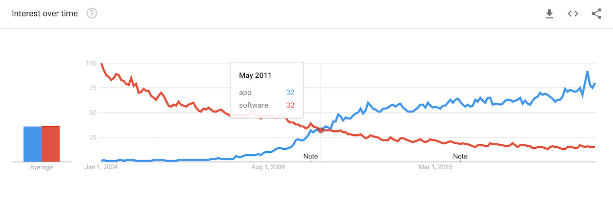
For the first time, the same number of people searched for app as software, ending software’s decades-long reign as the popular term for the stuff we run on computing devices. Program, application, software, applet, all replaced with a three-letter-word.
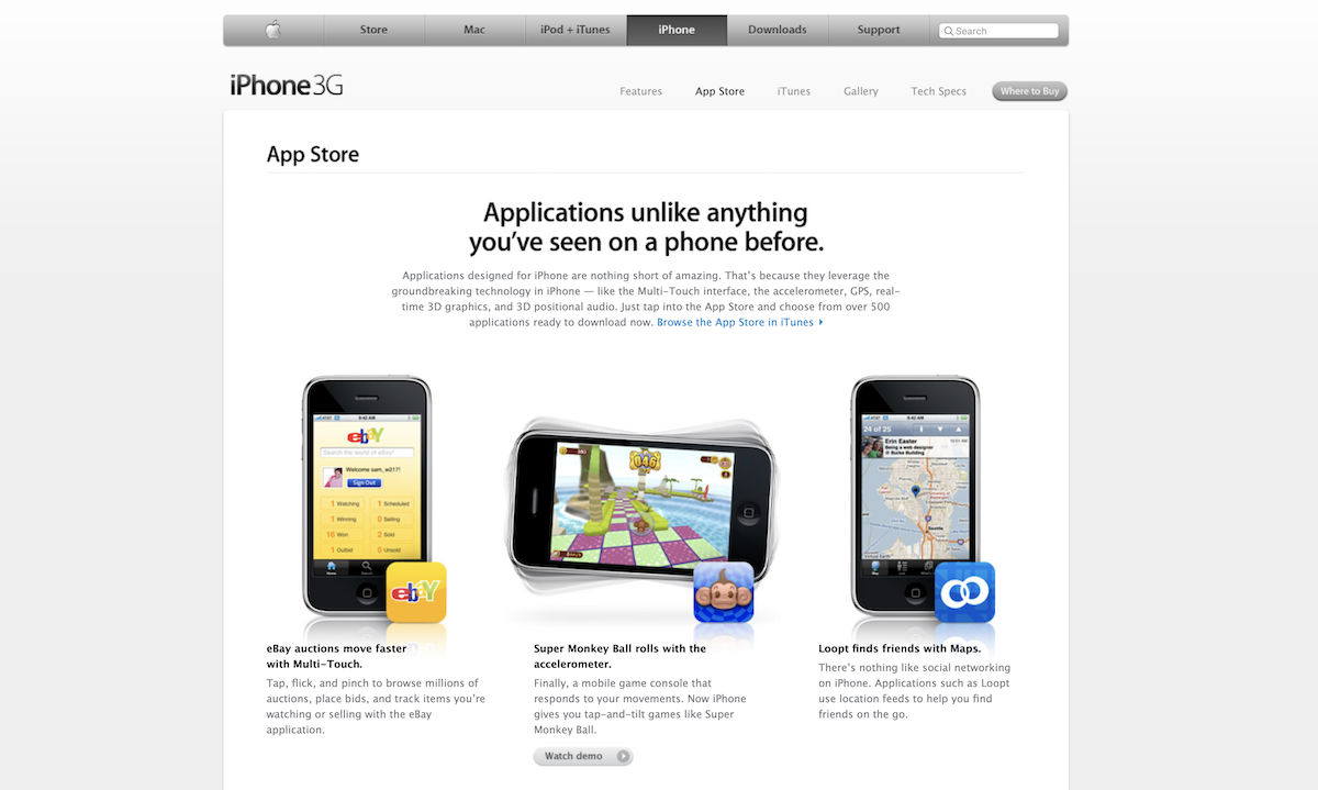
When Steve Jobs unveiled the iPhone App Store in 2008, it not only changed mobile development, it also changed the way we talk about software. Suddenly software invoked the old, boxy, expensive desktop relegated to the office desk. App invoked the new, the future, the next big thing you downloaded and tell others they should try. Software’s never been the same.
Yet perhaps software was the branding misstep. Apps were the software we were supposed to have all along.
What is software?
Software is “the programs (or series of coded instructions) and other operating information used by a computer”, or so says the Oxford dictionary.
Applications, then, are “a program or piece of software designed and written to fulfill a particular purpose of the user.” And app is a shortened form of the word.
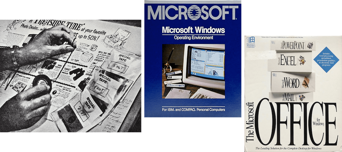
Software does everything, the more at once, the better. You wanted the most bang for your buck when you bought software in a box. Even a single program wasn’t enough—Microsoft Office, Adobe Creative Suite, and more came as a bundle. You installed one thing to do everything.
Apps do a single thing, something that makes perfect sense on mobile with smaller screens and lower priced programs. A clock program might seem ridiculous on a computer; a clock app that does nothing more than tell the time seems normal on a phone. One app, one purpose.
You might then string them together. Text your friend about grabbing dinner, then open Yelp to find a good spot, tap a link to Google Maps to get directions, then tap their phone number to open your Phone app to make a reservation.
“There’s an app for that” wasn’t just a slogan. It restated an early philosophy that dated back before personal computers, to “make each program do one thing well.”
And with that, mobile apps brought computing back to the original Unix philosophy.
One thing at a time.
Long before there was a computer on every desk, much less every pocket, the Unix philosophy in the 1970’s declared, essentially, that apps should:
Do one thing well, so you build new apps instead of adding new features.
Speak the same language, so one app's output can be another’s input.
Iterate rapidly, so developers can test and discard anything that doesn't work well.
Lighten tasks, even if that requires building new tools to support the original idea.
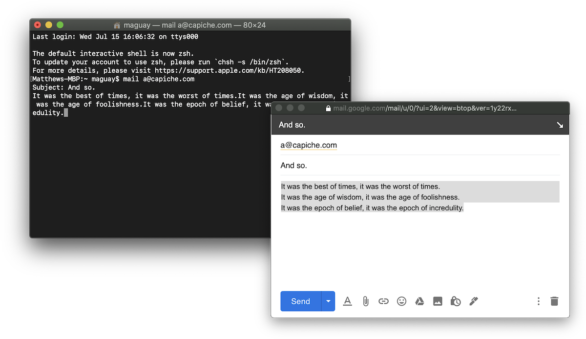
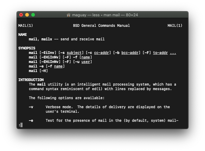
Original software was simple, partly out of necessity, partly by design. There wasn’t much need for folders and tags in the email app, the mail command that still lurks in Terminal today. All it needed to do was to send and and receive email.
The Unix philosophy said that was enough for one program. Imagine you wanted to send an email newsletter. Unix said don't add a feature. Instead, you could list your email addresses in a text file, your email body in another, and edit both with vi. Then you could make a new program that would read both files, and send individual messages using the sendmail command. You don’t need to reinvent the wheel; you only need to invent the one new missing thing. You’d move fast without breaking as many things.
Decades before there was an app for that, there was a command for that. You’d string commands together to get work done.
Software interfaces abstracted it all away. Perhaps internally, they would still use the same commands to send mail and do other tasks. But to the user, the software was a monolith, a black box that did it all by itself.
Software that never sleeps.
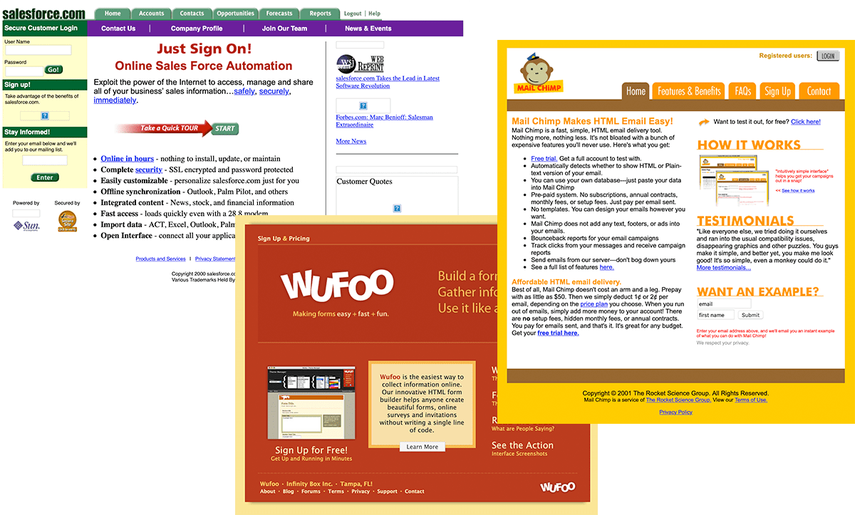
Then Hotmail showed up in 1995, Salesforce in 2000, Google Docs in 2005, Dropbox in 2007. The web app race was on. Everything that could be done on the desktop could instead be a web app that worked on every computer.
Web apps took software back to their roots, again at first by necessity. They were simple tools focused on one thing at a time.
They started as a way to to build cross-platform software that worked equally well on Windows, Mac, and Linux (and mobile, once that revolution came along). But web apps quickly found their core competency as collaborative software that was better since it could be used together. The web apps built around collaboration took off and turned into positional software, business software that, for once, went viral.
Those web apps were, increasingly, built Unix style on the backs of other, simple apps. Code running on Amazon EC2 fetching data from S3, authenticating users with Google and Twitter, sending SMS messages with Twilio and emails with Sendgrid, accepting payments with Stripe, using Segment to send data to other apps, and on and on it goes.
It’s apps all the way down, one little service after another doing its part to keep the whole thing running. Some of the most valuable SaaS startups from the past decades haven’t been software consumers use directly—they’ve been the services that support the app ecosystem, Unix style doing-one-thing-best style apps that make the bigger apps possible.
Underpinning it all is the 2nd Unix philosophy of text outputs, so the data one app exports can be imported by another. That’s how you can export your address book from Outlook and import it into Gmail, and it’s the same principle that lets web APIs connect software with built-in integrations and connection tools like Zapier, IFTTT, Segment, and more.
Yahoo Pipes had the idea right in 2007, albeit a bit before web apps were ready to support it. It was based around RSS feeds and CSV exports, and let you remix the data into anything you wanted. Then as more web apps added APIs with webhooks and endpoints with JSON and XML outputs to share data, tools sprung up to translate each app’s APIs and connect web apps together. And an entire field of no-code development blossomed around apps communicating on their own.
Web apps won at first by letting people communicate together. Then with APIs, they cemented their position and replaced desktop software by letting apps communicate, too. It was easier than ever to build tools focused on doing one thing well, when you could outsource every non-critical function to other app’s APIs, and let your users expand your app by connecting it to any other tools they already used.
Software got back to where it’d started in Unix, just in time for a rebranding.
What’s in a name.
The word software had been under fire for years. Java applets started the trend; they weren’t software, they were something lighter, something simpler. Then came what were first called web applications, the newer software that ran in your browser. The Basecamp team shortened it to “web-app” in 2005. Salesforce founder Marc Benioff perhaps did the most towards the switch, branding his tool as the end of software with a logo to match. He then registered AppStore.com as the original name for Salesforce’s AppExchange that launched in 2006. It was only a matter of time before web app became the default new term.
And it spread from there. One day apps were things on our phone; the next, they were everywhere. One day software lived on its own; the next, our apps were talking to each other, automating work together.
Software the word is still around, though increasingly hidden inside acronyms like SaaS and CMS. App won—it’s searched over 5 times as often as software today.
“You still make software; you just deliver it differently,” Benioff recalls press complaining about Salesforce’s No software campaign. The delivery, though, is what made all the difference. It not only changed how we talk about software, it changed how we think about them, how we imagine they should work.
And now, there’s an app for everything.
Originally published on the now-defunct Capiche blog on July 15, 2020.
When Jiro dreams of sushi, you’d hardly imagine him slicing sashimi with an ordinary, dull knife. Nor would you expect Usain Bolt to cross the finish line in shoes you could pick up at an outlet, the London Symphony Orchestra to grab the cheapest violins at the local music store, or Ford to take on Ferrari and win the Le Mans with any random car.
Experts use expert tools. Rigorously tested, finely tuned, carefully built to perform at the highest levels. They’re crafted, built for the most demanding audiences.
Then those best features trickle down, until yesterday’s best is today’s ordinary. In humanity’s pursuit of the best, we build better things, then mass-market them to fund the next best thing.
Along the way, the best, ideal versions of those tools become icons, symbols of victory. You might not need the absolute best shoe, the fastest car, the sharpest knife for your work. But wouldn’t you like the perfection they represent to rub off on your work? And so the best tools become status symbols. The watch that ticked on the moon makes you think you, too, could shoot for the moon, that you’re someone who needs the most exacting tools.
Now it’s happened to software.
Software was the great equalizer. “All the Cokes are the same and all the Cokes are good,” said Andy Warhol, and the same went for software. Gmail works the same on a $200 Chromebook or $2000 MacBook. Excel can track a $1,000 budget or a $100 million portfolio equally well.
But what if software could be better, crafted specifically for the professionals who need it most? How much would the people who email the most benefit from an email app that made them 10% faster? What would investors pay for a chat app specifically for finance? How many researchers would rebuild their libraries in a better notes app?
Thus positional software, an emerging category of software built for expert users with a focus on design and collaboration, adopted bottom-up in organizations, and often priced at a premium compared to existing category leaders. Similar to positional goods, highly valued items that showcase status, positional software are tools people aspire to use, either as experts in their industry or to position themselves as such.
The editor wars.
The first best software was built by programmers, for programmers.
One team at MIT wanted a better text editor, and built Emacs. Another at Berkley wanted the same thing, and built Vi. The former was so customizable, it could be anything: An IDE, an email app, even your psychiatrist. The latter was so simple, it looked like nothing at first, with arcane commands required just to edit text.
Yet there was magic in both approaches. Each text editor was powerful enough to give developers superpowers, customizable enough to keep them from reinventing the wheel again, opinionated enough to build a following.
To this day, preferring Vim or Emacs labels you, puts you in a certain class of developers who are picky about their tools, willing to invest time in learning obscure features, and far less willing to consider switching to other tools.
They’re positional software.
The best software for each job.
As software ate the world, developers weren’t the only ones demanding the best in software. When everyone’s work is done through software, everyone could use better tools to work at peak performance.
There have always been better tools, software that hit a higher bar. Niche software, things others in the same role and industry might know and tell each other about, but that would be hidden from the wider public. In the grand tradition of Vim and Emacs, they were often cryptic tools with steep learning curves, tools that made sense to invest time to learn if you used them all day, but that wasn’t worth the effort otherwise. Only those who truly need them would aspire to use them.
Then something switched. The best software became the most popular, aspirational tools that people built their identity around and wanted to use. What cooking shows and documentaries did for knives and premium ingredients happened to software.
Today’s Positional Software required a few ingredients of their own to happen:
Used in public.
Email software was perhaps the first mass-market tool where you could earn credibility based on the software you used.
Hotmail got the idea right first. Offer free email when few others did, and add a signature to the bottom of every email that suggested you, too, could get free email. That made it one of the first viral software, a trick both the iPhone and Superhuman copied with an email signature that told recipients what sent your message.
Public use is what made software convey mass-market status. You neither gained nor lost credibility by, say, checking email on Outlook Express or Emails or Apple Mail; few knew the difference. Your email address’ domain, on the other hand, announced your software choice to the world, drew a line in the sand, gave you a digital identity.
Positional software uses Hotmail’s trick, letting the world know you use something different, something better. Superhuman indicates it with an email signature; Hey forces you to get a new email address to make sure no one misses it. Figma’s share links, Notion’s public pages, Typeform’s embeds, and Slack’s invites do the same—everyone you work with sees the software you use, and has to use it, too, if they want to collaborate. The Bloomberg terminal was an early example: If you wanted to chat with other traders, you needed Bloomberg. Even less visible software—modern equivalents of Vim and Emacs—can be used in public if you let the world know on social media, something most common with the most opinionated software.
The halo can wear off. You switched to Hotmail to save money, not specifically for a better tool, so with time a Hotmail, Yahoo, Aol, or Juno email address signified you were behind the curve. A Hey email address, today, might say you’re ahead. It’s a delicate balance, one exclusivity helps extend into a moat.
Exclusive.
Free email is enticing. Free email only few can get, even more.
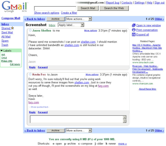
Gmail’s launch on April Fools’ Day, 2004, with a better web app and far more storage—leaps over the two things that set Hotmail apart in the first place. Gmail added something to the equation that made it even more desirable: Invitations. Only a thousand people could get in at first, and those could each invite a few friends. That let Google scale the service up over time, and gave a free Gmail account the cachet of an expensive luxury good, enough that people sold Gmail invites on eBay for over $150.
Invite-only bought Google time to perfect Gmail, a trick Google extended by keeping Gmail in beta for the first 5 years it was available. But the real success was in the viral word-of-mouth as everyone wanted an invite to use Google’s latest software.
Exclusivity speeds up the process of waiting for influential users to promote the product. Imagine Gmail without an invite system; some might mention using it, far more would use it without talking about it. The invite system made it exciting when you get to start using Gmail, making you more likely to talk about it—and for your colleagues and friends to ask you for an invite.
Add social media to the mix, and exclusive, invite-only software can quickly make a new product seem far more desirable. You just need to get people influential in the niche your software targets to use the software in public, sharing what they like about it, and the invite requests will start to come in.
Invite-only on its own isn’t enough; the initial buzz around Google’s later launch of Google Wave didn’t keep that product afloat. But it does add allure to software. Today, invite-only is a key launch strategy for everything from Superhuman (still invite-only) to Clubhouse (with an even more locked down invite system), Hey (invite-only for the first couple weeks) to Linear (invite-only while in beta).
Invite-only starts the sharing process. The real work-in-public, though, comes from collaborative software.
Built for you, then your team.
The best software in the world doesn’t help if you can’t use it.
When IT teams mandated what software you could use, there was no reason to seek out better tools. Better to invest in getting the most out of the software they authorized.
Then two major things changed. Companies started switching to bring-your-own-device policies, giving you more freedom over the computer and thus software you use, making bring-your-own-software possible. Then, web apps freed software from IT constraints, making new software only a new tab away.
You didn’t have to use older desktop software. You could use the new best-in-breed software in your browser.
These web apps weren’t just utilities you’d use on your own. Increasingly, modern software was built to work together with a team. Perhaps you’d try Slack during a hackathon or with a group of people from your industry. You’d enjoy it, think your team would like it too, and so would go to slack.com and make a new team, and invite your colleagues. The exclusivity appeal would take over again, as others in your company would want into the cool new app, and before you knew it, Slack had swept through your company.
Google Docs didn’t need everyone to switch. It just needed influential writers in your team to start using it for collaborative edits, then to share the document links, and it’d grow from there. Airtable did the same to databases, Figma to design tools, Notion to notes. They were enough better to make the most choosy users switch, got them to work in public, and that sparked bottom-up adoption throughout the company.
But first, the product needed to be enough better to get that first tranche of users to switch.
Opinionatedly different.
“Here’s to the crazy ones,” said the classic Apple ad. “They see things differently." That is the defining feature of positional software. They force you to work differently.
Gmail removed folders from email, prioritized an Archive button over delete, forced you to use tags if you wanted to file messages. Typeform showed only one form question at a time. Superhuman hid most buttons, opting to prioritize keyboard shortcuts and the command palette. Figma abstracted away files, blurred the lines between mockups, demos, drafts, and finished work. Hey took away archiving, said inbox zero isn’t important, said 3 folders is enough.
Few are passionate about the differences between PDF editors or domain registrars, say—they either do the job, or they don’t.
Code editors, however, are worth fighting for. Vim and Emacs’ opinionated differences are what make them polarizing. The same goes for modern positional software. They take a stand, say there is a better way of working. That makes them polarizing, which makes them worth talking about, which helps them spread further. It lets them charge a premium for a product built with care.
It’s a virtuous cycle that helps positional software spread to everyone in its niche. They don’t need everyone to use their software, but they do need everyone who cares about the same things they do to use it. You can’t get there by being a jack of all trades. Opinionated features let software be a master of one.
Premium by design.
Design, then, ties it those features together.
“Design is how it works,” said Steve Jobs, but better features alone were hardly enough for Apple’s co-founder. The company that taught us what chamfered edges and complications are cares deeply about how their products look and feel. So, too, do positional software.
Vim and Emacs may fall into the design is how it works category, with devotees favoring their raw simplicity. But they’re not turning heads when used in public, not making people wish they had an invite to see what the fuss is about.
Slack was an early leader in the crafted software space. Built from a company that two times had built a game and each time ended up building another product instead, the Slack team surely had great designers in their midst. But they also enlisted an outside design firm to launch the most polished team chat app the world had seen. Team chat wasn’t new; fun team chat was, and design was a key differentiator for Slack, enough that they could charge nearly three times as much per user than their closest competitor.
Positional software pairs a deep focus on features for the most exacting users with an equal focus on the design that will appeal to and work best for them. The chef’s knife needs a carefully curved handle and sharper blade to be worth buying—but it also needs to look the part, especially if it’s to cross the chasm from tool to desirable luxury.
Much of the discussion about Superhuman centers on its price, assuming a $30/month email app is a luxury, a Veblen good. Yet even if the status conveyed an exclusive Superhuman invite is worth the first month’s subscription, that alone is hardly enough reason to continue using the software. Subscriptions if anything align developer and users’ interests, as the latter can choose to leave anytime. Superhuman survives solely on how well it helps those who use email the most. If it makes them better at email, they’ll continue to pay, and talk about it.
Democratizing power features.
IRC had been around for decades as an early team chat. Slack added design and opinionated tweaks and turned it into a chat app worth paying more for.
Gmail was built around keyboard shortcuts since its inception. Superhuman taught them to you with personalized onboarding and tooltips, making sure you’d learn them.
Vim and Emacs had features tucked away to make you a more efficient text editor if you took the time to learn them. Sublime Text put those features in a command palette where they were easy to discover.
You could always email design files around, track document changes in Word, update an intranet by hand. Figma, Google Docs, and Notion turned those tedious tasks into a single click, freeing you up for your real work.
Positional software makes its name with unique features and better design. But often it’s not entirely reinventing the wheel. Instead, it’s thoughtfully simplifying what previously were power-user features, making you work faster in ways that were only possible in older software if you took hours to study and memorize. Thus the common complaint that positional software is nothing new, that Slack’s just IRC and Superhuman’s only Gmail with a newer design. The detractors have a point—the features often are there in older products if you dig.
Positional software makes everyone a power-user.
Customizable, within limits.
Software can’t gain a patina from wear-and-tear, doesn’t show your hard-earned battle scars of day-in-day-out usage the same way a long-loved tool can.
And opinionated software can never be as customizable as their developer-orientated, open-source, handcrafted counterparts. That’d take away the original insights and designs that make them great.
But you can’t have power user tools without some free-for-all, some area to experiment and make yourself at home. If anything, customization keeps the work-in-public going, as power users want to show what they’ve built from tools others might have originally dismissed.
And thus, positional software typically lets you customize something. Maybe just themes and addons, with an ecosystem of third-party developers turning the software into a platform. Maybe with emoji and stickers, consumer-style flair that makes you feel at home. Maybe with custom workflows that force you to think through how you work, make you invest in making the tool your own.
That keeps the virtuous cycle going, where the custom tweaks make it a tool you couldn’t imagine living without, which makes you talk about it in public, which makes others want in, which helps the vendors find someone else in your niche and increases their pricing power as that customer wants their software alone, not any random tool.
And that’s positional software.
A new world of premium software.
Software started out enigmatic, mysterious, difficult to understand, gate-kept by obscure terminology and hidden features.
Then it went mass market, where everyone used the same tools, where Microsoft Office was standard and seldom was indie software considered.
And then, as software became the primary tool for everyone’s jobs, not just developers, the same principles that helped developer tools become great were brought to prosumer business software. More esoteric software appeared, tools used by only those with the most demanding needs, with details you’d have to be an insider to appreciate. Mass-market software could serve the bulk of the market; these new software focused on those who need them most.
The best tools signify the value a craftsperson places on time and efficiency. They’re emblematic of the role that craftsperson holds, signify their status and skill. And they’re honed over time to be best for that role.
Today’s positional software does the same. It’s best tools, designed for specific roles, carefully designed to make craftspeople better at their digital work. It’s software that positions you as an expert. It’s priced at a premium, and worth paying for—by those who need their features, and by those who want the status those features convey. They’re spread as digital artisans work in public, share their work, talk about their tools.
And that halo effect can, over time, make positional software the new leader in its field. It still may not overtake the market leader in sales. But it will absolutely influence its entire industry as it occupies the mindshare of the most influential segment of that industry’s professionals.
Originally published on the now-defunct Capiche blog on July 2, 2020.
The problems with email were there from the beginning.
You’d be reading documentation, see something to improve, and wish you could tell the author.
For MIT’s programming staff in 1965, that idea led to the invention of email. “A new command should be written to allow a user to send a private message to another user which may be delivered at the receiver's convenience,” wrote the team. “This will be useful for the system to notify a user that … files have been backed-up,” presciently imagining email as a notifications inbox.
More fatefully, they continued: “It will also be useful for users to send authors any criticisms.”
We’ve been trying to escape those automated notifications and unsolicited feedback letters ever since.
Email was a simple enough concept, with a file name (what became the email subject), a user (what became email addresses), and the message. The MIT team’s proposal assumed “The proposed MAIL command can be written,” which proved true. Writing the MAIL command only took the summer of 1965.
Decades have passed, though, and email still hasn’t been perfected.
It’s not for lack of trying.
An email app has been part of Microsoft Office since 1993, another bundled with Windows since ’98. The Blackberry’s core selling point was email on the go. Google’s classic April Fools’ Day jokes started with Gmail, which was anything but a joke. And 55 years after email first launched, new email apps are still some of the most anticipated new software.
Yet email apps die at an alarming rate, enough that it’s almost a rite of passage for tech companies to acquire then shut down promising new email apps. Google did it to Sparrow, Dropbox to Mailbox, Slack to Astro, Microsoft to Acompli, LinkedIn to Rapportive, Essential to Newton.
“At worst, you’re dead within months. At best, you’re acquired, and then killed off a few years later,” wrote Casey Newton about email apps, after Dropbox shut down Mailbox. “To make a real dent, any new email client would have to be much, much better.”
Email apps are good at being better. They've invented or popularized some of the most innovative ideas in software—even if they can’t always find a business model to match. And those features are what live on.
Web apps.
Hotmail didn’t invent free email. Juno did, and against all odds still lives on.
Web apps, however, got popularized with email.
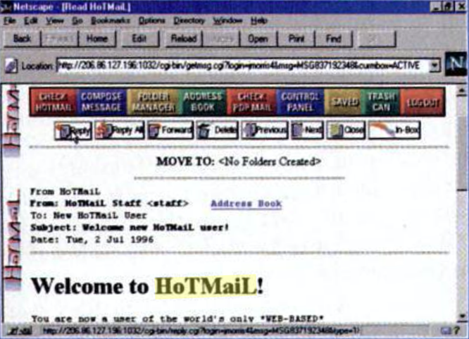
Hotmail was however the first web app most people used. “With Hotmail, if you know how to surf the web, then you know how to send email,” marveled PC Magazine in an early review. No software to download, a visit to hotmail.com was enough to send and receive emails from any computer.
Web apps helped turn software into a service, paved the way for today’s modern business software that works from every browser and device. But in 1996, that was revolutionary. Hotmail showed us how to work in the future.
Email as a status symbol.
Hotmail was also what The Economist called “the father of viral marketing.” Every email sent from Hotmail said “Get your private, free e-mail at hotmail.com” in the footer, a trick everything from the iPhone (“Sent from my iPhone.”) to Superhuman (“Sent via Superhuman”) copied. It was the original software as a status symbol.
Superhuman took that further, as an invite-only email app that costs $30/month. Hotmail’s footer said you got email for free. Superhuman’s says your time is valuable enough to pay for email. Hey's $99/year @hey.com email address says you wanted a better email service enough to switch accounts. Every new premium software offering, in a way, ironically has Hotmail to thank for blazing the way.
Bundling and unbundling.
Build a minimum viable product, they say. Focus on one feature, do that better than anyone else.
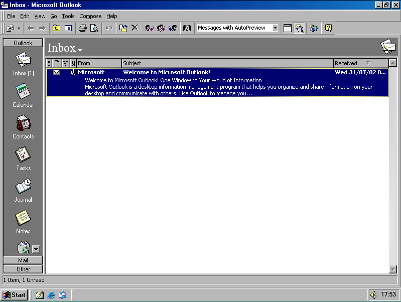
Not Microsoft. Their contribution to email is perhaps the best example of bundling in software. Outlook in late 1996 brought everything together, with email, contacts, calendar, notes, and even a journal in one app.
18 years later, Accompli launched as a mobile email app that again combined email, calendar, and contact management in one. It’s no wonder Microsoft acquired and rebranded it as Outlook mobile.
Modern takes on email like Sparrow, Mailbox, Superhuman, and Hey take the other road. They unbundle email from everything else, let you focus only on your messages. Less is more, they declare.
“There are only two ways to make money in business,” says Netscape founder and venture capitalist Marc Andreessen: “One is to bundle; the other is unbundle.” That debate is seen most clearly in email apps.
Notifications and always-on software.
If Hotmail was the first viral app, the Blackberry made email the first addictive mobile app.
Pagers, perhaps, were the first push notifications. The Blackberry took them mainstream.
First with its clamshell Inter@ctive Pager designed only to send emails, then with its original smartphones, the Blackberry is where email went instant. It’d push new emails to your phone, so you’d know as soon as someone messaged you, in an early version of today’s push notifications.
And now, we can’t escape from them. It’s not just email. Seemingly every personal and business app wants to notify you of new things, making office hours a relic of the past.
It’s yet another excess that new email apps tries to solve. Google Inbox would only notify you about emails at certain times of the day. Superhuman only notifies you about important emails. Hey only notifies you if specifically requested.
Perhaps these newest attempts to tame notifications in emails will trickle down to other apps that picked up email’s bad habits.
The end of files.
Email started out as files, in MIT’s earliest version. You’d write a text file and send it to your colleague with stuff for them to fix.
The earliest email apps treated messages much the same. Email took up space, so you’d read it, reply, then delete it. You’d backup your most important messages to neatly organized folders, much like your Word docs and photos.
Then along came Gmail and reinvented the way we think not just about email, but eventually about files themselves.
It started with Gmail’s then-generous 1Gb of free email storage, and the default Archive button instead of delete. You never needed to get rid of email again. Instead, you could be a digital packrat, archiving old emails to hide them, then rediscover them anytime later with a search.
Files and folders meant email could only live one place at a time, like your paper tax return in a file cabinet. Gmail instead used tags to organize emails—so now, your emailed tax return could live in a Finance and 2020 group at the same time.
We quit worrying about carefully choosing folders for email, quit backing up .mbox files to external drives, quit deleting email for fear of running out of space. Then we took those ideas everywhere else. Your Notion notes, Airtable databases, and Google docs work more like Gmail messages than traditional files.
It was the beginning of the end of files.
Keyboard shortcuts, command palettes, and developer features in consumer apps.
Gmail didn’t invent keyboard shortcuts; they were the natural progression of commands from early terminals. Superhuman didn’t invent the command palette; it, too, was a rethinking of terminal commands, and first showed up in Sublime Text’s code editor.
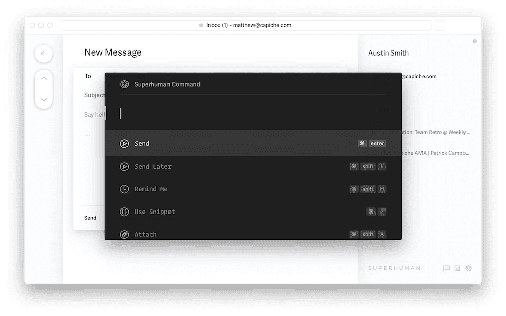
But both helped popularize the formerly-geeky features. Gmail made keyboard shortcuts simpler; you didn’t need to press CMD+N to start a new message, you could just press C instead. Superhuman made sure you’d learn those simpler shortcuts, with personalized onboarding. And it made those commands easier to find with a command palette, consumerizing a formerly developer-focused feature.
And now command palettes are everywhere, from new apps like Height and Notion to new versions of old favorites like Photoshop and even Microsoft Office. A coding app introduced them, but an email app made them a must-have.
A new focus on privacy.
As the original internet service, perhaps it’s only natural that email’s where some of web’s original debates happen.
Privacy, for instance. The first free email was shocking not only for its price tag, but also for what it asked in exchange. Early Juno and Hotmail signups required not only your name, but also your address, age, gender, marital status, occupation, and more. All the more to target you with.
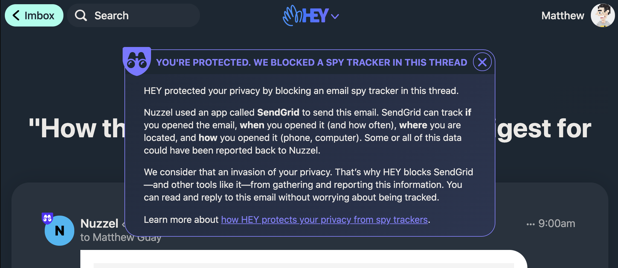
Gmail took away the banner ads and demographic questions, but kept the ad-sponsored business model with text ads targeted on the contents of your emails. Marketers and sales teams wanted to know if their emails were read, so email newsletter and CRM apps added tracking—the email version of Google Analytics or the Facebook pixel that make ads feel like they’re listening to you. Superhuman decided that was useful enough for everyone, and built in read tracking as a default email feature.
Then along came the Basecamp Hey team, and said “We think that’s a gross invasion of your privacy.” So when an email tracks opens, Hey lets you know, and blocks it.
The debate is still out on privacy and tracking, analytics and ads. But if the winds shift towards more privacy and less tracking—or if, somehow, read receipts become the norm in every other shared business app—it’s email again leading the way.
Features for a lifetime.
That’s along with all the other tiny things email introduced, including:
Flags: Some email’s more important than others—and you need a way to highlight them. Outlook added flags for that, and they stuck, in both email apps and to-do list tools. Even Slack’s starred messages and Notion’s pinned notes owe a bit to email flags.
Swipes: What the right-click did for PC software, swipes do on mobile. Email apps are where they got popularized, first with Sparrow then quickly followed by Mailbox. You’d swipe to archive or delete messages, file them, and more. And it stuck as the new default way to add extra features to mobile apps.
Snoozing: Some messages can wait, so Mailbox added a snooze button to email to hide messages then bring them back when you want. That’s now in Gmail and Superhuman, with similar features like Slack’s Remind me showing up elsewhere.
There’s more, too: Sending later, showing contact info pulled from social media, combining different messages into a single thread, and more, each of which started in one email app then spread to be a new default email feature everywhere. It’s far too early to say which Hey email features will stick around forever, though contact screening seems a strong contender.
Acompli’s work lives on as the new Outlook mobile app. Rapportive’s team got a second chance with Superhuman. Newton now has a second lease on life. Sparrow’s design and Google Inbox’ ideas influenced Gmail’s tweaks over the years, perhaps.
Somehow, today’s best-in-class email apps are hybrids, combinations of the best ideas every other email app brought before. It’s hard to imagine email without web apps, limitless storage, notifications, archive search, and a bit of over-the-top self-promotion. Each feature, at one time, was enough to launch a new email app, to convince us all to switch tools yet again.
Wake up with a great idea for a new widget. Build it, set up a table in front of your house, and sell it for $10 cash.
You just made $10. Pretty good deal.
So you expand your business, start a Shopify store, and sell online. Shopify charges 2% of your sale price, along with another 2.9% + 30¢ payment processing fee.
You make $9.21 per sale (though still need to pay $29/month for the store), and sent Shopify and Stripe around 8% total. Not bad.
More people are searching for widgets on eBay, so you list it there too. They charge 10%, plus PayPal fees. Other marketplaces are similar; Etsy charges 5%, plus a bit more to list your product.
You make $8.41, and pay eBay + PayPal around 16% total.
Amazon has more customers, and people love free shipping, so you sell there too. Though nothing’s truly free: You might pay a 15% referral fee, $2 fulfillment charge, and $0.99 fee per item sold.
You might make only $5.69, sending Amazon 43% of your sale price.
If your widget was in a real store, perhaps more people would see it. But that costs. You’ll pay slotting fees which “average $1500 per store per SKU,” estimates Trax. You might pay a few dollars per inch of retail space per store if your widget is sold near checkout, 10% stocking fees to put your inventory in warehouses, and pay-to-stay fees for promotions and discounts.
“A company might have to pay up to about $5 million to place one candy bar in all the stores of the 50 biggest supermarket chains,” said one report on the US retail market.
That’s enough to make Amazon sound cheap, until you’re selling a lot of widgets.
So you switch gears. People like your widgets; maybe they’d read about how you built them. You write a book, sell it on the Kindle and Apple Books stores.
Apple Books charges 30%. Sell a $10 book, get $7.
Amazon’s Kindle store charges 30%, but with conditions. Your book must cost $2.99 to $9.99, and 20% less than any print copiesell. It must be exclusive to the Kindle to get this rate in some markets. Any VAT comes out of your cut, as does a download fee of $0.15/mb. Sell a $9.99 book, and you might get $6.69.
Don’t meet those requirements, and Amazon charges 65% of your selling price. Sell a $10 book, get only $3.50.
Writing a song about your widget doesn’t seem like a great idea, either from a content and revenue perspective. Spotify pays 0.32¢ per play, Apple Music around 0.56¢. You’ll need someone to play your song 3,125 times to equal selling one $10 widget in front of your home.
Maybe an app would make more sense. You make a digital version of your widget, put it the App Store and Google Play, each of which take a 30% cut.
Sell your app for $10, get $7.
Games aren’t much different. Valve charges 30% for the Steam store (with a 5% discount after you sell over $10 million). Sony, Microsoft, and Nintendo also charge 30%. And if you sell your game in a real store, after all the fees the “takeaway from a physical retailer ... is often between just 10-15%.”
Maybe a subscription makes more sense, with new digital widgets every month. The first year, Apple and Google take 30% as before. The second and thereafter, they take 15%.
So your $10/year subscription gets you $7 this year, $8.50 next year.
Or. The web’s free, anyone can publish a website, and with a Stripe account, you can sell software yourself for only a 2.9% + 30¢ charge. A $10 sell nets you $9.41. Subscriptions will cost you an extra 1% through Stripe (an extra 10¢ on that $10 subscription), or perhaps $299/month with a subscription tool like Chargebee.
That’s better margins than selling physical goods on Shopify, incomparably better to the App Store’s pricing, let alone Amazon’s.
And here’s where it gets messy.
Paying for place.
It’s not like you’re paying for nothing when selling products at retail.
Real estate’s expenive. Shelving, stocking, logistics and distribution, the electric bill and checkout staff, it all adds up. If Walmart charges you for shelf space, promotion, and still adds their margin to your product, at least you’ve got something to show for it. You paid to put your product in front of real customers.
Same for Amazon. Shipping’s never actually free, neither are fulfillment centers and the fabled 1-click checkout. Even credit card fees and affiliate cuts add up. Plus, over 2 billion people visit Amazon sites each month. It’s worth paying a bit more to get in front of those people. And if the math doesn’t work, you could always go to one of their competitors.
You could pay less on eBay, Etsy, or with a Shopify or WooCommerce store. But the vendors that choose to sell on Amazon are willing to pay for the audience, for access to millions of customers ready to buy anything as long as it’s on Prime Now.
Before software ate the world.
The App Store, at its inception, did much of the same.
Software downloads had already killed boxed software when Apple launched the App Store in 2008. But that didn’t mean software was easy to distribute.
On mobile, for example, the typical Java mobile app was distributed through an aggregator, who would negotiate API access and sell it directly to carriers. “Carriers controlled which apps would make it onto phones, and often took most of the revenue - 50%, 70%, more,” recalled veteran technology journalist Walt Mossberg.
It wasn’t much easier on desktop. You needed people to discover your software, download it, pay for it, enter a license key to prevent piracy, and install updates as you fixed bugs. And you needed to do it on your own. Stripe’s only been around for a decade; before that, smaller developers were left to the whims of PayPal.
The App Store covered all of that, for 30% of your selling price. It could almost seem like a bargain, especially compared to dealing with phone carriers.
You’d upload an app, and instantly every iOS and Mac owner could buy your software with their existing account—no PayPal or entering credit card numbers needed. No licensing and accounts; Apple handled that for you. And at first anyhow, App Store search was enough to bring interested people to your software, the app version of Amazon’s retail search. Updates were easy; Apple pushed them to all your customers, automatically.
“The App Store is more than just a payment processor, and for some developers, Apple’s cut is either happily worth it or at least begrudgingly worth it,” as writer John Gruber put it. Customers like it, too, with payments only two taps away.
Then the cracks started showing. People downloading your app weren’t your customers, per se—you never knew who bought your app, had few ways of contacting them directly. Apple didn’t offer a way to sell upgrades, so it was difficult to keep making money even as customers expected you’d keep the app up to date. And if you sold extras in your app—songs, eBooks, videos, courses, content that wouldn’t have required license keys and updates and a whole App Store infrastructure to start with—Apple still wanted a 30% cut.
The web, with all its complexities, started looking more appealing. If anything, the App Store increasingly seemed an archaic burden, not a reasonable fee to simplify software distribution.
Everything as a service.
Of all the things the App Store offers, SaaS finds perhaps two things helpful: Discovery and downloads. And they could live without either.
Subscription software businesses have to build a customer relationship, with unique accounts per-user. Might as well build out payments while you’re at it. Accounts negate the need for license keys, and make piracy a thing of the past. And, odds are, your SaaS is a web app—so a browser’s all you need, no access to device and operating system-specific APIs needed. A mobile app would be nice to have, with offline support and notifications and share menu integration. Discovery in the App Store search would be nice, too. But all the other things that make the App Store valuable to, say, developers building games don’t matter to business SaaS vendors.
It’s not like you’ll have to build it on your own. Stripe handles payments, Recurly subscriptions, even blog systems like Ghost can help you set up a full membership system. You can even push notifications through the browser, and fall back to Twilio-powered SMS and Sendgrid email notifications on mobile if needed.
So came the workarounds. They started with content-driven businesses, the Netflix and Spotify and Kindle’s of the world, who wanted mobile apps for distribution, but didn’t want to pay 30% of their content revenue. Just like SaaS, they already needed to manage accounts and subscriptions, and found little value beyond distribution in the App Store. As a workaround, they built what Apple is now calling “Reader Apps” to sign in with existing accounts and view content already purchased. They just couldn’t let people create new accounts from their mobile apps, or Apple would require a 30% cut (or 15%, for subsequent-year subscriptions).
The same went for real-world goods and services, so the Amazon store app, travel apps like Expedia, and transit services like Uber and Grab are free to use their own billing and skip paying Apple’s fees. They need to own the customer relationship anyhow, and built their business around adding margin to others products and services the same.
That leaves SaaS. For a while Apple seemed content to look the other way, to let business software subscriptions’ mobile apps not offer ways to signup without fuss. But that’s changed.
The Basecamp team’s new email app Hey works like Netflix’ app: You can sign in with an existing account, but can’t create a new account. The App Store only does distribution; Hey has marketing enough on its own, and decades of experience selling software on the internet. Apple wasn’t too fond of that, rejected their latest update, and threatened to remove Hey from the App Store. Turns out, that was only the more recent; Ben Thompson on Stratechery found that Apple’s told apps selling digital events that they, too, needed to use official in-app purchases.
Here’s the funny thing. Apple’s 15-30% cut on subscriptions isn’t ideal for either developers or Apple. It’s enough of a cut to push the largest platforms, the most popular software to forge their own path.
The App Store’s worth paying for. Maybe not 30%, or 15% even, but something over just the cost of processing credit card transactions. Today, a free app brings Apple zero revenue, while the paid apps that do bring revenue shoulder the cost of the whole ecosystem. Perhaps a lower subscription rate, at 5% or so of transactions, might be enough to convince Netflix and more that the benefit of millions of connected credit cards were worth a slightly less direct connection to customers, enough to keep developers from complaining about the requirement.
Aggregator power.
Apple seems to disagree. The App Store’s not just worth paying for, it’s worth paying 30% for. It’s their storefront, end of discussion. Don’t like it? Maybe the iPhone’s not for you.
Apple seems to see the App Store as a digital retail store, where 30% and guaranteed shelf space would be a bargain for consumer packaged goods.
Perhaps. The Kindle store, though, shows monopoly pricing power at what may be the extreme in digital retail. 65% in fees to sell books on the Kindle store—unless you jump through hoops to hit the 30% fee tier—means you’re paying Amazon more for books than the authors. Yet even that was freeing to self-published authors compared to literary agents, publishers, bookstores, and the perhaps 10-20% royalties an author might receive in the traditional world after everyone else got their share. The old king is dead, long live the only slightly more benevolent new king.
Today’s software developers have a strong advantage, building their tools on the web, the most open distribution system every built. They’re used to things being free, or nearly so, of selling in market with minimal per-unit costs and impossible-to-imagine margins compared to physical goods. And the switch to SaaS, hard as it may have been, made teams build the skill sets to replace the App Store.
If App Store revenue cuts come down, it’s competition from the web and SaaS that will move the needle—much as Apple itself led the way in cutting the costs carriers used to impose on the previous generation of mobile developers.
Now, will SaaS—with new platforms to build subscriptions, sell media, and monetize a following—provide pricing pressure for the Kindle store, streaming music, and other media? Will Amazon continue to rebuild the price structure of physical stores online, or will independent retailers make charging 40+% of retail prices untenable?
Originally published on the now-defunct Capiche blog on June 18, 2020.
“The human mind does not work that way,” wrote Vannevar Bush of filing cabinets and alphabetical organization, in his seminal 1945 essay As we may think. He might have as easily invoked today’s computers, 75 years of progress notwithstanding.
Of all the metaphors computers could have used for data, the most familiar endured. Paper and folders, letters and business cards, desktops and trays. We recreated the office environment on a screen, and brought their physical limitations into the digital world.
Bush at the cusp of the computer age envisioned a different future. A researcher in this imagined world first “runs through an encyclopedia, finds an interesting but sketchy article, leaves it projected. Next, in a history, he finds another pertinent item, and ties the two together. Thus he goes, building a trail of many items.”
That’s the idea that brought us the internet, wikis, and today’s connected world. But it took a notes app to finally build the trail as originally envisioned.
A trail of thought.
The entire web could have been Wikipedia, if Tim Berners-Lee’s earliest ideas had worked out.
It started with Enquire within upon everything, an early encyclopedia that taught a young Tim “everything from how to remove clothing stains to tips on investing money,” remembered Berners-Lee decades later. “Not a perfect analogy for the web, but a primitive starting point.”
That provided the inspiration for Enquire, a notes app of sorts Tim Berners-Lee built at European research lab CERN as an early precursor to the web.
Links were central to Enquire. Instead of individual notes, Enquire’s notes linked to each other. You couldn’t just make a new note; you had to start by linking something in an existing note. A note about a colleague might link to their department and research documents, say.
Then, in a blend of bibliographies and cross-references, Enquire pages also listed everything that linked to them. So when you linked a colleague’s note to their department, “an internal link would appear on both,” Berners-Lee said. The trails that linked everyone to each other would start to appear.
Enquiring minds.
Links, after all, aren’t a word invented for tech like smartphone or CPU. They’re anchored in the real world, links between text like the metal links in a chain.
The earliest tech visionaries thus imagined links as two-way connections, the same way you see a chain on both the boat and the anchor. The brain, as Bush had written decades earlier, “operates by association. With one item in its grasp, it snaps instantly to the next that is suggested by the association of thoughts.”
You don’t come up with new ideas. You build on what came before. One idea combines with another which reminds you of something else you’d heard before, and eureka!, an idea is born.
If computers could aid innovation, they’d need to help us make those connections.
Ted Nelson’s Project Xanadu two decades after Bush’s essay imagined two-way links giving us a digital brain. As Nelson imagined the future, every document would be linked to its sources. You wouldn’t simply quote another document; you’d embed the quoted section from its source. Both your document and the document you quoted would show the connections.
“Computers could become much more powerful if they could be programmed to link otherwise unconnected information,” thought Tim Berners-Lee in the 1980’s while dreaming up what became the World Wide Web.
Links made that happen, but half of the original idea got lost along the way.
Just one new thing.
Sometimes you have to cut scope to ship a project, simplify a concept to convince people to use it. Thus it was with the World Wide Web.
Tim Berners-Lee envisioned a world of websites about everything imaginable. His employer, the CERN laboratory, had more pedestrian concerns of managing the people and ideas under its roof.
“Our first target, humble beginning that it was, would be the CERN telephone book,” Berners-Lee decided after failing to get much interest in the first version of his WorldWideWeb browser.
And so, a few ideas were cut. Bi-directional links were out; “so long as I didn’t introduce some central link database, everything would scale nicely,” he theorized, so every page must stand on its own.
Also on the chopping board was editing. Tim’s ideal web made it as easy to edit web pages as to view them. “Simply being able to read the documents was good enough to bootstrap the process,” it turned out though, and so we got web browsers. Editors could wait.
Thus the web was built, cuts here and subtractions there, until it was something everyone could understand. And then it was everywhere.
Tracing back the tracks.
eBay. Hotmail. Geocities. The .com boom. Yahoo!
A decade after the web sputtered to life on a NeXT computer in a nondescript CERN office, it was hard to imagine life without the web. And tech had time to catch up to the vision.
Browsers never did become editors. Personal websites then blogs, though, almost fulfilled Berners-Lee’s vision where “sharing what you knew or thought should be as easy as learning what someone else knew.”
And they brought back bi-directional links for a brief moment in time.
It started as TrackBacks, a tiny feature added to Movable Type in 2002. If you linked to a site in your blog post, Movable Type would send a comment to the site you linked. It established “a connection between authors,” said Movable Type co-founder Mena Trott. You could see who linked to your writing, discover like-minded writers, and see the connections between your favorite blogs.
WordPress tweaked the idea with Pingbacks to prevent spam. Tumblr took it further with reblogging, where you could share a full post and add commentary, resurrecting Xanadu’s concept of embedded quotes.
Xanadu never was fully built; “Fonts and glitz, rather than content connective structure, prevail,” mourned Nelson. But blogs, at least, started building the two-way links between ideas.
The editable web.
Then came the in-browser editor with the Wiki, dreamed up by Ward Cunningham five years after Tim Berners-Lee’s WorldWideWeb, built to explore the way “programming ideas are carried by people as they move between projects.”
Connections, again, were the focus. In Cunningham’s WikiWikiWeb, you could edit any page, which meant anyone could contribute. And to explore how ideas were carried, you could link to anything else in the wiki with CamelCase words. It made editing easy, linking even easier.
Wikipedia, launched six years later as an experiment to let the world build an encyclopedia together, ran with the same idea. Only, CamelCase words got confusing, so two weeks into the project, developer Clifford Adams switched to using double brackets like [[this]] to link pages.
The new link style prevented accidental links to, say, three-letter agencies, and as a benefit let linked text look like standard English, not geek-speak. “Now Wikipedia looked more like a proper work, and not one littered with strange CamelCase”, remarked Andrew Lih in The Wikipedia Revolution.
And so the foundation was laid. Anyone could edit and link anything, and they did, writing billions of words and linking concepts together. Even bi-directional linking came along, with Wikipedia’s somewhat-hidden What links here tool on every page listing the pages that reference it.
Roaming through ideas.
Google almost built two-way links back into the web with the now-depreciated link: query that showed sites that reference a link—something that stayed around in Google Scholar to show research that cites another. But Wikipedia and the few remaining blogs with trackbacks aside, bi-directional links never became a core part of the web.
Thus it fell to the next generation of developers to find better ways to link ideas. “We need better way of organizing the questions we are trying to answer, and making explicit the lines of reasoning we hold,” tweeted developer Connor White-Sullivan in early 2019. Months later, his now-viral app Roam Research would be one of the closest modern cousins to Enquire, Xanadu, and Bush’s Memex.
It starts, as you might expect, with bi-directional links, built wiki-style with [[double brackets]], building on Wikipedia’s earlier innovation. That adds a link to the bottom of the linked note in a Linked References section, like Enquire.
That’s enough to connect ideas, to link a mention of an author, say, in multiple notes, and see them all together in the page Roam auto-generated when you linked the author’s name. But what if you want to use a quote from that author in a new article?
That’s where Roam’s block embeds come in. You can search for any section from any note and embed it into a new document, Xanadu style. Link ideas, build new connections, then create mashup documents that combine the best of both. Since it’s your private notes, there’s no fear of spam and clutter as with Trackbacks, nor fear of others ripping off your work via mashups. Somehow, finally, the pieces all came together.
The dream was there all along, envisioned by Vannevar Bush as projected articles on a wall, linked together through research. But ideas are hard to sell, sometimes. Maybe we needed a couple decades with links and browsers before editing, bi-directional links, and embedding made sense. It took wiki’s simpler links, blogger John Gruber’s Markdown for more readable copy, Trackbacks’ connected posts, YouTube-style embeds, and time for it all to come together.
Roam’s not alone, either. Wikis offered much of the same idea for the past decades, albeit cluttered with extra markup and features. Notion took the web’s existing embeds to the next level, making it easier to pull work and inspiration from a variety of apps into one document in a more visual Xanadu.
But Roam, with its sparse layout and focus on the core features of bi-directional linking and embedding, finally pulled the core elements together into a tool that could link ideas.
Perhaps Ted Nelson was right about fonts and frills. Maybe plain linked ideas were what we needed all along.
Enquire within upon everything.
Though perhaps, even bi-directional links and embedded sections may not be enough. You still have to remember to link things, decide in advance what may be of interest later, and make the mental connections to embed ideas from other documents.
What if instead, the computer did that for you, turning everything into links and letting you connect things that in the past you never knew you’d find interesting?
It’s almost an easter egg in macOS’ Dictionary app. Open a definition, then hover over the text. And like magic, every word is a link. Click any word to jump to its definition, building a trail of meaning as you discover new words. It makes Wikipedia better; even if no one thought to link something, the Dictionary app makes the connection for you.
Now imagine that for your notes, your research, your team’s work. You could actually enquire upon everything, no foresight required.
“Computers might not find the solutions to our problems,” wrote Tim Berners-Lee, “but they would be able to do the bulk of the legwork required, assisting our human minds in intuitively finding ways through the maze.”
When the team that built Wunderlist set out to build something new, its whimsically designed landing page got all the attention.
Wunderlist itself was a final hurrah to the skeuomorphic design that the early iPhone popularized, launched only a couple years before iOS 7 decreed flat design was the next big thing. With paper-like notes, bubbly buttons, and background photos of brick and wood, Wunderlist felt more like a real-world thing unconstrained by silicon and screens.
Pitch, their team’s new presentation app, didn’t bring back digital felt and paper. Instead, it showcased the newest thing in software branding: 3D, clay-style graphics that look more like kids’ toys than digital tools.
Art, so often, reflects the technology of its day. Charcoal on cave walls. Bronze cast in clay. Pigment infused parchment. Letters pressed.
And so it has been with software landing pages, where form followed function and changing technology enabled new design styles. But who would have foreseen software’s switch to subscriptions changing today’s state of the art?
Is this the real world?
“This is the BBC” was branding enough for decades of radio news. Simple technology, simple branding.
Television required show and tell, an identification logo or ident as they came to be known. Thus it fell to WWII-era poster designer Adam Games to decide how the BBC should “identify itself to viewers” with “something more exciting than a selection of test cards in between the programmes.”
Technology inspired—“The symbol must move”—and limited. Screens of the time showed only 405 lines of detail, and animation tools were decades away.
So the poster designer teamed up with a sculptor to build a wire and wood model, with a motor and lights to fake animation. Just enough to create the bat wings logo—BBC’s first moving ident.
Technology marched on, and with it the state of the art. The BBC welcomed color TV nearly two decades later with a motorized globe in a mirrored box, color added during the broadcast. And by 1985, computer technology finally matched the BBC’s ambitions as the first digitally rendered globe proceeded the nightly news.
And then software-powered design was everywhere, following the same progress as the BBC’s logo with increasingly better designs as technology made it possible.
Scissors and glue: 1990’s.
Technology had influenced print design for decades before the personal computer. Print design, in turn, influenced software branding.
Before you could crop photos and mash them up in Photoshop, designers were clipping art from paste-up books and manually building page layouts on paper. Xerox machines and later digital scanning duplicated the work, but the original always started with layers of paper.
Software branding on boxes and disks arrived when paste-up was still state of the art. The first Microsoft Windows box—released the same year as BBC’s digital globe—was closer to a collage with a photo of a computer framed in blue. Early Microsoft Office box art featured box inception, with boxes for each included product with its own digital clip art icon.
Flat and fast: 2000-2005.
Box art changed faster. Office boxes showed clouds (to match Windows 95’s iconic background), photos of actual offices, and bubbly 3D icons. Adobe put paintings and photo mashups on their boxes, educational software included cartoons. With print design and loading screens, there were few technological restrictions to hold you back.
For nascent web apps, though, simple flat designs weren’t as much an aesthetic choice as a necessity. When your average user has dial-up internet and a browser like Internet Explorer 5 with limited CSS support, you kept things simple.
Thus the flat, boxy designs that dominated early web apps such as Salesforce’s site in 2000, MailChimp in 2002, and even Wufoo in 2007. Strong colors, detailed copy, and grid-based layouts defined early SaaS startup’s design language.
Screenshots everywhere: 2005-2015.
In the grand tradition of BBC’s fake-animated logo, web designers used detailed image layouts to get around the early web’s limitations. Product companies like Apple built their sites around images, with product photos and detailed typography patched together from Photoshop slices. You couldn’t copy the text, and the sites took longer to load, but the web's design limits didn't hold you back.
SaaS startups had to take the slower route. Their customers would load their landing pages daily, and every second mattered. As internet speeds increased, though, that became less of an issue, and suddenly photo-heavy sites were everywhere.
Basecamp switched earlier than most SaaS to a screenshot-heavy design in 2005, before newer startups like Typeform and Airtable put a modern takes on the design a decade later. Wunderlist put their efforts into designing the software—and let it speak for itself on the landing page. Software’s design was what mattered now; the landing page stood merely to showcase it.
Sketchy designs: 2012-2018.
Then came touch, with smartphones and tablets and the digital apps they enabled. Wacom tablets had been around for decades, but the iPad gave everyone a chance to try their hand at sketching.
So when analyst Ben Thompson launched Stratechery in 2013, he used the Paper drawing app on iPad to illustrate his first article. “For me, it was honestly a feeling I really didn’t anticipate: I drew something, and it didn’t suck!” relayed Thompson. Years later, it’s still how he illustrates his blog posts.
A similar sketched style of illustrations took over SaaS landing pages around the same time, prompted by similar apps. Basecamp in 2012, Airtable in 2016, and both Dropbox and Mailchimp in 2018 redeigned their sites with a more organic, sketched design.
There was “a huge wave of illustration” prompted by the new drawing apps, shared freelance designer Valentin Galmand who’s worked with Lattice among others. “For me, it was Procreate that made me an illustrator now. I was an Interface designer and developer before, and when my agency I worked for got an iPad and Procreate, a long love story began.”
“It probably wouldn’t be far off-base to assume that a lot of these illustrations were done … by product designers who also have some illustration talent themselves,” surmised designer Koi Vinh in an essay on illustration-style designs. “They designed the app and while they were at it, it was faster and cheaper to just have them create the illustrations too.”
Sketched designs were easier to make—and gave brands more life than screenshots alone. They “illustrate your message a lot more than photos and are so much lighter.” Sketches made websites faster, too. Retina displays made photo-heavy designs need increasingly large images, while sketched designs in SVG files let websites load faster while having perhaps more of an impactful design than screenshots and photos allowed.
Tools as toys: 2018-2020.
Then Pitch showed up in late 2018, and with it a new wave of startup sites with bubbly 3D graphics.
“There’s no official name for it,” said Romain Briaux, the designer behind Specify, Swile, Evolt, and other startups with the new 3D graphic design. “Clay-style” perhaps, or “plastic-toys.”
It’s in sharp contrast to what Galmand had described as “classic SaaS illustrations” with flat colors, screenshots, and sketched artwork. These new designs looked like they walked off a Pixar set.
“Startup websites were a bit stuck with the same illustration style and everything was looking the same,” said Briaux. “3D graphics brought something fresh and new.”
“Claymation-style 3D hands imply our design tool is our friend,” said designer Tobias Van Schneider in a recent essay about design trends. “Circles and squiggles say our form-creation app is here to party. The muted colors and lack of sharp corners signal safety. It is approachable. It is charming. It’s Kawaii.”
Realistic, 3D graphics were formerly the domain of studios, requiring thousands of dollars in equipment and software. Then, seemingly overnight, even new startups with limited budgets had animated characters selling their products.
This time, two innovations changed the state of the art: Software and subscriptions.
First, software. The biggest change is that most 3D renders—Octane, Redshift, and Blender’s Eevee—are now live, a shift enabled by GPU advances over the past few years.
“Before live rendering,” Braiux explains, “the process was tedious. Imagine that you had to do all your settings for lighting, material, etc., and then wait 10 minutes to see that the result was not as you expected.” Live rendering means today’s 3D design software makes it easy to experiment through trial and error and ship something more quickly. “You can see what you are doing without waiting and it changed everything,” said Braiux. “It's easier for beginners to learn and achieve nice results.”
Then, subscriptions. “One of the main reasons is the fact that design tools have become more widely available,” explained 10Clouds designer Igor Kozak, something that helped both traditional and 3D design tools spread. “Thanks to various subscription options, almost every designer can afford to use Photoshop. Other tools such as Cinema 4D are more expensive, but you can still purchase a license to use it for $100 for a month without being tied in”—something that cost $3,495 before subscriptions. Even as subscriptions helped inflate software costs over time, as you may pay more over time for subscriptions than you would have paid with one-time purchases, their lower per-month fee makes it far easier to use software for a limited-time project.
Then there are increasingly powerful free tools. “Blender is free, super advanced, has been completely redesigned and now the UI is more ‘designer-friendly,’” explained Braiux. And last year, Blender gained a live rendering engine, Eevee, that’s made 3D design even more approachable. Designers can start for free in Blender, then upgrade to subscription rendering tools like Octane (a 19.99€/month subscription today, versus 299€ before) as their skills improve.
Subscriptions mean you don’t even need a powerful computer to render 3D graphics. Instead, you could run Blender or Modo in the cloud with tools like RenderStreet from $3 per hour, or even use Pixar’s RenderMan in Google Cloud from 53¢ an hour.
Subscriptions made advanced design tools accessible to everyone. And now, they’re everywhere. As Briaux said, “Technological barriers almost disappear and designers have now the freedom to create more easily.”
“Technology is constantly evolving,” says Kozak, “and as a result, we can now create something faster and at a higher level of quality for $100 than we could for $200 a couple of years ago.” As designer Sheldon Drake wrote, “It’s the difference between nearly impossible and just press OK.”
It’s now entirely feasible for startups to commission 3D designs for their homepages, thanks to the combination of better tech and subscriptions.
Future design.
Already the styles are merging. Notion and Airtable mix sketched designs with screenshots. Lattice’s landing page combines 3D graphics with photos; Mixpanel put screenshots and 3D material elements together. Luc Chaissac’s sketches mixed with 3D graphics for Lattice and Romain Briaux’ 3D animated line sketches for Firekast that blur the lines between the two styles.
“Design can be compared to fashion, which is cyclical,” said Igor Kozak. Flat, then 3D, then something in the middle, then something new again.
The software that enables Pitch-style 3D graphics also enables everything from animated sketches to hyper-realistic models. And it’s not just the tools to build 3D graphics that are changing—the web is changing too. Tools like Airbnb Lottie render After Effects in real-time in the browser—no video or GIFs needed. Sketchfab lets you embed 3D models in a site today; tomorrow, it could power more creative landing pages.
It’s not software holding design back anymore. We’re far beyond wire and wood. Imagination’s the limit—and for today, that seems focused on designing the most graphical landing pages possible.
“There’s a saying in Russian: ‘When you meet a person, you judge them by their clothes. When you leave them, you judge them by their mind,’” relayed 10Clouds’ Igor Kozak.
“I think the answer here is that startups need to learn how to present themselves as you only have one chance to make a first impression. Effective illustrations, along with the right messaging, will provide a strong user experience, guiding prospective customers through their journey on your website.”
It just might be an animated character that guides you on your next user journey. Clippy may at last have its revenge.