The company behind the Centurion Club and the Black Card, best known for a concierge service and charge cards without limits, and for turning the card in your wallet into a lifestyle choice, that company started out without a product or almost any capital to speak of.
It started, instead, with an idea.
It was the 1840’s, the railroad was shrinking the travel time between cities from days to hours, and suddenly it was possible to send stuff from one place to another, fast. That is, if you had time to take the train yourself and hand-deliver the parcel, or enough trust to hand it to a stranger on the platform heading to the same destination.
One of the things I enjoy most about storytelling for startups is digging into the history of how their sector of tech came to be. Case in point: Email, with Buttondown. The more I dig into email with the Buttondown team, the more interesting bits of history I found about how email came to be.
This time, I stumbled in bits and pieces into an alternate history of email, one dictated by postal services and telecommunications companies, one that promised to be far better than the email we ended up with. X.400, it was called, and it stumbled before it ever left the gate. Instead, the simpler email went global, and left us with one of the last few remaining decentralized communications tools that has survived longer than the web itself.
And yet X.400 itself found a niche, and is still used today by air traffic controllers among others.
Here's the X.400 story, and how a complicated idea lost to the simple email transfer protocol.
For the first time in 54 years, humans are flying by the moon. And perhaps for the first time ever, email may be sent that far into space, as Artemis II rounds the dark side of the moon and starts heading back home—as email itself is only 55 years old.
But email has been sent to space before, starting with a Space Shuttle flight in 1991 that sent the first email from space on a Macintosh Portable.
Here's the story of the first email in space, and how data still works in space today, on the Buttondown blog.
A bridge I drive over regularly has been under construction for the better part of a decade. One lane closed, then the next, then two lanes at a time. On and on the construction dragged, until it seemed that the bridge was doomed to perpetual roadwork. And so every time the road would back up with traffic, we blamed the roadwork, blamed the bureaucracy, blamed what we perceived as incompetence or mismanagement of resources or whatever buzzword of the day came to mind to explain the decade-long boondoggle.
Then a few weeks ago, the bridge opened up. First one lane, then the next, with black asphalt and sharp paint dividing the lanes. At last the decade of construction has come to a close.
The traffic has not cleared up at all.
There’s a side road that feeds into this more major road two blocks before the bridge, a two-lane road with more traffic than you’d expect. It needs a red light, or at least that’s my new prescription, as I realize that it’s the cause of the traffic more than the construction ever was. The main road still backs up, more or less the same as before, only now it clears up once you’re past that artery and it’s smooth sailing over the bridge. And I can’t help but feel that we placed the blame on the obvious problem, on the ongoing construction and what we perceived as the worst of bureaucracy and problems that drive on forever, when the real problem was there in plain sight.
Now I have to wonder if a red light was added to the feeder road that now is the apparent traffic problem, would the traffic actually clear up? Would our commute times go down, or would we just trade a traffic slow down for a red light slow down? Or would we discover another bottleneck somewhere else along the road, something else to continue to remind us that we are the traffic, that the true problem lies at an entirely different spot than what we perceived?
It was easier to have the bridge to blame. A scapegoat for what’s likely due to city planning or the a lack thereof, to a booming population, to the very things that attracted us to the area in the first place.
I think that applies to more of life than is at first apparent.
It’s not that you can’t pirate software today; there are still cracked versions of Office and Photoshop out there.
But today’s best business software can’t be pirated. You can’t torrent Slack, pirate Salesforce, crack Notion to give you more features for free.
“Hardware must be paid for, but software is something to share,” lamented a young Bill Gates in 1976, whose dreams of hiring 10 developers to build software for his nascent Micro-Soft company seemed threatened by rampant sharing. “Who cares if the people who worked on it get paid?”
Little would he have guessed that four and a half decades later, his company’s Office suite would list sharing as one of its core features.
The best new business software today asks you to share. The more people using it, the better, even if everyone doesn’t pay.
Shareware—the business model behind the earliest indie viral software—became the default business model. It just took a few decades of technology change, and tweaks to what we’re sharing, to make it work.
Do copy that floppy.
If there’s one shareware app you’ve likely used, it’s WinZip. To this day there’s a notice on WinZip’s website: “There is no free version of WinZip.” That would be news to most computer users in the ’90’s, who used the ubiquitous tool to unzip files, opting to click through the reminder to pay instead of paying.
Yet perhaps that was the very reason we remember WinZip today. WinZip was everywhere: Bundled with magazines and books, installed on new computers, available to download from some of the earliest online services. WinZip became the default tool to zip files because it was freely accessible to paid customers and “sharers” alike.
Distribution was the original challenge in selling software. Burning disks and printing boxes and negotiating retail shelf space required money and connections, both in meager supply among budding software developers. How do you get people to buy your software when they can’t see it, let alone try it first?
Early computer users figured it out on their own. They’d try software on a computer, like it, then copy it to their machine. It’s both how the earliest software spread, and how the open-source movement got started. But as computers moved from universities and laboratories to homes and offices, the commercial software industry that sprang up alongside wasn’t so happy about copying.
“When software is free, or so inexpensive that it's easier to pay for it than to duplicate it, then it won't be ‘stolen’,” predicted West Coast Computer Faire founder Jim Warren. But there was no Stripe, no PayPal, no App Store to distribute and charge for software. There were only mail-order catalogues and big box stores.
Thus Gates’ Open Letter to Hobbyists with its call to pay for software. Copying would prevent good software from being written, he claimed, and kill the dreams of an early industry—even if, ironically, copying had helped Micro-Soft’s BASIC grow, with what Gates estimated from feedback letters were 9 free users for every 1 paid copy sold.
Then he had an idea that would become the way a generation of new programmers would sell their software: “I would appreciate letters from any one who wants to pay up, or has a suggestion or comment,” said Gates. “Just write to me.”
Sharing is caring.
Gates wasn’t suggesting shareware, directly, but the groundwork was there. If you’d copied his team’s BASIC, and decided you wanted to pay, you could write him a letter (presumably with a check or money order to legitimize your copy).
Six years later, database software developer Jim Knopf used that as his business model.
“I decided to place a message in the program,” wrote Knopf of his PC-File app. “I would ask those who received it to voluntarily send a modest donation to help defray my costs.”
PC-Talk (almost an early FTP app) developer Andrew Fluegelman had added a similar request to his program. Then Microsoft developer Bob Wallace called his PC-Write word processor shareware, with the same share-then-pay-when-you-like business model. And within a few years, that was the default model for new indie software.
These new developers weren’t purely altruistic, developing free software for the greater good. They instead realized that copying gave their software free marketing. Sure, everyone wouldn’t pay, but a small percentage of a far larger audience was still better—enough to pay Knopf 10x more than his former IBM salary.
Sharing as the new default.
Sharing software installers was one thing. How about sharing the entire program in a click, no install or shareware payment needed?
When the web matured enough to become an application platform in the early 2000’s, that’s what started happening. First it was Salesforce, with a free trial, simple subscription-based payments, and no software to install on a server. Then it was Google Docs, a free online word processor with a prominent Share button in the top right corner.
You didn’t need to share Word documents, and hope your colleague had Word installed on their computer. You were sharing your file and the software to view it in a click.
And then sharing was everywhere. As older desktop software got replaced with modern software, we weren’t simply trading an older app for a newer one. We went from software that ran on a single machine with software that ran everywhere. Software scarcity turned into software abundance.
You don’t even need to think about the software most of the time. If someone share a document, code sample, or design with you from a modern app, you should be able to click the link, open it, and add feedback, often without even needing an account.
You quit sharing files, and started sharing the entire software experience. Sharing went from a discouraged behavior to the default way we work.
Pay as you go.
Sharing and free use doesn’t make a great business model on its own, though. “Free is not a magic bullet,” wrote former Wired editor Chris Anderson in his book Free. “You have to think creatively about how to convert the reputation and attention you can get from free into cash.” Thus as software went online, it quickly switched to the SaaS model, where you pay per month for software.
Sharing gets the “reputation and attention.” Subscriptions get the cash. And limited time, metered billing lets everyone pay what fits their needs.
You might collaborate on a Google Doc with classmates, then decide to buy G Suite when you start a company years later. You might check a designer’s mockup in Figma, adding comments and small tweaks for free, then pay after you start using Figma more and more. That’s the shareware model on steroids. Instead of buying one copy of the software, you’re paying for the software for your whole company, each month.
But there’s another twist to the model: Temporary software subscriptions, something that's far more common than it might appear at first. You might not have needed WinZip enough to buy a perpetual license, but what if you could have paid a few cents each time you needed to unzip a file?
Thus the best SaaS doesn’t lock you in, doesn’t make you pay from the start. Subscriptions make that possible. Even as software subscriptions have gotten more expensive over the past few years, their per-month price is still a fraction of buying a perpetual license in the past. PC-File couldn’t have let you buy a one-month license and known you wouldn’t break your promise; Adobe Photoshop today can.
So you can pay per project. Need to use Illustrator or Figma to collaborate with a designer this month, but next month will go back to coding and not need design tools again? Just pay for this month. Want to make a website for a hackathon, but not keep it around forever? Spin up a DigitalOcean droplet for the days you need it, and only pay for those days. Some are even better: You can buy email credits to pay Mailchimp per message you send, or use Twilio for cents a minute without an ongoing contract. Micropayments can work, it turns out.
When you needed to pay hundreds of dollars for software, you'd carefully choose the tools you'd use, and stick with them. Today, you can use whatever software you want, whenever you want it. Illustrator for this project, Figma for the next, or both for one month if you want. You might keep an ancient fax machine around if the only alternative was paying $10/month for a fax service, but HelloFax' 99¢ per fax plan lets you digitalize the process for the rare times you need it. SaaS isn't just a way to keep you paying, it also enables new use-cases where you otherwise might have simply gone without the software.
Shareware got more people to use the software than needed to pay for it. Subscriptions get more people to pay since there’s no other way to get the software. And the best SaaS today lets everyone pay what fits their needs. Each made software accessible to a far wider range of people, and opened up new use cases.
It took three things: Billing infrastructure to make payments easy, sharing options to help software go viral without economic incentives, and server-based software to enable metered usage.
Today, aside from software that requires sales calls or annual billing, almost every major SaaS product is modern shareware. You can try it for free—at least with a trial—share creations from the software with others, and pay for the software only as long as you use it.
Software is, truly, something to share.
Originally published on the now-defunct Capiche blog on June 11, 2020.
Unbundling is selling individual features. Bundling is selling the mix.
Remember Google Wave?
Gmail had quickly become the most popular email service, enough that invites to the free service were bid up on eBay. Google Docs made modern collaboration possible, spooked Microsoft enough to build free, web-based versions of its Office tools. Google itself had become a verb, synonymous with searching the internet. The giant could do no harm.
And it’s not like Google Wave was an impossibly bad idea. Essentially, it was chat merged with email merged with Google Docs, things Google had already built merged into one. We already had collaborative documents and chat; why not collaborative email? Everything you typed could show up in real-time—faster is better, no need to wait for a reply, or so they thought.
Everyone wanted to try it; invites went up on eBay again. “I thought Google Wave was the future of the internet,” remembered Box CEO Aaron Levie in an interview years later. “I was wrong.”
Google Wave crashed. Hard. Just over a year being announced, and only a couple months after opening to the public, Google Wave joined the Google graveyard.
You get one thing.
Contrast Google Wave with the innovation that made Wave possible: The World Wide Web.
The web wasn’t such a new idea when Tim Berners-Lee published the first website in late 1990. Berners-Lee himself had started building a linked notebook along similar lines a decade earlier; Douglas Engelbart’s “mother of all demos” showcased linked documents (along with almost an early Zoom and Google Docs) in 1968. Ted Nelson’s Xanadu the beginning of that decade featured many ideas that turned into the web.
What Berners-Lee did uniquely was cut scope. Focus. Build the single smallest possible thing that people could understand.
Documents were familiar enough; word processors had been around for decades already, paper documents for centuries before. Links were increasingly common, though often in local help documentation and references. Connecting to other computers, even, wasn’t a new concept—it just wasn’t typically done outside academia.
“I would have to sell this project as a documentation system,” realized Tim Berners-Lee, as he wrote in his Weaving the Web book.
Off he went, telling colleague Berne Pollermann who maintained their employer CERN’s internal address book that “the web was just what he needed to make life a great deal simpler.” Instead of getting everyone to update the address book on their computers, Pollermann could use the web to publish an address book anyone could view.
And so it was. “Our first target, humble beginning that it was, would be the CERN telephone book.”
But that meant cutting features yet again. Along with linked documents, Tim Berners-Lee’s web was designed to be editable. Pollermann wouldn’t even have to keep the address book up-to-date; everyone could edit and maintain it together. Editing proved hard to build, though, an obstacle in wider adoption.
“We established that no matter what machine someone was on, he would have access to the Web,” recounted Berners-Lee. And so, the editor was cut. “Simply being able to read the documents was good enough to bootstrap the process.”
Cutting is part of the process; focus brings products we remember. You only can sell one new thing at a time.
Early word processors were basic. They needed to be essentially digital typewriters. Extra features could come later once people learned the basics. Spreadsheets digitalized existing paper spreadsheet processes.
Email was digital letters. Hotmail was free email in your browser. Gmail was email with more free storage; it had tags too, but you didn’t have to understand them to get Gmail. Each new thing added one major new feature on that which came before.
Google Docs was a word processor, with collaboration in your browser. One new major feature, one core reason to use it over what you’d used before. That was enough to usher in change business software forever.
Wave, on the other hand, tried to do everything, all at once. It wasn’t simply a new email tool or document editor, it tried to rethink how humans work together. That’s too much to take on at once.
“I don’t think they articulated a clear user benefit that was universal to their whole user base,” said Google Docs founder Sam Schillace on why Wave didn’t work. “The combination of something disruptive (so, by definition, hard to understand because it breaks assumptions) without a clearly articulated problem statement, I think was fatal.”
Google Wave did too many things, without a clear reason why all those things went together. It broke norms, showing text while you’re typing instead of after you hit send, and tried to replace email, the oldest active part of the internet.
It was a jack of all trades, master of none. And without a clear reason to live, it was dead on arrival.
Just give me a reason.
“The most powerful concept in marketing is owning a word in the prospect's mind,” write Al Reis and Jack Trout in The 22 Immutable Laws of Marketing. It’s not just marketing that needs such focus. Products need it first.
Customers need one thing to catch their imagination, one thing that makes them go “Aha!”
The web as it would one day be was too much to introduce in 1990. A shared documentation system or even just a linked contact database was new enough to be existing, focused enough to be understandable. Then came all the extras.
Tim Berners-Lee, along with Vannevar Bush and Ted Nelson before, imagined the end game, saw the future, knew the web could be so much more. But it took Tim Berners-Lee’s cutting and refining to make the web something people could understand.
“Determining which features to omit is just as important as—and perhaps more important than—figuring out which ones to include,” wrote professor Stefan Thomke in the Harvard Business Review. It’s hard work, cutting ideas down to their minimum. “Building an app with fewer features is much harder than adding a bunch of settings and letting the user decide,” says iA Writer developer Oliver Reichenstein. But it’s worth it. It’s the only chance you have to sell people on your core idea.
Berners-Lee had learned from his trusty NeXT computer, the machine Steve Jobs commissioned as the next big thing after the Macintosh. “The NeXT interface was beautiful, smooth, and consistent,” gushed Berners-Lee. It had everything: a word processor with links, email, a synthesizer—features far ahead of its time.
“Its failure to take over the industry, despite all these advantages, became for me a cautionary tale,” said Berners-Lee. “NeXT required users to accept all the innovations at once — too much.”
The Web, he determined, would not repeat that mistake. It was change enough; no need to bring everything at once. It’s what Steve Blank of minimum viable product fame would years later call “perfection by subtraction.”
Feature as a product.
Syncing files between computers wasn’t a new idea when Drew Houston founded Dropbox in 2007. Box, its enterprise competitor, launched two years earlier. Google was already rumored to be building what became Google Drive; Microsoft’s Windows Live Folders (complete with an in-browser Windows desktop) came around the same time. Enterprises had synced files between computers and servers for years.
What Dropbox did was simplify file syncing down to one easy-to-understand feature: Every file you put in one folder will automatically sync with all your devices and colleagues if you want.
Dropbox worked because it was a single feature. There was only one thing to learn, one new concept to wrap your mind around. It taught the world how to sync files, paved the way for native OneDrive and iCloud file syncing in modern devices.
Maybe Steve Jobs was halfway right when he told Houston that Dropbox was “a feature, not a product.” It just turned out, a single feature was all the product needed to be.
Until, that is, it came time to bundle that feature with other features, and make a new single thing from the combination.
Then come the bundles.
The iPhone, today, is everything. Your camera, browser, book, gaming console, notepad, voice recorder, alarm clock. The list goes on. And, occasionally, it’s still your phone.
But when Steve Jobs took the stage in Moscone West to introduce the original iPhone, it was a single device that combined three things, he said.
“An iPod. A phone. And an internet communicator,” repeated Jobs. “Are you getting it?”
The iPhone wasn’t the fully all-in-one device it is today. No copy and paste. No third-party apps. No 3G, even. Instead, it combined two existing, well-defined devices—the phone and the iPod—with a browser. Putting them all in one was the feature that launched the iPhone.
So the original marketing called it a phone, showed people saying Hello? in classic movies, emphasized it as a phone, just newer.
“Jobs aimed for the simplicity that comes from conquering, rather than merely ignoring, complexity,” wrote his biographer Walter Isaacson. His team made the iPhone greater than the sum of its parts by making it feel like a unified whole.
Then came 3G. Then the App Store—that was the reason to buy the iPhone. Then Siri. Then increasingly better cameras. Each a singular feature Apple emphasized to let each new iPhone shine with a purpose.
It’s not that your new product can’t do everything. Maybe doing everything is your feature. Notion, for instance, leans again on the 3-things-in-one formula, emphasizing “Notes & docs, Wikis, Projects & tasks” as the three cornerstones of their product. That works when people already understand the core components of your product. The new thing you’re introducing is the remix.
Their competitors paved the way. Evernote among others had popularized team note-taking tools years earlier. Google Docs showed us how to collaborate online. Trello had taught the world how to use Kanban boards. Airtable remixed ideas from Microsoft Access into a modern database. Outline apps taught us how to move list items around; the web had made linking and embeds natural.
Even Notion itself paved the way. “[Version] 1.0 was just notes that you could take and a wiki so that you could collaborate with people,” reminisced Notion COO Akshay Kothari. The bundle with tasks and project came with version 2, “which kind of seemed like an inflection point.”
Notion’s challenge then was the bundle those features together into a single, cohesive whole—and sell us on the bundle being better together. The vision was a product that “brings all your work into one space so you can close all the many apps and tabs you’ve been using, and work alongside your team in the same spot,” said founder Ivan Zhao. That feature is the sum of the bundle.
Perhaps that’s the push and pull between the cycles of bundling and unbundling. “A bit of this and a bit of that is how newness enters the world,” as novelist Salman Rushdie said.
First someone builds a product that’s the best possible version of that thing. Then someone else combines that item with another idea and bundles them together. Better together, they say. Later, odds are someone will build a simpler version of the best parts of that combined item, unbundling and starting the cycle again.
Each time, you get to sell one thing. The feature, or the bundle as the feature.
Find that singular thing, cut and trim until it shines, and then you have something to sell.
Image Credit: Google Wave photo via the Google Blog.
Originally published on the now-defunct Capiche blog on May 29, 2020.
It took little under a decade for the headline feature developer Jon Skinner added to Sublime Text’s second version to become one of the defining features of this decade’s software.
“Goto Anything” is how it started, a search pane to jump to other files. Open a folder, press CMD/Ctrl+P, start typing to see a list of matching files, then press Enter to jump to it. Seems simple enough: You think of a file you need, and without leaving the keyboard can switch to that file and continue work.
Within months, that search pane gained a companion: The now-famous Command Palette. “The Command Palette provides a quick way to access commands that don't warrant a key binding, and would usually be hidden away in a menu,” explained Skinner. This time, you’d press CMD/Ctrl+Shift+P and get a search bar, only here you’d search through program features.
Type Save to find the Save as… command without looking through the File menu. Type Theme to change your text colors without clicking. With the Package Manager plugin, you could browse Sublime Text add-ons and install them, like a mini keyboard-powered App Store.
Compared to clicking each menu looking for a command, or hovering over every button in a toolbar, waiting for its tooltip to flash for a second with a hint of what it does, the Command Palette felt like magic. Tell the program what you wanted to do, and it’d do it. It was search that worked for you, a terminal you wanted to use.
It was the interface computers had needed all along.
Hide and seek.
Typing into blank boxes is how personal computing started. The earliest Apple computers and PCs started with a command prompt, a C:\\ >_ waiting at your command.
Enter dir to browse files, type to view a text file, and so on. Easy enough if you remembered a command, equally easy to mess everything up if you manage to type format or rm -rf in Unix.
Thus, toolbars and menus, the graphical user interface that made computers approachable. “People need to feel that they can try things without damaging the system,” recommended Apple’s Human Interface Guidelines, the software design handbook for the Macintosh.
Floppy disk and trash can icons made computers feel understandable, approachable even. As Netscape founder Marc Andreessen said in a demo of the earlier Mosaic web browser, “Instead of having to actually use cryptic commands... you can just point and click on things you're interested in.” It was decades before smartphones would make software something you could actually touch and manipulate, but the mouse was close enough. We could figure this out.
Figure out, though, often meant trial and error. Computing replaced the terror of the blank page with the thrill of clicking an unknown button. Windows 95’s Minesweeper became the perfect analogy for toolbar buttons, where behind each button might lay a bomb.
It was manageable at first, with merely 19 buttons in WordPad and 20 in MacPaint. But the 75 unlabeled buttons in recent versions of Photoshop are a digital minefield that take years to learn. They keep people from trying out new software, make developers default to their old terminal habits instead of playing button roulette.
“Personal computers are just too hard to use, and it’s not your fault,” opened tech journalist Walt Mossberg’s first column in 1991. Despite designers’ best intentions, that same feeling still rang true a decade later.
When search started working.
If searching for the right button wasn’t hard enough, finding files wasn’t much easier. You could click through folders if you took the time to organize, but if you saved everything to your desktop, finding document187.doc was an exercise in frustration at best, slow enough that Windows XP’s search box included an animated dog to keep you company while you waited.
But as annoying as desktop search was at the time, it hinted at how computing should be. After all, Google could find anything on the web faster than you could find stuff on your own computer. What if you could just tell your computer what you wanted, and it’d find and run it?
Then Google came to the desktop, with a tool in 2004 to search the web or your computer for files and programs in a keystroke. Suddenly we’d come full circle. The fastest way to launch programs was to type their name into a box, only a box that looked a bit more stylish than the terminal of old.
Suddenly search was everywhere.
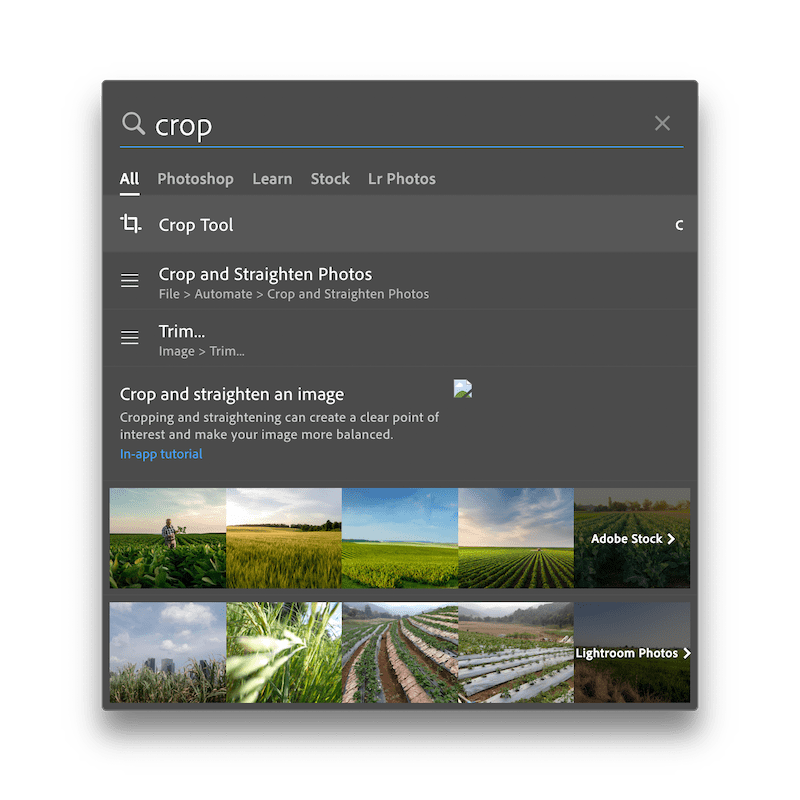
2007 was quite the year for search. It’s when Excel gained Formula AutoComplete (as surprising as it seems that it wasn’t included all along), so you could start typing and Excel would suggest the formula you likely wanted. It’s when Visual Studio also got a file search box that doubled as a command prompt. Two years earlier, Apple had added Spotlight to the Mac (the same search tool build into your iPhone today), but it’s what Apple added to the Mac’s search in 2007 that moved search forward.
Hidden in the release notes of OS X Leopard was Help Menu Search. “A new search field in the Help menu displays all relevant menu items in the active application,” explained Apple, Spotlight for all your software features. Click help, start typing, and you could find the command you need in seconds, no trial and error required. Suddenly Photoshop’s Crop tool or Excel’s Replace function and every other hidden software feature were easy to find.
Spotlight itself feels like a modern command line. Type an app name to launch it, 3+5 to see its sum, $25 in Euro to convert currency, and more. Paired with search inside your app’s features, you had the best of the terminal paired with the best of graphical interfaces.
Buttons and menus, after all, have text describing their functions. Add search and suddenly everything was more discoverable, no cryptic commands or oddly shortened words like dir needed. Menu items and button tooltips use real words, after all, the terms you’d use to describe them in real life. Search those words and you’d find the tool you need.
Taking shortcuts.
There was an easier way all along: Keyboard shortcuts, where you’d press CMD or Ctrl+C to copy and so on.
They're faster, for sure. “Keyboard is by far the most efficient way to navigate and control modern digital technology 90% of the time,” said @Blakejmyer in a Capiche discussion about keyboard shortcuts. “Super users are keyboard only.” As engineer coach @MorganJLopes said, “The efficiency of navigating a computer without shifting hand position compounds over time.”
“A mouse is okay for browsing the web, but for getting working done I prefer a keyboard.” @ahubbs. As @AndrewPenry said, “You can't beat the speed of not moving your hands to another device or to touch the screen.”
The problem they're like magic incantations, secret codes passed down from computer classes and textbooks, not the things you’d discover on your own. “Once you know what you're doing, the keyboard is much faster for things you do all the time,” said @dharmesh. But you've got to know what you're doing first.
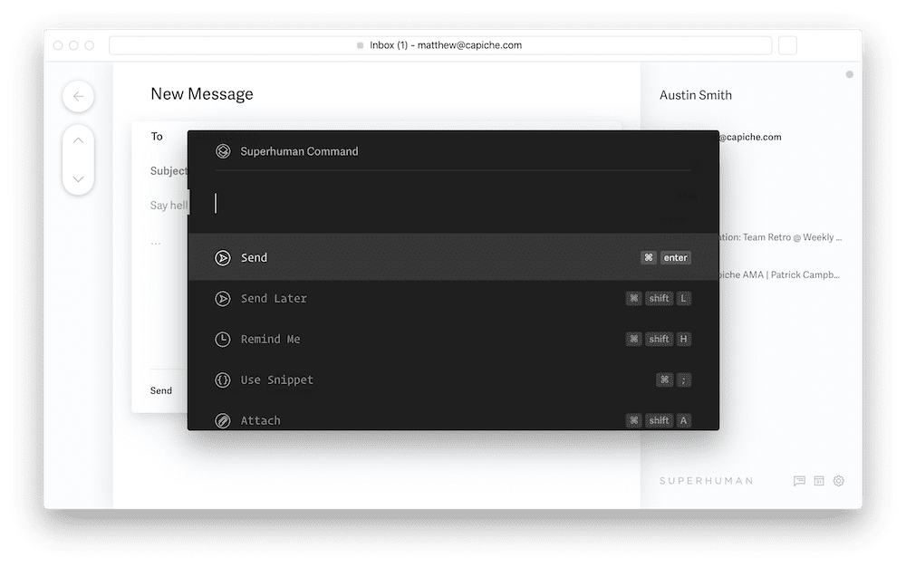
“If you don’t know a shortcut, how do you look it up? And if you don't know a feature exists, how do you find it?,” mused Superhuman founder Rahul Vohra in an email conversation about command palettes.
Enter the command palette.
Early text editors like Vim took the command line approach, with commands such as :wq to save your work and quit the program. They’re fast to use once you learn them—but you have to learn them in the first place.
Thus the genius of the command palette in Sublime Text—and its early predecessor in the Mac’s help menu search. You don’t have to learn what to press or even know what to look for. Just type and get the feature you need.
What makes a command palette?
“A command palette has quite a few parts,” said Vohra:
“A single shortcut to invoke the palette
A fuzzy matcher to find commands
A way to see the direct shortcuts for next time”
Height project management app founder Michael Villar said something similar. “There are a bunch of reasons why a command palette is interesting: it makes features completely accessible from the keyboard and discoverable in a standardized UI, makes shortcuts findable, and hides the underlying complexity behind a piece of software.”
So when the Superhuman team set out to make a more efficient email experience, they knew keyboard shortcuts would speed you up and search was critical to the email experience. “And then it struck us,” said Vohra: “the answer was staring right at us in our text editor.” Sublime Text’s command palette took a single shortcut to open, matched what you typed to the commands, and showed shortcuts so you could remember next time. Superhuman brought the same to email.
The Mac’s menu search inspired other developers to build similar tools. When iA Writer developer Oliver Reichenstein was asked about the inspiration for their iPhone app’s search that combines file and feature search in one dialog, he starts: “Well, in Help…”
The team behind writing app Ulysses skipped feature search, but still says their in-app search was inspired by Spotlight. “We took the elements we liked, a shortcut, quick entry, simple result preview and selection, and built our own mini-version of this search into the app,” said Ulysses co-founder Max Seelemann.
And some found inspiration even further back, in the terminal. As Alfred search tool co-founder Vero Pepperrell said when asked where they’d first encountered a command palette, “Using a command line was the original way you'd interact with any computer.” It just took some refinement and polish to make them usable by everyone.
“Command palettes are a vastly superior UI than point-and-click and can democratize the speed engineers experience in our editors,” said Command E founder Tom Uebel. Developers had long experienced their simplicity, perfect over generations in Terminal, Vim, Visual Studio, Sublime Text, and their successors. Power users discovered them in the Mac’s help search.
And now they’re everywhere.
Photoshop has a command palette hidden in its search tool, added in 2017 as a way to both search for stock media and to sort through the vast array of features in the photo editor. Microsoft Office has a command palette, in the top of the ribbon where the “Tell me what to do” box lets you search for Word, Excel, and PowerPoint features with a click or a press of Alt+Q. Notion changed the idea a bit, put its core tools behind a / menu, where you type a slash then continue typing to find the tool you want. Nuclino, a team notes tool, and Deepnote, a data science tool, are among the new apps that are built around command palettes. They went from being a headline new feature to something you should almost expect new software will have.
Computers without screens.
When computer scientist Alan Kay laid out his vision for computers, he among other rules the following:
“The service must not be esoteric to use. (It must be learnable in private.)”
Terminals, unlabeled buttons, and keyboard shortcuts never quite hit that. We could learn them in private, sure, but they definitely were esoteric to use, at first anyhow. It took combining a few things from each into a search bar to get a new feature that could turn everyone into power users.
Then as soon as it came to desktop software, the search bar disappeared again in the newest devices. Alexa, Siri, and Google Assistant all are essentially command palettes, activated by voice with no interface to see. Hey Siri, what's the weather? or Alexa, turn off living room lights or Ok Google, find directions to the airport, and it is so.
“People need to feel that they can try things without damaging the system,” said Apple’s Human Interface Guide, and the ease at which children learn to interact via voice perhaps means voice assistants at least have got the no-fear-of-damaging-the-system right.
Maybe Siri’s a command palette when we don’t want to type—and real command palettes are the way to simplify work the rest of the time. Maybe the future’s less about looking for the tool we need, and more telling computers exactly what we need, and it actually working.
Originally published on the now-defunct Capiche blog on February 21, 2020.
Apps in a browser weren't enough. Collaboration and cross-platform development made the difference.
When Google launched their online office suite with Docs and Sheets in 2006, feature parity with Microsoft Office wasn't the focus. Neither was a price tag of free, or cross-platform support by virtue of being a web app. Instead, Google focused on the pain of emailing documents back and forth to collaborate, then trying to merge everyone's edits.
"We made a deliberate bet that users would want speed, convenience and collaborative features enough that we could ignore richer functionality like rich formatting, margins, pagination, etc," Google Docs née Writely creator Sam Schillace told The Verge in 2013. Google Docs wasn’t better than Word, and users were perhaps not be thrilled that it only ran in their browser—but better collaboration features and being able to open your documents anywhere would more than make up for it, or so bet the Google team.
The story played out over and again as apps became the new leaders in their fields, or created entirely new categories. Often they were web apps, the easiest way to ship software that works on every platform from day one. But web apps were a means, not an end—as was their often low entry price of free.
What mattered were better features.
Web Apps for a Reason
For a brief window in the late 2000's, everything would be a web app, or so it seemed. Aviary and Pixlr aimed to replace Photoshop in the browser, CodeIDE and Cloud9 moved software development online, and apps like Jolicloud and Nvivo tried to recreate the desktop as a web app (the former as a new app, the latter as real Windows, but online). Microsoft even got in on the action with Windows Live Desktop, complete with a start menu. Web apps were built simply to have apps in the browser.
Customers shrugged, and went on using Photoshop, Sublime Text, and the desktop that came with their computer.
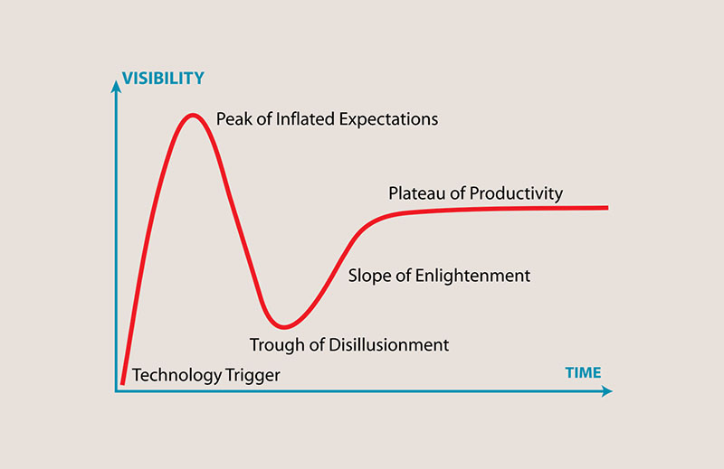
At the end of the decade that brought us Gmail, Google Docs, GitHub, Facebook, and Twitter, enough of our lives had moved into the browser that it seemed everything would. The increasing popularity of Macs in the workplace along with early mobile devices meant that being cross-platform should give web apps a strong advantage. And in the rush to go online, web apps hit the peak of inflated expectations in Gartner’s hype cycle—only to quickly hit the trough of disillusionment.
Web apps didn’t work when you were offline. They loaded slower than native apps, and often had fewer features. Free was nice, but working consistently was nicer. And the then-new mobile app stores made native apps all the more appealing.
Technology often starts out as an exciting new idea that's quickly iterated upon, enough to produce a bubble of exciting new things that use the new tech for tech’s sake. That’s a recipe for disappointment. Customers may get caught up in the buzz of new features, but in the long term they won’t buy tech simply because it’s new (sorry, 3D TVs). They don’t care that apps are coded in today’s fanciest frameworks, that they’re web apps or native apps or Electron in-betweens. They care, solely, that the app works, that it does what they need effectively and better than anything else. And they won’t switch to something new unless it is better at something they need.
In Gartner’s telling, it takes a “slope of enlightenment” of what new tech can uniquely do and how to use that to build better products, before new tech finally reaches a plateau of productivity.
For web apps, that enlightenment was collaboration and cross-platform apps.
Apps for Collaboration
In the rush to build early web apps, the critical yet often overlooked question was why. Free isn’t necessarily a reason to use a web app; after all, GIMP and OpenOffice have for decades been free alternatives to some of the best selling desktop software. Neither was simply being a cross-platform app enough on its own, when many desktop applications also had Mac and Windows editions. It takes something more to convince people to use a product that often, especially at launch, has fewer features than its legacy competitors.
The secret was hidden in plain view all along. Google Docs’ launch post accepted that their product wouldn’t include everything Word offered. Instead, Google Docs would add "collaboration ... to the productivity options people already enjoy."
Better for one specific need, one thing the platform was uniquely better at—and not better at everything. Even today, if you need advanced page layout tools or want to crunch millions of values in a detailed spreadsheet, you'd likely reach for Microsoft's desktop Office apps instead. But for real-time collaboration—even on text that doesn't exactly fit Google Docs' page design, such as a blog post or speech script—you'll likely reach for Google Docs with its superior versioning and commenting system.
The same inspiration fueled Figma, the design app that is quickly replacing the combination of Sketch or InDesign plus InVision. Their original plan to simply build “Photoshop in the browser” was quickly scuttled. Their app needed a reason, a purpose.
"Even though design is inherently collaborative, popular design tools were single-player and offline at the time," said founder Dylan Field in an interview last year. That was the reason: Make it easier to collaborate on designs, and you wouldn't care if the app only worked online and didn't have feature parity with other design apps. Design and photo editing in the browser wasn’t interesting if it didn’t bring anything new to the game. Collaboration itself made Figma better.
So it goes for Slack making team chat more fun and fluid, for Airtable helping the ghost of Microsoft Access escape the desktop, for Soundtrap finally providing an alternative to GarageBand. They were all built for community, with collaboration as the default. They were designed around the web’s always-on assumption where software can do things while you sleep. That gave us a reason to switch, even to pay for something that replaced a tool we'd already owned.
New web apps were better than what came before, specifically at collaboration. It wasn’t where the apps ran that mattered, it’s what they enabled. You didn’t care if a feature was missing, when the app let your team work together in ways you never could before.
The Right Platform for the Job
For software developers, perhaps the greatest appeal of web apps was building software for every platform with the same code. Write once, run anywhere. But web apps, by virtue of being in the browser, often were slower especially on congested internet connections. That made them feel unreliable; what would happen if your internet went down? And by being simply another browser tab, they were far more forgettable than software in the dock or taskbar every time you opened your computer.
Then in 2013 the GitHub team released Electron, a framework to turn HTML, CSS, and other web technologies into native-seeming Windows, Mac, and Linux apps, and changed that equation. Instead of web apps feeling out of place among other installed apps on your computer, Electron promised the code once, run anywhere dream—and delivered. You could code an app using web technology once, and turn it into a cross-platform app that felt equally at home on all computers. Electron apps ran offline, but could still include web components to keep data synced.
“Building native apps for multiple platforms doesn’t scale,” wrote the GitHub team on launching their Electron-powered desktop app. “The web isn’t a perfect platform, but native apps aren’t built on perfect platforms either.” At the very least, though, web technologies run everywhere, and fit well into the continuous development model where new features and bug fixes are released in near real time.
Electron helped bring apps to the desktop that might have otherwise stayed in the browser. It’s the main reason that new apps today tend to support Mac and Windows from day one. From new apps like Slack, Notion, Airtable, Superhuman, MeisterTask, and Abstract to new versions of legacy software such as QuickBooks, Electron powered apps are everywhere today. They’re built with web code—the same HTML, CSS, and JavaScript that power web apps in your browser—even when they require a download to run.
Even still, everything doesn't work better as a web app. Google Hangouts is perhaps the best thing to come from the search giant’s attempt to build a social network, yet if anything it feels held back by being a web app. Hangouts only supports Chrome, and has a maddening tendency to burn through your laptop battery and drop calls when the internet’s less than perfect.
Zoom met the challenge with desktop and mobile apps, paired with a lower quality web app if needed. It was a seemingly backwards step from the web-first Hangouts. And yet, Zoom’s native apps did so much better at streaming video calls, at keeping you connected despite your connection quality, that people switched to Zoom en masse.
"I often met with customers, and in my conversations with them learned they weren’t happy with the current collaboration solutions, including WebEx. I firmly believed I could develop a platform that would make customers happy," said founder Eric Yuan. Him, included, after experiencing the pain of spotty video calls during a long-distance relationship. "So how do we win? We care," Yuan told Inc. Magazine.
Caring about the little things means picking the platform and app style that delivers those things best. Web tech might make development better; platform-native features make users happy. For the popular new email app Superhuman, nailing both meant throwing away some of the default assumptions about web apps.
“Everyone assumed you’re in a browser tab, so clearly the service should store the email, the service should do the search, and the service should work like Gmail,” founder Rahul Vohra told TechCrunch. Instead, they designed their app to store emails locally, and be as fast as possible—two things typically seen as desktop app advantages.
“We decided it would be blazingly fast; it would be visually gorgeous; the whole thing would work offline; you wouldn’t need a multitude of browser extensions to get things done; and people would be materially faster at doing their email," said Vohra.
Vohra’s previous app, Rapportive (now LinkedIn Sales Navigator), was an email add-on to surface new info about your contacts. As such, its ideal platform was as a Chrome add-on so it could work inside Gmail. A pure web app wouldn’t have worked. Now with Superhuman, a new take on a web app along with native mobile apps makes the most sense—enough that people are willing to pay far above the market average for a better email experience. It’s a web native hybrid that’s increasingly how newer apps are built.
Yesterday’s Constraints are Today’s Opportunities
Everything still isn’t a web app, even a hybrid one—nor could all software reasonably be replaced by one. Survey people about their critical software on or check the App Store top downloads section, and you’ll find hundreds of reasons why we still need Macs and PCs to get work done.
Most obvious are utilities that tie into your system and help you across all your apps. Terminals, text expanders, backup utilities, file managers, automation tools, and more all fit here. They can’t be isolated in a browser window and need to work closer to your operating system—and are both the best argument against switching to a Chromebook or iPad for work and the best example of apps that are unlikely to become web apps.
Things that rely on your device’s hardware are another broad category best for native apps. Camera and motion-sensing apps on mobile, design tools that rely on external drawing pads, virtual machines to run other operating systems and test or isolate applications, and video games that use video cards to generate realistic graphics are all things built around the best of your device. You want those to use your device’s local power, something web apps are generally designed to avoid.
Bandwidth constraints have eased over the years as our internet connections have become progressively faster—but still, local hard drives are still far faster than your internet connection, much less newer solid state drives. When you’re cataloging photos, editing video into a movie, compiling code into a new app, and more, you want fast storage and a faster machine to cut through your work.
The apps that keep many of us attached to our Macs and PCs are often those that work better without being a web app, from utilities like text expander, file managers, and terminals to advanced video editing and CAD software. Perhaps they don’t need to be.
Or perhaps, someone will rethink those things with the best of the web, with its collaborative foundation in mind, and reinvent what we think software can be. Web apps today—as Progressive Web Apps—can work offline, use your device’s sensors, store as much data as needed locally, send push notifications, and hide the browser UI to feel more like a native device. And thanks to faster internet, make things like streaming video games and remote desktops feel nearly as smooth as running them locally.
The discarded web app ideas of yesterday suddenly might make sense. Replacing Illustrator with a web app might have seemed preposterous even a decade ago, or building a faster email app than Gmail. Figma and Superhuman proved otherwise, proved we’d line up and pay to switch to a web app if it actually did things better—while Zoom and every new native app in the App Store proves again that the best apps are designed around their platform’s best strengths, and that even today everything isn’t quite meant to be a web app.
Image Credits: Gartner Hype Cycle graph via Wikipedia.
Originally published on the now-defunct Capiche blog on November 5, 2019.
This is the best thing you could buy, promises the internet, the holy grail, the be all end all, everything you’ve ever wanted. This product does everything at once—or maybe it only does one thing, but it does that task better than anything ever did it before.
You don’t have time or budget to try all the things; no one does. So you have two choices: Trust the wisdom of the crowd and buy the most popular thing, or check reviews and roundups of the best items in a category. Reviews are Google gold for blogs, productive-feeling entertainment as if researching the thing that will make us productive is actually productive.
And it’s not like the writers are terrible, the reviews misinformed, or the ratings skewed. Sure there’s junk online, but there’s also lots of great info. Pick a trusted publication and buy a “best” item from their list, and you’ll get something that meets what their criteria for what makes something best.
But what do you need?
You don’t need the best widget. You need the widget that does the one task you need.
You don’t need a social media management application; you need to schedule Tweets. You don’t need a form builder; you need to survey your audience and easily see their favorite option. You don’t need a word processor; you need to share your copy and get feedback.
You don’t need software. You need to accomplish a task.
Thus the adage that 80% of people only use 20% of a product’s features, taken from Standish Group research into software dating back to 1996. That was for custom, in-house software. For “package applications” such as Microsoft Office, it’s even worse—less than 5% of features are often used.
Here’s the catch: You’re not everyone. You’re you, and one person’s needless feature is another’s treasure. You might need that one specific feature that only 1% of people use—but it’s the critical reason you chose that specific piece of software.
Broad categories obscure that. It’s easy to say something's the best office suite or CRM or project management tool, based on sales records and industry accolades. It’s far harder to drill down and find what’s best at the specific thing you need.
No one’s lying. Each person shared what they feel is the best program, with facts to back them up. And you know what? They’re right.
Take Google’s Docs word processor, for example. Google claimed over a billion people use Google Drive in 2018 after Microsoft claimed 1.2 billion users for its competing Microsoft Office in 2016. It’s popular—perhaps not the most popular, but easily #2 if not. While Microsoft Word format is still required for so many government, educational, and corporate documents, it’s easy to imagine Word may still be more popular, but Google Docs is right up there.
But best? Google Docs has fewer features than Microsoft Word, an older interface than more buzzy writing software like Notion and even Microsoft’s OneNote, and is far less flexible for print layouts than publishing software. It’d be easy to poke holes in the argument that it’s the best word processor.
What’s not debatable is that Google Docs is best for collaboration. “Google Docs has great collaborative functionality,” said Spectrum Labs founder Jackson Moses. “The comments/assign feature is incredibly useful and being able to review historical changes saves a lot of time.”
HubSpot CTO Dharmesh Shah shared similar feelings about Google Docs: “Not as cool as the cool kids, but it works and it's helpful when collaborating with folks outside the org as well (pretty much everyone has access to Google Docs in some way).”
Perhaps it’s not best for everything, but for collaboration specifically—where anyone can edit your document and share suggested changes, and you can look back through the edits easily—Google Docs is best. When you need to collaborate on documents, it’s the tool you pick not because its best, but because it’s best at that specific feature.
The iPhone wasn’t objectively the best phone at launch, in a “speeds and feeds” comparison of features. No copy/paste, no third-party software, no hardware keyboard, no front-facing camera, and no 3G. Yet it was best at the things that mattered: Web browsing and touch interface. Where touchscreens were clunky and required styli, the iPhone made it feel like you were touching software. And instead of basic mobile websites, you got the real internet in your pocket.
People chose it for the features they wanted most. Every other missing feature mattered far less for those customers.
When Salesforce entered the market as an early web app in late 1999, it wasn’t the most powerful or most feature-filled CRM. That crown went to software like Oracle and SAP. Salesforce’s winning feature was that it worked everywhere and didn’t require expensive in-house servers and maintenance. That feature was enough to turn Salesforce into the industry giant it is today—where now its killer feature is flexibility, something won by decades of iterative development. And rival HubSpot CRM’s core feature is that it’s free, which alone can be enough to cover a multitude of potential shortcomings.
Best is subjective, something everything from movie ratings to bestseller lists should teach us. We want the best—but maybe there’s no absolute best. As Shopify content strategist and writer Owen Williams recently wrote about gadgets, “finding one ‘best’ option for everyone might not actually be possible.”
And so it goes with software.
Is Sketch or Figma the best design tool today? “We've just moved from @sketch to @figmadesign at @Smarkup because of collaboration and scalability,” shared @adsabla, while @brendanciccone countered the opposite, saying “The reason I prefer Sketch is that I don't like people looking over my shoulder while I'm in design mode and seeing multiple people inside the document I'm working on just makes me feel anxious and less inspired to experiment.” Collaboration mattered to one, privacy to another, both key features that made one product best for different people.
There’s no best software. Some products have better specific features than others, though, and those tiny tools make us productive and help us get our jobs done.
Don’t waste your time looking for the perfect software. Find instead something that has features and tools you need. It might not be the coolest app, and might be worse for every other use case. Perfect; those are the 80% of the features you don’t need.
I have a love/hate relationship with phone cases. I loved the original Apple leather cases; on the iPhone X, with its curved glass edge and the gap at the bottom of the screen, with leather that patinated over time, the leather case felt like a nice addition to the phone. It felt nice in the case, nice out of the case, and both made sense depending on the situation. I never could love the iPhone 13 Pro's leather case as much, with its sharper edges that were more prone to wear and that added a bump to the bottom of the screen right where you swipe up to go home.
And so, increasingly, I used my phone caseless. Living dangerously, I know, and yet it feels nicer in hand, and I grew accustomed to the somewhat-slimmer form factor without a case. The first year of my iPhone 13 Pro's life, it lived mostly in a case. The remaining three plus years, caseless.
I expected it to accumulate its share of scratches and the occasional dent. I didn't expect it to somehow go through a natural bluing process, though. Yet that's what seems to have happened.
Whether through heat (I always felt like it ran hotter than previous iPhones, especially when on 2 bars of cellular connection—even if on Wi-fi—or with the default sim and an eSim enabled), or through some interaction of the stainless steel with my hand, my black (officially, "Graphite") iPhone 13 over time took on a blue sheen that looks for all the world like a heat-driven bluing.
The color was the most prominent on the lower parts of the phone, less-so near the top, leading credence to my theory of it being touch-related. The sim card tray and buttons were unaffected.
In some ways, Apple's choice of color for this model already had a hint of blue; the rear glass glowed a shade blue when the flashlight was turned on. Perhaps there was a hint of blue in the "Physical Vapor Deposition" process used to color the stainless steel that shone through as the upper layers wore off?
I liked the effect, though, and was somewhat sad to lose that patina when finally upgrading after 4+ years of service. It's not every day you get a uniquely colored phone, after all. And strangely there's my long-term review of the iPhone 13 Pro: It was a perfectly good phone that lasted well, got a bit warm, and changed colors over time. It never elicited any of the feelings that the iPhone X did—it was just another iPhone, that turned blue.