Ever since Google killed Google Reader last year, I’ve felt uneasy about using Google’s services. That uneasiness hasn’t been enough to push me away from Gmail and Google Docs, but it did convince me to move Techinch’s RSS feed off Feedburner soon after Google Reader shut down. After all, if they killed their RSS reader, what’s to keep them from killing off their RSS syndication tool, too?
But then, sans-Feedburner, it’s next-to-impossible to know how many people are subscribing to Techinch. Maybe that’s an unimportant stat, but it’s fun to know that people are reading what you write. And so, last week, I signed up for FeedPress to get stats on Techinch’s RSS feed, among other things. That requires a little .htaccess tweaking, which is always slightly unnerving for me since I have the uncanny ability to mess something up every time I open that file, but it went fine the first time. Then, once everything looked good, I just had to get a FeedPress Premium account so I could keep everything on my domain to make moving away from FeedPress—if such a thing was ever needed—possible without any pain.
That’s when I managed to mess stuff up (and so, to everyone who subscribes via RSS, sorry if you got some random articles from a different site in your reader today. That was my fault, and it’s fixed now). I couldn’t leave good enough alone, and wait for more time to get things working.
My feed worked before, and it worked after the initial redirect to FeedPress. It would have been fine to wait. And yet, there’s this crazy, eternal drive to tweak stuff. They say plumber’s pipes always leak. For them, it might be because they’re too busy to fix their own, but for geeks, our problem is typically that we can’t leave good enough alone. All’s not well until everything’s perfect—but it should be readily apparent that there’s no such thing as perfect in a fast-changing industry like ours. You can eternally tweak, but there will always be something else to tweak.
So stop. Agile development and rapid iteration and constant progression is good, but it’s so easy to take it too far. If your Mac is working, just get your work done and don’t go trying to tweak something to make it better. Same for your site, and your to-do list, and your everything else you’re tempted to tweak with when you’re bored. When it’s time to actually improve your site, set aside a block of time to do that, and just do that. But stop with the constant tweaking. You’re only going to drive yourself mad.
Or at least I’m going to. Which is why I’m trying to stop, and thought you might do well with the reminder to do so, yourself.
I'm a tech writer and editor, who remotely from Thailand online for Envato, an Australia-based company. And it's great. The only problem is, my job title is inherently confusing to anyone who's not geeky. Say you're a writer, and people assume you've published novels (now that'd be nice, but...). Say you're an editor, and people either assume you work in a newspaper (not bad), or stare blankly. Try to say you're a tech writer, and it simply doesn't make sense. Perhaps this all wouldn't be so hard in an English-speaking country—I can easily get by saying I'm a writer in English, but anything beyond that still tends to break down—but in Thai, it just doesn't work.
The simple question of "What's your job?" has, for so long, been the most annoying part of meeting new people for quite some time. That's ridiculous.
And then, finally, it hit me a couple months back: when asked, just say I "work in IT." Everyone gets that—even old people. It conveys that I work with tech, sounds like a real, respectable job (especially without any published books to back up that "writer" title), and even makes people not surprised when I say I work remotely. That one tiny change to the way I refer to my job has simplified my life way more than it seemingly should have. It was one of my best life decisions of the past few months.
Seth Godin recently asked the question on his blog "Should you teach the world a new word?" He discussed his own challenges with finding a job title for himself that didn't cause confusion, something that obviously struck close to home for me. He then expanded the idea to naming products, careers, and anything else, saying:
"Your job might be like no other one like it in the world, but that doesn't mean you need a new job title. ...if you can happily succeed while filling an existing niche, it's far easier than insisting that people invent a new category for you.
It doesn't matter if you're right, it matters if you are understood."
Isn't that the truth? Being understood—getting our point across—is the whole point of language and communication and titles. And yet, it's easy to want to call your thing something 100% new. Who wouldn't want the world's most unique and impressive job title? Who wouldn't want their app to add new words to the vernacular?
That's preposterous. There's enough real words out there to describe what you're doing with out having to invent something new. So simplify. Use normal words the way they were intended, and make what you're saying as clear as possible to everyone. It'll simplify what you're saying for others, and will actually simplify your own life, too.
Life's a lot easier when you're not having to explain everything you say a second time.
...though if developers keep using real words for their new app names, it's going to start getting harder to say anything that doesn't have a tech double-meaning...
There's a little app called IFTTT that can change your life.
Tech can get pretty tedious, and if anything, it's getting more tedious instead of less. We take pictures with our phones, then edit them in Instagram where they're automatically shared on Twitter and Facebook, but then would have to upload them again if we wanted to share them on another network. Then, we save those pictures to Dropbox or back them up to our computers so they don't get lost. And that's just for pictures of your lunch.
There's no need to wade through countless junk emails or have to duplicate everything you share online to make sure all of your friends can see it. You shouldn't check Etsy or Craigslist daily to see if the thing you want to buy is available, and you shouldn't even have to ask Siri if it's going to rain. Instead, you should enlist one of the coolest free tools to help you: IFTTT.
Launched in beta back in 2010, IFTTT is the ultimate simple automation service built around a simple sentence: if this then that. If this thing happens, do this.
Stop for a moment and think of all the things you could do based on that one phrase. If it's going to rain, send me an SMS. If I tag my grandma in a photo, email it to her since she doesn't use Facebook. If my package is out for delivery, email me. And the list goes on and on.
Whether you've already been relying on IFTTT or haven't heard of it before now, chances are there's more ways you can put it to use that you haven't thought of yet. It's simple to use — you literally just pick the thing that happens first, and then pick what happens if that first thing happens. Set it, and forget about it. There's a brand-new free iPhone app for IFTTT that lets you use your iOS photos, contacts, and reminders as IFTTT this triggers to let you do more with the data on your phone, in addition to the stuff you can already do with it online. But even online, IFTTT is insanely valuable. Here's some of the best ways to put it to use:
Backup All Your Stuff
Even if you keep your computer and phone backed up, you're likely not backing up all the stuff you share online. Sure, much of it is inconsequential, but you'd likely want to keep at least some of the photos you've put on Facebook and Instagram if they happened to accidentally lose them. And the great articles you read in Pocket will quickly be tough to find if you don't have a place you're keeping them after they're archived.
With IFTTT, though, none of this has to be difficult to do. You can set it to backup all of your stuff to Dropbox, automatically, so your stuff will be protected and you'll never even have to think about it. You could have it save your contacts, archived articles, and bookmarks to Evernote, all the pictures you're uploaded and tagged in everywhere to Dropbox, and all the emails you send to your significant other archived as PDF. You could even backup all of your social media updates to Evernote, so you can go back and see everything you've written online.
Sure, you might not want all of the stuff, but why make yourself have to think about what's really important? Just set it all to backup, and then forget about it.
Social Networking Without Being Social
Social networking can get quite frustrating when your friends are spread about between a half-dozen different services. Plus, you might want to post somewhere else entirely — on your blog, perhaps — but you know no-one will even see what you write without it being on Facebook and Twitter.
Here's what you have to do. Figure out where you want to post by default, then use IFTTT to publish it everywhere. There's never a reason to have to copy and paste to post to Twitter, App.net, and Facebook at the same time — let IFTTT do the dirty work for you. Just set up a recipe to post to the other networks whenever you post to your default network, and you're good. Better yet, just write on your blog, then have IFTTT share that post on all of your networks. And to save just a bit more time, you can have it change your profile pictures on all of your social networks when you change it on one of them.
Then, for good measure, you can have IFTTT backup your blog posts to Dropbox or Google Docs or Evernote. Or all 3 — the more, the merrier, right?
Quit Talking to Siri
Siri's great, really. But why should you have to ask it what the weather is, or what today's stock prices are?
Instead, use IFTTT to tell you when there's news that's relevant to you, when stock prices on your stocks change over a certain amount, when it's going to rain, and more. The latter two are simple: there's built-in weather and stock/currency triggers that you can directly. With News, it's a tad tougher since Twitter locked down on IFTTT's API usage, but you can still use it to monitor news RSS feeds for certain topics (or turn Twitter into an RSS feed and use that in IFTTT), or follow @breakingnews on App.net and use IFTTT to let you know when stuff happens in your country.
You can even have it remind you when you're supposed to be doing stuff — have it SMS you when you have an appointment, or turn on your coffee maker in the morning with a Belkin WeMo. Combine it with your email and an app like Mint or your bank's own alerts, and you could have it SMS you when you spend over a certain amount of money. Make your budget go even further with alerts of sales on Craigslist near you, without having to waste any of your time looking for them. And, of all things, you could have it keep track of all these little things in Evernote, giving you yet another backup on a part of your life that you would have never thought of backing up, but that just might be interesting going forward.
----
IFTTT won't automate everything in your life, but it sure can simplify a ton of the tedious little tasks that take up time and keep you from being productive. And it can even help you know stuff you wouldn't have otherwise. It's hard to imagine living without it once you've got it integrated in your life.
You can check out the Most Popular recipes on IFTTT's own site, or see what Hacker News and Quora users are using it for. Or just think of what you need to automate — your inbox, the news, your backups — and try to put it to use on your own. You might be surprised how much this one little tool can keep you productive by taking care of more of those little frustrating things for you, automatically.
Originally published on July 15th, 2013 in Techinch Magazine Issue 5
It’s just a screen. A rather locked down screen. Let’s change that.
The TV was everyone’s favorite thing to say should be disrupted, until watches became the Next Big Thing™. Steve Jobs famously called their Apple TV set-top box a “hobby”, but that didn’t keep away the annual rumors that Apple was eventually going to make their own TV. But it’s not that surprising that Apple hasn’t gone for it yet; the road to a fully disrupted TV is littered with dead products and failed dreams.
It’s hard to look at the so-called Smart TVs today and think that we’ve arrived. If anything, they’d remind you more of the original Tablet PCs with clunky software that doesn’t feel like it’s been designed specifically for that device. The TV needs an iPad-style revolution.
But what would such a revolution look like? For that, you’ll need to take a stroll down the dark alleys of the internet. No, you won’t need Tor, but you will need to look beyond the likes of PirateBay to the streaming sites that list every movie and TV show imaginable. For there, just one search and a few clicks through ads later, you can instantly watch anything you want. The quality varies, and you’ll occasionally find something recorded in the wrong language, but that’ll be easily forgotten after you’ve started watching anything you can think of seconds after searching for it.
Now, combine that with full-length HD movie downloads for the stuff you want to keep around without the DRM restrictions that make movie downloads today so cantankerous — something the likes of PirateBay or a couple downloads and your Bluray player can provide today — and you’ve got a solid glimpse of what the future of movies and TV shows could be. And you can’t reinvent TV without first solving the content issue itself.
We’re 6 Years Behind
Digital music used to be every bit as frustrating as digital video is today. If you had an iPod and bought your songs from the iTunes Store, or if you had any device and bought CDs and ripped them yourself, you were fine. Otherwise, you’d have to pick from an excruciatingly limited selection of music that’d work with your device or jump through hoops (like burning DRMed songs to a CD and ripping them) to get songs from iTunes to play wherever you wanted. It was a mess.
Compare that to today, where every digital song you buy online or from iTunes is DRM free and will work from any device on the planet, and there’s an incredible number of streaming services that’ll let you listen to as much music as you want with a subscription. It’s a world of difference, one prompted by Steve Jobs’ “Thoughts on Music” post on Apple.com. Today, there’s no excuse to pirate music — it’s simpler to stream it online or buy a copy from iTunes, and you can use the copy you buy anywhere and back it up however you want.
We’ve solved the digital music issue, so why not solve the movie issue? We’ve got a partial solution today, one very similar to the music issues of a half-decade ago. You can buy almost any movie or TV show you can think of from iTunes, but will have to play it back on a Mac or PC, iOS device, or Apple TV. Or, you can stream most TV shows and a number of movies from services like Netflix, the one place it’s easier to go legit than to pirate. Broadcast TV — say, CNN and sports — are hit-and-miss, some easy to watch online and others only available if you also have a cable subscription.
What we really need is DRM free video purchases, and reasonable streaming/rental options that have everything we’d want to watch. If Netflix had every movie and TV show ever made ready to watch in a click — and was global, without any location restrictions — I’m certain they’d be able to easily charge double or triple their current subscription price. And if iTunes HD movie downloads were DRM free so you could play them directly on any TV sans-HDCP or burn them to a disk to play at Grandma’s house or watch them on an Android phone or Microsoft Surface, digital video purchases would make a lot more sense. Purchasing — or legit streaming — would be simpler than pirating.
Broadcast TV and cable stations would still have to have an future-proofed online solution, of course. There’s still stupendous to turning on a channel and watching whatever’s on, without thinking about it, and that’s lost with digital video where you have to pick what you want to watch. Plus, you can’t switch news and sports to simple episode streams the way you can chop up AMC and HBO’s content, so we still would need live streams. But that should be simple enough — after all, online streaming video is nothing new. Do it in an open standard, on its own subscription or perhaps bundled in a Netflix-like service, and make it fully global, and I can’t imagine why it wouldn’t work.
Put all of that together — streaming video services that have extensive catalogs, DRM-free downloads, and streaming channels, all without geoblocking — and you’d have the media part figured out for the future of TV. We’re at least half-way there, what with Netflix (and their new ventures into original content), the iTunes/Amazon/Google Play stores (and Vimeo’s new shot at streaming indie movies and selling and rather innovative sports streaming that lets you pick angles and replays to rewatch — but we need to go the rest of the way before we can really have the future of TV. It might take forever for the studios to catch up, but it’s beyond time to make the changes.
The App Store Potential
But then, limiting the TV to just video seems ridiculous in the age of the App Store. After all, a TV is just a big screen. And yet, we’ve been far more creative with the other screens in our lives — hello, computers and tablets and phones — than the TV. Surely once we have media solved, we can do a lot more with the TV — both for videos and for things we haven’t even thought of yet — than Smart TVs of today offer.
Now, TVs have far fewer pixels than your iPad, so they’re definitely not going to be where you want to do your reading — even though reading apps have become one of the main killer apps on the iPad. One might think that the TV screen would be great to fill with widgets showing the weather and stocks and your latest emails, but we already know how horrible TV news looks now with multiple tickers and info-panels. Throwing an API at the big screen is surely not enough, or otherwise the smart TV interfaces we’ve seen so far would have fared better.
What we need is someone with a brand new idea on how to use the TV screen. Not something out of Minority Report or the many “tech of the future” videos put out by Microsoft and others, but something that’s a new idea for how you can put a TV to use today. See, no one seemed to think of ways normal people could put a tablet to use in their lives, so when Apple made the iPad they had to make their own best-in-class apps for it, from iBooks and the built-in browser and email apps to iWork and Garageband, to showcase what it was capable of. Someone’s got to do that for the TV before the whole idea of a smart TV makes any sense. We need a killer idea for what a TV can be used for, and then the tech to bring that to the TV.
I happen to think Geckoboard and other status board web apps for teams are one of the most innovative uses of a large screen that we’ve seen in a while. Perhaps everyone doesn’t need something like that for their personal use, but it’s an idea, at least. Then, there’s the oldest living room tech, game consoles, that still are the best alternate use of TVs to date. There’s got to be more ways to put the largest screen in your house to use, though, and someone’s got to come out with an incredible new idea that makes the way we think of TV today seem quaint by comparison.
Until then, the TV will continue to be a video and game screen. And that’s fine, really, especially if the studios would hurry up and get everything online. But I’m looking forward to see someone who will revolutionize the TV the way Apple did the smartphone and tablet. It might be Apple, or it might be someone else. But without an incredible idea of something new the TV can be used for, there’s little more an extra set-top box can do for us today — we’ve all got the tech already to make DRM-free video and streaming services work on the TV.
Somebody’s going to figure this out, and it’ll seem like it should have been obvious all along in hindsight. But today, there’s nothing on the market that’s the real future of the TV, aside from the first steps of Netflix and others to free TV and movies from the constraints of cable and disks. We’re waiting and ready — someone needs to surprise us and deliver the future of TV.
Originally published on September 10th, 2013 in Techinch Magazine Issue 5
There’s not enough time to learn everything you want to. It’s just impossible.
So go make stuff.
I know, it sounds like an insanely backwards idea. But it’s the best way to learn.
Case in point: Jennifer Dewalt. She decided she wanted to learn to code, and to do so decided to build 180 websites in 180 days, armed with nothing but Google. Her first sites were basic, but she worked up and each day improved her craft. She built everything from basic games to to-do list apps, using everything from CSS animation and Instagram APIs to Backbone and Node.js, all without taking a single coding class. Her school was trial and error, combined with Google, GitHub, and StackOverflow. Instead of regretting that she didn’t know how to code, she quite literally just did it and made real stuff along the way.
Now, her example isn’t enough to prove anything. There’s theories galore on how much you need to practice to master a craft, everything from Malcolm Gladwell’s theory in Outliers that it takes 10,000 hours of practice to perfect a skill to Josh Kaufman’s book that says the first 20 hours are the most important for learning anything. But both of those ideas include the same thing: practice. Practice makes perfect, says the old saw, and while it may not be true, you’re at the very least going to learn a lot more with practice than you will doing nothing.
It’s a lot easier to read yet another simple trick that’ll help you do what you want to do, but a lot less rewarding. So go make stuff instead. You’ll mess up, but that’s the point: you learn from the great old school of hard knocks. And hey, start small: you don’t want those knocks to be too hard. But there’s no better way to start running than to try to avoid falling down.
*****
We decry the notion that tablets are only for consumption, not creation, but then the most popular uses of phones, tablets, computers, and the very internet itself is for consumption. We watch viral videos, read rehashed news stories, upvote funny comments — we consume content. That’s what tech ends up really being about. The only guy spending time wisely on Reddit is the one doing an AMA to promote his work; for everyone else, it’s almost only passive consumption of brain junk food.
Fuss about Instagram filters all you want, but at least it’s got more people than ever trying to capture moments artistically — creating something of value, at the very least to their own selves. That’s not bad.
Blogging, they say, is a dying art. Don’t let it die. Go write something, however small. Share your photos. Strive to improve. Try to take a slightly better picture every day — don’t go buy a new camera or new apps, but use what you have and improve your skills a bit at a time, and publish your efforts. Don’t read a book on coding — go try to tweak the CSS of your blog’s theme. It’s the perfect test ground where nothing can really go wrong (and if you’re that worried, go make another blog just to break.). Change some numbers here, refresh, see what broke. Now fix it. If you can’t fix it, Google the problem, and then fix it. Now go break something else. Then write another blog post, but break out the thesaurus and use words you’ve never used before. Use different sentence structures. Break English, and fix it, too.
*****
If I ever have kids, I plan give the Lego company a ton of money — but I don’t plan to buy any of their branded kits. Instead, I’ll get a ton of the raw original Legos and a table of green sheet Lego board, and let my kids go to town. No, I’m not being a cheapskate. I just think the kits are as dumb as the next toy set, and the plain sets of raw Legos are one of the best ways ever to promote making stuff and learning by doing.
Putting a kit together by following the instructions is just like putting IKEA furniture together as an adult: you’ll feel like you’re accomplishing something, like you’re making something, when really you’re just doing some really active consumption. You don’t really have to think (that is, once you’ve figured out what the diagrams mean — that, admittedly, can sometimes be a true puzzle).
Making something new, though — that’s a whole different game. You stare at the little blocks, and imagine what they could be if you put them together just so. But there’s never enough of the right pieces, so you’ll have to improvise. And then, your perfect dinosaur’s head is far too heavy and falls over, and you’ll have to improvise again. Trial and error. Learning by doing.
Then you grow up, and by the time you’ve put your IKEA furniture together, you feel pretty good that it’s done, and sit down to consumer some more content. Why not make your own shelves from raw wood and screws instead? Yeah, don’t put your valuable stuff on them at first, until you’re sure they’re sturdy, but I bet you can do it. And if not — if you hit a snag after you started — you’ll be able to find the answers. Just don’t look for them beforehand.
There’s something to planning ahead, counting the cost, and thinking before doing. All very important. But that’s not something you need to think about when you’re trying to learn. You’re either busy being born or busy dying, as Steve Jobs liked to quote Bob Dylan. So keep being born, reinventing yourself, learning. It’s messy. Life’s messy. But you’ll sure learn from it.
So go make stuff. Over and Over. Every day. Keep making stuff, something small, every day. Oh the places you'll go, oh the things you'll learn. You’ll improve your skills, a tiny bit at a time, without even thinking about it. You’ll grow. You’ll become an expert, accidentally.
The next time you think “I wish I knew how to do that”, go do it. You’ll learn a lot trying. And you’ll make stuff.
Originally published on October 8th, 2013 in Techinch Magazine Issue 6
Wherein my friend Pedro breaks down what we really need in apps, and why the awesome, new apps don't always pan out the way it'd seem they should. Sometimes, we simply don't need something new and shiny.
The best apps solve a real problem, and simplify life. To borrow a catchphrase from Minimal Mac, that's what we believe in.
You don't need PowerPoint to make a presentation. Or Keynote. Or any special app, really.
As my first tutorial at Tuts+ Computer Skills, here's the absolute basics of making a presentation. And not just any presentation, but a great presentation.
It's the simple tips to blowing default PowerPoint templates out of the water, using Paint or Paper or even TextEdit, that no one wants you to know.
We're used to breathless reviews of the latest gadgets, written before the rest of us have a chance to even see the gadgets in real life. The reviewer gets a couple weeks - or sometimes just a couple minutes - with a new device, tries out the new features, and declares it a winner or loser in today's market. The next day, it's time for a new gadget. Rinse. Repeat.
It's not bad, per se - I do the same with apps for reviews, and obviously most movie reviews are written after watching the film once. Restaurant reviews? Why, they're typically written after only eating a couple entrées in the restaurant, and hardly can really tell us how everything in the restaurant will taste.
But how about something different: a review of a gadget that's far past its prime, one that's all but obsolete but still in service?
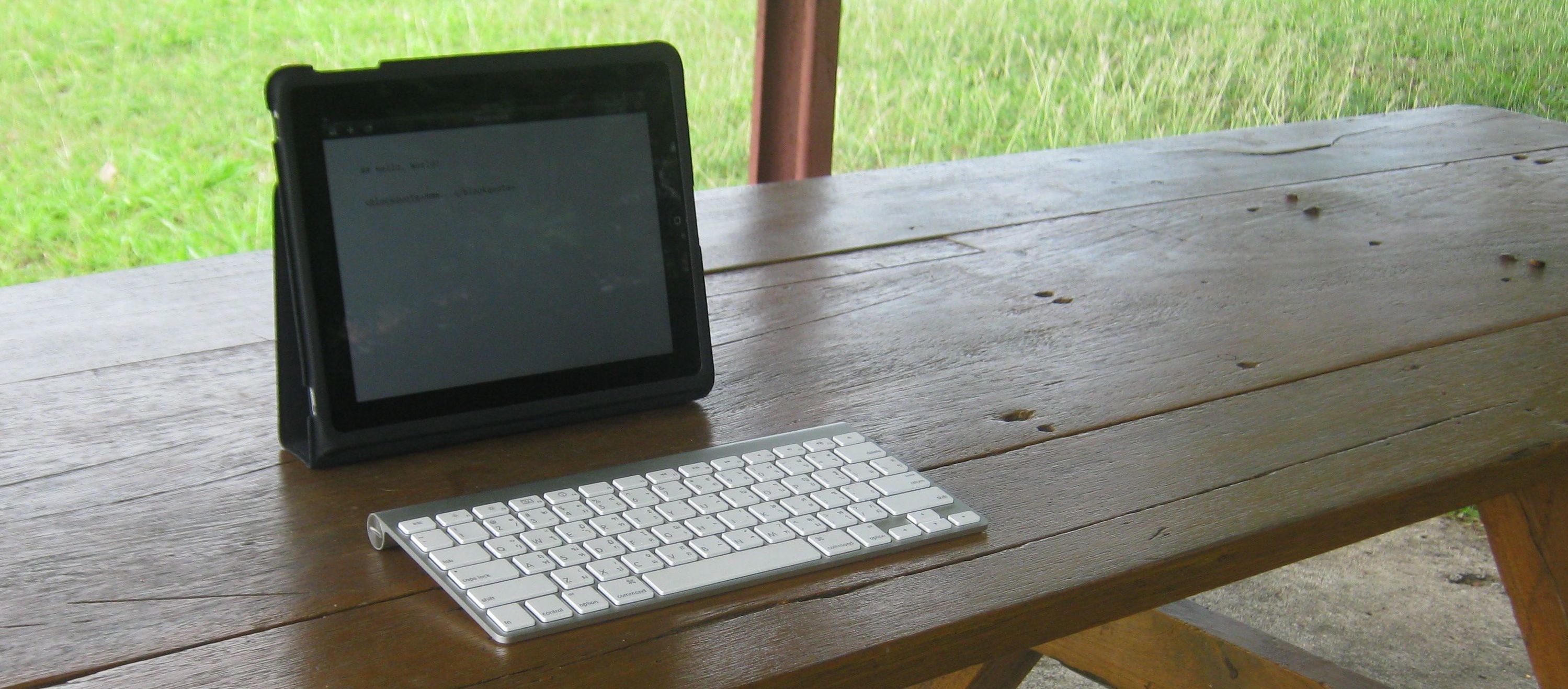
Enter the iPad 1. Blackberry's (now former) CEO predicted that 5 years from now, tablets will be passé at best, so where does Apple's original tablet stand today? The iPad 1 is increasingly a tech dinosaur, shadowed by The New iPad and the iPad Mini - and whatever tablet Samsung is promoting this week. But it still works, and many of us are still using it in 2013. My wife and I still used it daily until she got an iPad 4 earlier this year — and now my Mom used the old iPad 1. It's still working, and is still a game changer for anyone without a tablet today.
Most Techinch Magazine readers will be familiar with the iPad already — you may even be reading this issue on one right now. But I thought there was something to the idea of capturing my thoughts on Apple's first real tablet, an experiment that was inspired in part by Patrick Rhone's review of his iPad 1 late last 2012. So here's my take on the iPad 1.
The Tablet That Started it All
My first Apple tablet wasn't official a tablet at all, but rather a Newton MessagePad 2000, given to me in, of all things, 2000 after the company he worked for decommissioned them. It was my first Apple product, one that introduced me to the puff of smoke that now graces the OS X dock when you remove icons, and the pull down to trash can animation that was in Notes, Mail, and more until iOS 7. But, for the most part, the Newton was a novelty, one where I kept a journal and used an on-screen calculator and practiced writing in Graffiti since it was far more accurate than the Newton's own software. It was fun, but never something I ever used for all that much.
I was a bit late to the iPad party, getting my iPad 1 in early January 2011 (after I won a giveaway; thanks BraveNewCode!). At the time, the only laptop I had was a PC netbook, which I used exclusively when traveling - it was too annoying for much else. I purposed that the iPad would replace it completely as my on-the-go computer.
And it did that, and more. I was still in college at the time, and ended up typing up numerous essays in Pages, even submitting them thanks to iCab Mobile's support for file uploads (the lack of file uploads is still the biggest frustration I've had with my iPad until now - something that's been fixed for pictures in iOS 6 which the iPad 1 can't run, but is still an issue for iOS overall). At the time, I was both writing for AppStorm and doing tech support for Flow for work alongside college, and the iPad 1 performed remarkably well for both of those jobs. The built-in 3G made getting online on the go insanely simple, something that felt miraculous compared to sharing internet from my old phone then or using a 3G dongle. And I'd easily get 8-10 hours of use out of the iPad even through a full day of work on 3G, something you couldn't beat on a computer until this year's MacBook Airs were released.
The first and most obvious complaint about the iPad is that no one would want to type on the on-screen keyboard all day. But, for myself at any rate, I found I could type far more accurately on a cramped bus with the iPad's on-screen keyboard than I could on my old PC netbook or my newer 13" MacBook Air. The former was simply too small and flimsy, and the latter is large enough to make use on public transit a public nuisance. The iPad, on the other hand, was just the right size to fit in my lap and let me type rather accurately without taking up too much space. And yes, I can touch-type without looking at the iPad screen — it still amazes me that I can thumb blind on my iPhone, but typing on the iPad is equally surprising. And yet, it works.
What also works amazingly well is using an external keyboard. I linked the Apple Wireless Keyboard I used with my Mac to the iPad, and was pleasantly surprised to find that, even from the beginning, iOS supported most of the best text editing keyboard shortcuts from OS X. It was great on the go, but add a keyboard and it almost felt like a "real computer". And, the iPad 1 even was light enough that you could bring along an external keyboard and not weigh more than most laptops — but really, that's unnecessary, because the on-screen keyboard is that good.
Performance with iOS 4 was good enough that I never really thought about the iPad 1's speed — it simply worked. What did bug me from the beginning was multitasking — or the lack thereof. There was basic app switching from the beginning, but that's all it was: basic. iOS 5 bought the multitasking gestures, though, and that changed everything — at least once they were brought to the iPad 1 with the first update. Sure, iOS 5 felt slow on the iPad 1, and most apps would have to refresh when you switched between them. But doing a tiny bit of Safari research then swiping back to your text editor to keep writing was suddenly simple. If they'd only add CMD+tab to the external keyboard support to let you switch apps without touching the screen, it'd almost be as good as a Mac.
And here's something that I really have always loved about the iPad: you can only do one thing at a time. That's frustrating, and yet, it makes you slow down and just do one thing. Turn off notifications, and there's nothing at all to distract you. It's scary almost how much the friction of switching back and forth between apps feels odd, because you're really not getting much done when you're constantly switching back and forth anyhow, even on a Mac or PC. It's good for you, once you're used to it — enough I almost wonder if it wouldn't be good for most of us to turn off tabs in our browsers.
But I digress. So, the iPad 1 for me was a revolution for two main things: it was easier to use on the go, something that was huge for me as I was traveling a lot the year I used it the most, and it made it easier to focus on just one thing at a time.
Everything Rises and Falls on Apps
Now, on a Mac or PC, there's well-known apps for just about everything you'd think of. The iPad, especially at first, didn't have that advantage — or should I say, it didn't have that curse. Instead, developers were able to find their own way with apps. Apple jumpstarted the iPad with the iWork apps, each of which found its way into my personal iPad-only workflow. Pages, as mentioned before, was the perfect Word replacement even in college, Numbers met my needs for lite spreadsheet use, and Keynote is the gold standard for presentations on any platform — assuming you can use Keynote to show said presentation, something I did from the iPad with the VGA connector. No problems there.
In the same way, the built-in email app was a tool I used daily, and with the iPad 1 it was practically the only email app on the platform. But that was ok — it worked great for my needs, and is always a reminder to me that sometimes we overlook the best built-in apps on platforms because we're so quick to want something shiny and new. Safari, also, was nearly enough, but the aforementioned lack of upload support in the iPad 1 made iCab Mobile my browser of choice whenever I needed to upload stuff — something that's still needed on any iPad today if you need to upload more than just images.
For nearly everything else I needed to do, there honestly was an app for that. Screenshot resizing is something I have to do a lot in my AppStorm work, and OneEdit was an app I just discovered in the App Store that worked perfect for that. Same goes for Textastic for code editing and FTP, iA Writer for writing, and more.
Now, that's where the iPad 1 quickly showed its age. It was fun using Garageband and Diet Coda, but both proved almost too much for it. Newer apps just were too much — oddly enough, for a machine that played back iTunes movies more smoothly than my older PCs ever did.
In the end, the iPad 1 today is still a great reading and writing device. For everything Jobs demoed in the original keynote, it's still perfect. It still gets great battery life, still scrolls beautifully in Instapaper, still is amazing for typing out some thoughts in Notes or Pages or iA Writer. Maps never were as awesome as they seemed they would be, thanks to the lack of turn-by-turn directions, and tabs in Safari were only mildly useful at best with the iPad 1's limited memory.
But you know what? It did the things it did better than anything else I'd ever used — and then enabled the awesome experiences of games like World of Goo, tools like the Paper app for drawing, and animated eBooks that my younger siblings loved. And hey — it still works today, something you can't say for so many competing tablets.
That's not bad.
Originally published on October 8th, 2013 in Techinch Magazine Issue 6
An online store? No thanks. I’ll just post a picture.
Ever tried to setup an online store? Rather daunting little task, isn’t it? Every major eCommerce CMS is complex and confusing at best, from the newer and simpler solutions like the WordPress powered WooCommerce all the way to full-fledged eCommerce engines like Magento. You can use them to make your own store, but you’ll sure find it frustrating at best to get everything to look and work the way you want. And don’t even talk about hand-coding your own eCommerce system from scratch without at least using a payment solution, unless you really know you can make a fully secure and PCI compliant.
Really, just scratch building your own online store by hand unless you’re really dedicated to the tech side of things. Just make a store on a hosted platform like Shopify or Big Cartel, places that make it easy for sell stuff online for a few dollars a month. You’ll get your own site to tweak as you like, within reason, and it should just work. That’s a ton simpler.
But even that’s likely too much trouble if you’re really not geeky. I mean, you just want to sell stuff: why have to go to this much trouble? So instead, just list your items on eBay and Etsy. There’s a built-in audience at those sites looking for things, so you’re more likely to get discovered anyhow. Seriously.
Wait. Is discovery the magic word? In that case, you might not even want a store at all. Just think for 3 seconds about where you discover stuff at random the most online, and you’re ready to sell.
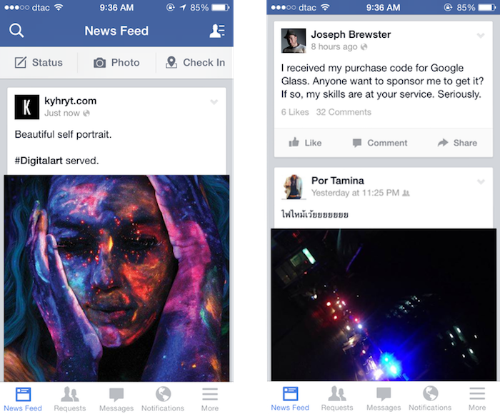
Apparently, that’s what entrepreneuring farmers in Kuwait did, when they decided to start selling their sheep on Instagram. No, really. It sounds insane, but as Quartz reported, farmers there are taking pictures of their livestock, adding the price and their phone number or WhatsApp messaging ID to the photos, and then posting them on Instagram. Voilà. Without doing anything more than simple photography and editing, they got a full eCommerce store that looks sharp and automatically broadcasts their new products to their customers. What more could you ask for?
Maybe we all think too hard
Backtrack several months, and my wife was trying to start an online business, selling handmade natural paper and more. She’d sold stuff on eBay years ago, but the fees and frustrations with eBay’s interface and policies made her want to try something new. So, I suggested we just make an eCommerce site and sell directly.
Easier said than done. WooCommerce proved rather frustrating, and the whole website project turned out harder than I would have thought at first. But once you have a site done, how are you going to attract buyers? You can try to get to the top of Google for the things you’re selling, but that’s tough at best — and still, how many people are going to buy stuff directly from a site they just stumbled across from a Google search? For her, eBay became the solution again. It’s filled with people looking for stuff to buy, and if you can put up with their insanely dated interface and listing tools and make enough to scrape together a profit after paying all of their fees, it’s rather simple to make your store a quick mini-success.
Discovery is the crucial element. If people don’t see what you’re selling, you’re out of luck. eBay fit the need by bringing potential customers and sellers together in one place that most people online think to look for stuff. But social networks are even better. Facebook and Twitter are where most people’s attention are these days. So why not sell stuff directly to where people already are?
As it turns out, Facebook eCommerce is already popular in Thailand in much the same way Instagram eCommerce is in Kuwait, but I never thought of it as such. There’s stores here that sell everything from furniture to iPhone cases without more than a Facebook Fan page. They’ll post pictures of their products, and leave more info about them and their prices and shipping policies in the description. If you want to buy anything, you can call them or send them a private message on Facebook, and complete the purchase with a bank transfer. There’s an element of trust since you can see the store’s fans talking in the comments on Facebook, and you know you could raise a ruckus if they didn’t deliver. But they do: eCommerce really works this way.
You’ll still have to build up a fan base, and you’ll still have to make great products. But processing payments and getting a web presence doesn’t have to be nearly as difficult as most of us think. You really just need to tell people the stuff’s for sell, and there’s likely really low-tech options for everything else.
No wonder Instagram sold for $1 billion.
Originally published on August 20th, 2013 in Techinch Magazine Issue 4
Flash back a decade ago, to early 2004. XP powered desktops are laptops were practically the only computers you’d see, running either IE6 or an early version of Firefox, and more likely than not connected to the internet via dial-up. Gmail wouldn’t be announced until April, the iPod was still black and white, and Fortune wondered aloud if anyone could ever topple Blackberry. YouTube was still a year away, and Netflix streaming wouldn’t be a thing for 3 years. The iPhone was still over 3 years away, and Android even further.
That’s the world Facebook was launched into. A world dominated by desktops and traditional browsers, ones where always-on internet was something new and sharing pictures meant syncing a digital camera and painstakingly uploading pictures hours or days later. It was a slower, simpler time.
And it was a time that Facebook was perfectly suited for, with a slower feed that’d show your friend’s longer, rambling posts they’d have time to type on a desktop, and the flash games and more that made it the one web app everyone used. It ended the reign of Myspace, AIM, MSN Messenger, and strongly displaced personal blogging in one fell swoop. It was unstoppable.
Then 2007 happened, and the iPhone changed everything. Another startup social network with 140 character messages styled after text messages had seemed like a rather unlikely challenger to Facebook’s dominance a year earlier, but now, the information density of short messages made perfect sense with smartphones. The next US election, only one year later, would see Twitter the talk of the town far more than Facebook had ever dreamed of. It was the perfect timing for the most unlikely social network.
Smartphones should have been an equal boon for Facebook, but the desktop-focused social network never felt as natural on smartphones as it had on the desktop. Its purchase of Instagram — the photo social network that, just like Twitter, seemed perfectly suited for a mobile audience – was a final Hail Mary to earn a place in a mobile world. And yet, Facebook itself has increasingly felt like an afterthought for most people: you private message on WhatsApp or Line or iMessage, you share pictures on Instagram, you discover what’s happening on Twitter, and if you’re writing anything of substance, you likely switched back to private blogging or writing on new platforms like Medium.
It's not that Facebook was so bad at sharing your status, or private messaging. It's that it strove to be everything, in an age where we're using one app for one purpose. And then, in trying to be too much at once, it made it impossible to focus on the one thing you where in the app to do: see what others posted.
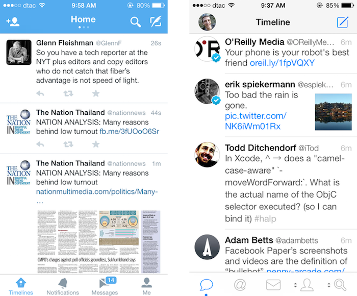
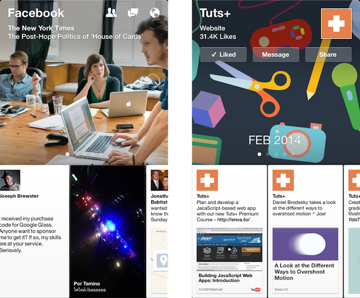
See, on mobile, information density is where you live or die. Facebook's app shows, at best one and a half posts at once, and often that half is an ad. You're scrolling a full screen each time you want to see another post. And those extra features — private messages, say — are at best 3 taps away. Information density wasn't a problem for Facebook on spacious laptop screens, but when they tried to shrink everything down for the phone, everything got cluttered and crowded, quick.
Compare that to Twitter, the social network that feels much more like a messaging app. In the official Twitter app you’ll usually see 3 posts (though one of those may be a sponsored post), and in 3rd party apps you’ll often get 4 posts at once. Twitter gives you over 3 times the information density in the same screen as Facebook, with far fewer options and confusions than the Facebook app presents at once. Those 140 characters have managed to cram in a ton of info — locations, links, and even pictures of late — that let one tweet tell you so much, while still taking up so little space. Twitter’s focused and information rich, while Facebook retains its desktop bloat.
Enter Paper
Thus, the new Paper app. The issues with its name notwithstanding, the Paper app represents the best new shot at making sense on mobile for Facebook since their purchase of Instagram. This time, though, it makes the core service make sense, not just one tiny aspect of it.
The app is slick and polished, enough to catch everyone's attention even in a crowded app market. And, for once, it wins the information density game, even without feeling like it’s cramming as much in one screen as possible. There’s a large banner at the top — itself actually one of the recent posts in your stream — with two and a third full posts visible below. That’s as good of information density as Twitter, if not better, considering how much text and graphics are in that one view. It, for once, has proven that retina displays can actually be more useful than their lower resolution counterparts, with its beautifully rendered full-length-yet-tiny Facebook posts.
Paper makes browsing your Facebook stream — the essential Facebook experience — fun again. Search and private messages and the other Facebook extras are still hidden away behind extra taps, but at the very least it nails the Facebook feed on mobile (and the separate Facebook Messenger app already gives you a one-tap look at your private messages if you'd like that).
And it makes exploring fun again. You likely don't rely on Facebook for your news, but Paper shows that you just might want to, with its curated topic views. They're far from perfect — it'd be much better if it turned your Facebook Likes into curated selections, and then perhaps threw in some of Facebook's recommended picks — but it's the first time I've discovered new sites on Facebook in a long time. Something's right, here.
Best of all, Paper's new card design and simple gestures to flip through content are so unique and yet so obvious once you've used them, it's hard to imagine that they won't be copied as much as Tweetie's then-new pull-to-refresh gesture has been. Facebook's leading mobile design here, and that's a surprising new start.
So, here's to the social network that I'm not particularly fond of. Facebook hasn't been my favorite social network in quite some time — that crown would go to Twitter. And yet, with Paper, I see promise again. At the very least, it's the one Facebook app that feels truly mobile-first and innovative. It's hard for that not to feel exciting.