The day before that, even. Scratch that: If you’d started last week, a few months back, a year ago when the idea first hit your head, you’d already have some traction. You’d be on second base, at least.
But that was then, and this is now. You didn’t do it then—and that’s fine. Odds are you did some pretty great stuff instead.
And now it’s today, and it’s the best time to start.
There will never be a better time, in fact. You take a step today, and tomorrow you’ll be ready to take the next step. You write something today, it’ll be there for someone to read tomorrow, fall in love with, and follow you for the next great thing you’ll publish. Google will get a head-start indexing it today, so it’ll be ready when someone searches for it next month.
Your brain will say no, you should have done this before, and now it’s pointless, and look at everyone else who has already done the things and is so far ahead.
And, yeah, good point brain. But if you don’t do it now, you’ll just be stuck in the same old loop tomorrow, next week, next year. And your brain will still be saying too late, should have done it back then, but now...
Oceans rise, empires fall, and companies rarely last long enough to see even part of the cycle. Today’s most venerated brands were, not all that long ago, not even a thing.
Then someone said, you know what, I’m just going to start making watches or sewing handbags or mixing sparkling sugar water or writing code, and it was so. It wasn’t overnight, but with that slow compounding of time, one bit of great work on top of another, the dream became a thing.
That slow, steady process is perhaps most clear online, where Google search rankings are there for anyone who will put in the work to claim them. The questions people google every day aren’t going to answer themselves; if you’ll show up and write what people are looking for, publish it consistently, over time your stuff will do well, will get traffic, will get discovered by the folks who need it most. It’ll take time; it took well over a year to get Capiche ranking first for its name, for instance. But it also didn’t take any tricks, didn’t take hiding links and doing shady SEO tricks. It was just publishing, showing up every day and putting more stuff on Capiche that we bet could rank well. And eventually Google said, you know what, Capiche is a thing. A thousand little commits, cashed in at once.
That’s what you’re kickstarting when you start today. It’ll still take time. Nothing’s built overnight.
But at least you started. The first brick’s laid down. The foundation’s there.
Tomorrow you can tell your brain, no really I actually did the thing yesterday, and today I can do it again.
And then it’ll be the best time to take the next step.
writing about writing.
Got space in your inbox for one more email a week? Join the Techinch newsletter for a five minute read, once a week, about writing, technology, and stories.
It started as an experiment, as the best things do. Or rather, as a handful of questions:
Why is it so much easier to share photos and even video than audio?
Why do podcasts always go to YouTube when they want to go live?
What makes podcasting so difficult, and how could we simplify that?
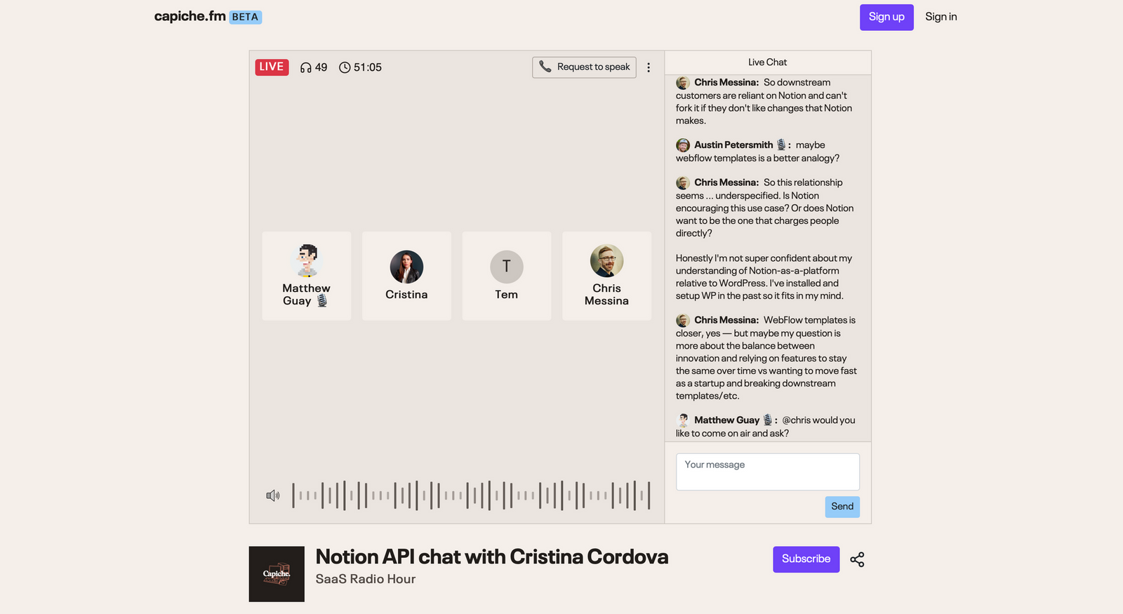
One thing led to another, and over the summer of 2020 the Racket née Capiche team dev team built Capiche FM, first as a way to start a live broadcast literally over phone calls, before morphing into online live broadcasts.
And in the process, I hosted over three dozen live episodes that were listened to live for over 318 hours, interviewing tech founders and leaders about the ideas behind their products and what's next. From a chat with iA Writer founder Oliver Reichenstein about what inspired their eponymous writing app, to talking to Kirby founder Bastian Allgeier about the CMS that powers this site, to having Notion's head of platform Cristina Cordova come on to talk about their then-upcoming API (which was instantly the most popular talk on the show), Capiche FM led to fun conversations I wouldn't have otherwise had and bridged the Capiche software community over to our new livestreaming platform.
Then we kept tweaking, built Racket as an even simpler take on recording and publishing audio, and shut Capiche FM down this June. That leaves Capiche FM as a handful of memories of incredible live conversations over the fall and winter of 2020, and this collection of recordings from the SaaS Radio talks.
Matt and Staat founder Amanda Sabreah chat about what makes JIRA so complex and confusing, setting up developer teams for success, why Staat focuses on Jira and GitHub issues instead of building new issue tracking from scratch, and more.
Matt and Intelivideo CEO Adam Zeitsiff chat about the digital transformation that gyms and other local businesses have gone through over the past year, and what it takes to build a platform that brings local business online and help them compete with larger platforms.
Matt and Salesforce Enterprise Architect James Cull to chat about one of the original SaaS web apps—and how customization, flexibility, and a suite of acquired apps has kept Salesforce one of the top CRMs for decades.
Matt and Rows founder Torben Schulz to chat about the future of spreadsheets, where spreadsheets are still better than databases, Rows’ upcoming button, and more.
Matt and Andrew to chat about Zapier, Integromat, n8n, and Parabola, how automation platforms have changed, and what’d be the most exciting to see added to Zapier now that loops are supported.
Matt and Andy for a chat about how to make apps not boring—with a game engine-powered weather app, calculator, and timer. Plus, what happens when you make software for the people who want it most—the double-IPA of software?
Matt and Coda head of product and design Lane Shackleton chat about Coda's unique take on documents + spreadsheets/databases, why buttons are the most powerful thing in Coda, what’s coming next for Coda (hint: You’ll soon be able to connect any API with Coda and build your own Packs), and if files are dead.
Matt and Pitch Head of Presentation Experience Tomaz Stolfa chat about Pitch’s new approach to presentations, rethinking how presentations should be centered around storytelling, Pitch’s upcoming follow feature and mobile apps, and more.
Matt and Kirby CMS founder Bastian Allgeier chat about flat-file content management systems, what's tough about building bookmarking tools, building a hosted version of Kirby, balancing open source and a business model, Markdown vs WYSIWYG, and more.
Matt and Roam Research's Bardia Pourvakil to chat about wiki linking, using daily notes to memorize things, the upcoming Roam API, note taking strategies, and more.
Matt and Makerpad founder Ben Tossell chat about no-code, automation, apps like Zapier and Airtable, building a community, why “no-code” is too limiting of a term, and more.
Matt and Airtable Customer Success manager Shani Taylor chat about Airtable, building custom database powered apps, syncing data between databases with an upcoming feature, the new Airtable apps and marketplace, and more.
Matt and Ben Lang from the Notion marketing team chat about using Notion even if you're not taking notes, replacing everything from Wunderlist to Dropbox with Notion, why teams need a Notion Librarian, and more.
Matt, productivity trainer Maria Aldrey, Notion evangelist Ben Smith, and RadReads founder Khe Hy kick off the new year on SaaS Radio Hour with a roundtable chat about Notion. Hear their organization tips (hint: Use databases to organize everything), what Notion needs to improve (unanimous vote on speed), building a GTD workflow and Zettelkasten in Notion, and much more.
Matt, Cord CEO Nimrod Priell, and Cord product marketer Abby Barsky chat about Cord's unique take on chat, working between multiple apps, switching costs, how chat has evolved over time, and more.
Matt and Andrius chat about Pixelmator, building indie apps for Apple’s platforms, one-time purchased software versus subscriptions, naming versions, and more.
Matt and Notion's head of Platform Cristina Cordova chat about Notion's upcoming API, what to expect from the first integrations, and much more in one of SaaS Radio's most popular broadcasts.
Matt and Linear CEO Karri chat about Linear's unique take on issue tracking, building fast web apps, how the command palette helps overcome limitations with both mouse-driven and keyboard shortcut interfaces, Linear’s tools to see project momentum, and how Karri breaks down issues and ideas into smaller, more accomplishable tasks.
Matt and QotoQot founder Ivan Mir talk about indie app development, time tracking, privacy, building for Apple platforms, subscriptions versus one-time purchases versus pay for a year at a time apps, and more.
Matt and Vanta CEO Christina Cacioppo chat about privacy, SOC 2 compliance, building a secure organization, why you should use 2 factor authentication and a password manager, deleting unused data, and more.
Matt and Calendly founder Tope chat about Calendly's scheduling tools, why calendar apps haven’t evolved as much as email apps, why to keep your camera turned off during calls and turn them into walking meetings, and more.
A chat on the ideas behind the Capiche essay on how Microsoft Teams bet on files, while Slack + Salesforce bet on data, and how in many ways Slack built a new take on the terminal for SaaS, a text way to interact with software, while Microsoft Teams rebuilt Finder and Windows for web apps.
Matt and Streak founder Aleem Mawani talked about the story behind Streak’s CRM, building a business inside Gmail, keeping your product running even when the platform it’s built on changes, Google’s standardization of both the browser rendering experience and the email experience, where Kanban breaks down and isn’t as useful as a table, and more.
Matt and Yac founder Justin chat about voice messaging, remote async communications, building Zapier integrations, and more—with stories about how the Yac team now has zero live Zoom calls, doing everything from standups to hiring interviews over asynchronous Yac voice chats.
Matt and iA Writer founder Oliver Reichenstein's chat about Markdown, the story behind iA Writer and how it originally almost was a physical device, why iA Writer didn't switch to subscriptions yet, and more.
Matt and Austin chat about the big news in SaaS from the past few weeks, from Excel's new database-powered linked data types (joined by Al Chen to discuss how those will be used in businesses) to Hey for Work and the challenges of convincing businesses to switch email providers. Plus: Fast and simplifying eCommerce checkout, Social commerce and selling products via live video as almost the QVC of the web, Twitter's Fleeps and why that was the focus instead of other Twitter features, Google Photos ending unlimited free storage, and Apple and Spotify's different approaches to podcasts.
Matt and Ulysses co-founder Max Seelemann chat about their Markdown writing app, how its design has evolved over the years, the limits of touch interface design, why subscriptions make sense for Ulysses even without being a web app, Max' prediction on the future of Apple's platforms, and hints at what may come in the future for Ulysses.
Listen to Matt and Tem from Optemization chat about Notion and what's made it such a flexible tool for everything from notes to project management to publishing web pages, how it compares to ClickUp, OneNote, Coda, and more, and how Notion's carved out a new category as a flexible page where you can create anything you want.
What makes a markdown-powered notes app for teams different from a wiki like Roam Research? In the first part of this call, Matt interviews Slite CEO Christophe Pasquire about the notes app he founded and what makes it different from other tools.
Then, in the second part of this call, hear how the Slite team approaches organizing team notes, what makes it different from Slab, and how notes and knowledge bases differ.
Nearly every tech giant now has game streaming, with Microsoft, Google, and Amazon all competing for streaming console games, and now Facebook announcing they'll be streaming mobile games. It's something that's been tried before with business software—but it never took off. Could it eventually come back, and let you stream, say, AutoCAD or Premiere to your computer, relying on a server to do the heavy rendering?
Also:
Google Maps APIs now let you build your own delivery service
Dropbox new family plans cost quite a bit more than the competition, for less—highlighting the challenge of managing files today
For years, the thing to complain about in software was lock-in, how you had to keep using the latest Microsoft Word to open files from colleagues. That’s gone away, as SaaS put everything in a database, let us share software for free with collaborators.
Now we’re locked-in with unique software that has features that would be hard to replicate elsewhere, things like Notion that put notes and kanban boards and tables and more in one app. You could never replicate everything in your Notion in another app. Yet we’re happy.
That’s thanks to the IKEA effect in software, where today’s lock-in doesn’t feel nearly as restrictive as feature, file format, database, and subscription lock-in alone did.
Four years ago, Microsoft built Skype calls into their web apps, so you could edit a Microsoft Word doc in the Word Web App, then start a Skype call to collaborate live or present it to other people from the app.
That's the new SaaS battleground. Late last week, Zoom announced Zaaps, web apps that open inside your Zoom Calls. Google recently, on the other hand, announced Google Meet video calls inside Google Docs and more, and one of the newly released Pitch presentation app's core features is in-app video chat while you're collaborating.
In this episode, Matt and Austin, along with a guest appearance from Al Chen, chat about how video is the new work operating system, how Google missed the boat with social, whether Google is a monopoly, and more.
Step back to 2002 as we talk about the history behind Markdown, the plain text formatting syntax that changed how we write on the web for good.
There was Aaron Swartz’ ATX, Dean Allen’s Textile, then John Gruber’s Markdown, in short order, one after the other. Competition for the plain text editing crown, or so it seemed.
Here’s how, in the pursuit of capturing the magic of typewriting and early plain-text emails, the way we edit text changed.
Catch the story in this episode, then dig into the complete Markdown history on the Capiche blog.
Twilio is building an ecosystem of developer tools—from Sendgrid to Authy to now Segment. Matt and Austin discussed what that means for the future of Segment and Twilio, with a guest appearance from Aaron Gotwalt.
Plus:
Trying to decipher what Cloudflare One is offering.
Zoom is adding encryption—and we discussed how they won the market, even without traditional enterprise tools.
Google rebranded G Suite as Google Workspaces, and the contrast between their broad product strategy centered around distribution versus Zoom and other SaaS startups focused on making the best possible single product.
One of the few perks I took advantage of as a student were software discounts. Adobe's Creative Suite at the time was a $700+ purchase—or as a student, it was a bit over a hundred dollars, something far easier to budget.
Adobe and Microsoft's famous student discounts are hardly the only ones available today. After checking over 200 popular business software products, here are over 88 of the best student discounts today—including Slack, Notion, Basecamp, GitHub, and more for free.
Superhuman, the latest attempt to reinvent the email app, really does make email faster. You can clear out emails without reading them, split your inbox into categories automatically, snooze emails for later, and do everything in your inbox with only keyboard shortcuts.
And somehow, it teaches you to go through emails faster and not worry so much about each message.
Software started out as a rare commodity, something you’d buy in a shrink-wrapped box for hundreds of dollars. Competition, the internet, App Store, free open source software, and subscription models democratized software to a degree, making even professional software approachable priced—at least in the short term.
But that’s changing. After years of software getting cheaper, over the past decade software has gotten more expensive, fast. Three times faster than the average inflation rate, in fact.
Learn more from our study of 100 popular business tools’ pricing over the past decade in Capiche’s first blog post.
Ever gone to sign up for a price only to see a "Starts at $X" or "Call for pricing" tagline and wondered what the app actually costs? Or tried out an app and gone to pick a plan, then puzzled over which plan your team actually needs?
Software pricing is surprisingly confusing. Either it's hidden entirely with more enterprise focused tools, or it's obscured between a range of similar plans or metered pricing for something you can't quite tell how quickly you'll use up.
So as a first part of building a new software community, my new team at Capiche is helping make software pricing transparent. If everyone shared what they really pay for software, it'd set baselines, help us all know what to expect to pay and how to negotiate to get the best pricing. It'll help us all pick software better—just as flight searches help you navigate pricing options and pick the airlines that makes the most sense for your trip.
“This startup wants to turn the cloud software business on its head.” ~Business Insider
A review of the Apple Watch Series 4, after eight months of use
You’re running late, or so you fear. You instinctively raise your wrist and see the minute hand hovering near 10. You’re good. You’ve still got a few minutes left.
You might not notice the date or even the hour. They’re there, but the date doesn’t matter right now, and you can visually confirm the hour without thinking much about it. It’s the minutes that matter.
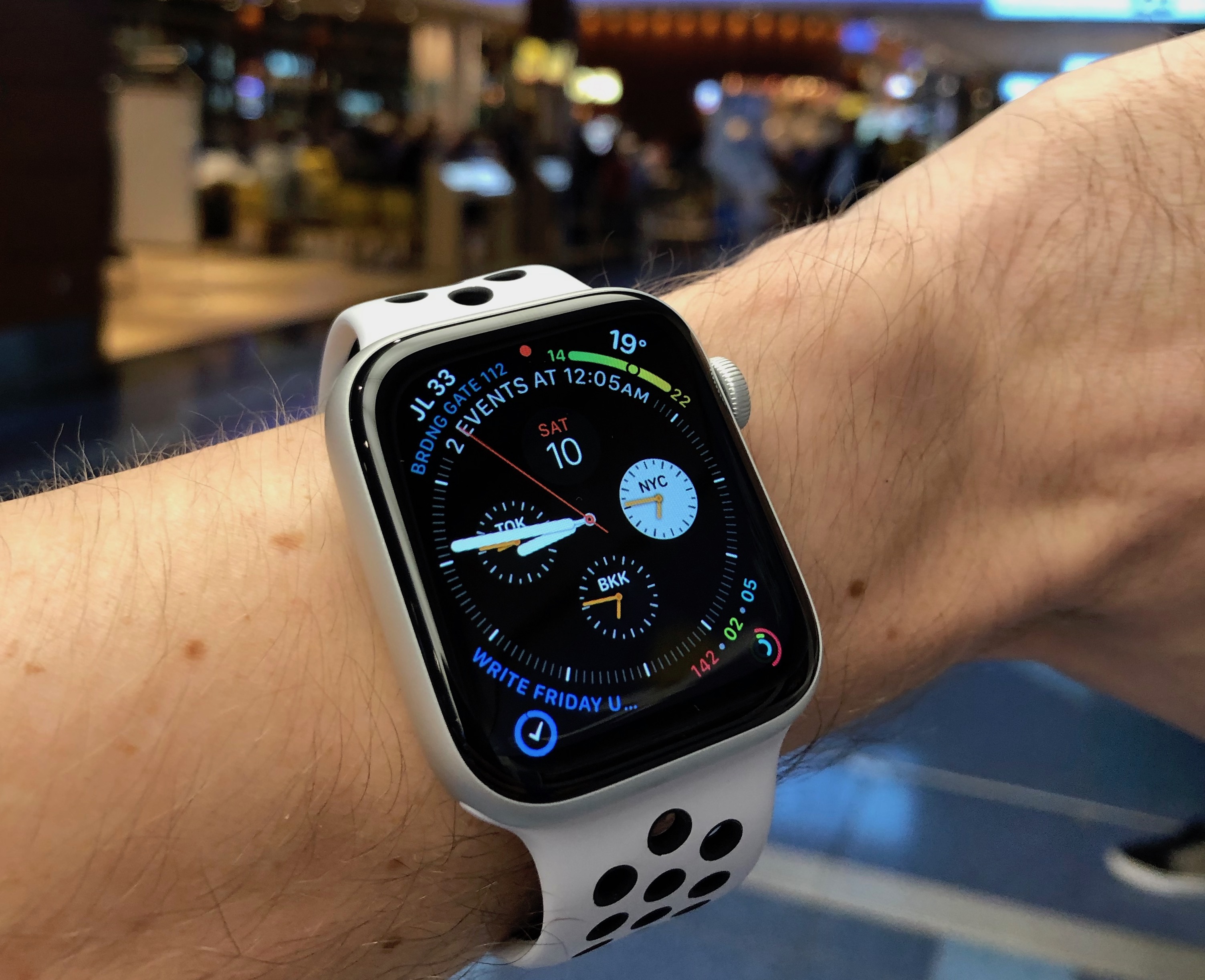
That’s how watches have worked for decades. And that’s essentially the Apple Watch experience, too, only with more bits of data—more complications, in horology-speak.
Feel like it’s surprisingly hot? Glance down and, oh, it’s 37°C, no wonder it’s so hot. Need the time in another city, your next flight’s gate, the current air quality index, or the next task or appointment on your agenda? Those and more are also just a glance away, depending on how you set up your watch. The same way you quickly see the time on a traditional watch without paying attention to the date or other complications, on Apple Watch you can get the weather or any of dozens of other bits of info in a quick glance without noticing the other stuff. Seems crazy, but over time it seems your eyes and brain know where to glance to get the info you need, and when you glance down wondering what the weather is, that’s the main thing you’ll notice. You might check the temp and not notice the time. And when someone mentions it being hot, you'll look at your wrist instinctively like watch wearers already do for the time, and feel like something’s missing if your watch isn't on your arm.
It doesn’t pull you in quite like a phone screen with all of its apps and longform content luring you to keep tapping. The Watch only shows bits of actionable data so you can go on with your real life.
Apple Watch context switches based on what you’re doing, which is where apps feel the most immersive. If you go for a run or swim, for instance, you can track it with the built-in Workout app (which will notice if your exercising and offer to log the workout even if you forgot to start the app first) or a 3rd party app like Nike Run Club or Strava. Then you’ll run as normal, forgetting the watch until you are wondering your pace or how much further you need to go. Glance down, and there’s the info you need, the distance in one corner, your average speed in another, and so on. The time is ever-present in the top right of the Watch, too, if you need.
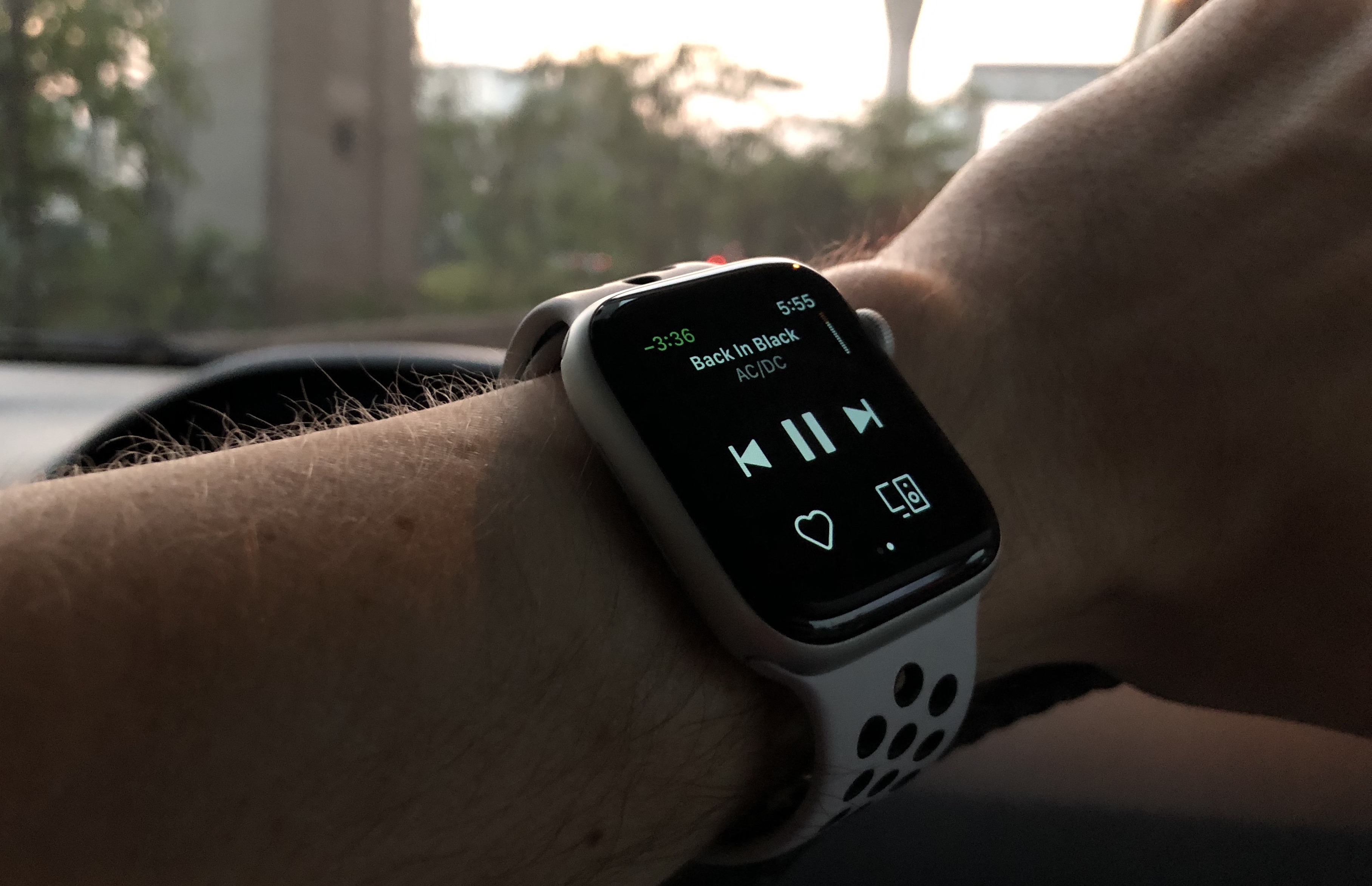
Walking somewhere? Use Apple Maps to find the best route, then glance down to see how much further you have to go, or rely on vibrations to know when it’s time to turn (with slightly different vibrations for left and right turns). Listening to music or a podcast, even one you started from your phone? Glance down to see the track details, playing time, and large pause and skip buttons, perfect to see the artist’s name or jump to a next track. When you’re doing something immersive, an app turns your Watch into a different gadget built around the data you need right then, for what feels like the closest thing to augmented reality for your real life.
Of which, notifications are another part, the third core part of the Watch experience. Any app that can send you notifications on your iPhone can pass them to the watch, where they tap your wrist, let you see the full notification and reply to it if possible (such as with chat apps) or take other actions (such as deleting an email message from the notification). See the notification, quickly reply with dictation, and go on with your life without opening the full app. If the notification came from an app that supports the Watch, you can tap the notification to see it in the app (especially helpful to get the full context on a conversation in chat). But even without a Watch app, you can still reply to many notifications directly from the Watch, as I often do with those from Slack.
Notifications are annoying enough on the phone. On your Watch, they'll drive you mad if they're not notifications you want. I've restricted mine to the ones I find most valuable: Chat and important emails, finance for payment notifications, calendar to get reminded of upcoming events, and transit apps to know when a Grab or Uber has arrived. Each of those are helpful enough to want something poking you on the wrist when they come in.
Apps are a core part of the Watch experience, ever present in complications, notifications, and as full-screen apps when needed. You can also run apps on their own from the home screen, helpful say to check your bank account balance or to dictate a new note. They’re good for scratching an itch, when something comes to mind and you want a quick bit of data. They're not like iPhone apps, where you would waste time scrolling through feeds, or like iPad and Mac apps where you would sit down to work. They're instead good at bits of data, telling you something small or logging data for you to expand on later.
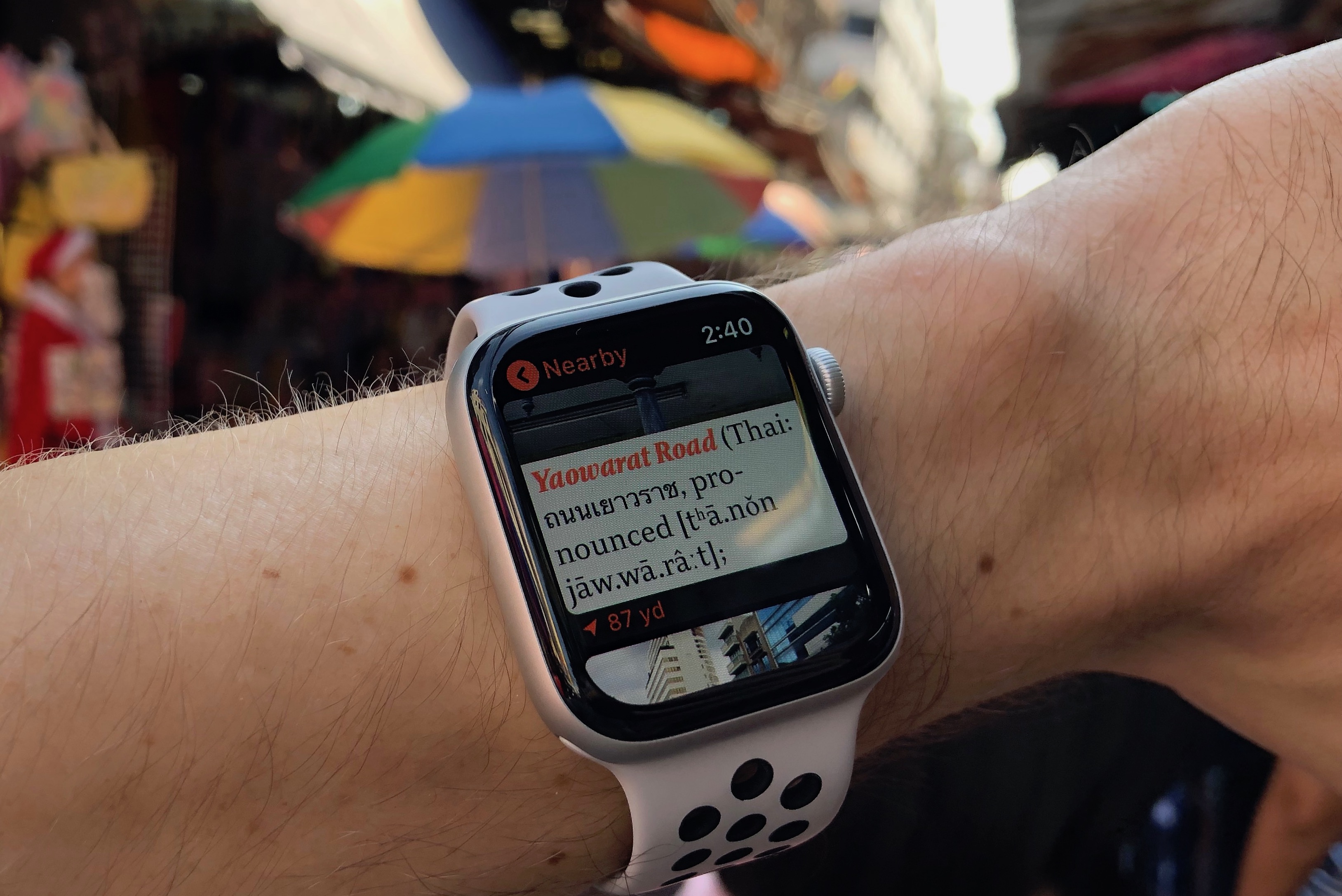
A great example is the V for Wiki app. On an iPhone, it's a nicer way to read Wikipedia. On a Watch, it's a quick way to see what's nearby. Walking around a city and wondering what important things are in the area? Tap V for Wiki on your Watch, tap the Nearby button, and discover things around you. It scratches that itch of wondering what's around, in seconds, without pulling you away from your surroundings.
Or take Drafts. On iPhone it's a detailed writing app with tools to automate your text and use it to start workflows. On Watch, it lets you read recent notes, or dictate a new one to save for later. Less features, but exactly what you need to remind yourself of something you wrote down recently or to log something new so don't forget it. To-do lists are another perfect fit for the Watch, of which Things lists things that need done, and Streaks lists the routines I need to do daily (read a book, work out, and more)
The Watch includes two other helpful features, both of which only make sense if you live in an Apple ecosystem. You can have the Watch auto-unlock your Mac, to keep it secure without typing in your password every time. And you can use Apple Pay to pay for stuff from your wrist. Both nice extras, but not critical.
The critical thing is the watch face, with the time and other complications (including one on many of the more decorative watch faces, and up to 8 on the Infograph face on newer Watches). You can customize watch faces to the style you want, then swipe between them to quickly go from the productive Infograph face to the fun Mickey Mouse face to the more dressed up Numerals or Chronograph faces, depending on the occasion. Fit them to your mood or outfit, or to the bits of data you need from complications that fit particular timeframes.
The same goes for Watch straps: I use the platinum Nike sport band that came with my watch for workouts and more active days, and a “midnight blue” standard sport band otherwise. Apple’s sport bands feel quite nice, and even though I’ve always preferred leather bands in traditional watches, the sport bands fit the spot for me for now. But if you want something nicer, there are plenty of options available, all easy to swap in seconds, making the Apple Watch easier to match to outfits than almost any other watch (aside from a large square screen not perhaps fitting into any formal attire, regardless the strap).
It’s a watch—a thing to watch all the little bits of data in your life, not just the time. And that’s pretty handy.
73 years after the invention of the mouse, and a dozen years after the iPhone made touchscreens feel like the inevitable future of computing, the mouse is back. Not that it ever fully went away, mind you, but Apple’s iPad always pushed in a different direction, first with a finger-focused touch interface, later augmented with the Apple Pencil.
And now, you can use a mouse on an iPad.
With iPadOS, the iPad-focused version of iOS 13, there’s a mouse option hidden under iOS’ Accessibility settings. It’s the real deal. You can connect a bluetooth or USB mouse and click and tap to your heart’s content. Anything that works with your finger works with a mouse; you can select text, drag pages to scroll or use the scroll wheel, and click and swipe up from the bottom and sides of the screen as you would with your finger.
Here’s how to get it working.
What Do You Need to Use a Mouse With an iPad?
You first need iPadOS 13, the latest version of iOS for the iPad. It’s in beta right now, so unless you have a spare iPad for testing and love having software crash all the time, it’s best to wait for public release sometime this fall.
Any iPad that supports iPadOS works with mice—so an iPad Air 2 or newer.
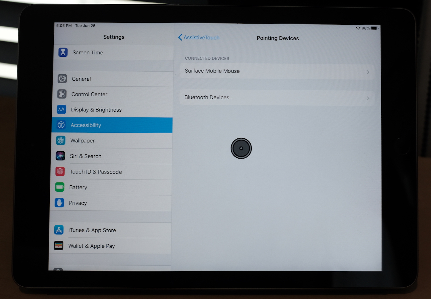
And you need a mouse, either a Bluetooth mouse (not one with a wireless USB dongle) or a wired USB mouse and a USB adaptor for your iPad. Apple’s magic mice and magic trackpad work with iPad over USB, but not wirelessly (I'm using a Microsoft Surface mouse; many on Twitter reported using various Logitech mice).
How Do You Connect a Mouse to iPad?
It’s a bit more tricky than just connecting your mouse.
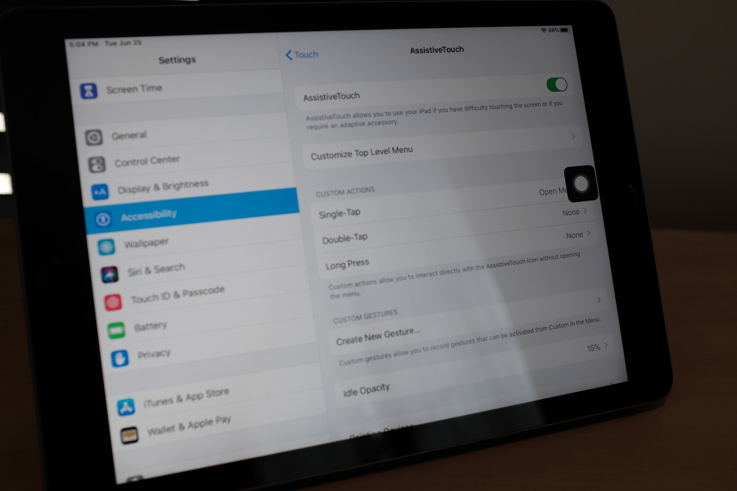
First, open your iPad’s Settings, tap Accessibility, then select Touch and AssistiveTouch. There, turn AssistiveTouch on in the setting on the top. That will show a black rectangle on your screen, similar to the “fake” home button often used on older iPhones to prevent home button wear-and-tear. Tap that button to go home, or to do other actions on your iPad.
But you didn’t want AssistiveTouch, you wanted a mouse. So turn on your mouse, and make sure it’s not connected to any other devices. Then scroll down that AssistiveTouch settings page, select Pointing Devices, then Bluetooth Devices, and finally select your mouse from the options.
Voilà. Your square AssistiveTouch button will turn into a round oversized cursor, and you can finally use a mouse on iOS.
How Can I Customize My iOS Mouse?
The default iPad cursor is huge and round
There are a few settings to tweak to make your iPad mouse a bit nicer to use:
The iPad mouse moves pretty fast at first. In the AssistiveTouch settings, you can turn down the Tracking Speed to slow it down.
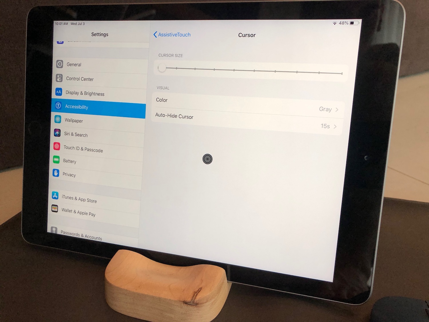
Want a different cursor? In AssistiveTouch settings, select Cursor to choose from 7 color options.
Want a smaller cursor? In that same Cursor menu under AssistiveTouch, there's a slider to make your mouse much larger—and one level to make it smaller.
Want the cursor to disappear when you're not touching it? Select Auto-Hide Cursor under the AssistiveTouch Cursor settings, then set the time for the cursor to hide.
The new, smaller, autohiding iPad cursor
Want to customize what your mouse buttons do? Tap the i icon beside your mouse name in the Bluetooth Devices settings to choose custom functions for each button (by default, left click works as expected, clicking the scroll wheel goes home, and right click opens the AssistiveTouch menu for a quick way to say open command center or take a screenshot). You can also customize that menu and what single, double, and long taps mean from the AssistiveTouch settings. Power user tip: Mouse buttons can run Siri Shortcuts, too.
You may notice your keyboard popping up even if you have a bluetooth or smart keyboard connected to your iPad. Back in the AssistiveTouch settings, turn off the Show Onscreen Keyboard toggle which should keep it from showing up when unwanted.
iOS keeps the AssistiveTouch button visible whenever your mouse is disconnected—which can be annoying. You can fully hide it by turning off AssistiveTouch whenever you're not using a mouse. Or, you can make it nearly transparent when you don't touch it. In AssistiveTouch settings, select Idle Opacity, then set it as low as possible.
Then get back to work, and use the mouse like you would use your finger on the iPad screen. Click and drag up from the bottom of your screen to open your dock, open multitasking, or go home. Click and drag from the right of the screen to bring in the floating multitasking apps. Click and drag down on the home screen to open search. Click and drag to select text, or spreadsheet cells (perhaps the most useful reason to add a mouse to your iPad workflow.
The iPad’s still best for finger-driven interaction, and you’d likely be more productive with an external keyboard and keyboard shortcuts than a mouse. But hey: It’s nice to have it as an option, if a bit surreal to use a real mouse on iOS.
Updated July 3, 2019 with new mouse features from iPadOS Beta 3.
The internet’s an easy thing to blame. Faceless, ethereal, piped to our homes and offices by bureaucratic corporations better known for ever-increasing bills and unreachable customer support, it’s the obvious target when something goes wrong on the computer.
You can’t hear someone on a call, or the video freezes in a meeting? The internet. The movie pauses to buffer? The internet. You miss a move in a game? Definitely the internet.
Instead of optimizing and improving, finding ways to eke performance out of the unoptimized, the scapegoat allows us to relax in mediocracy. If only someone else would fix the internet, everything would be right in the world. Far easier it is to assume everything would just work if everyone else did their job than to learn and improve your own systems.
External limitations are convenient excuses for the status quo. They overshadow other issues, turn them into a speck in the eye to analyze and critique, somewhere else to place the blame.
You didn’t leave late for the meeting. It’s the traffic’s fault; “you know how rush hour is,” and with an eye roll and a flick of the hand, personal responsibility is absolved. It’s not that your ceiling could use more insulation, or your car better maintenance; “the sun is so crazy strong here” or “you know how the salt eats the cars” and we nod our heads and chime in with our own anecdotes of similar misfortune.
Until, that is, the external limitations are stripped away. The construction’s finished, the traffic dissipates, yet your arrival time is still uncertain. Gigabit fibre comes to your neighborhood, the speed improves, and the WiFi coverage is still spotty. All along, the internet speed was to blame—as were the pipes and concrete and raw space separating you from your router, the technical limitations of 2.5g WiFi, your frayed cables and cluttered shelf of random electronics. Everyone else resolved their issues. The ball’s back in your court.
There’s a balance to be had, sure. For as soon as your improve your network, a faster network will be available, and you’ll have joined another mini rat race of keeping up. Maybe your speeds are fast enough, your house warm or cool enough, maybe you’ve reached your equilibrium. Zen, calm perfection.
Or perhaps this is where continuous improvement comes in, where products and projects are never fully completed, only gradually improving, approximating every more closely the perfect curve. The lifelong push and pull of better and best, where today’s best is all too soon tomorrow’s better and the next day’s merely ok. Kanzen, continuous improvement in search of perfection.
Either way, the focus isn’t on the external limiting factors. Perfection is to be achieved within the limitations presented. You can’t optimize a car into a rocket, and a car engineer railing against the limitations of gravity at every turn would be delusional at best. You instead perfect what’s at hand. And when the job’s done well enough, you step back and consider what’s next, what other process could be improved, what external limitation could be removed to continue down the improvement path. Otherwise you accept the limitations as they are, neither using them to excuse inaction or blaming them for limitations you’ve discovered that cannot be removed.
Blame not external limitations. Use them instead to frame your optimization strategy, as a guide to perfect what can be. You might not be able to get to the moon thanks to your external limitations, so instead of wasting time and thought cycles on wishing, you can focus instead of what can be achieved.