The best software lives at the extremes. Extreme feature sets, extreme polish, extreme choices. Opinionated software. Software that has a voice of its own, so to speak, one that tells us exactly how it was meant to be used.
Take, for instance, the two writing apps I use most: iA Writer and Sublime Text. It'd be hard to imagine an app comparison more drastic. The former is an app, quite literally, devoid of choices. No settings, no options, nothing. It's the closest to a typewriter that one could have on a computer, a well-oiled machine for writing, and nothing else. Contrast that with Sublime Text, the quintessential configurable text editor. It's designed around options, so many that it offers them in a json file rather than a traditional options screen. It has a package manager and its own command system. It can be anything you want. It's practically an operating system for text.
Neither app is bad. In fact, both are polished apps, the epitome of their particular style of editor. They're both text editors, but that's where the comparisons should rightly end. That is, comparisons of their feature sets. For both apps share one other quality that makes them both apps that have continued to be important: they're opinionated.
iA Writer is opinionated to the extreme, some would say. Its designers picked how they wanted the app to work, and declared their choices best. End of story. On the other hand, Sublime Text caters to those who are picky, and want to tweak endlessly to make their text editor their own. It's far from opinionated, we would say.
Except that's anything but the case. Sublime Text is an opinionated app too, though in a totally different way. It's designed specifically for those who love text editors and want to tweak them, and thus exposes every possible setting so you can extend it and make it what you want. It doesn't try to make things simpler for everyone else with a settings dialog or other graphical interfaces. It's opinionated that text and keyboard commands are best, and if you don't like that, you'd best find another text editor.
It's these defining features that have made both iA Writer and Sublime Text apps that have continued to be worth talking about. They're interesting because of the choices their developers have made. Far too often, app simply hit the middle. They try to perhaps please everyone, and end up thrilling no one. The very best apps, however, stick out and do something different. Maybe that difference is having a very curated set of choices, maybe it's in letting people work in a unique way, and maybe it's in giving far more freedom than any other app.
If you're building an app, give us some reason to talk about your app, something that makes it stick out. Otherwise, it'll soon be forgotten, bypassed by the apps that — while either simpler or more complex than yours — actually changed the way we work.
If you've got an iPhone and your carrier allows it (or you've paid the extra in the US to use it), Personal Hotspot is one of the best features in the iPhone (or Android phone that supports tethering). Turn it on, and within seconds you can be browsing on your laptop or Wifi-only iPad. I used to have a data plan on a 3G USB adapter so I could work on the go with my MacBook regardless of whether the place I was working had Wifi, but ever since I got my iPhone, I've used its Personal Hotspot instead. It's simple, gets comparatively great speeds, and gives me one less thing to keep up with.
There's only one problem: sharing the internet connection over Wifi goes through your battery rather fast. It's still not that bad, but it'll easily eat 50% of your battery in a 2-3hr session. Tethering over USB alleviates that problem, at least for your iPhone, but it means you've got a cable to remember to bring and keep up with.
There's another solution that I never even thought to try until today: Bluetooth tethering. It sounds archaic and slow, but actually worked out better. And it wasn't slow, either: the speeds were essentially the same as I typically get through 3G already, or around 1.5Mb down and 1Mb up. Comically, it was faster to connect. I always seem to have a somewhat tricky time getting my iPhone's Wifi hotspot to show up in areas with tons of Wifi networks, but connecting via Bluetooth literally took two seconds. You pair your phone with your laptop, if you haven't already, then click the gear icon in your Bluetooth settings and select Connect to Network. Put your laptop to sleep and wake it up, and repeat those steps, and — no joke — it'll connect the entire way in 2 seconds.
That's faster and simpler than connection to my iPhone's internet over Wifi, and it was definitely easier on my MacBook Air and iPhone's battery life.
It was sometime in 2007, during the summer before I started college, that. I first tried out WordPress. I didn't have any hosting of my own, and was rather certain nothing I could write was worth publishing, but I found it facinating to try out locally. I'd already done some basic web design, and played around with the wonders of CSS Zen Garden, but still knew I was far from being able to develop my own professional sites. And here was this free software, WordPress, that let me add some quick tweaks to a theme and turn some basic HTML pages into a modern, powerful site. I was hooked.
So, a couple years later when my Business English professor made making a blog one of our class assignments, I turned to WordPress.com. It lacked some of the power I'd already grown to love, but it was free and worked great. Suddenly, writing online was fun, addictive even, and I was hooked all over again. That basic blog led to to my first paid writing job at Labnol.org, which led to writing at HowtoGeek.com, which led working for AppStorm. All of which were, obviously, powered by WordPress. My entire career, in fact, has been based around writing on WordPress-powered sites.
WordPress was, and still is, Matt Mullenweg's baby, but it's grown far beyond what, surely, anyone could have dreamed of in its early days. It's made web development simpler, and given writers and more a voice on the Internet. It's used for everything from blogs to eCommerce sites, support systems to internal social networking. It powers over 66 million sites, covering everything from CNN and the NY Times to mommy blogs and everything in between.
It's grown up, and gotten more complex, making it better for use as a large CMS for teams and relively less nice for indivual writers. But it still works great, regardless, and even though I personally love lite CMSes like Kirby these days, WordPress is still the best choice for most people. It's the first thing I'd recommend to anyone wanting to start a new site, since it really just works, and empowers you to do more without any coding. And it's rather amazing how, of all CMSes out there, WordPress made blogging practical for the rest of us, and if anything it inspired the rest of the blog engines we love these days.
So, congrats to WordPress on a decade on the 'net, and here's to the next decade. Or century. It sure deserves it.
We're used to the term "getting things done" or GTD being thrown around when discussing to-do list and project management apps. It even comes up when discussing note apps and strategies, especially when they involve bucket apps like Evernote that have tags and folders like popular GTD to-do list apps.
What people forget is that GTD is actually a method for productivity, not something that can be encompassed in a particular app. People use GTD as short-hand for productivity apps that fit their bill of what they need to do. They forget that, at its core, David Allen's original Getting Things Done idea was that you capture anything that has your attention, find what you need to do with it, organize information, and make the best choices about what to do at a given moment. All good, practical ways to keep your brain clear and focused on your work instead of being constantly distracted, but not something that precisely one app can encompass.
Instead, how about tools that let you get what you need to do, done, without having to remember to come back and finish stuff up? That can be very, very valuable to keeping you productive and sane, without leaving dozens of tasks half-completed every day.
And that's what the best new apps do these days. Take the iPhone email app Triage, for example. It lets you check your mail — one message at a time — and quickly either archive/delete the email or save it as unread in your inbox to read/reply to later from your computer. It's an actionable app, one designed with a specific workflow to make you productive and get what you're doing, done.
The best example of this, though, is the new Mac app Minbox. It's designed to make sending large files faster, with a specific workflow. You drag the file(s) you want to send to your menubar, enter the recipient's email address and a brief message, and hit send. Done. No more waiting for Dropbox to sync files, or for a file to upload to your FTP server, and then remembering to email your colleague about the file. Nope. Now, you just think of the file you need to send, and send it.
I mentioned to the developers that the app was GTD in a way since it let you get the task of sending a file out of your mind by letting you fully complete a task that used to take hours in seconds. And maybe I'm stretching the term here, but I think it's apt.
It's another reason why I've fallen in love with Evernote again: the menubar app and the web clipper make it take almost zero thought to archive stuff I find to Evernote and build up my own info database. It's the same with Sparrow: I can't replace it because every other Mac email app I try takes more steps to accomplish the same tasks, and that's frustrating. It's why Google Now has already won fans, because it takes steps out of, say, finding directions to get home.
Preview is my favorite image editor for quick crops and resizes because it doesn't do tons more than that, and is dead simple for it (especially with customized keyboard shortcuts). And iA Writer's lack of settings — and perfect default settings, for my tastes at least — combined with a single shortcut to copy HTML from my Markdown writing for my AppStorm articles make it a writing app that fits like a glove. None of these may be GTD apps, per se, but they sure help me get things done by making decisions for me and taking steps out of my work.
I want to see more apps that let me accomplish what I'm setting out to do without having extra steps, especially those that will have to be done at a later time. Reduce steps, especially theses that require us to remember to complete them when we're likely to forget. Make apps like that, ones that actually save people time and give them less they have to remember to complete a task, and you're just about guaranteed to have a market for your products.
They'll be choosy apps, apps that decide for the user what's best, but I think that's the best. And the market for simpler apps sure seems to be validation of that.
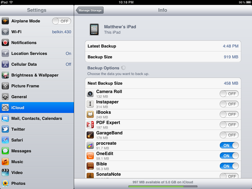
Several days ago, I got an email from Apple, letting me know that my iCloud account was nearly out of storage space. I've stuck with the free 5Gb account all along, and until now it's met my needs. But with an iPhone 5 and an original iPad backing up to the same account, along with my semi-heavy use of iCloud file storage for iWork, iA Writer, and other apps, I'd maxed it out.
I didn't particularly want to shell out for a paid iCloud account, even though that's something I may need to do in the future. For now, I just wanted to clear up some space so I can keep my apps syncing - and ideally, I wanted to do it in a way that won't change how I use iCloud normally (i.e. to sync documents in apps, and let me have the peace of mind that my iPhone is backed up).
Turns out, there's a very simple trick. You can simply turn off the backup for individual apps from your iOS device’s backup settings to free up space. Don't do it for apps that don't have their data backed up any other way, but for apps like, say, Instapaper or Pocket that have all your data backed up in their own cloud already, there's no real reason you need it backed up again in iCloud.
So, just open Settings, select iCloud, then select the Storage and Backup button near the bottom. Tap Manage Storage to see all of your backups and app data. Now, select the device that you're using right now under Backups, and turn off the backup for apps that don't have to get backed up in iCloud. This is somewhere you're going to need to use your own discretion, but basically, if the app’s data is in another cloud storage already (Instapaper, Evernote, Kindle, and even apps that sync via other services like OmniFocus and 1Password, or anything you use with Dropbox), you can turn off their iCloud backup without fear.
One other thing: you can free up a lot of space both on your device and in your backups (if you're like me) by syncing your pictures and videos to your computer, then deleting them (or at least most of them) from your device. Or, remember to copy them out of Photo Stream, then delete them from your device. I'm terrible about not syncing my pictures, even though my phone’s sitting beside my Mac half the day.
So there. Now you should have enough space in iCloud to let your apps keep syncing, and you'll still have the stuff that's not stored elsewhere backed up in iCloud as it should be.
A couple years back, I picked up something in a bundle that became my favorite little design tool: the Pictos Font. It's an icon font — a font with icons instead of each letter, like Webdings but nicer — and one of the nicest in my opinion. It's organized nicely — icons are usually on the first letter in that object's name — and the icons are simple yet elegant.
You've likely seen the Pictos icons if you've paid attention to my articles at AppStorm, where I'll often reach for a Pictos icon when I need a basic elemental icon for an article logo. They're only a T away in Photoshop, and are infinitely resizable and tweakable. If you want some flat design, all it takes is good colors and a nicely aligned icon from the font, and you're good.
Icon fonts are far from new, but they're most popular in web dev circles for a nice way to add icons to your UI. But that's not all they're useful for: you could use them to spice up a report, add icons to your print designs, and more. Resizing and coloring them is simple, with the same font settings you're used to. And there's some that go beyond replacing a single letter with an icon: FF Chartwell lets you turn numbers into auto-generated graphs with, yes, just a font, and Symbolset that uses OpenType features to turn words (say "heart) into icons.
There's tons out there, and you should pick some up to help in your designs, whether you're a budding designer or a pro. I love Pictos, but it's far from the only one out there. There's the free Any Old Icon font built from zany, community contributed icons by my colleagues at Envato, for starts. Then, CSS Tricks has a huge roundup of the best icon fonts, some free, some paid. If you need more icons, check out the ambitious Noun Project for loose icons not in fonts (though some are in fonts as well).
I love web apps. Hardly anything inspires me to write a detailed review like an exciting new web app. I got started writing online back when I only had a Windows PC, and web apps were the most exciting thing there with the all-but-inexistent indie app market on PCs. So I found the best of them, curated them at the now-defunct GreatWebApps blog, then got my first editorial job at Web.AppStorm.
And yet, I'm a hypocrite. I use plenty of web apps — mainly as services to feed into native apps. When I'm writing, my words might be synced in iCloud or Dropbox, but they're usually written in a native app. Same for almost everything else. I use web apps to publish my site, track stats, collaborate with team members, and everything else that obviously has to be networked. Everything else might be synced with the cloud, but I reach for native apps for work and fun whenever I possibly can. And I suspect the same is the case for almost most others.
Foster at Mysterous Trousers just wrote a detailed article about the numerous little things that stack up to make us conditioned to not rely on web apps for our normal work. They make a very good point:
"Someone could build the most amazing web app ever and they’d be battling our history with hundreds of other web apps that have let us down."
Go read the full article for all the reasons they came up with for why people are scared of relying on web apps, which are all too true. It puts in words what I've been thinking about web apps — even those I love — for quite some time.
Ever wanted to run an ad specifically on Techinch.com to make sure our readers hear about your app or service? Here's your chance. Right now, we run only one ad from InfluAds on Techinch.com, and we're proud of the minimalist quality of their ads. It keeps Techinch's hosting paid for without the ugliness of Google Adsense, and if you pay attention, you'll likely find stuff you actually like from the advertisers (case in point: right now, we've got ads from the beautiful hosted CMS Squarespace, the cute Instagram-powered magnets Instantgram, and more).
And now, if you want to make sure your app is featured with an equally stylish ad on Techinch.com, you can. Just head over to our Techinch InfluAds Page, where you can get your ad on Techinch — exclusively — for $85/month, or in our RSS feed for $25/month. Or, you can purchase a brand-new sponsorship page for $100/month. The rates are rather low, so now's a great time to get in.
Looking forward to having your app featured on Techinch.com!