iA Writer: Simple Markdown Writing, Perfected
One would scarcely notice a piece of copier paper, let alone pontificate about the tree that birthed it and the finer qualities of its textures. It's paper, everyday paper, something to use, reuse, then discard.
And so it would seem with writing apps. They're blank pieces of digital paper, somewhere to type words, print on humble copier paper, and promptly forget.
The apps are just a medium—the results are the same.
Until they're not. Paper is not created equally; neither are apps. There's humble copier paper, and its humbler sibling thermal ink receipt paper. There's the paper in your Moleskin, the paper your diploma was printed on, and the cotton paper you'd expect the President to use. There's paper so delightful it inspires pontifications about its finer qualities.
There's paper, and then there's paper.
There's Notepad and Text Edit, and there's iA Writer.
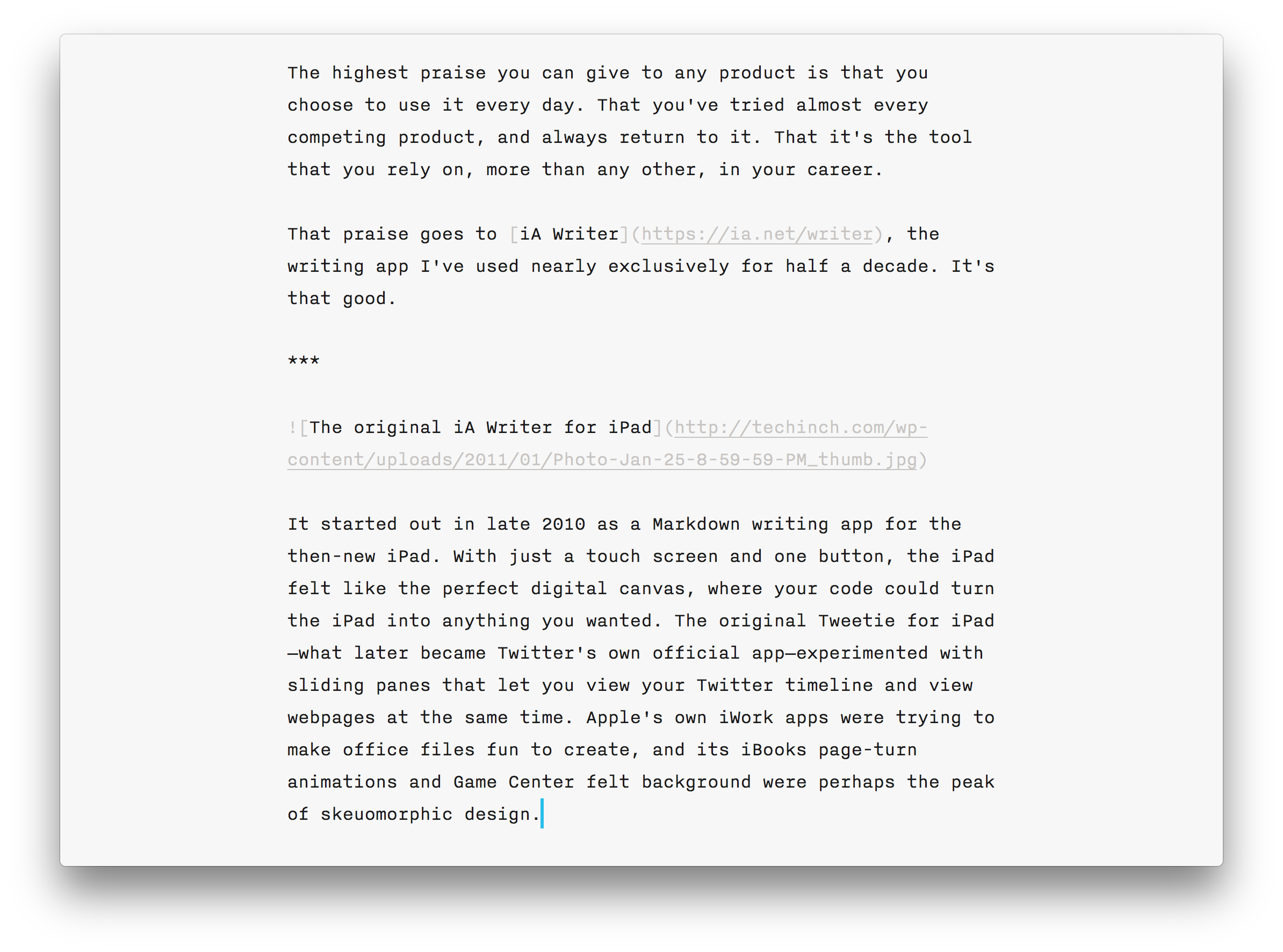
The highest praise you can give to any product is that you choose to use it every day. That you've tried almost every competing product, and always return to it. That it's the tool that you rely on, more than any other, in your career.
That praise goes to iA Writer, the writing app I've used nearly exclusively for half a decade. It's that good.
But it almost lost its way.
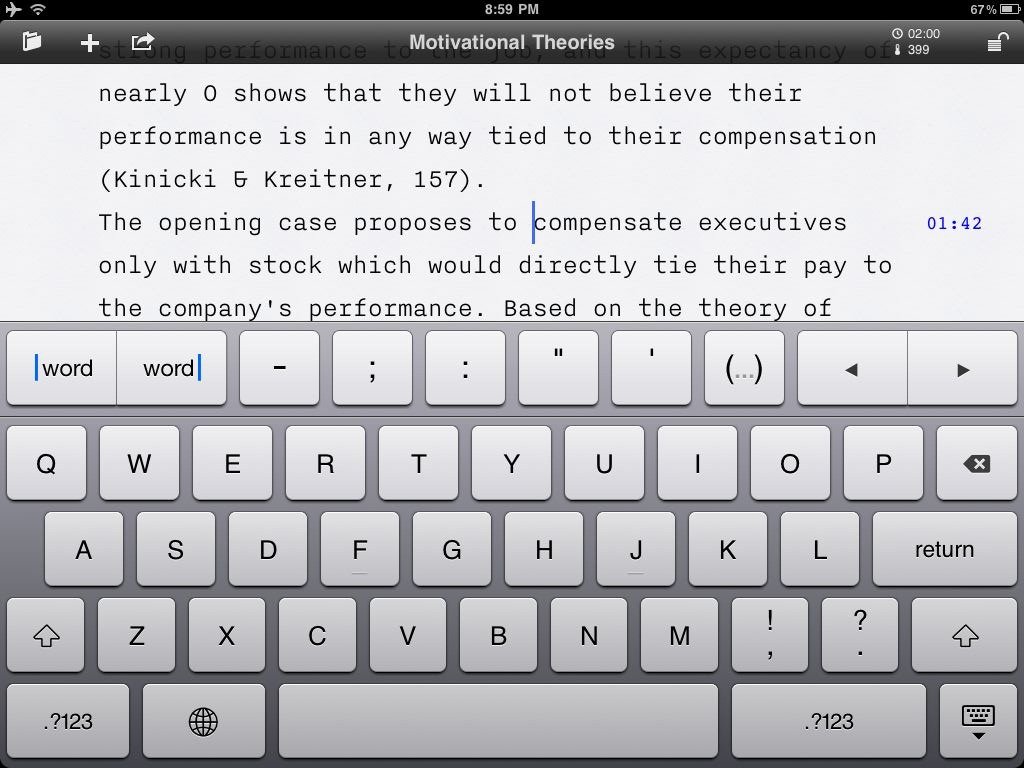
It started out in late 2010 as a Markdown writing app for the then-new iPad. With just a touch screen and one button, the iPad felt like the perfect digital canvas, where your code could turn the iPad into anything you wanted. The original Tweetie for iPad—what later became Twitter's own official app—experimented with sliding panes that let you view your Twitter timeline and view webpages at the same time. Apple's own iWork apps tried to make office files fun, and its iBooks page-turn animations and Game Center felt background represented the peak of skeuomorphic design.
iA Writer launched into that market as a simpler tool, a rethinking of what is really needed in a writing app. It harked back to simpler days of typewriters with their monospaced fonts and symbol-based designs. It asked you to focus on your words, something already easy with all iPad apps being full-screen by default. And, of all the app design experiments from that year, it's one that's lived on—both in iA Writer and the simpler writing modes in dozens of other apps.
With a pre-set typeface (the monospaced Nitti), a light colored background, and a blinking blue cursor, there was nothing to tweak, nothing to distract you from your words. Even your previous sentences could be hidden with its Focus Mode that blurred out everything except your current sentence. There was nothing to tweak—all you could do was write.
iA Writer came to the Mac the following year for $19.99, and was the first app I purchased in the Mac App Store. Keeping with the iPad app's design—and the sensibilities of OS X design at the time—it kept the same simple interface with a slightly textured background, and zero settings. More surprisingly, it lost the window bar—when you wrote, everything else disappeared other than your text and iA Writer's clean background.
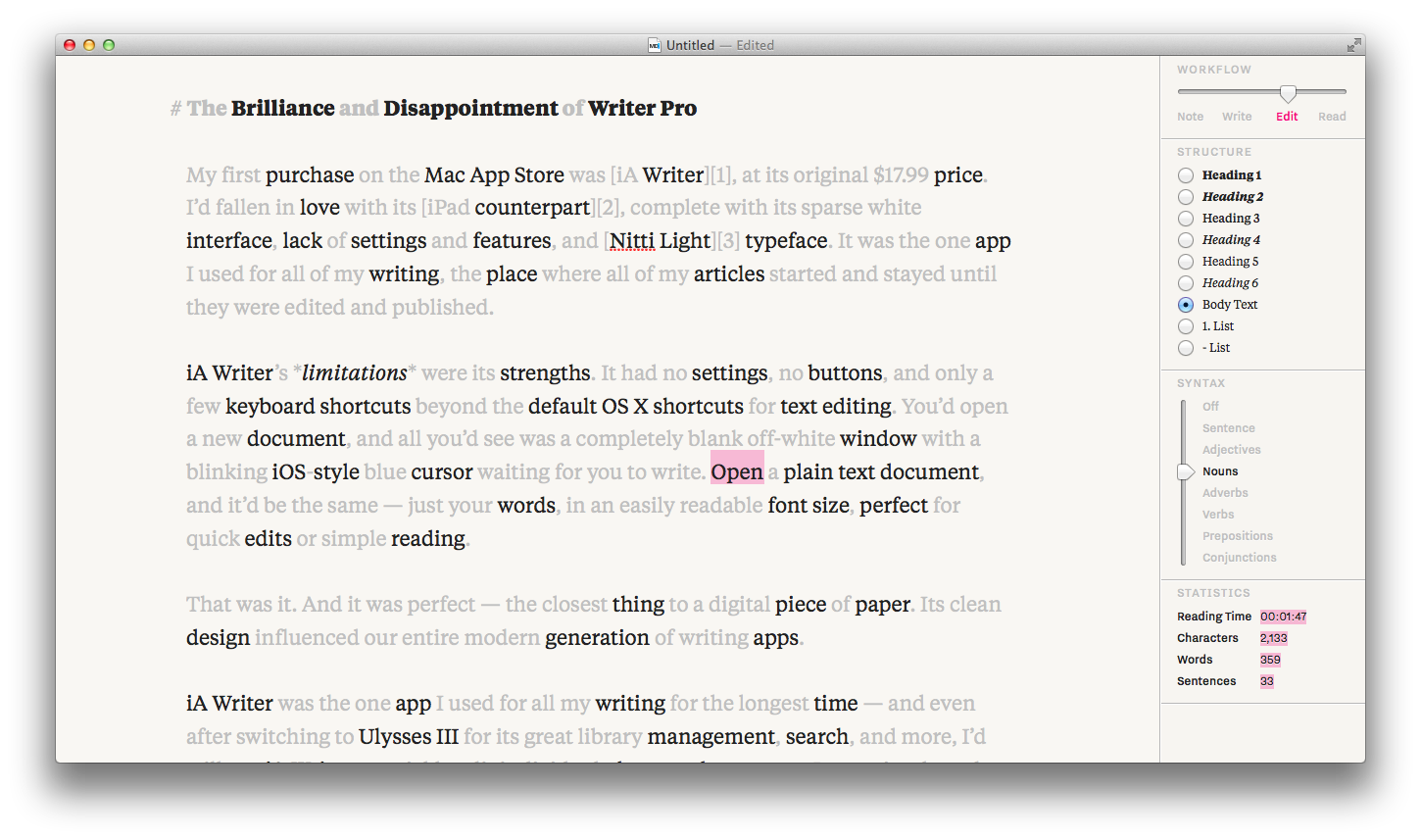
And it grew up. Over the years, it gained iCloud sync, a dark theme, and a preview mode to see what your Markdown-formatted text would look like. A new version, Writer Pro, even flirted with complexity, with a workflow of writing and editing modes and a syntax tool to highlight your adjectives and other parts of speech. It included some nice ideas—using a sans serif typeface to jot down ideas, a monospaced typeface to write, and a serif typeface to edit did make your brain switch modes based on a visual queue. The problem was, it was complicated, extra things in an app built around simplicity.
It pushed me to flirt with other writing apps—and, for once, I even kept the old version of iA Writer around even though I'm typically the first to upgrade new apps.
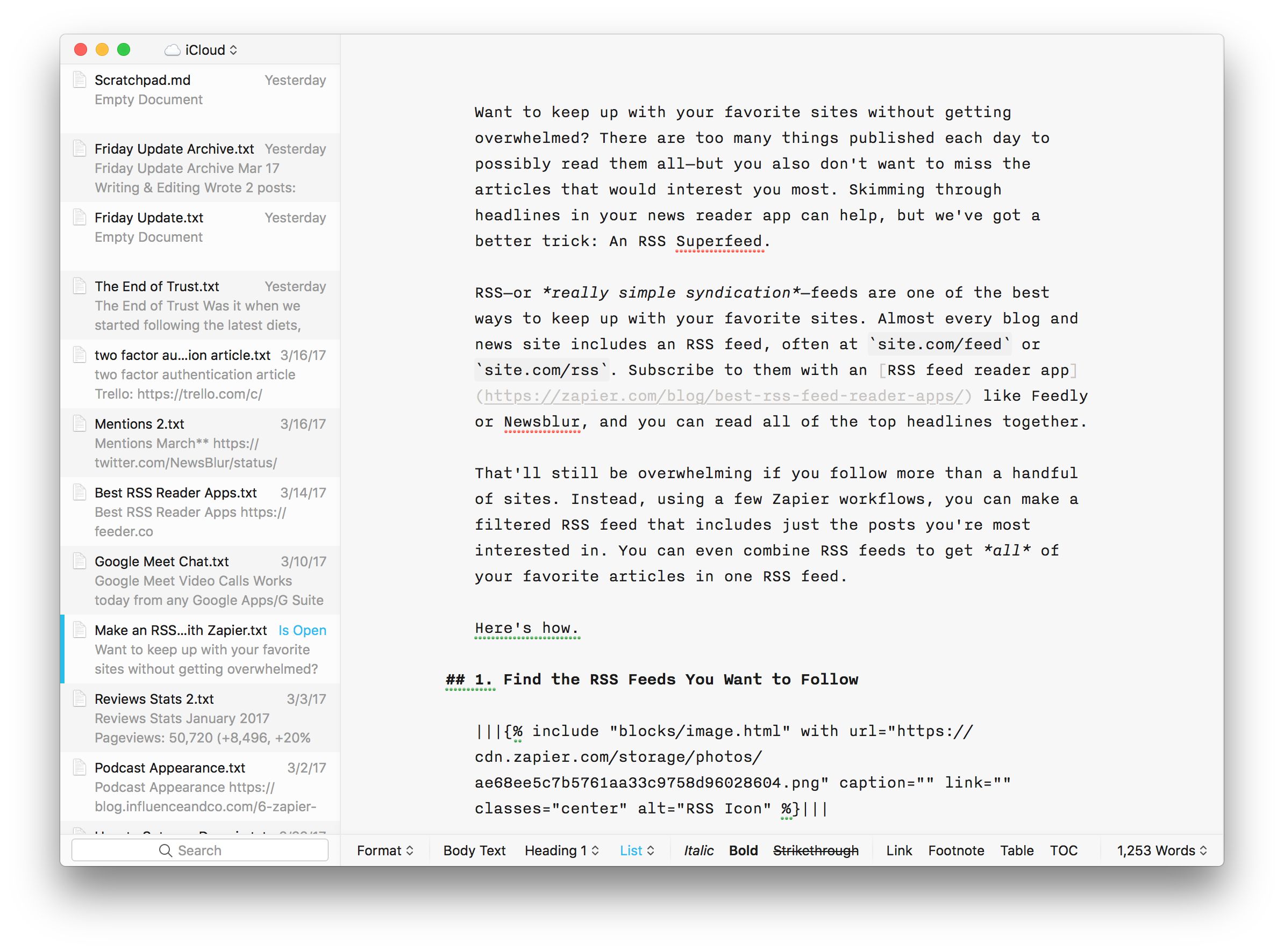
So we're back to the basics. iA Writer 3, released in late 2015, was a rare app update that removed features. No more writing modes, no more toolbar on the side: There was just a blank slate with your text again.
Swipe to the left from the right edge, though, and you'd uncover a preview pane—with the new typefaces from Writer Pro repurposed to read through your finished text. Swipe to the right from the left edge, and you'd see an iCloud or Dropbox-synced library with your files, complete with folders that you could drag-and-drop files into. iA Writer wasn't just a piece of paper anymore; it's now a notebook with all of your text.
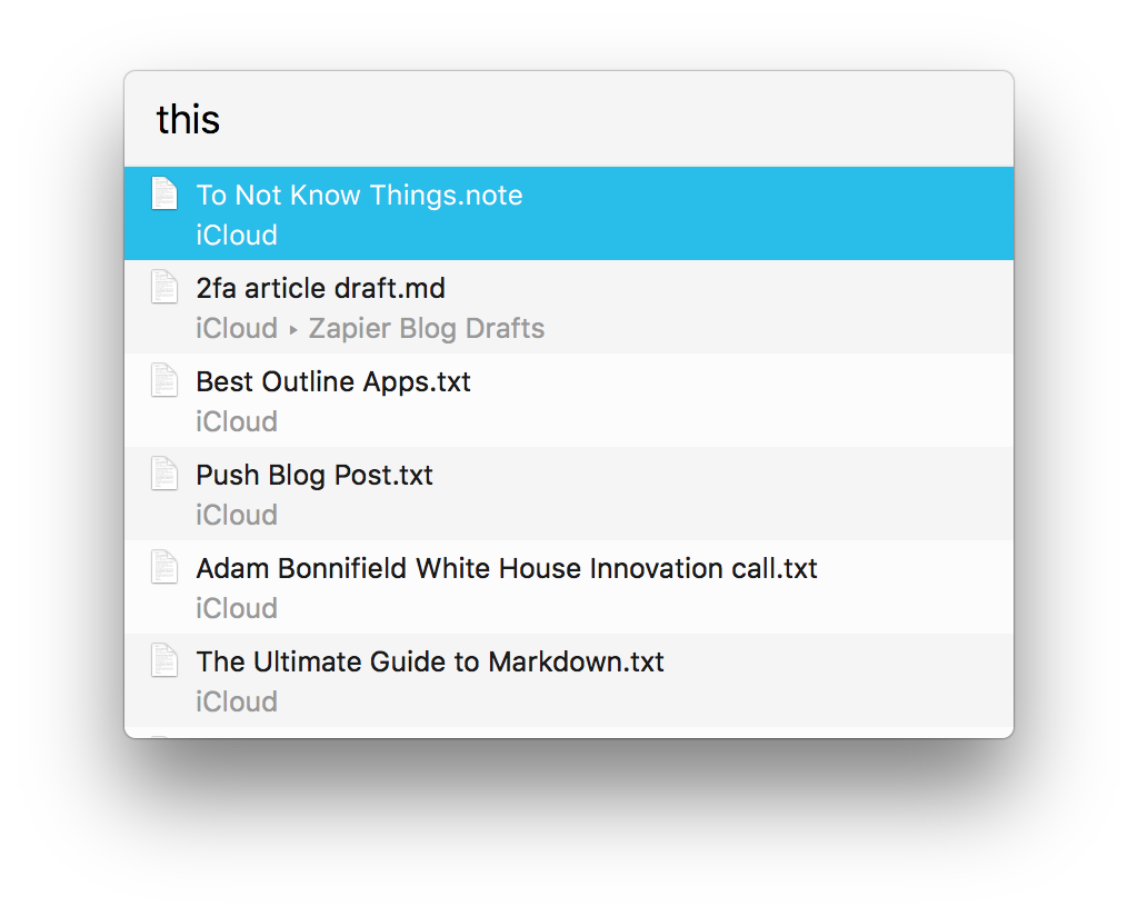
Need to find something? Tap CMD+Shift+O for a Spotlight-like search bar to search through all your files and find them in seconds.
Heretically, iA Writer both brought the file menu back on iOS and the preferences pane to its Mac version. Now you could tweak your text size, set your sync preferences, and choose a preview template without needing buttons in the app. And you could still highlight adjectives or sentences—only now those options were relegated to a toolbar on the bottom of the window that'd show when you hovered over it (along with word counts and reading time). Slight nods to customization, while still leaving little to distract.
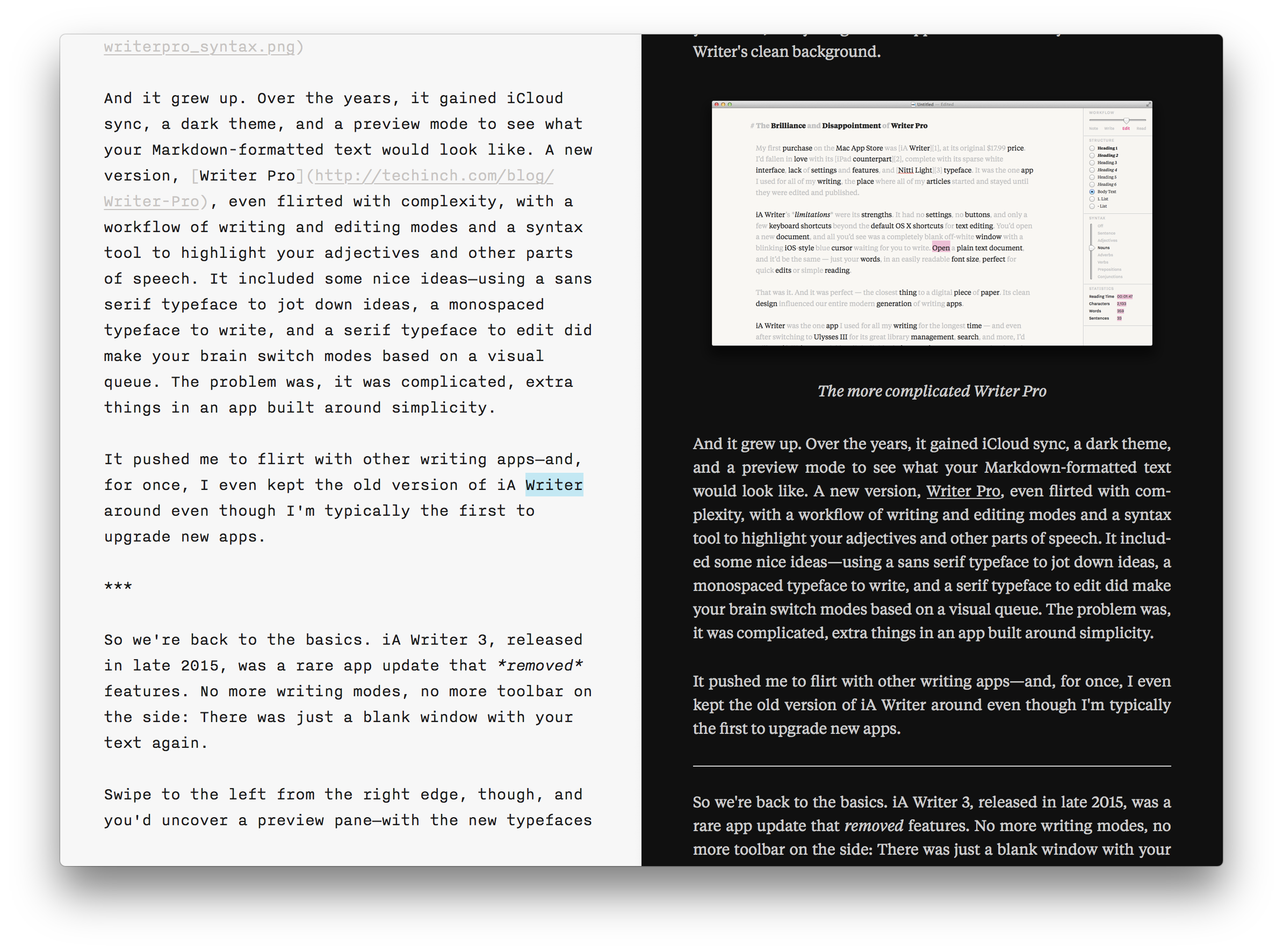
iA Writer 4 built on that clean foundation. It added new hidden features: You could embed files into your documents, to make one master document that combined all of your smaller sections into one longform piece. Drag an image into iA Writer, and you could preview it in your text and export your document as a polished PDF. Dislike Markdown tables? Just make your table in a spreadsheet file, then drag it into iA Writer and it'd display in your document.
It's Markdown grown up. Plain text when it makes sense, other file formats from other apps when they make more sense. You can still use it as a plain text Markdown app—or you can use it as a longform writing app.
Why use iA Writer? Because it's simple. Because it makes Markdown writing simple, with shortcuts to add lists and links. Because Nitti is such a great writing typeface, and this is the cheapest way to use it. Because it fits like a glove. Because with its Mac and iOS editions, you can keep everything you write with you everywhere, without any of the bloat of most notebook apps.
It's just barely customizable, so you'd better really like its typeface and two editor colors. But if you do, you're in luck.
Perhaps it's a side effect of being such a simple app, but there's almost nothing to complain about, few things that have ever glitched or broken.
Anyhow. I like it. Love it, even.
You might too.
iA Writer
The simplest writing app, refined to the essentials then enhanced with features to organize and publish your writing, iA Writer continues to be the least distracting way to write down your thoughts. It's the one app I use most, every day.
for Mac, iOS, and Android | $9.99
What do you think about iA Writer? Let me know on Twitter.
