Ever tried an app that just didn't fit into your workflow, that you then tried again years later and it suddenly fit perfectly? That's how PopClip was for me. I tried it, felt that it was little more than some iOS-style features on OS X, and sent it to Trash unceremoniously.
Then Apple included PopClip in the Get Stuff Done collection this week, and I gave it another try … and discovered that PopClip had added extensions. Powerful extensions. Ones that could call numbers on Skype, solve math problems you'd typed in a text editor, turn chunks of text into OmniFocus tasks. I was hooked.
Check my article above for the full scoop, or just run over to the App Store and grab a copy of PopClip while it's on sale this week. It's a mouse-powered tool that's nice enough, it won a keyboard shortcut geek's heart.
I finally got around to reviewing my new favorite web app: the Kirby CMS. I moved Techinch to Kirby last October, but it took me forever to get around to finally writing a complete review of it. Since I wanted so long, though, it turned into one of my most comprehensive reviews ever, since I've really used Kirby inside-out after using it to build this site from scratch, migrate old articles from WordPress, and keep writing on here semi-regularly.
Kirby got a 10/10 in my review, and if you're considering switching your site to it or using it for your next web dev project, you should be sure to check out the review.
Kirby's awesome, and I definitely wouldn't want to switch my site back to WordPress. WordPress is still good - hey, I use it all day at AppStorm, and am working on launching a new eCommerce site using WooCommerce - but for a writing-focused site, Kirby's amazing.
Now, I've just got to find a use for my extra Kirby license...
Facebook found a way to turn your likes and profile data into something a bit more useful - and a bit more creepy - with their new Graph Search. It's great for finding new things (apps, restaurants, movies, and more) based on what your friends like, and I can see a big future for that. But it's far from smart (you'll end up pulling your hair out trying to find a way to search for all of your friends' Instagram pictures), and veers enough to the creepy side to make it seem surprising that Facebook didn't limit some types of searches.
That Facebook can put all of this data together is no surprise, especially for anyone who's ever tried to buy an ad on Facebook, since you've been able to target ads using this exact same data for quite some time now. It's not all bad, per se, but it's yet another reminder that you should treat everything you put on Facebook as public, no matter what your privacy settings are. If you're fine with everyone on earth seeing everything you've liked and put in your profile, then you should be fine.
Dashboard Widgets seem to have lost their appeal before tablets became mainstream, and here we're several years into the tablet revolution. Yet, Dashboard still got a number of little updates in OS X Mountain Lion, enough that it still feels like an essential part of the Apple experience.
But it's not the iOS style widgets that have kept me using it, or the 3rd party widgets, since most of them are terribly dated now. Instead, it's Safari's Web Clip widgets, which I use mainly to have an easy way to get updated data from Wolfram|Alpha.
It sure would be interesting if Apple did more with Dashboard+iOS in the future, but there's still enough in Dashboard to make it interesting in 2013.
I've had a soft spot in my heart for web apps for quite some time, so it's no surprise that I picked up a small gig posting to GreatWebApps.com (now closed) years back, and then became editor of Web.AppStorm later on (where I still work). It's rather amazing seeing what can be done just from a browser, and exciting to know that anyone on any computer can use the app, no matter what OS they're running. As someone who used to use Windows and envy the shiny new apps Mac users regularly got, I've always found that inspiring about web apps.
One of the first web apps I fell in love with was 37signals' Backpack. I loved its free-form nature, and found it a handy productivity tool in college. In fact, one of the first app tutorials I wrote online was about Backpack. I was thus sad to see it closed last year, but also excited to see many of the features I'd loved about it in the new-and-redesigned Basecamp. The new Basecamp was good enough that I got our whole AppStorm team using it for collaboration, and it's worked great … but I've always wished I could use it for my own projects without paying $20/month.
That wish has come true now with the newly released Basecamp Personal, a lite version of the new Basecamp that gives you 1 project for a one-time $25 fee. Check out my full review over at Web.AppStorm for more info. In short, it's the best of Basecamp (including the great email integration) designed for tiny teams - or even individual projects.
The neatest thing is that it's a one-time payment, something rather unusual for web apps. In fact, monthly payments are my biggest frustration with web apps, and that's the reason I don't use more of them in my daily life. I buy a lot of apps on iOS, OS X, and even on the web, but am wary of spending money on subscriptions since they can cost so much over time. Now, some of my favorite web apps - Pinboard, Typerighter, Kirby, and now Basecamp - have personal account for a one-time payment, and that makes them much easier to recommend for most people who won't want to pay per month.
Plus, the new Basecamp is nice enough that it'd sell itself anyhow, if it wasn't for the subscription price (and hey, that's even reasonable enough that for a team the size of AppStorm's, Basecamp is far cheaper than most competing products. Really.).
Napkin is one of those apps that was so cool, I knew I'd have to review it as soon as I saw it. It's the easiest way to annotate images and screenshots on your Mac, and I've already started using it to answer the many one-off computer questions I get. Sure, it's a bit skeuomorphic, but for once, I think it's the right balance of native Mac UI and natural-looking design elements mixed with animation. Just enough to make an otherwise boring task fun.
Really nice stuff. It's pricey for the App Store at $39, but if you have to markup images and describe processes often for work, it'll be worth it. It's an app that's already part of my normal workflow, which is something I obviously can't say for most apps I review.
Reviews are a mess, as are public comments on most sites. We know that. Cranky customers that resent paying $0.99 for an app, and then expect the world from the developer because of their "investment" are bad enough. What's worse? This:
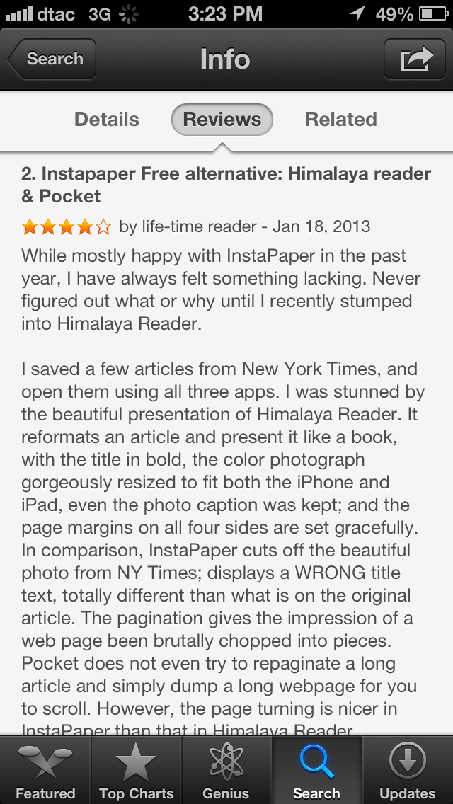
Everyone that runs a blog with public comments knows what a problem spam is, but at least the App Store (by requiring a download before you can comment) shouldn't have that problem. But it does. Here's someone blatantly advertising a competing app, one that looks like a mess at best, by trying to flatter Instapaper and then say why they like their app better. In a review of Instapaper that actually gives it 4 stars. Right.
The App Store has many problems, but this is a major one. We need a spam button on App Store reviews. Apple apparently doesn't want developers to reply directly to reviews or remove reviews to keep shady developers from taking down critical reviews, so fine: crowdsource it. Plenty of app fans would be glad to flag spam comments like this.
Sadly, I have to wonder how many normal people browsing the App Store for a good app get confused by junk like this.
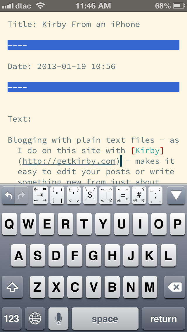
Blogging with plain text files - as I do on this site with Kirby - makes it easy to edit your posts or write something new from just about anywhere. All you need is a plain text editor and an FTP app, and you're in business. No special editors required.
The first part is easy; I already had a ton of plain text editors that I loved on the iPhone. My favorite, iA Writer, makes it simple to write in markdown and sync my thoughts back to the Mac. But if I want to actually post to my Kirby powered site on the go, I'd need a way to FTP files to my server.
That's where Textastic comes in. It's a great text/code editor that includes a special row of extra keys to make it easier to type code without having to search through special characters all the time, and even includes the Solarized color schemes and Source Code Pro font I use in Sublime Text on the Mac. But what makes it really great is that it can upload text files, folders, and images via FTP, which is exactly what I need to post to my Kirby-powered site. I can write in any editor - even iA Writer - then open the file in Textastic and upload it to my site. Quick and simple.
So, if you're looking for a way to post to your Kirby-powered site, or any other plain-text file-based CMS, from your iPhone, iPod Touch, or iPad, give Textastic a try. It's a great little app that can let us coding geeks feel at home and get more done in the post-PC world.
Most apps don't really have a life-changing effect on our lives, at least not in a dramatic way. Even the apps we use every day don't usually end up making that connection with us that makes us feel grateful that the app was around for us. But for me, there was one app over the recent holiday season that did make that lasting connection with me: the new Livestream.
Go check out the review for more info. Or if you want to just go try it, here's my quick review: Livestream makes it dead-simple to stream live video from events, and it worked perfectly when we needed it. That's about as high of praise as I can think of for an app.
When I first switched to the Mac, I wasn't used to using a native email app. Years of using PCs and trying to endure Outlook, Windows Live Mail, and more just made Gmail seem all the nicer. Consequently, I tried out Mail.app, but pretty much went back to using Gmail online. That is, until I tried out Sparrow.
Sparrow didn't click for me instantly, but once it did, I was hooked. Sparrow was the best of Gmail mixed with the best of a native Mac app, and I was hooked. Its clean interface and native labels support, combined with CloudApp - my favorite file sharing tool - made it the perfect email tool for me. As someone who gets dozens - if not hundreds - of emails per day, Sparrow ended up being one of the apps I use the most.
Then, Google had the bright idea to buy out Sparrow and stop developing it. Sparrow still works great today, but odds are that won't last forever. A future OS X update that breaks it would mess my email workflow up entirely. Plus, it has a few odd bugs - like showing a blank white window if you open a new email in a new window without previewing it in the main app window first, or the not-so-infrequent search failure - that seem to bug me more every day they're not fixed.
Today, the options are basically Mail.app (Apple's built-in email app), Postbox (a spinoff from Thunderbird), and Outlook (Microsoft's … wait, don't even go there). There's also a number of promising new mail apps coming soon for the Mac, including the Sparrow-inspired .Mail, but I really need something new today.
That's why Mail.app is going to be my next email app. My colleague Pierre Wizla just wrote a brilliant article at Mac.AppStorm about how he uses Mail.app, including ways to customize it to make email less of a time-drag. Go read it, I'll wait.
Now you see why I'm sold on using Mail.app. Just the CMD+[number] trick to switch between smart mailboxes - incidentally the same shortcut that works in Safari to trigger bookmarklets in your bookmarks bar - is enough to make me think that Mail.app will integrate better in my workflow than any other email app has so far.