The All New Dark Photoshop Interface?
My first Photoshop experience came by way of Photoshop Elements 7, with the Photoshop/Premiere Elements bundle. I was rather surprised how much power Adobe packed into their entry-level version of Photoshop. It's obviously designed to make it easy for average computer users to, say, remove red eye and make a photo book, with the bright colored icons and wizards that come with it. But it's actually powerful enough to do most Photoshopping jobs most of us need to do, and if Photoshop is out of your price range, it'd be the 2nd best option I'd recommend, hands-down.
The funny thing was, upgrading from Photoshop Elements 7 to Photoshop CS 5.1 was a bit jarring. Sure, the interface was much more professional, but it was also a light grey. I'd gotten used to Photoshop Elements' dark interface, and found it rather nice, except for the bright icons in the tool palette.
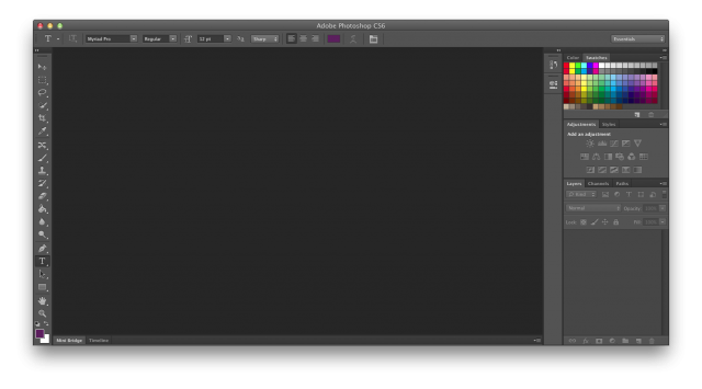
Then news broke of Photoshop CS6's all-new dark interface. Photoshop pros around the blogosphere praised the new dark interface, noting how professional it looked and what a change it was from Photoshop's standard interface. And I had a hard time laughing. The new Photoshop CS6 interface color is rather similar to the color scheme Photoshop Elements has been sporting for years, except in Photoshop CS6, your tools palette is filled with nicely shaded light grey icons instead of Elements' candy-colored icons.
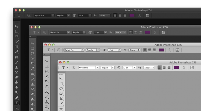
One nice extra in Photoshop CS6 is that it has 4 color schemes, one darker than the default and then two lighter ones, with the lightest being basically the same as it was in CS5. I happen to prefer the default interface color, but it's very nice to have the choice, and Adobe's done a nice job of integrating the custom colors into their apps without feeling half-baked or quirky. My only frustration is that, while many of the other CS apps such as Illustrator got the new UI, InDesign didn't get the new interface options, and still looks largely the same as it did in CS5. Guess we'll have to wait for CS7...
Back on the Elements side of the equation, Photoshop Elements 10 has a slightly darker outer window, with a slightly lighter shade of grey on its tools pallets. It looks much the same as previous versions of Photoshop Elements, with slightly less bright colors than before. Now, we'll have to see if PSE 11 has the interface color options of Photoshop CS6, or if it inherits an "all-new" light grey interface previously seen in CS5...
Thoughts? @reply me on Twitter.


