Make Your PC a (nicer) Kindle
Kindle for PC is one of my favorite new programs for Windows, and a recent update made it even better. The Kindle Store offers more new ebooks than most other ebook stores, and the terms usually allow you to keep books on up to 5 computers and devices. I use my netbook as an ebook reader, and with all the ebook programs I’ve tried I still prefer the Kindle app. Here’s what the newest update brings to Kindle for PC
Getting the Update
Kindle by default automatically downloads updates and installs them, so you’ll usually have the latest version of Kindle for PC installed. Kindle for PC was released as a beta shortly after Windows 7’s launch last fall, so if you installed it when it first came out you may still be running the older version. Just open Kindle for PC while you’re connected to the internet, though, and the latest version should automatically download. Next time you open Kindle, it will automatically install the update without requiring you to click or select anything.
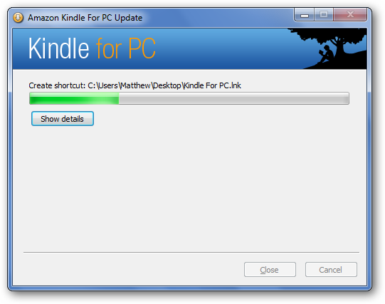
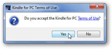
After the update installs, you’ll be asked to accept the license agreement.
Welcome to your updated Kindle for PC! Notice the changes?
Changes in Kindle for PC 1.1.0
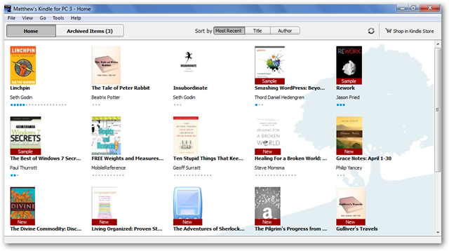
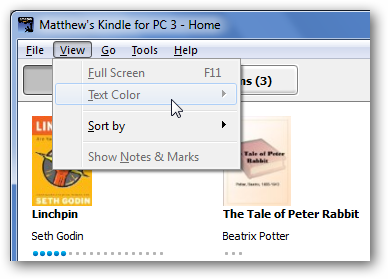
The latest version of Kindle for PC has several changes, so let’s explore them quickly. Most noticeable is the old-style File menu at the top of the window. This is an unfortunate design decision; previously Kindle had a consolidated menu on the right of the top toolbar similar to IE8. Hopefully they’ll adopt a more modern UI instead of the File menu with future versions, but one thing we can be excited about is that they expanded the menu to contain more features. On the front screen, most of the menu items are grayed out since they’re book-related features (another reason why modern, context-centric menus would be nicer … but I digress).
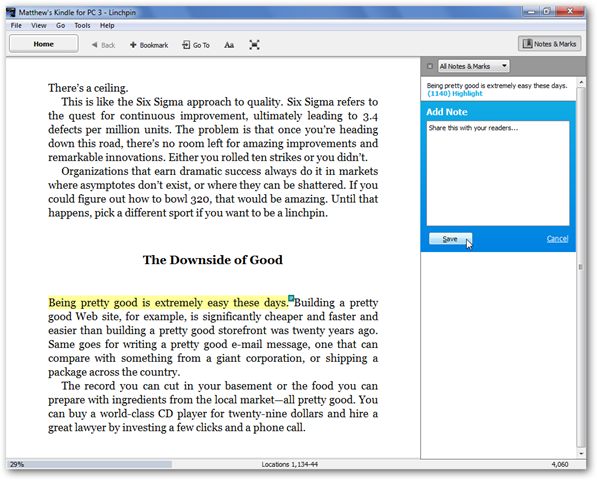
So let’s dive into a book to see the new features. Here I’ve opened Linchpin by Seth Godin, the latest ebook I’ve been reading (very good reading/ideas, by the way!). First off, Kindle tells us that we can now add notes and highlights directly from Kindle for PC! This is the biggest features Kindle for PC was missing up till now, so it is a very nice addition.
To make a note or highlight text, just select the text and a context menu automatically pops up. Choose the option you want.
Highlighting looks just like you would expect (though maybe they should make the highlight less straight to look more like my real-world highlighting!).
If you choose to add a note, the Notes & Marks sidebar will open so you can enter anything you want. Click Save when you are finished. Remember, Kindle will sync these notes and highlights to all of your computers or devices via WhisperSync, which is very handy!
If you decide you don’t want the highlight, right-click on it and select Delete.
Nice UI Enhancements
Another nice new change is the darker background color and shadow behind the ebook. This is mostly a cosmetic change, but one I found very nice.
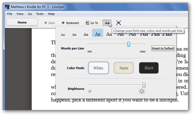
But for even more options, click the “Aa” button. This button used to only change the font size, but now it contains a variety of options.
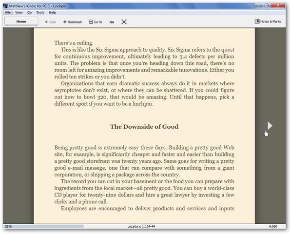
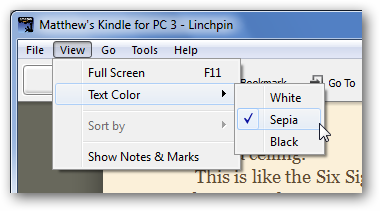
You can choose the font size, number of words per line, color mode, and brightness. All changes can be previewed by simply hovering over the option, which is very nice. The new color modes are especially nice. The Sepia options looks more like real paper, while the Black option gives you White text on a Black background which many prefer for on-screen reading. Here’s our book with the Sepia color mode … very nice.
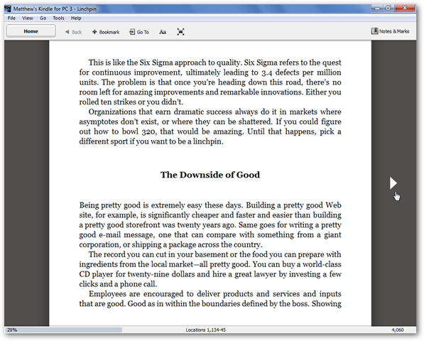
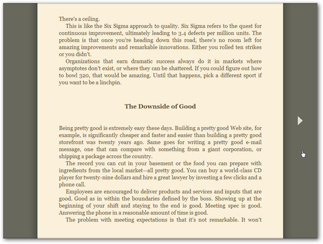
And, right beside the Aa button is the newest button … which activates full screen mode! You can also activate full-screen mode by pressing F11 on your keyboard, which is the universal “full-screen mode” shortcut. Nice!
Here’s our book in full screen mode. Now your PC really feels like a Kindle! Press Esc on your keyboard to exit full-screen mode when you’re done reading.
The file menu offers the same options that we’ve used with the standard buttons, so it seems to be there just to help those who prefer file menus. I hope they remove the file menu in a future update, but I’m one user that really wants File menus to die :)
Conclusion
That’s all the changes I noticed; if you notice any more, be sure to let us know in the comments. As is, though, Kindle for PC is my favorite ebook reader for PCs, and I highly recommend it. These changes only made it nicer, and I can’t wait to see what other features Amazon brings to Kindle for PC over time!
Thoughts? @reply me on Twitter.

