With Paper, Facebook Finally Proves Its Worth on Mobile
Flash back a decade ago, to early 2004. XP powered desktops are laptops were practically the only computers you’d see, running either IE6 or an early version of Firefox, and more likely than not connected to the internet via dial-up. Gmail wouldn’t be announced until April, the iPod was still black and white, and Fortune wondered aloud if anyone could ever topple Blackberry. YouTube was still a year away, and Netflix streaming wouldn’t be a thing for 3 years. The iPhone was still over 3 years away, and Android even further.
That’s the world Facebook was launched into. A world dominated by desktops and traditional browsers, ones where always-on internet was something new and sharing pictures meant syncing a digital camera and painstakingly uploading pictures hours or days later. It was a slower, simpler time.
And it was a time that Facebook was perfectly suited for, with a slower feed that’d show your friend’s longer, rambling posts they’d have time to type on a desktop, and the flash games and more that made it the one web app everyone used. It ended the reign of Myspace, AIM, MSN Messenger, and strongly displaced personal blogging in one fell swoop. It was unstoppable.
Then 2007 happened, and the iPhone changed everything. Another startup social network with 140 character messages styled after text messages had seemed like a rather unlikely challenger to Facebook’s dominance a year earlier, but now, the information density of short messages made perfect sense with smartphones. The next US election, only one year later, would see Twitter the talk of the town far more than Facebook had ever dreamed of. It was the perfect timing for the most unlikely social network.
Smartphones should have been an equal boon for Facebook, but the desktop-focused social network never felt as natural on smartphones as it had on the desktop. Its purchase of Instagram — the photo social network that, just like Twitter, seemed perfectly suited for a mobile audience – was a final Hail Mary to earn a place in a mobile world. And yet, Facebook itself has increasingly felt like an afterthought for most people: you private message on WhatsApp or Line or iMessage, you share pictures on Instagram, you discover what’s happening on Twitter, and if you’re writing anything of substance, you likely switched back to private blogging or writing on new platforms like Medium.
It's not that Facebook was so bad at sharing your status, or private messaging. It's that it strove to be everything, in an age where we're using one app for one purpose. And then, in trying to be too much at once, it made it impossible to focus on the one thing you where in the app to do: see what others posted.
See, on mobile, information density is where you live or die. Facebook's app shows, at best one and a half posts at once, and often that half is an ad. You're scrolling a full screen each time you want to see another post. And those extra features — private messages, say — are at best 3 taps away. Information density wasn't a problem for Facebook on spacious laptop screens, but when they tried to shrink everything down for the phone, everything got cluttered and crowded, quick.
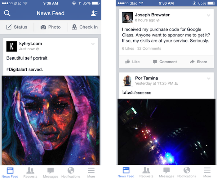
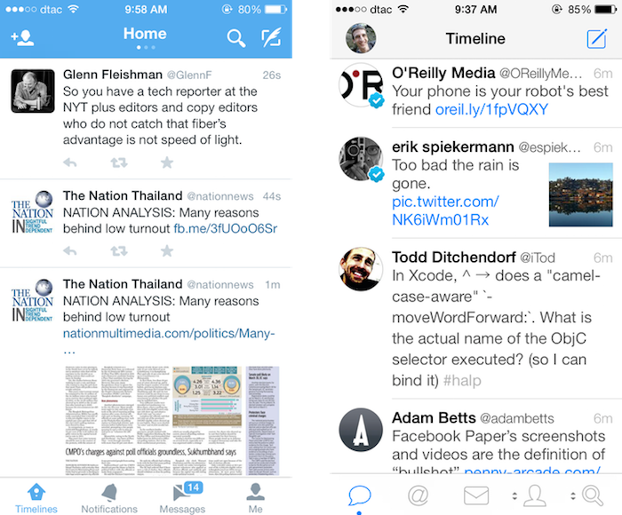
Compare that to Twitter, the social network that feels much more like a messaging app. In the official Twitter app you’ll usually see 3 posts (though one of those may be a sponsored post), and in 3rd party apps you’ll often get 4 posts at once. Twitter gives you over 3 times the information density in the same screen as Facebook, with far fewer options and confusions than the Facebook app presents at once. Those 140 characters have managed to cram in a ton of info — locations, links, and even pictures of late — that let one tweet tell you so much, while still taking up so little space. Twitter’s focused and information rich, while Facebook retains its desktop bloat.
Enter Paper
Thus, the new Paper app. The issues with its name notwithstanding, the Paper app represents the best new shot at making sense on mobile for Facebook since their purchase of Instagram. This time, though, it makes the core service make sense, not just one tiny aspect of it.
The app is slick and polished, enough to catch everyone's attention even in a crowded app market. And, for once, it wins the information density game, even without feeling like it’s cramming as much in one screen as possible. There’s a large banner at the top — itself actually one of the recent posts in your stream — with two and a third full posts visible below. That’s as good of information density as Twitter, if not better, considering how much text and graphics are in that one view. It, for once, has proven that retina displays can actually be more useful than their lower resolution counterparts, with its beautifully rendered full-length-yet-tiny Facebook posts.
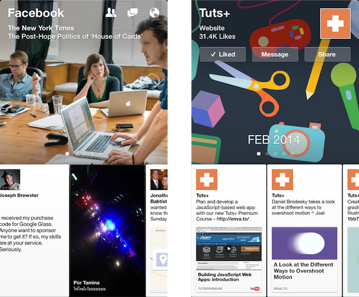
Paper makes browsing your Facebook stream — the essential Facebook experience — fun again. Search and private messages and the other Facebook extras are still hidden away behind extra taps, but at the very least it nails the Facebook feed on mobile (and the separate Facebook Messenger app already gives you a one-tap look at your private messages if you'd like that).
And it makes exploring fun again. You likely don't rely on Facebook for your news, but Paper shows that you just might want to, with its curated topic views. They're far from perfect — it'd be much better if it turned your Facebook Likes into curated selections, and then perhaps threw in some of Facebook's recommended picks — but it's the first time I've discovered new sites on Facebook in a long time. Something's right, here.
Best of all, Paper's new card design and simple gestures to flip through content are so unique and yet so obvious once you've used them, it's hard to imagine that they won't be copied as much as Tweetie's then-new pull-to-refresh gesture has been. Facebook's leading mobile design here, and that's a surprising new start.
So, here's to the social network that I'm not particularly fond of. Facebook hasn't been my favorite social network in quite some time — that crown would go to Twitter. And yet, with Paper, I see promise again. At the very least, it's the one Facebook app that feels truly mobile-first and innovative. It's hard for that not to feel exciting.
Thoughts? @reply me on Twitter.