The Colors of Microsoft Office
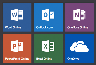
Microsoft Office's branding today is more centered on colors and typography than the icons themselves. If you find yourself wanting to use their icons in your own work, say perhaps in a preview image when writing about them (the reason I needed them), it's easiest to have a palette of the colors used for Office's branding. And thanks to the CSS on Office.com, here's the official colors for each of the major Office apps:
- Word: #2b579a
- Excel: #217346
- PowerPoint: #d24726
- OneNote: #80397b
- Outlook: #0072c6
- OneDrive: #094ab2
And, of course, each of the app names are set in Microsoft's Segoe UI Light typeface.
The icons themselves are a tad trickier. You can grab the original icons from an Office 2013 install, or otherwise there's a combined PNG of the Office icons in Office.com’s code. Or, on deviantART there’s a perfect set of the flat white Office icons, complete with correct background colors for each app. And if you actually want the colored individual icons without a colored background, Wikipedia has a full SVG of every icon in the Office lineup.
Thoughts? @reply me on Twitter.