Why Popups, Ad Push Notifications, and Degrading the User Experience is Bad
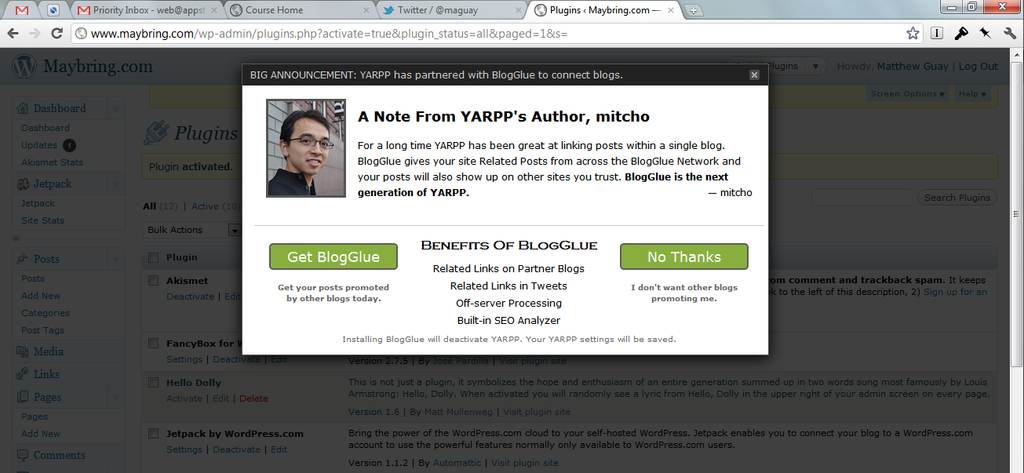
When you get used to an application just working, it can be a true surprise when it doesn't work as you expect. Minutes ago, I opened the Plugins page in WordPress on my site. When it loaded, I was stunned to see a popover asking me to upgrade to a new plugin. This was not a standard WordPress notification letting me know an update was available. It was a full popover that was essentially an advertisement for a new service, that took over your whole settings page until you closed the dialog. Talk about a surprise: it was as startling as ad popup windows when browsing the web in the '90's.
In WordPress, plugins typically only add a settings page, and potentially a widget on your main dashboard. Otherwise, they don't change your main WordPress experience unless they've been designed to do just that. In this case, the plugin, Yet Another Related Post Plugin, took over the entire WordPress experience in the native WordPress settings page. My initial reaction was to think that my site had been hacked. As soon as I realized where the popup came from, I immediately deactivated the plugin.
As a technology user, and as a writer who tries to decipher technology and explain it to others, I find myself increasingly appreciating clean, consistent user experiences. Users should be able to expect certain things from a platform. They should be able to expect that applications or add-ons to a platform will only affect the things they have been designed for.
Thoughts? @reply me on Twitter.

