OS Xi — A Realistic Peek at the Next OS X
It’s been 6 months since OS X Mavericks was released, which is a relatively short time but in the age of annual OS upgrades, it’s half a generation. Mavericks itself wasn’t a huge leap forward for OS X, design-wise, but it dropped some of the more skeuomorphic elements from the OS and rebuilt the core of the OS to be more energy efficient and speed up the entire system. If the Mac was Apple’s only computer, we could at best expect light UI changes and perhaps some new built-in apps in the next version of OS X.
But today, it’s iOS that’s the OS everyone notices, in a world where iPhones and iPads vastly outsell Macs. iOS 7 was a complete redesign of the original modern mobile OS, with bright colors, thin fonts, and swipe-orientated navigation. It’s so sharply different from everything that came before, it’s hard to imagine that Apple won’t work some of the iOS design changes into the Mac this year. OS X Lion was the “Back to the Mac” version that brought new apps and design from iOS over to the Mac, and Mavericks continued that tradition by gaining iBooks and Maps from iOS. But this year’s 10th release of OS X is all but guaranteed to be a far sharper change from everything that’s come before—one Apple presumably wants the world to help them test, by opening OS X beta testing to everyone this week.
There’s next-to-no way Apple’s going to turn OS X into iOS directly, with its one-app-at-a-time model. It also seems rather unlikely OS X will be fully redesigned as deeply as iOS 7 (and as so many designers have mocked up, as in the above OS X Ivericks concept). For now, everything’s speculation.
Steven Hackett rounded up the progress of Apple's user interface designs over the years, for a solid look at the past and a perspective on how Apple might change OS Xs design. But for a glance forward, the best place to look is at the apps that have already been designed with a lighter, thinner UI that’s reminiscent of iOS 7. And then, for a better idea of the future of pro apps on the Mac, there's everything from Apple’s own iWork apps to the new OmniFocus and Sketch that have this year redefined the way inspectors work on Macs, even while sticking with more dated designs. These apps give us the best concrete glimpse of the future of the Mac, as it already exists today.
The Simplification of OS X Design
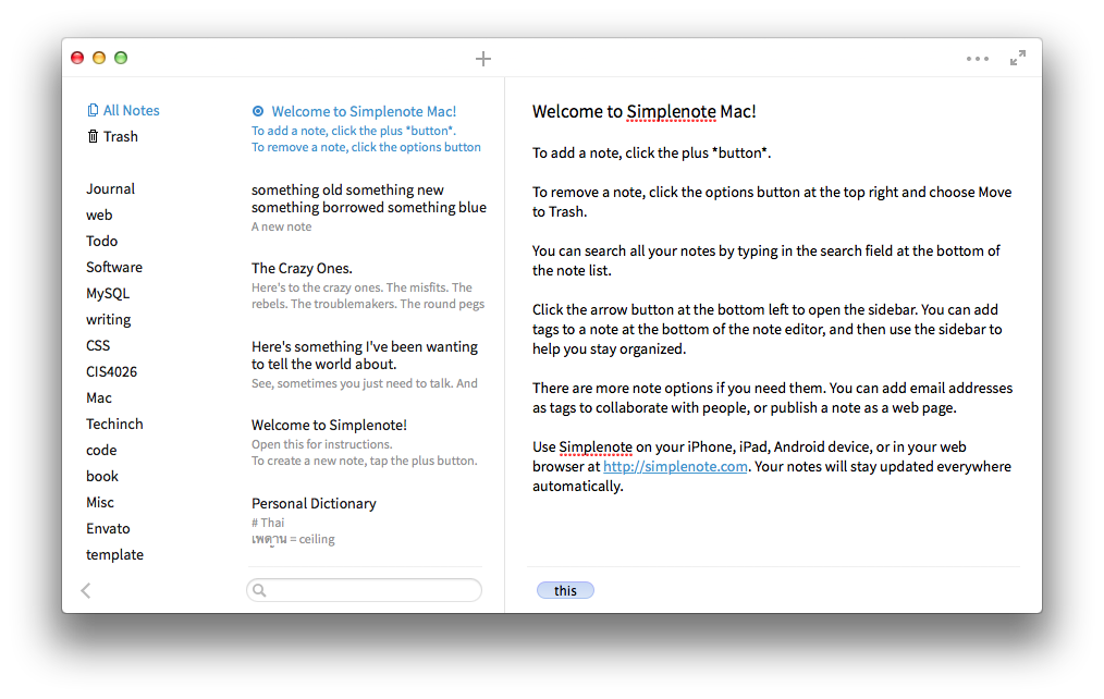
There's been a steady march to lighter, less distracting UIs for years now, with writing apps leading the way. WriteRoom was the original UI-free writing app that, while being a traditional windowed app, harked back to terminal-powered text editors like Vi. iA Writer took the next step, making a lighter, typography focused writing app with zero settings or options. It was the original iOS 7-styled app, launched nearly 30 months before iOS 7. And so, it's only appropriate that one of the first new Mac apps launched with an even closer iOS 7 style was Simplenote for Mac. Clean, bright white, and focused on thin lines and typography, it would feel at home immediately in a redesigned OS X aside from its traditional bubbly window buttons.
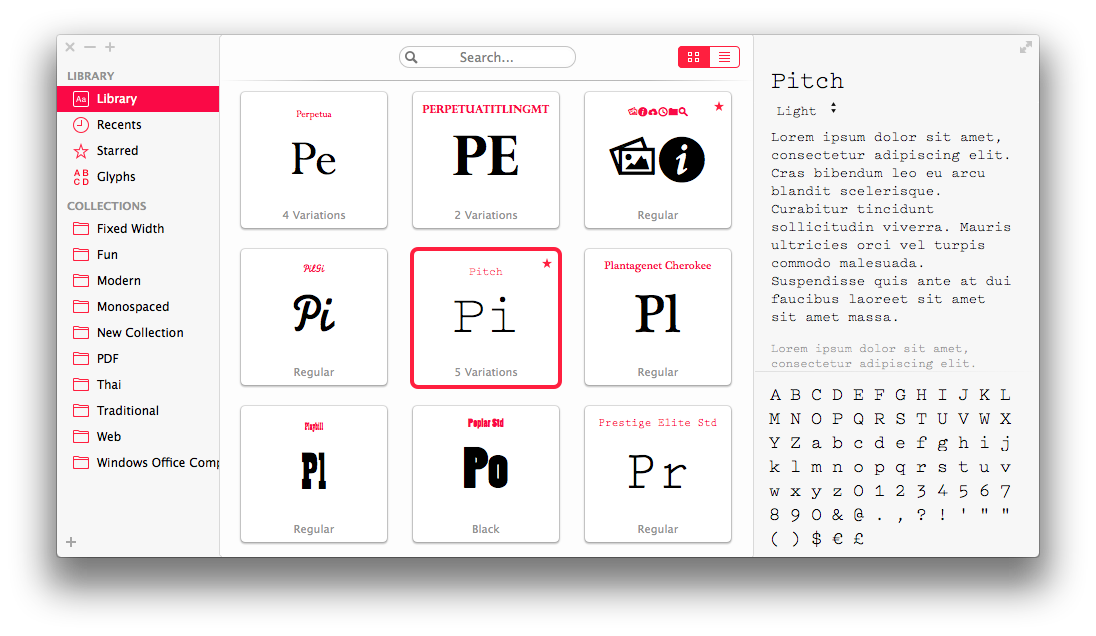
Fonts from Bohemian Coding, launched last November as an alternative to the Mac's default Font Book app and a successor to their own Fontcase, is at once a nice app and a beautiful showcase of what light, typography centric design could bring to the Mac. It has familiar Mac features like the move-mouse-to-scrub font previews that are reminiscent of iPhoto libraries, coupled with a unique design that stands on its own while being obviously influenced by iOS 7. Most interestingly, it has its own typography-based window buttons in the top left corner.
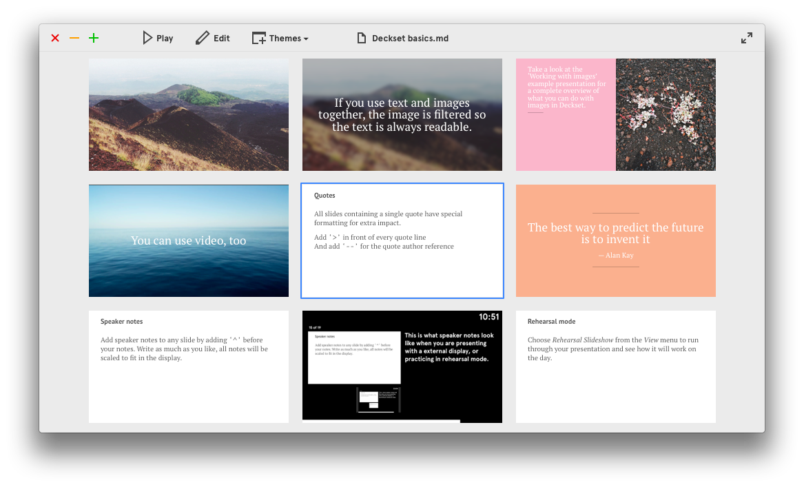
This month's release of the new Markdown-powered presentations app Deckset completes the circle from iA Writer's original off-white sparse writing interface merged with an iOS 7 style UI. The app is centered on your slides, not the UI, which makes it feel more like a mobile app than the traditional inspector-driven Mac apps, but it's the multicolored typographic window buttons and the beautiful theme browser that earned it inclusion in this list. A new OS X with this level of redesigned window boarders seems immediately possible.
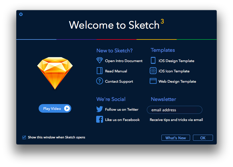
Modern doesn't have to mean bright white, though, as the launch screen in the new Sketch 3 proves. The app itself relies on a more traditional interface—though Sketch itself was one of the earliest adopters of the integrated inspectors that fill the ranks of Mac productivity apps today. What does show a sharp contract to traditional Mac design is the launch screen that's at once unique and yet iOS 7 inspired.
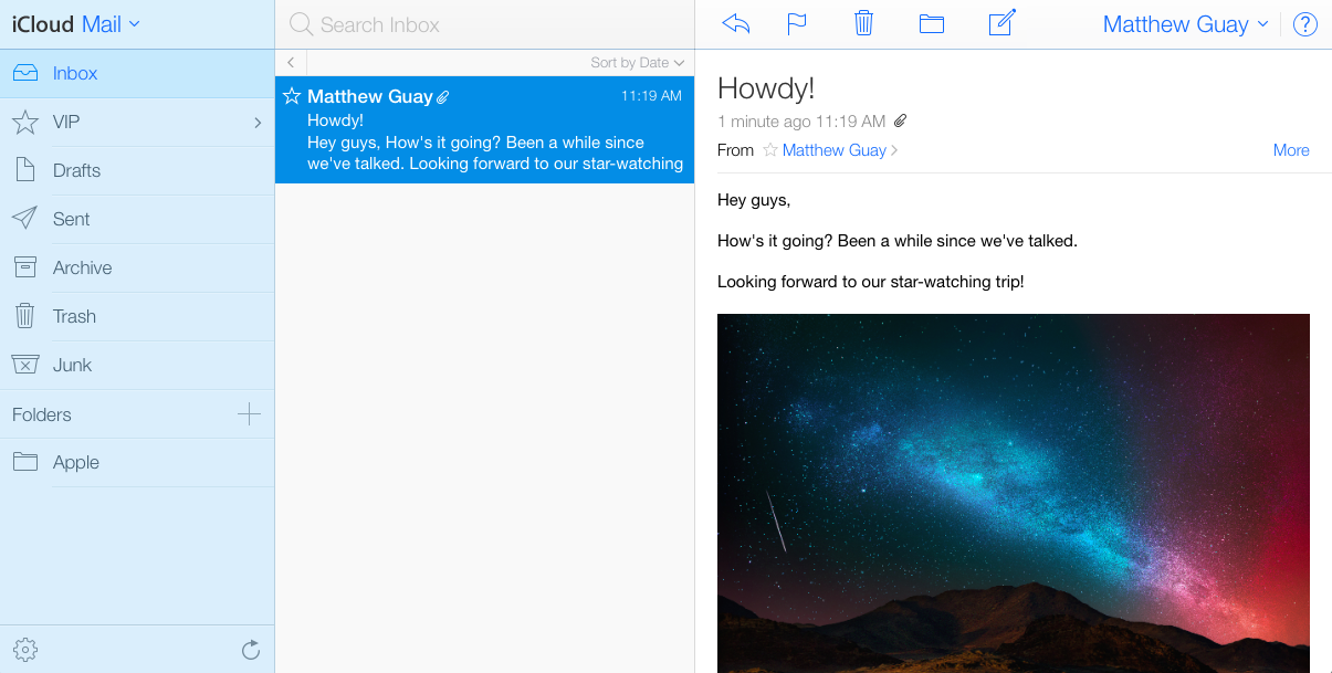
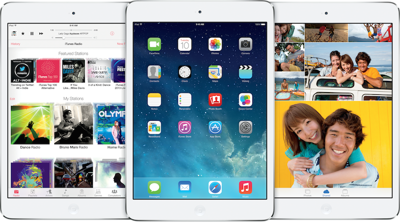
But if you want the strongest iOS 7 experience on the Mac, you'll need to look at Apple's own iCloud.com web apps. The Mail, Contacts, Calendar, and Notes apps feel almost just like their native iPad counterparts, with some desktop-orientated tweaks. I'd highly doubt the next OS X will look this much like iOS 7—after all, the last iCloud web apps looked precisely like iOS 6, and even at the height of OS X' skeuomorphic design it never looked that precisely like iOS. Still, these apps provide an interesting look at what an iOS 7ified OS X could look like if taken to its logical extreme.
Whither Inspector?
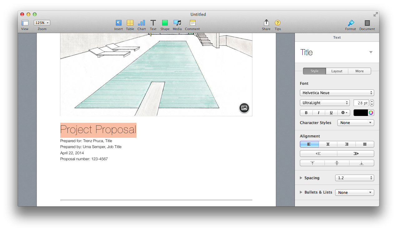
There's one more shift over the past few years in Mac app design that's as important to remember in how the next OS X will look as any other design change: the new integrated inspectors. They're embed in the right side of the app, use tabs that typically will switch smartly based on context (similar to Microsoft's Ribbon, albeit without taking up valuable vertical space). Perhaps it's not such a huge change from the former floating inspector windows, but it does make full-screen apps make much more sense—and that's one of the tiny iOS-style changes that have popped up in OS X over the past few releases.
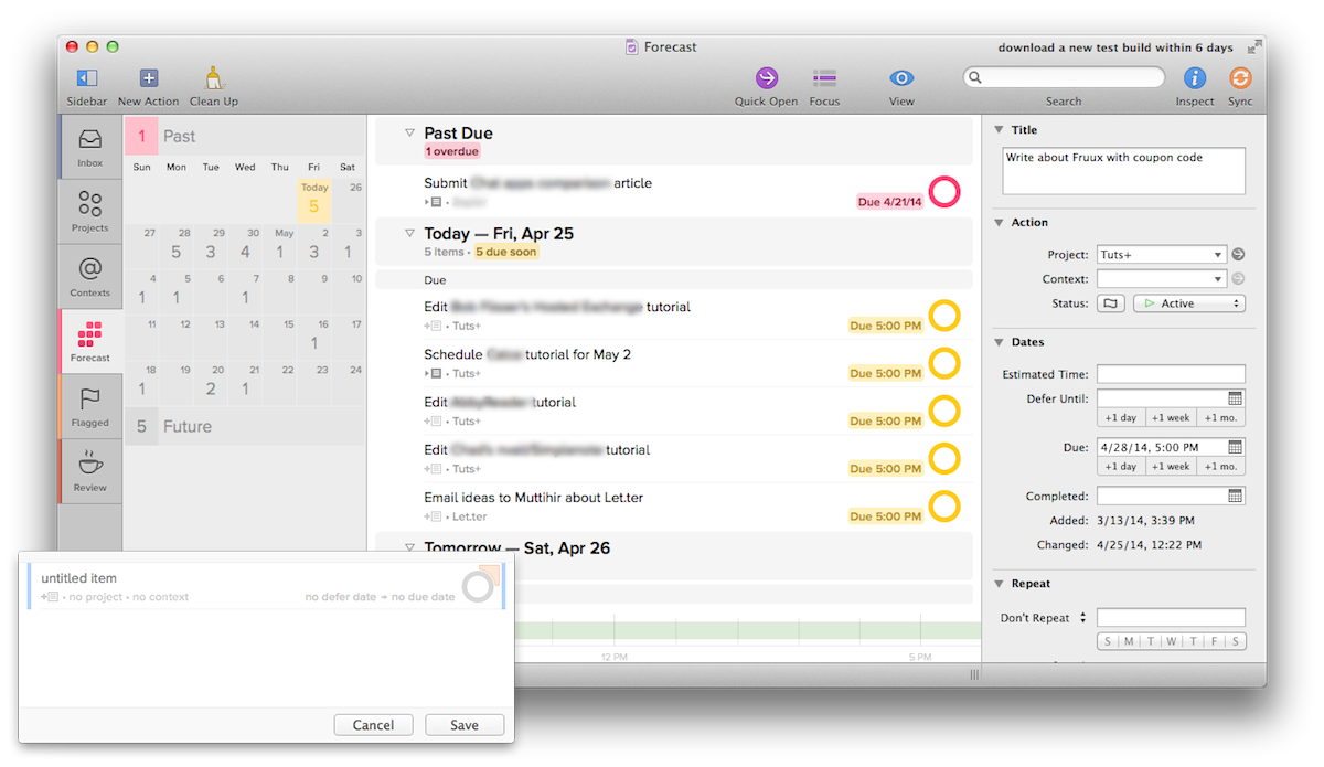
Third party developers have been using the new built-in inspector in various ways for quite some time now, with Sketch including one of the nicest built-in inspectors, but a recent adopter of the style has been the Omni group. OmniGraffle's UI looks perhaps the most dated of recently released Mac apps, but its inspector is similar to the iWork inspector while adding the extra tools needed for that app. OmniOutliner kept a floating inspector, but with the tabs and smarts that make it similar to iWork's inspector, while the still-in-beta OmniFocus 2 has a nice new twist on a built-in inspector that's flatter and whiter than most. Plus, its new Quick Add pane would look perfectly at home in an iOS 7-style interface.
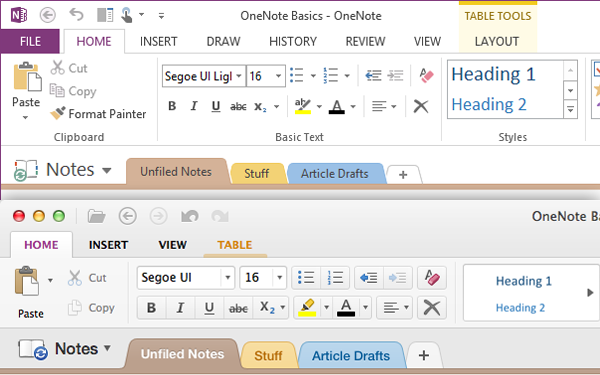
Speaking of flatter, whiter design, Microsoft Office 2013 took that to a different extreme, with all-caps typography, bright white accented with app-specific colors, and flat elements through the apps. The new OneNote for Mac sports a similar design, though with a bit more of Apple's Aqua bubbly plastic than could possibly look at home in an iOS 7-styled OS X. It'll be fascinating to see how the presumed upcoming Office 2014 for Mac looks—if Apple goes to an iOS 7 style extreme, and Office 2014 looks like Office 2013 for Windows, it'll actually look quite at home.
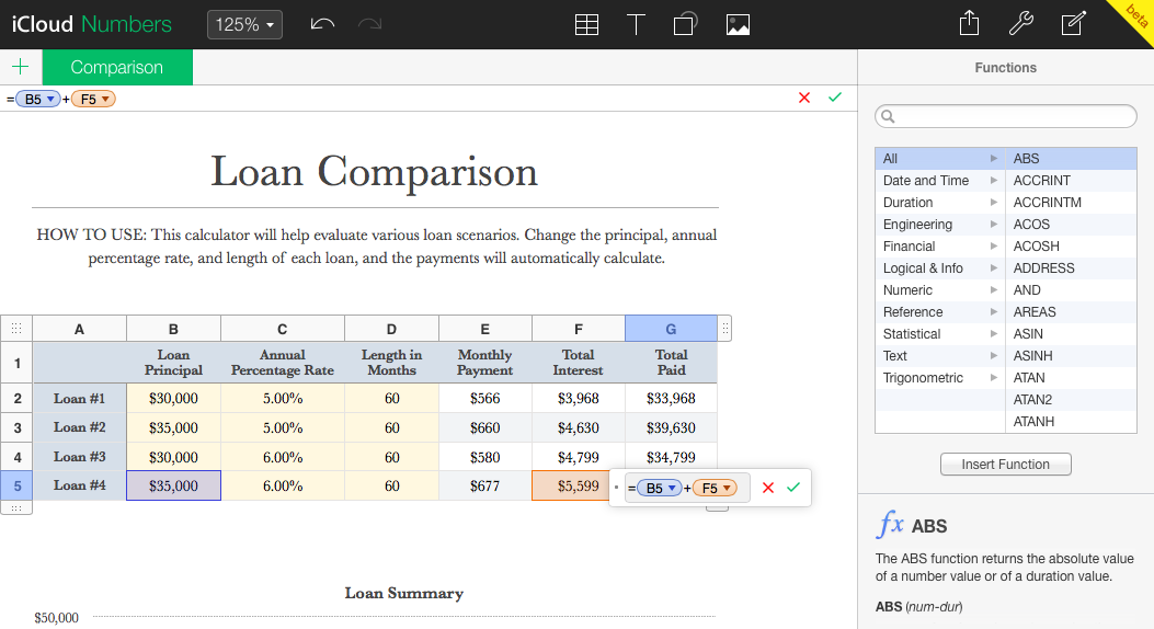
Then again, the best hint at what Apple may have planned for the next OS X' design is once again the iCloud.com web apps, this time the iWork apps. Their recent still-in-beta redesign uses a dark UI theme that includes iOS 7 style thin fonts and flat elements alongside an OS X style new-style inspector. These web apps design are unique in Apple's in-house lineup today, and I have to wonder if they don't point more towards a more "professional" twist to iOS 7's style that could be what Apple has planned for the next OS X.
New design, new inspectors, or perhaps something entirely unexpected that we can't predict? It's tough to say definitively what the next OS X will bring, but I happen to think you can put together the designs that have hit the Mac already and guess rather well at what a redesign that's halfway between iOS 7 and OS X Mavericks would look like—and my money's on that being the direction Apple goes.
What's in a Name
And then, there’s one more thing that’s fun to speculate about: what the next version of Mac OS will be called (which apparently is currently codenamed “Syrah”). OS X Mavericks was the first OS X version to not be named after a cat, but rather after a surfing location in California, and that change presumably means the next version of OS X will include a California location name as well. OS X Cupertino, anyone?
Even more interestingly, though, is the version number Apple will use. Mavericks is OS X 10.9, so will the next OS X be 10.10? Or, is it possible that this year OS X, will actually become OS XI (or OS Xi to show a closer alignment with iOS)?
OS Xi 11.0 Cupertino. Insanely great.
And then, there’s that fabled One more thing Wall Street is salivating about…
Thoughts? @reply me on Twitter.